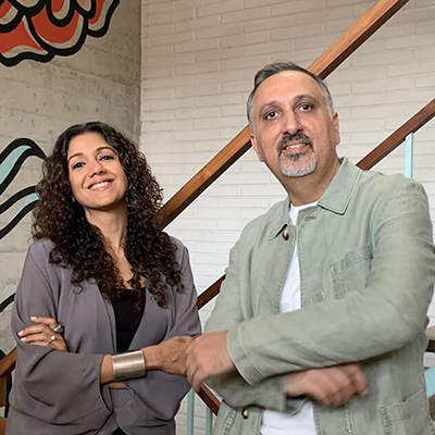
DIALOGUE
Words help transcend barriers of language or abilities by creating access and enabling meaningful communication. This typographic installation explores that interpretation, acting as both sculptural and spatial composition—an instigation of multiple dialogues.
Larger-than-life letters are arranged playfully, with their counter forms acting as framing devices that prompt interaction and offer pocket avenues for unpredictable perspectives. Their scattered placement introduces moments of surprise, inviting exploration, relaxation and shifting views of the surrounding space. Dialogue is supported by vis a vis, a pioneering integrated lighting solutions company operating pan-India and running the country’s largest experience centre dedicated to qualitative design and cutting-edge technology.
The letterforms are set in Curry Display, a hybrid typeface designed by Tania Singh Khosla. Combining influences from Latin Uncial and Indic Devanagari scripts, it bridges the East and West, symbolising a 'dialogue' that reflects the festival's multidisciplinary ethos, connecting diverse creative communities from around the world.