


Architecture22 mins. read
Discussion, discourse, and creative insight through STIRring conversations in 2022
by Jincy IypeDec 27, 2022
•make your fridays matter with a well-read weekend
by Anmol AhujaPublished on : Mar 15, 2024
For communities historically disavowed and othered, the practice, making, display, and circulation of art has seldom been for pleasure and indulgence. Reflecting fortitude, pride, and repressed anger at systemic bias against, un-simplistically stated, individual identity, art for underrepresented peoples globally has been a means of resistance and emancipation. That manifests in an exciting relationship with ‘space’, which has unfortunately not only been categorically denied to minority populations but has also been used to further narratives of exclusion. And making that ‘space’ thus remains essential to any endeavours of revival or revision, or simply of representation; of history, a relatively calmer but dubious present, and a hopeful future. So while institutions may have historically escaped culpability in mass exclusion based on majority-minority metrics—and they still do—these spaces have been made, preserved as havens, and passed on as legacies. Their proliferation, often taking forms other than of physical space (or institutional space as we may imagine), in books, magazines, films, conclaves, clubs, and other autonomous bodies, remains key to the inception of inclusive narratives everywhere.
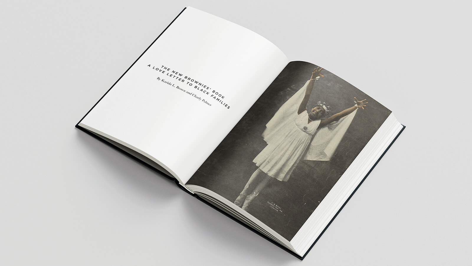
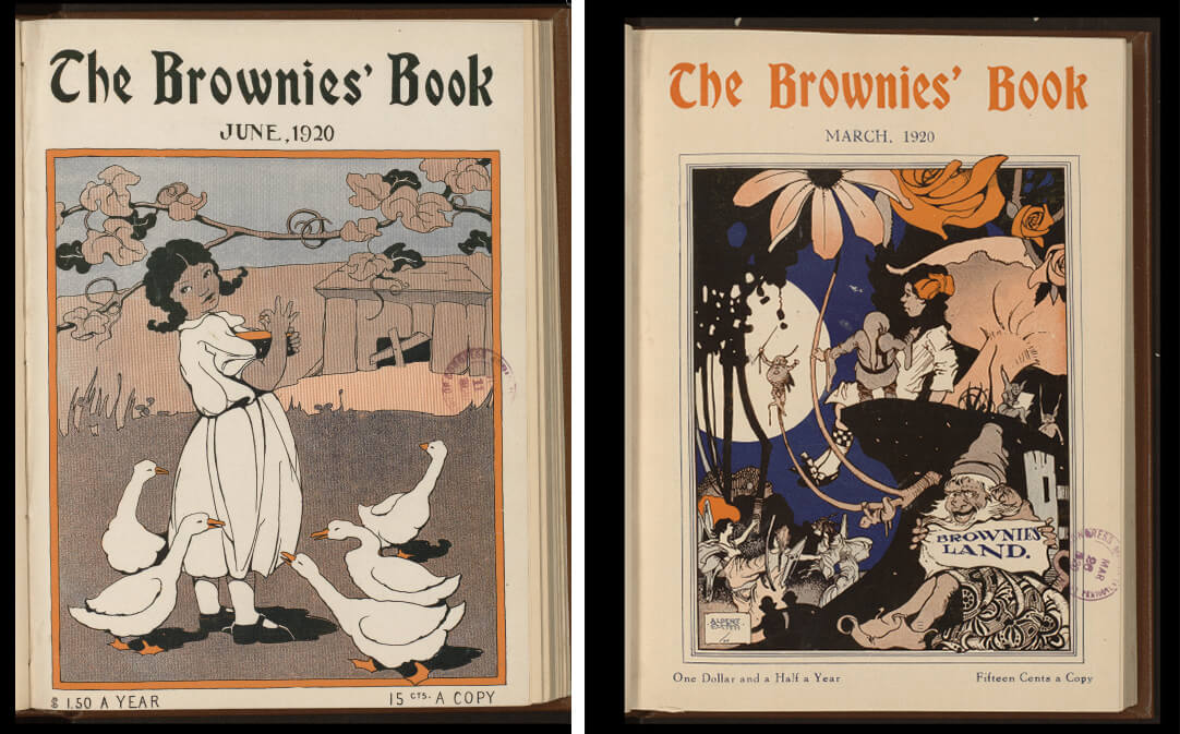
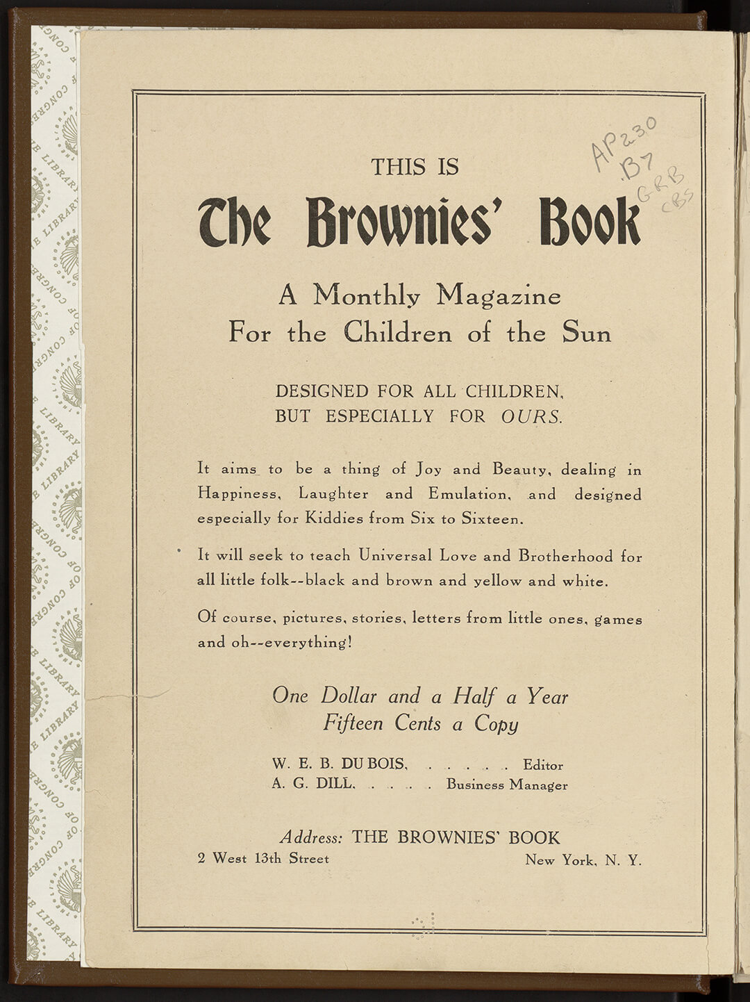
At the onset of the Harlem Renaissance era—definitive for Black history, but particularly so for the flourishing of Black cultural creative enterprises, and thus commons—The Brownies’ Book, founded by W.E.B. Du Bois, Augustus Granville Dill, and Jessie Redmon Fauset, was conceived as one such space. Its continuing endurance and legacy over more than a century, however, was owing to its dedication of that space to children of colour everywhere, but particularly from black families, endearingly called “children of the sun”. The monthly magazine was designed as an object of pride and awareness to be possessed and cherished by the young, away from the representational one-dimensionality of popular children’s literature then. Its conception of ‘space’, as aforementioned, then operated on the bifold objective of making space for young and lesser-known Black artists to display their work, and for established Black creatives to incite joy and hope within the community. It was, amidst more racially sensitive times, also a testament to inspiration for young Black people to see other popular figures in their image, notoriously missing from the mainstream until then. The inner cover of all issues of the magazine, in a resounding proclamation of love and all things joyous like its very being, read:
“DESIGNED FOR ALL CHILDREN BUT ESPECIALLY OURS. It aims to be a thing of Joy and Beauty, dealing in Happiness, Laughter and Emulation, and designed especially for Kiddies from Six to Sixteen. It will seek to teach Universal Love, and Brotherhood for all little folk–black and brown and yellow and white. Of course, pictures, stories, letters from little ones, games and oh-everything!”
A century later, historical and cultural sociologist Dr Karida L. Brown and visual artist Charly Palmer reimagine W.E.B. Du Bois’ editorial as an anthology book with the same beating heart, and a roadmap to navigate coloured experience, identity, and living in our current perceivably liberal but intrinsically divisive times.
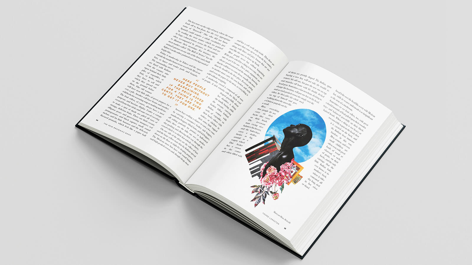
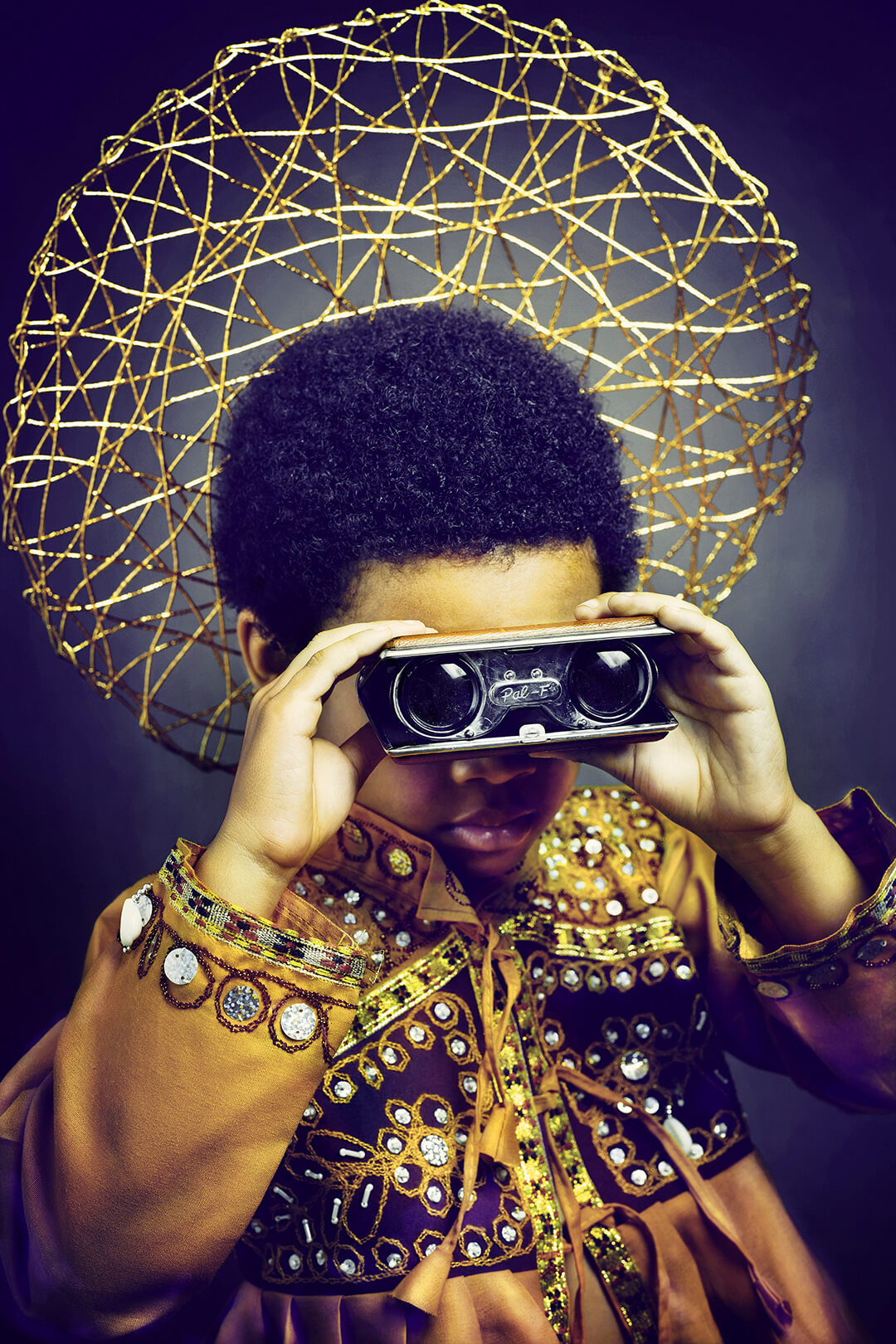
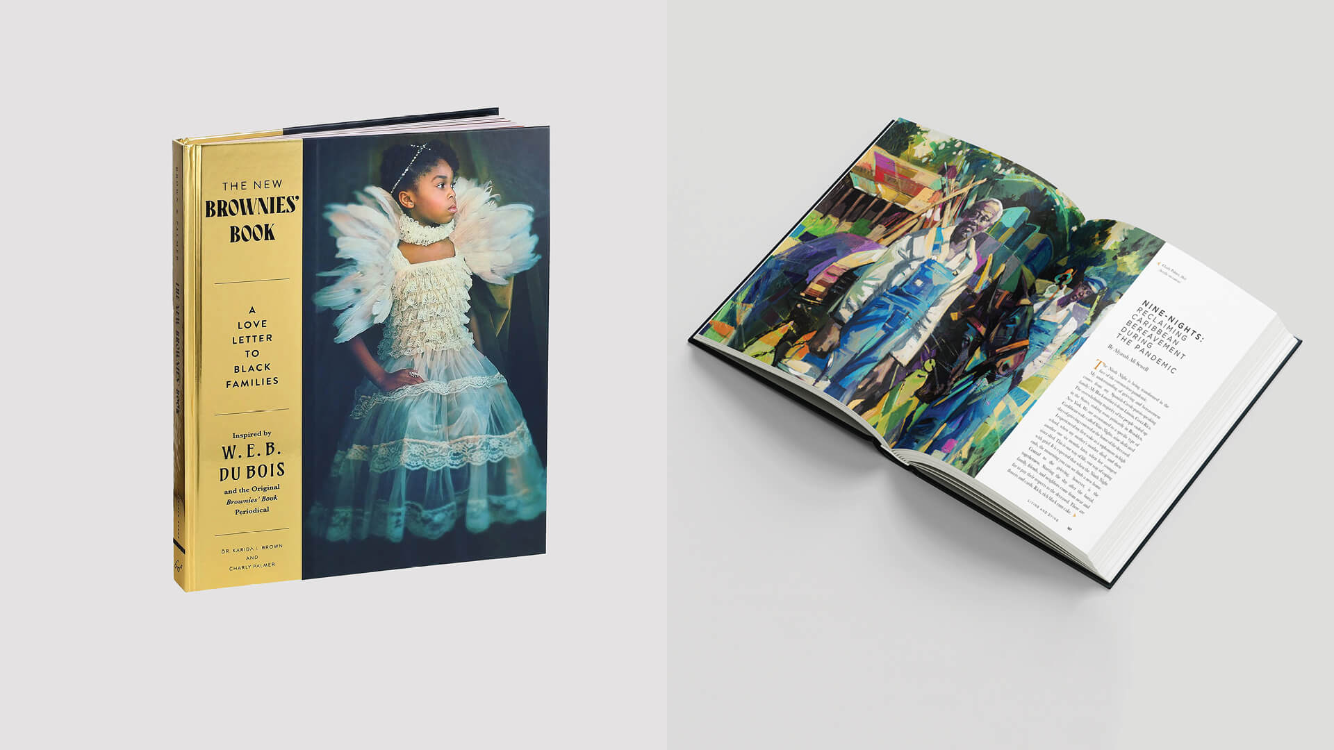
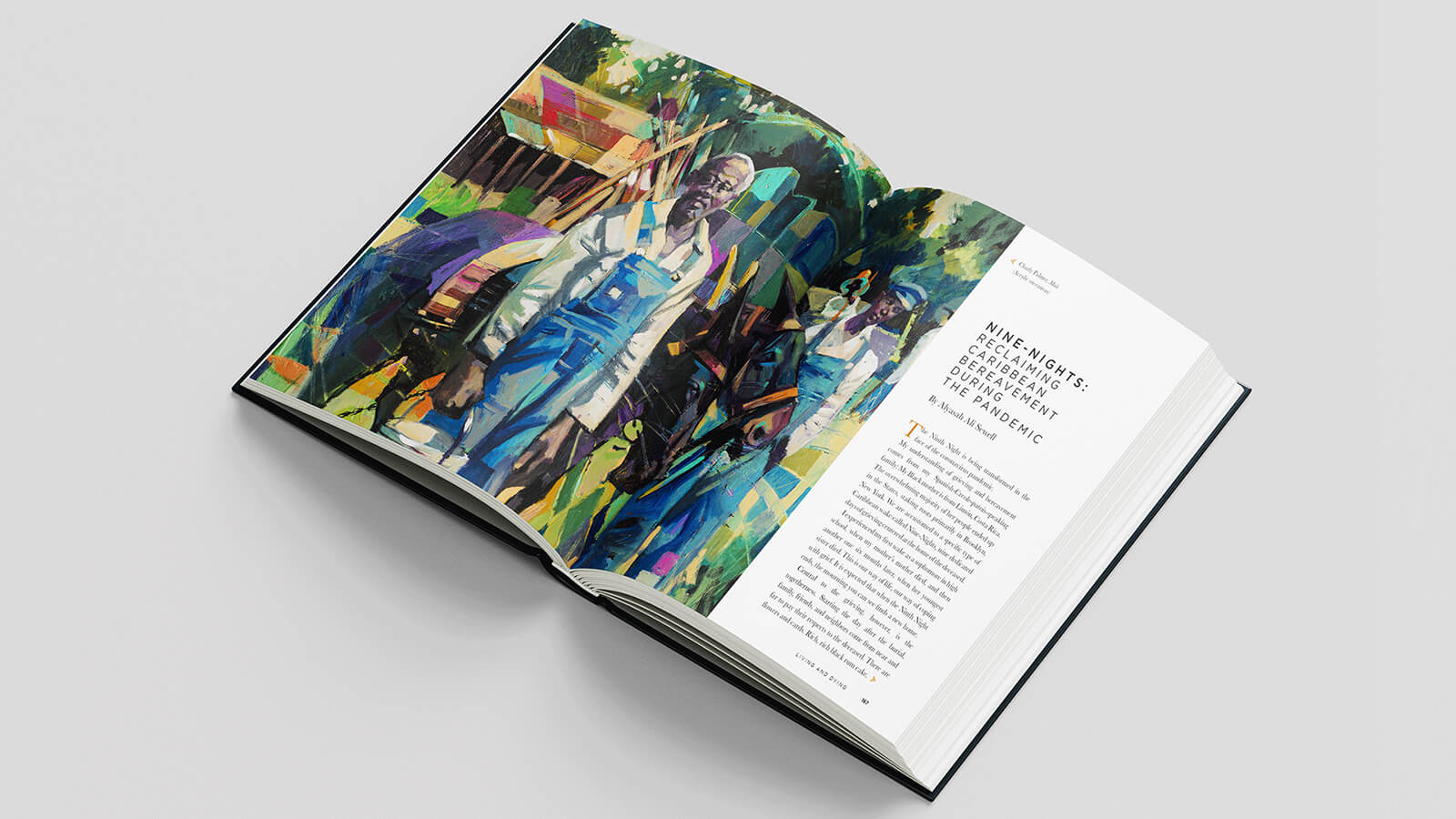
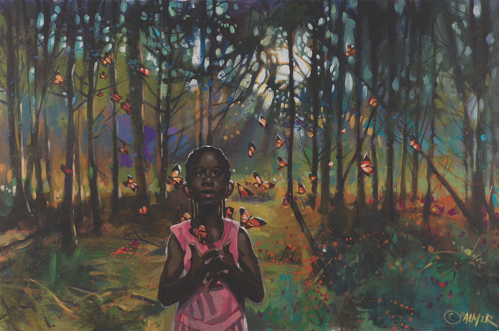
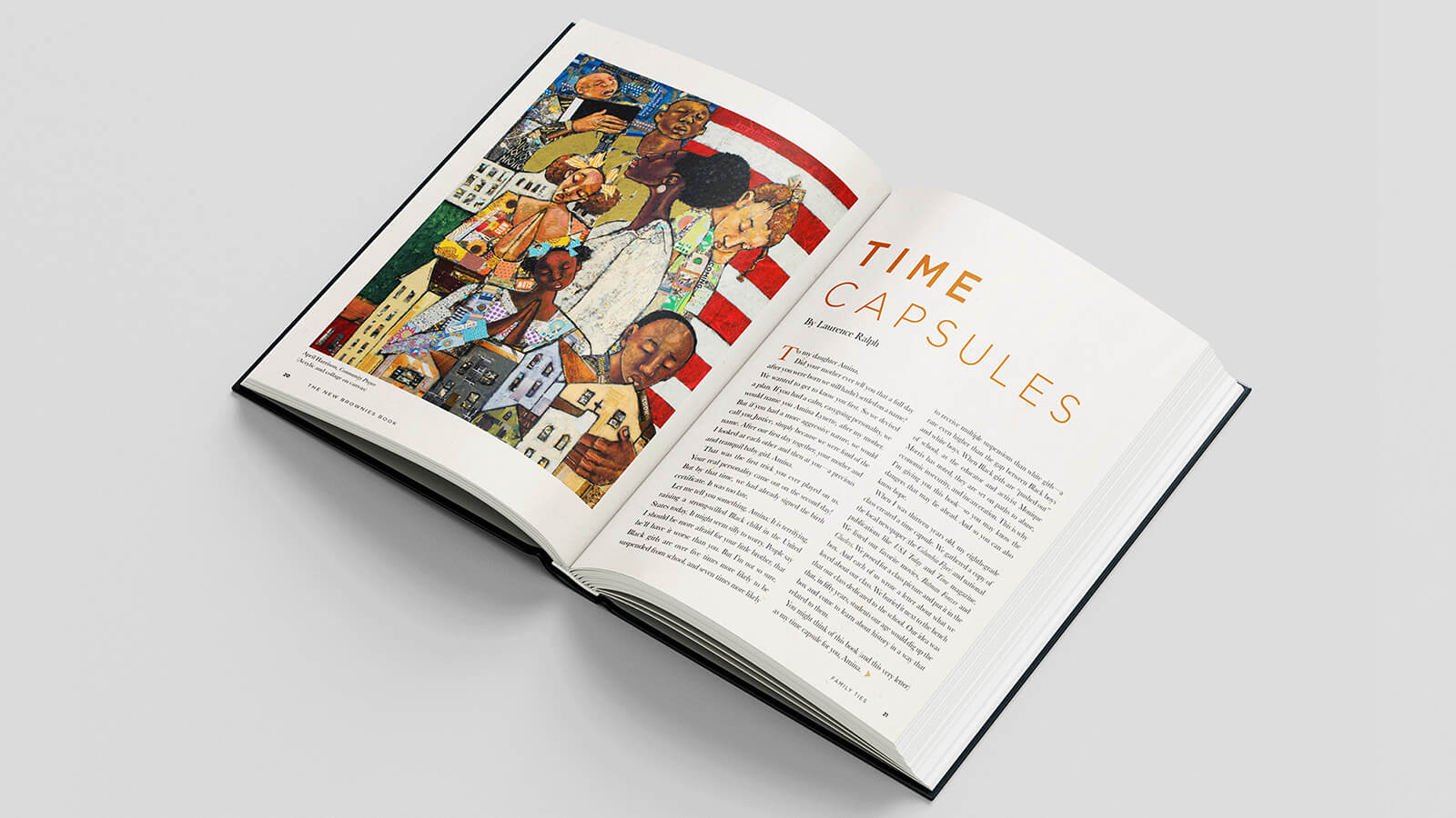
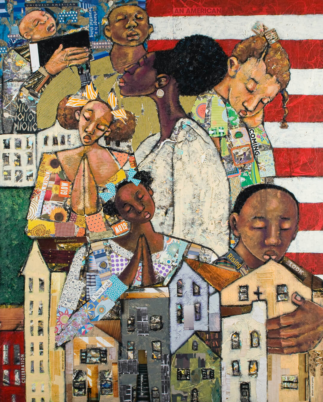
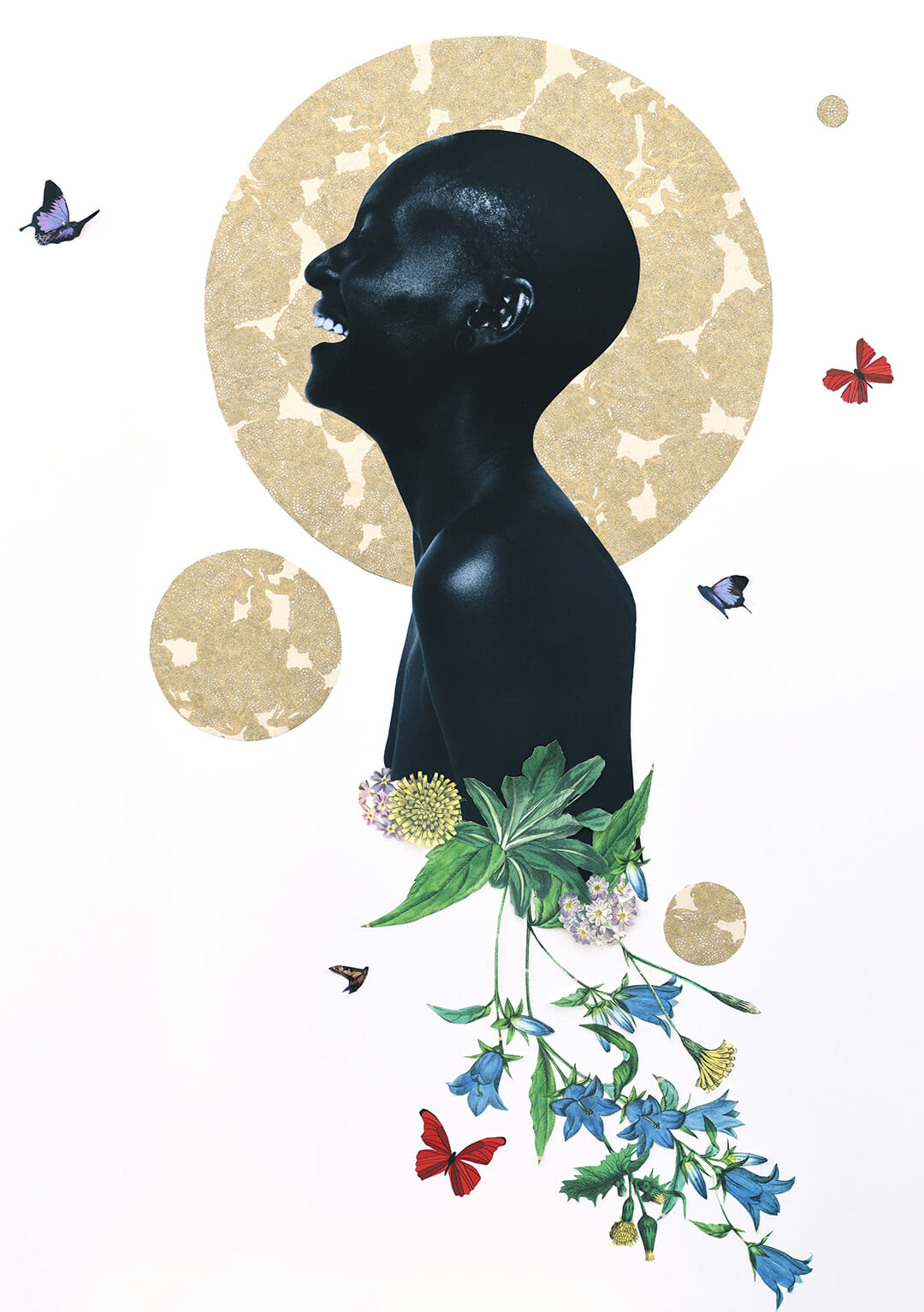
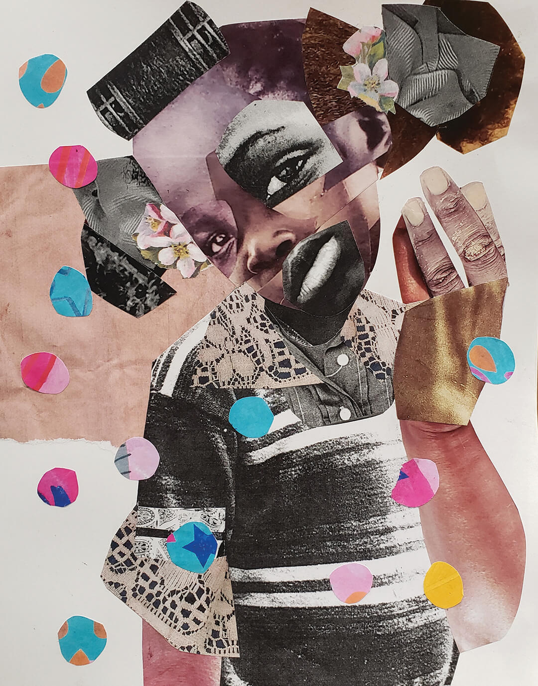
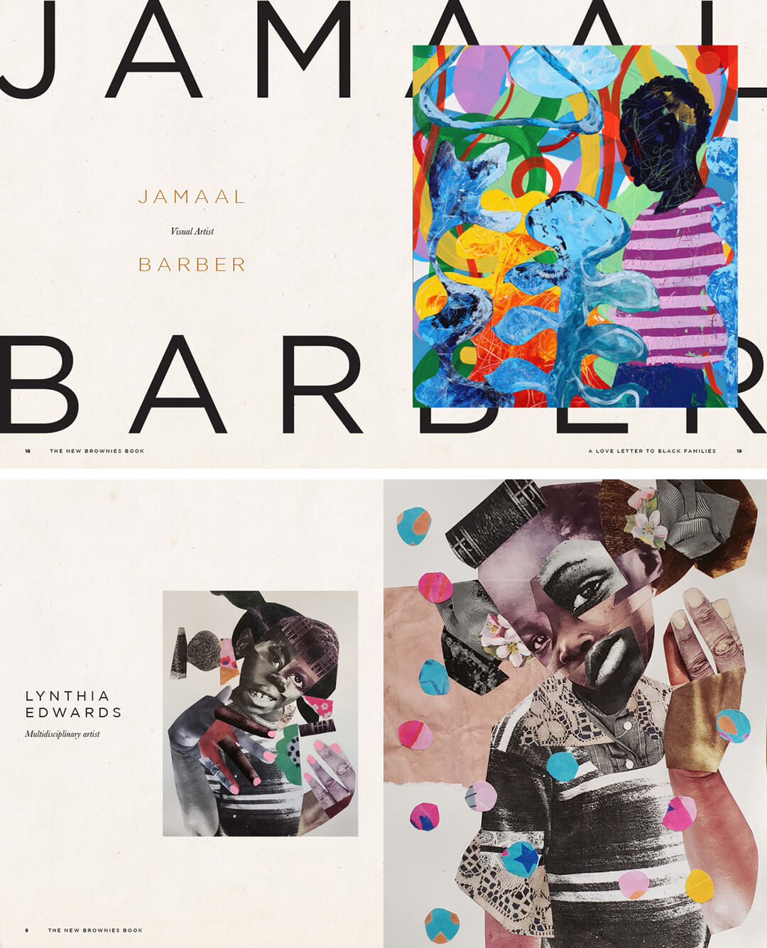
The New Brownies' Book, subtitled as a “love letter to black families”, bears the same mission statement as the original periodical, expanded and intensified to cover a bibliographic format. It's the essential difference between a recurring zine publication, though still finite and short-lived by the standards of a typical periodical in circulation today, and the intended posterity of a book, which makes The New Brownies all the more special. The roughly 200-page book, designed by Kieron Lewis, comes alive through contributions by Black artists and creatives, including essays, poems, illustrations, short stories, photographs, and paintings, the latter two of the list lending the book most of its vibrant, fervent visual character. It is brimming with colour and character; reflective of a tough history and nostalgic about the bright spots of resistance and unity within the community. In the notion of bridging, the book nearly seems to be suggesting to hold on to ‘colour’, to be proud of it, and reflect on its virtue and everything it brings to chart a way into a better future. It is unabashed pride, and it is quite lovely. “Black is brilliant, beautiful, and bold,” states a note on the book.
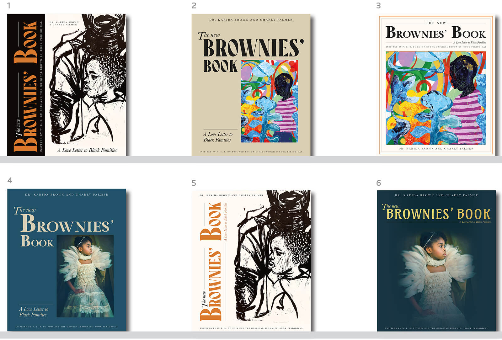
To the book’s credit, it emerges as an object of immense archival value, doubling up as both, a collection of texts that can be examined with an academic lens, and a coffee table book with a strongly defined, distinct aesthetic value. The authors’ and designer’s ideas for the book especially coalesce on this front in earmarking it as an essential addition to one’s bookshelf. "‘Designed for all children, but especially for ours’ is a quote from the original book that I used as the main reference to guide my design process. While designing, I was in awe of all the impactful content that W.E.B Du Bois put together, aiming to empower black and brown children. However, the audience of the new book is a completely different generation of readers, and I believe that the aesthetics should reflect this", recalls Lewis in a candid chat on the book, and on his design process bridging inspirations. To Lewis’ credit, he lets the visuals in the book—the artworks and photographs—take centre stage, more than his visual language designed for the book, subtle to the touch. Right from the gold-foiled hardback cover to the embossed title atop it, several of Lewis’ design interventions complement and uplift the book’s ethos and thematic heft. The selection of the cover image—that of a young black girl dressed as a ballerina staring confidently ahead—is also apparently a call back to the cover of the first Brownies’ book in January 1920, with a young black girl dressed as an angel, printed in monochrome. “The book feels precious and looks luxurious. It portrays what it means to be black today,” states Lewis.
While free to be enjoyed across a wide demographic of people, the book's design bears its key demographic in consciousness—the larger than usual font size and the serif typeface aid readability for the young ones, nearly mimicking the choices of a children’s story or rhyme book. Lewis's use of a modern sans-serif font such as Gotham manifests this dialogue between the old and the new. The individual pages, while glossy, are printed with the relief and texture of a pulp publication in what is a soft but delightful pastiche. Expanding on design choices for the end user, Lewis states, "Whenever I design a hardback publication, especially of this size, I’m always taking into consideration who the reader is and how they will engage. As the publication has a special place for young people, I was conscious that when we include a lot of text, we need strategic ways to make this digestible for the reader. One example is that I included pull quotes that are prominent throughout the book. This allows the reader to have a sense of the spread, before reading in depth. Titles for each submission are visible in capital letters, so there is an obvious way to navigate through the spreads. Despite there being a lot of content, I kept a lot of white spacing around the text and images. This gives the overall designs on the spread room to breathe". Lewis’s idea of understating his design intervention is probably best at display in the rather simplistic, orange double-spread chapter dividers, that, to my mind, encourage quite a continuous readability. Strangely so, the inconspicuous bookends meant it was easier scrolling and transitioning from one chapter to the next for me, an observation that amazed Lewis in a brief meeting I had with the British graphic designer at the Hayward Gallery’s cafe to discuss the book’s design.
The chapters themselves—'Family Ties', ‘Let me Count the Ways’, ‘Young Langston’, ‘We Were Kings’, ‘School Daze’, ‘She’roes’, ‘Kin’folk Tales’, ‘Living and Dying’, ‘Old Woman’, and ‘Coming and Going’—delve on aspects of Black-ness, often wantonly evading chronological arrangement for thematic coherence, some admittedly more mature than others. Admirably as well, several other contributions also harp on issues that are specific to the Black community, but without necessarily gazing at them in correlation with whiteness and other coloured experiences. In the context of that discussion, the essentiality of the inclusion of George Floyd’s killing and the subsequent Black Lives Matter protests, while not under question, establishes particular relevance for the book, especially when that discussion is juxtaposed against the publication timeline of the original Brownies’ book, shy of a few months from the Tulsa massacre, and in a period of blatant racial discrimination even as Jim Crow laws governed several US states. I Don’t Wanna Be Black, an illustrated tale in the book, written by Shannon Byrd and drawn by KEEF Cross, recounts that tragedy. "
"This publication has been created at the perfect time. I believe that, although there have been positive steps forward to how we treat people who look or act in a certain way from different communities, we have found new, and at times deceitful ways, to display characteristics of racial discrimination and atrocity without necessarily being verbal", Lewis comments on the continuing relevance and need for publications such as this. "Hopefully, this distills the message of uplifting, which is the focal point that the authors wanted to communicate as the ethos of the publication", he concludes. Elsewhere in the book, a cautionary letter from a mother to her young daughter about how she would be treated differently from her peers, or her lament of the lack of stories about Black women, ends with the idea of creating shared joy and using laughter to fill those gaps. So, while hard conversations as such are the essential baggage that racial constructs beget, a steely rite of passage so to say, The New Brownies’ Book accounts for those too with the optimism of a child.

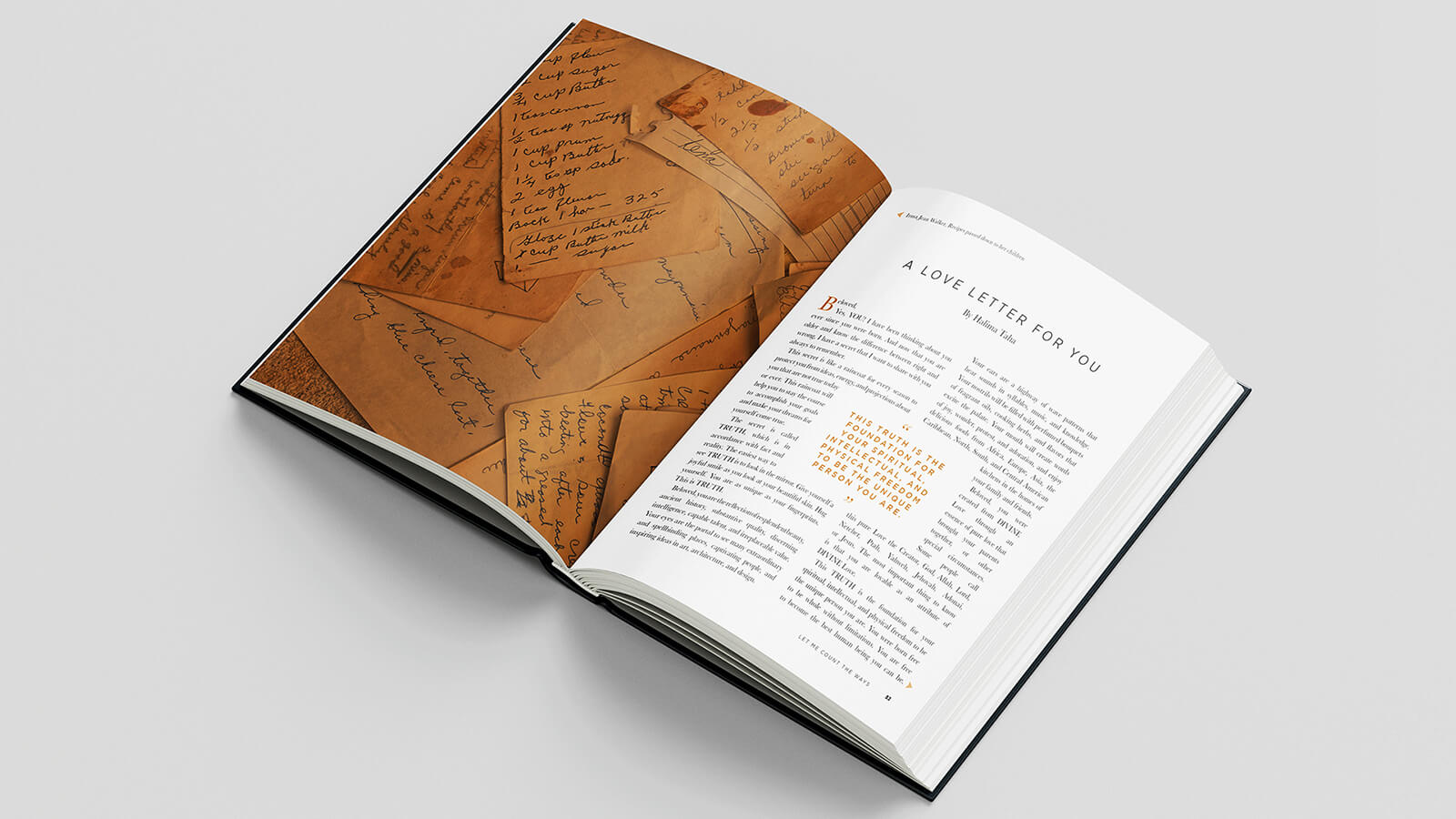
“Give yourself a joyful smile as you look at your beautiful skin. Hug yourself. You are as unique as your fingerprints. This is TRUTH.”
- Excerpt from A Love Letter for You by Halima Taha, featured in The New Brownies’ Book

by Pranjal Maheshwari Jul 14, 2026
Taking a closer look at the comprehensive retrospective at the Vitra Schaudepot in Weil am Rhein, STIR explores the enduring relevance of the 20th-century designer.
by Anmol Ahuja Jul 13, 2026
An inflatable chair, a rocking bench, an angled, adjustable floor lamp and artistic textiles, among others, round out IKEA’s 10th PS collection, built around ‘playful functionality’.
by Pranjal Maheshwari Jul 06, 2026
Using hanji paper and stitches, Seoul-based MANO Design Studio channels the Korean concept of yeobaek-mi in a recent lamp series to restore 'thingness' to design through craft.
by Bansari Paghdar Jul 04, 2026
Designed by the Berlin-based firm, the vibrant renovation of an apartment features dramatic sculptures and wave-like forms cut into walls and furnitures.
 surprise me!

make your fridays matter
SUBSCRIBEmake your fridays matter with a well-read weekend
Enter your details to sign in
Don’t have an account?
Sign upOr you can sign in with
a single account for all
STIR platforms
All your bookmarks will be available across all your devices.
Stay STIRred
Already have an account?
Sign inOr you can sign up with
Tap on things that interests you.
Select the Conversation Category you would like to watch
Please enter your details and click submit.
Enter the 6-digit code sent at
Verification link sent to check your inbox or spam folder to complete sign up process


'The New Brownies' Book': On Black joy, kinship, and resilience for a new generation
by Anmol Ahuja | Published on : Mar 15, 2024


 Sign in with email
What do you think?