


Art06 mins. read
'Shaped by Water': Lachlan Turczan and Google Design Studio's sensorial installation
by Daria KravchukApr 25, 2023
•make your fridays matter with a well-read weekend

by Zohra KhanPublished on : Apr 10, 2024
Within the industrial space of Garage 21 in the centre of Milan last year, Google Design Studio collaborated with water, light and sound artist Lachlan Turczan to create an experience that explored our connection with water. Shaped by Water was thus, born as a series of spaces that allowed visitors to sensorially discover water through its optical and sonic peculiarities and a dream-like play with light. Co-created by Google’s Vice President of Hardware Design, Ivy Ross and her design team, central to the installation was the idea of how water—being one of the most powerful compounds in the natural world—has inspired the design of Google’s hardware portfolio.
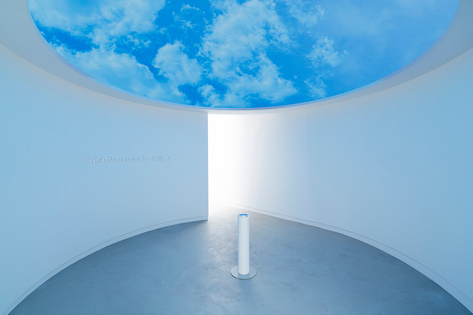
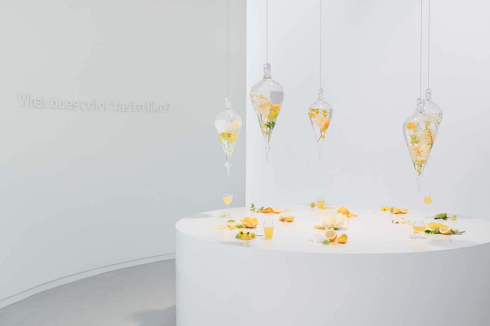
This year at the upcoming Salone del Mobile, Ross and her team are gearing up to bring forth an installation in which the protagonist, colour, will reveal its inherent role in Google’s latest hardware design. Making Sense of Color, a collaborative project between Google and arts + research lab Chromasonic will take up space at Garage 21 in Milan from April 15 to 21, 2024. Repeating translucent scrims composing several open rooms and nodes will be activated by a single source of light and spatialised sound. As guests circulate through the spaces and its delicate thresholds, their movement shall further modulate the experience resulting in a sense of feeling, ‘light made audible, and sound visible’.

STIR connected with Ivy Ross to discover more about the project. The following are edited excerpts from the conversation.
Zohra Khan: Why did you choose a spatial medium for the project?
Ivy Ross: We're asking a series of questions in each of the rooms. How does colour sound? How does colour taste, feel, smell, look, hear, etc? With our work with the artistic group, Chromasonic, the installation invites you to walk through a series of rectangular boxes where the colour and the sound change. The idea of wanting a physical presence of colour was that we wanted people to experience what colour feels like when you can touch or smell it. So this is all about how our senses take colour in. Machines have sensors, but they don't have sensory systems. So, to have a sensorial experience of colour, to answer the questions that we're asking, people have to experience it physically.
Zohra: A large part of how the installation operates is through movement, not only does it connect to people's mobility through the space, but there's also an emphasis on imparting a sense of presence through that movement, a certain consciousness perhaps that is also meditative. I have two questions here. One is, why have you made movement central to the experience?
Ivy: In the first experience, part of the experience is seeing people move as the colours and sound change. There are moments when it gets to be a light colour where you see the shadows of people moving through the space, and that was yet another layer of the experience. Movement is a sense as well. It plays a role in the experience, especially in the Chromasonic installation piece, seeing humans move through these boxes as the colours change becomes part of the experience.

Zohra: And what about this movement corresponding to well-being?
Ivy: I did write a book called Your Brain on Art: How the Arts Transform Us. Movement, sound, light and all of the arts have a great effect on our physiology and our psychology. We are dynamic beings and we are designed to move. And so movement, even dancing, has proven to be critical to our health and well-being. In 2019 with A Space for Being, we showed how all of these ecstatic elements affect our health and well-being and have an effect on our body. Not only colour, sound, light, and music but movement is important for our health.
Zohra: I'd like to bring forth a little excerpt from the installation literature. “The exhibit experience shifts from the ethereal to the material as guests move on to a series of spaces, each dedicated to a particular colour, inspired and informed by a specific sensation. Step by step, sense by sense, a journey culminating in a feast for the eyes that shows how colour comes to life through the design of Google's hardware platform that will be on display.”
What is going to be presented spatially is, of course, a means of communicating the essence of the practice of developing colours at Google. Could you give us a brief overview of the driving process for this?
Ivy: First of all, we look at societal trends as these influence colours. In general, when society is a little depressed, bright colours may come into play versus light ones and neutrals. When we do our phones, we have neutrals and some surprise colours. The actual process is to start with what colours we feel will connect with society at the moment in time. We're working about 18 months to two years ahead of time to develop these colours. And for each colour, there are many aspects. A green is not just a green. It has so many nuances. So we'll make that green in many shades because the material that you're making the colour in also comes into play. A certain colour may look very different on aluminium versus stainless steel and so you have to take into account what material this colour is going to be seen in. We also have a system now where we look at a colour on different skin tones. So if it's a wearable like a watch or an earbud, we literally have a way to check before we say, “That is the particular shade of green”.
The other thing we do is we take maybe twice as many colours as we need into consumer research and we get feedback from a wide range of consumers of all ages on which ones are their favourite colours for a particular product. Someone may pick a phone in a hue very different from what they would pick for a watch. It's very interesting to hear people's psychology. There are also multiple associations with colour. Colour evokes an emotion, it's a vibration, it's a wavelength. People can get emotional over colours. They may say, “Oh my God, I love that colour.” And then you ask them, “Would you put that colour in your ear?” And the answer could be, “Maybe not.” So it is a process of deduction for us, starting with the range of what we feel may be relevant for the future and then it goes through all of these processes that I just explained before we arrive at what is the colour palette for that season.


Zohra: What has been the most interesting aspect of the collaboration between Google and Chromasonic?
Ivy: It's been wonderful. In Milan, every show has been a collaboration of some sort. Even within Google, we are constantly collaborating with others, so it's a muscle that is very exercised. And I think everyone has their nuance. I discovered Chromasonic about three or four years ago. From admiring and experiencing their work to having more philosophical conversations with them, we found out how aligned we are and that stayed in my memory bank when we decided to explore colour because it's one of our guiding principles. Sometimes a collaboration takes a little bit longer to lock into the rhythm of what we're doing but with Chromasonic we have been on the same wavelength. We can almost finish each other's sentences in terms of our depth of understanding of colour and sound and how profoundly these affect the human body. We both, in isolation, have been so engaged in studying and working with it that it was one of the easiest collaborations because our reference base was so similar.


Zohra: Were there any challenges in the collaboration?
Ivy: Not in the collaboration, but in other parts of the exhibition that my Google design team and I envisioned. Chromasonic’s work answers the question, “What does colour sound like?”, but not what it smells and feels like. What's great is that the designers and I have these crazy ideas, like “how we can make rose petals fall from the sky?”. It's great for them to work at a different scale because usually, we're working on small objects such as phones, watches and earbuds. Milan is spatial, it is architectural and that is fun and challenging because we're working on a different scale. So I would say, mocking up some of these experiences here, to come to the answers, we had to do our miniature models to develop the vision and it was a little challenging. But we found a way and it was like putting on a Broadway show together, you persist and then all of a sudden you feel you’ve nailed it. Design is about solving problems and the refreshing thing is that these were problems on a big scale, but we got the same joy. We're persistent and pursuing the ideas and when the answer comes, it's magic.

Zohra: What do you anticipate visitors’ impressions to be coming out after taking a walkthrough of the showcase?
Ivy: Last year, people's experience was, “Oh my God, this was transformative!” because we made the invisible visible by showing how sound creates patterns in water and how we're 70 per cent water. I hope that people walk out of this exhibition understanding that colour gives life a pulse. And that they become more conscious or present of how colour affects us biologically and psychologically because it's something that we have agency over. We think of colour as one-dimensional. I hope that they come out of this, understanding that colour is multi-dimensional.
Stay tuned to STIR's coverage of Milan Design Week 2024 which showcases the best of exhibitions, studios, designers, installations, brands and events to look out for. Explore EuroCucina and all the design districts—Fuorisalone, 5vie Design Week, Isola Design Week, Brera Design District and Porta Venezia Design District.

by Mrinmayee Bhoot Jul 25, 2026
STIR speaks with furniture designers Nata Janberidze and Keti Toloraia about their studio’s work, which distinctly blends romanticism with a contemporary design sensibility.
by Jincy Iype Jul 23, 2026
Published by everyedition, Alberto Vieceli’s latest book is a visual archive that charts how adverts have enlisted felines to sell everything (except cat food).
by Lisa Marie Sneijder, Kate Dooley Jul 22, 2026
Celebrating 25 years of MA Curating Contemporary Design, the symposium explored how language can move beyond fixed meanings to transform design-curatorial practice.
by Chahna Tank Jul 17, 2026
STIR speaks with the celebrated American graphic designer about the new retrospective publication by gestalten that chronicles the lesser-known world of his children's books.
 surprise me!

make your fridays matter
SUBSCRIBEmake your fridays matter with a well-read weekend
Enter your details to sign in
Don’t have an account?
Sign upOr you can sign in with
a single account for all
STIR platforms
All your bookmarks will be available across all your devices.
Stay STIRred
Already have an account?
Sign inOr you can sign up with
Tap on things that interests you.
Select the Conversation Category you would like to watch
Please enter your details and click submit.
Enter the 6-digit code sent at
Verification link sent to check your inbox or spam folder to complete sign up process


Google's 'Making Sense of Color' to question everything we know about colour at MDW
by Zohra Khan | Published on : Apr 10, 2024


 Sign in with email
What do you think?