


Architecture10 mins. read
The Monash Woodside Building by Grimshaw is a study in regenerative architecture
by Jincy IypeMay 02, 2022
•make your fridays matter with a well-read weekend

by Devanshi ShahPublished on : Aug 23, 2021
As different parts of the world begin to emerge from a year of lockdowns, into a world that is not entirely a post-pandemic, public design, retail design and commercial design also see a shift as these sectors try to recover and move forward in sync with the contemporary paradigm shifts. This does not, however, take away from the poetics and the ardour that designers and architects incorporate into their work. While the pandemic gave rise to clinical and what can only be described as antiseptic design solutions, the slow transformation and withdrawal of those elements gave room to an unrestricted engagement with colour and tactility.

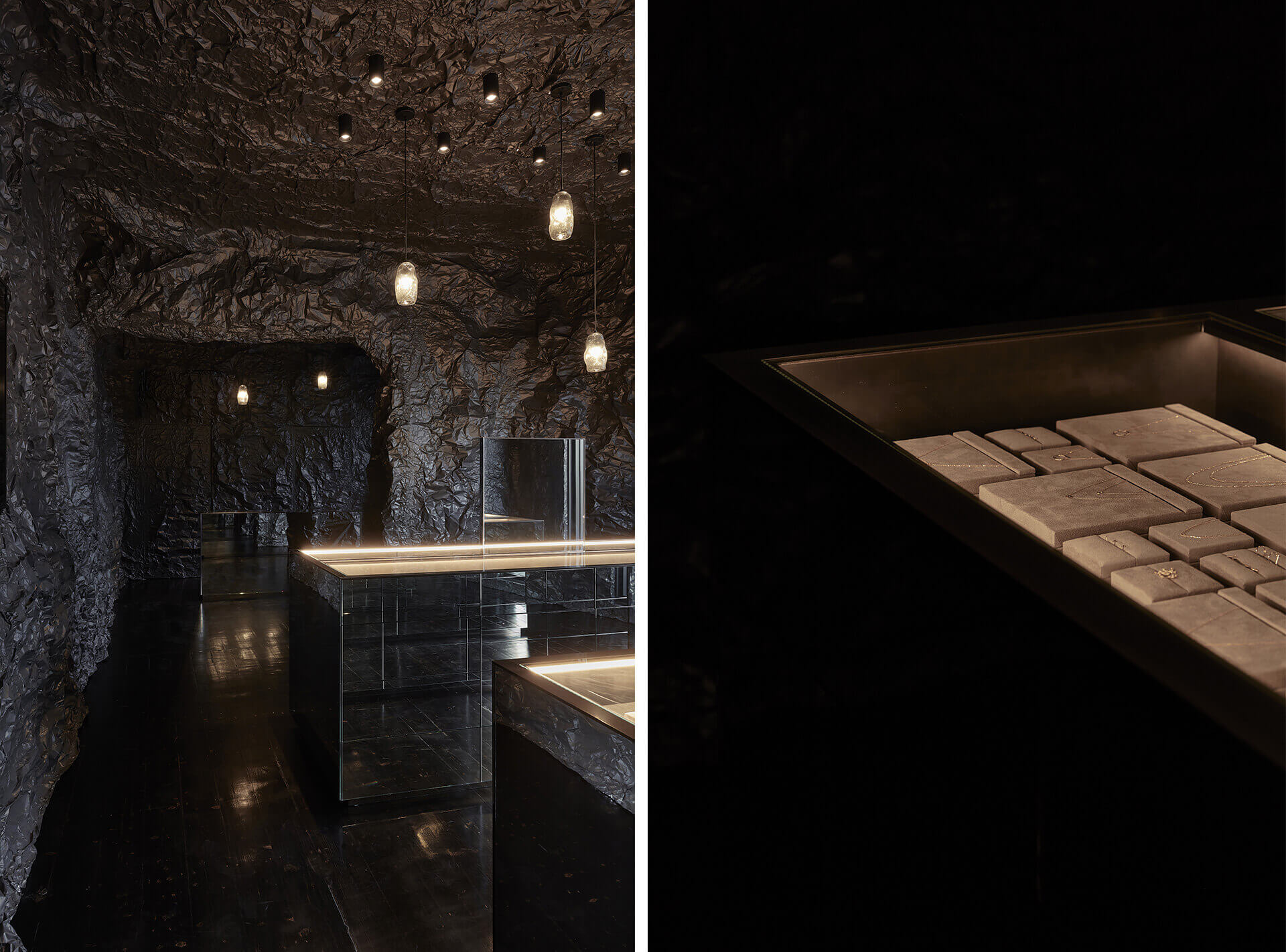
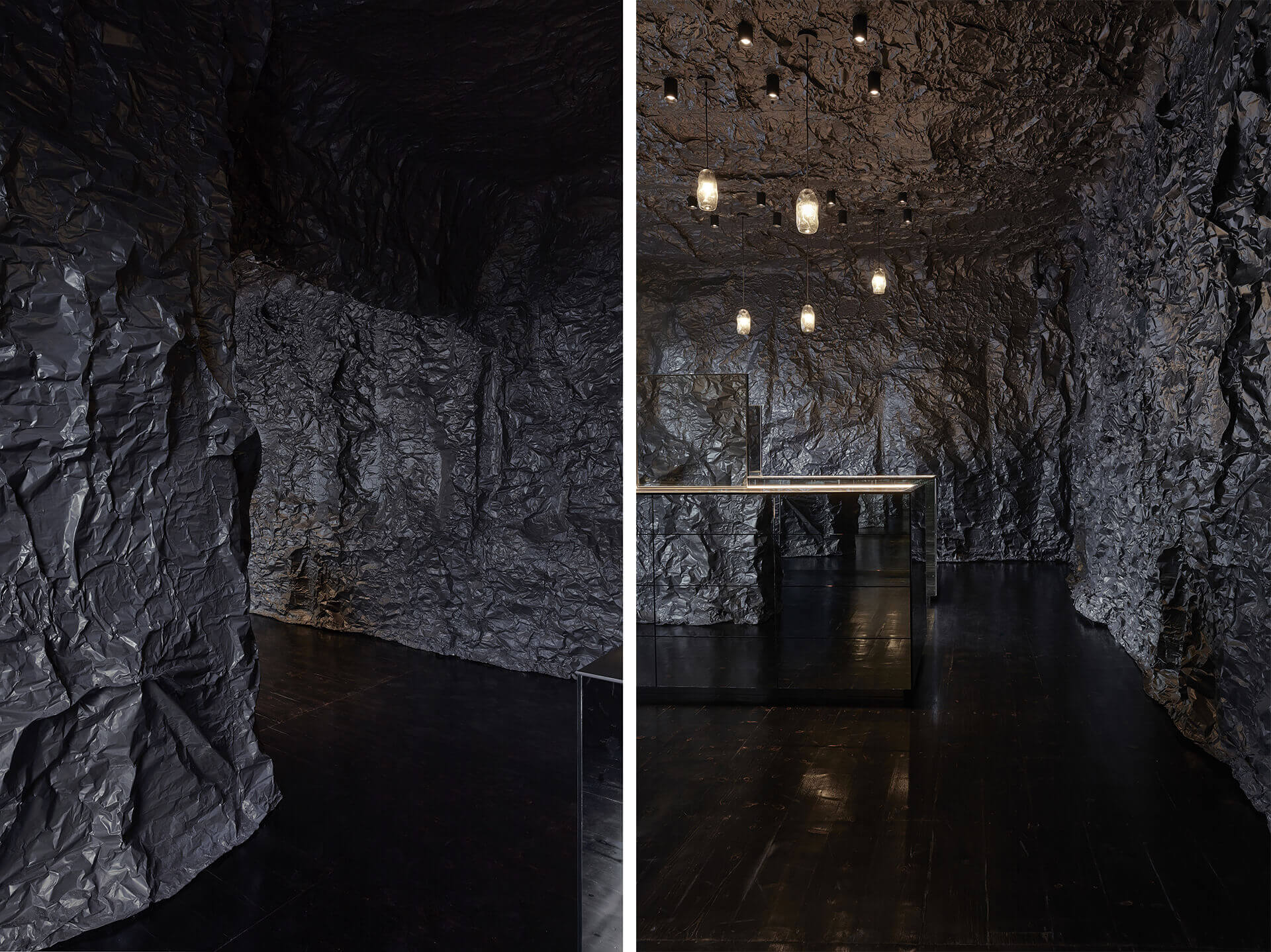
Australia-based studio Russell & George’s design for Sarah & Sebastian's retail store is like a love letter to the city of Melbourne as it emerges from a year of COVID-19 lockdowns. The retail design is conceptualised as an urban gesture and an artwork that is in conversation with the streets of Melbourne. An embodiment of the luxury jewellery brand Sarah & Sebastian’s fascination with the ocean, the design explores a more nuanced visual parallel of its main inspiration. Unlike many newer, post-pandemic projects that feature bright colours, Russell & George chooses to go in the other direction. In this retail design project, it is important to note the significance of separating the core inspiration from its synonyms. In Russell & George’s interpretation of the brand's fascination, we do not see the ocean as simply water. This particular retail store displays a unique take on the use of colour and tactility. Instead of relying on typical marine tropes, the design looks beyond the surface and draws from the depths of the ocean.
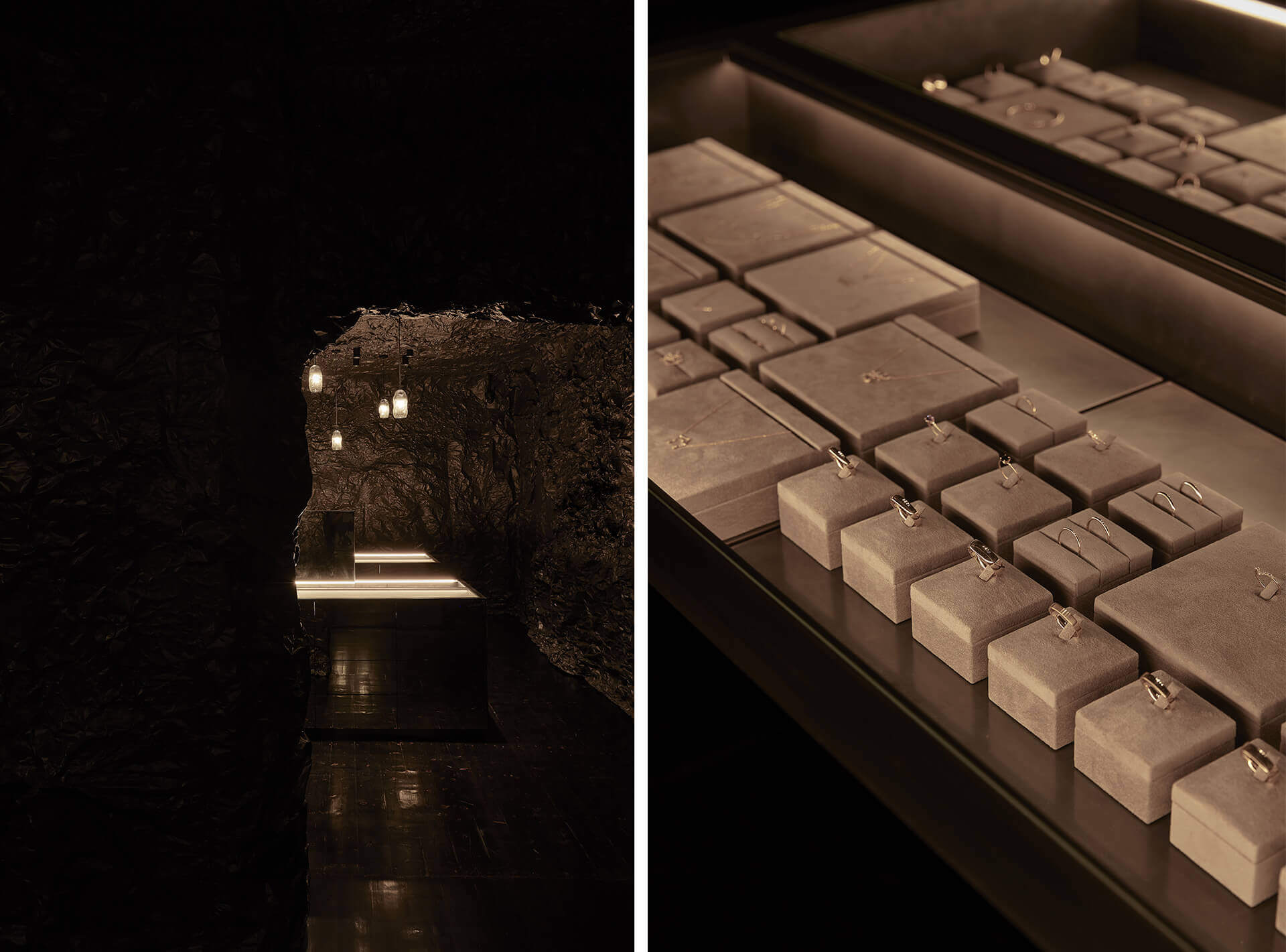
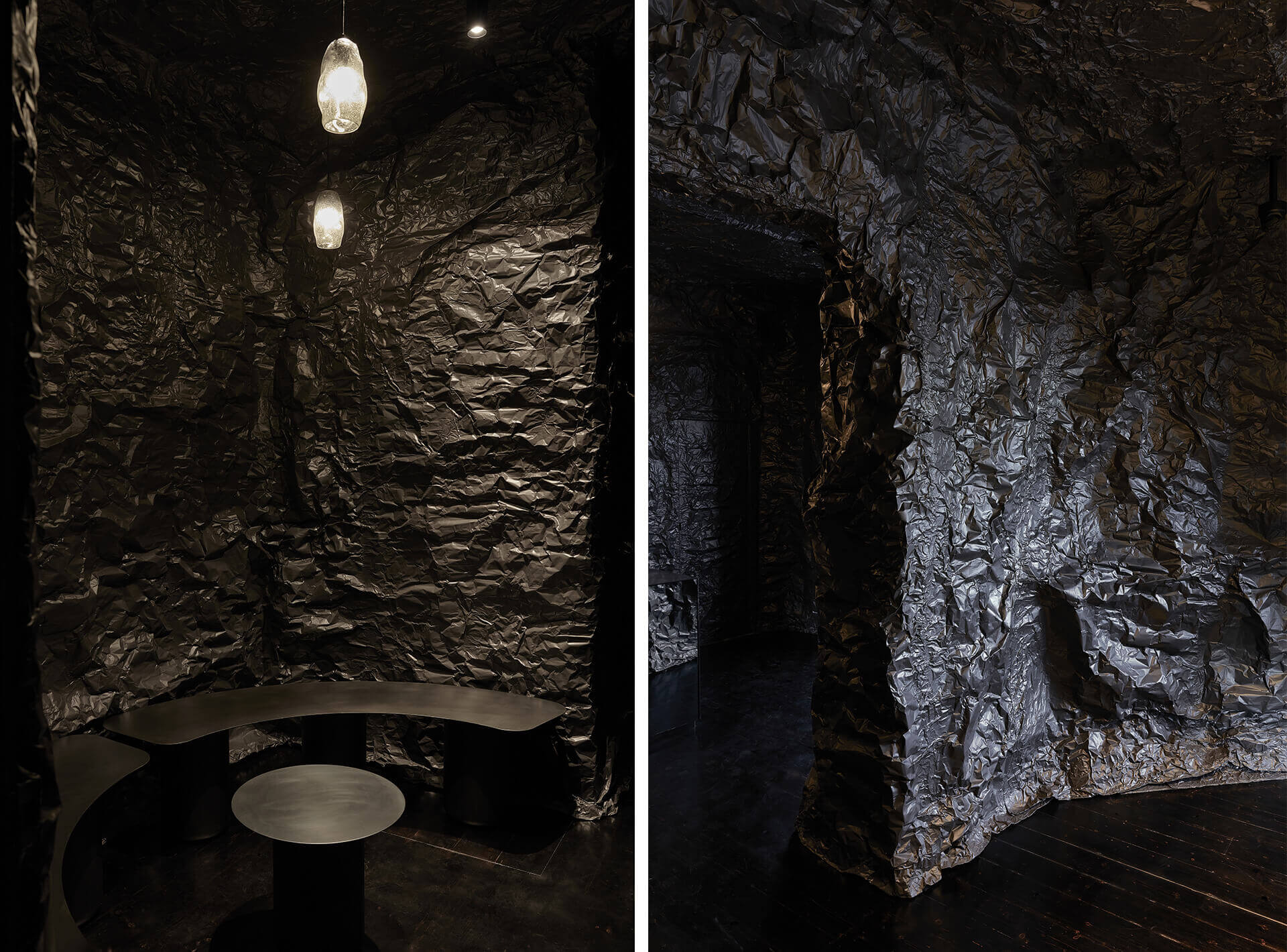
The spatial design and the display design are tethered together through a quote by Japanese artist, Naoshi Arakawa: “Even in the depths of the darkest oceans, some light always pierces through." Delicately echoing this quote, the walls of this space utilise a palette of varying sheens and tones of black. The variations in tone and intensity are particularly evident because of the irregular undulations of the surface, which are meant to depict the deeper surfaces one might encounter in the ocean. This darkness, however, also has a purpose. In addition to creating a moody, immersive and playful experience, it also allows the lighting design to be more measured to focus on the smallest of elements, like jewellery.
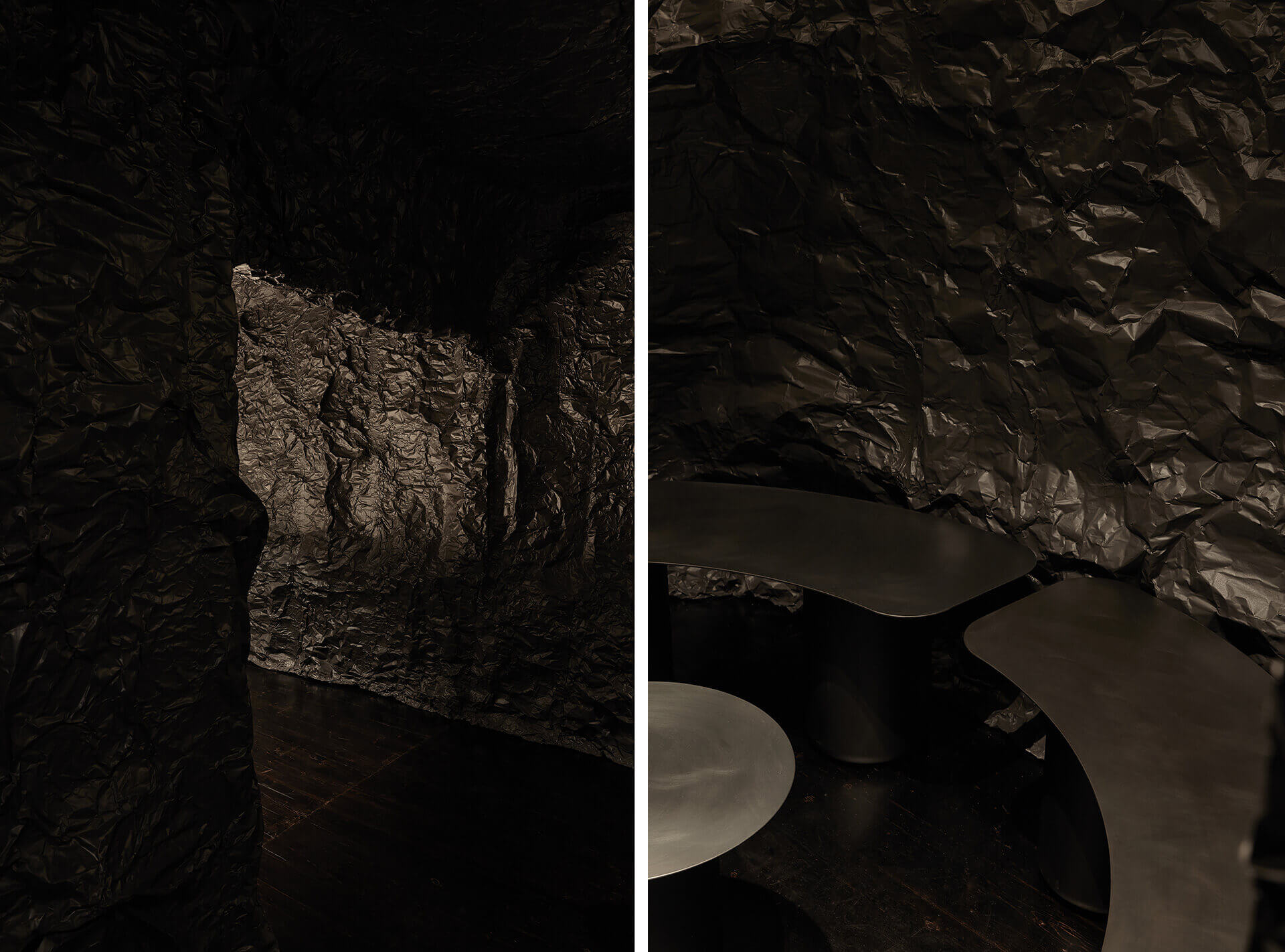
Enveloped in the undulating cave-like landscape installation are three simple mirrored forms housing jewellery displays and a sales desk. The lighting is kept directly on the jewellery pieces, allowing light to ‘pierce through’ the design. Hand-blown, smoky grey glass pendants with colour changing bulbs create colourful up-lighting effects when the store is closed, to amplify the store’s association with the ocean. The product display unit is carefully crafted where the joinery elements are meticulously detailed. Since the lighting is only on the products, there are concealed magnetic locks, so that the mechanisms of a traditional lock do not detract from the form of the joinery element.
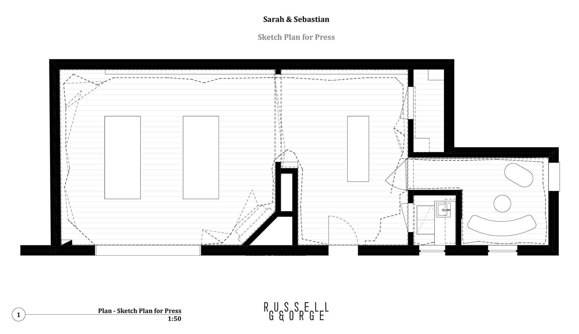
The undulating walls also help organise the plan of the store. A hidden consultation room for private jewellery discussions is incorporated in the design as well. The colours and form of the store’s walls are in stark contrast to the traditional cyclical interior design and neutral colour palette. Rounded off by a stained black Japanese timber flooring, in a satin finish, there is a level of depth and reflection to the entire spatial composition. Designs that rely on deep conceptual ideas, succeed or don’t based on when there is a divergence between the inspiration and the construction; Russell and George, however, find a balance between concept and actualisation.
Sustainable design in interiors has become an inescapable aspect of the practice. The impact of construction-related material sourcing and waste management has become an important issue that studios across the globe need to be mindful of. This project addresses sustainability in two ways: the material used is completely recyclable and the current finishing was applied directly over the previous design. The old details were not removed prior to installation, the new fit-out was literally applied over the old interior. This palimpsest significantly reduced the amount of waste created by this project. There is a case to be made about the value of interior design as a series of palimpsest operations as opposed to a tabula rasa. Unlike other traditional retail spaces, the wall and ceiling treatments as well as the joinery substrates and joinery cladding can be removed and recycled or re-used.
The retail design for Sarah & Sebastian is not a trend-based presentation, but a design meant to kindle a connection between a brand, its identity and its locations. The hope is that this unique relationship will help ensure that the design will live beyond the usual retail refurbishment cycle, eliminating the need for unnecessary and environmentally destructive reconstruction after a short period of time. It is designed to last as long as the brand is in this location.

by Pranjal Maheshwari Jul 14, 2026
Taking a closer look at the comprehensive retrospective at the Vitra Schaudepot in Weil am Rhein, STIR explores the enduring relevance of the 20th-century designer.
by Anmol Ahuja Jul 13, 2026
An inflatable chair, a rocking bench, an angled, adjustable floor lamp and artistic textiles, among others, round out IKEA’s 10th PS collection, built around ‘playful functionality’.
by Pranjal Maheshwari Jul 06, 2026
Using hanji paper and stitches, Seoul-based MANO Design Studio channels the Korean concept of yeobaek-mi in a recent lamp series to restore 'thingness' to design through craft.
by Bansari Paghdar Jul 04, 2026
Designed by the Berlin-based firm, the vibrant renovation of an apartment features dramatic sculptures and wave-like forms cut into walls and furnitures.
 surprise me!

make your fridays matter
SUBSCRIBEmake your fridays matter with a well-read weekend
Enter your details to sign in
Don’t have an account?
Sign upOr you can sign in with
a single account for all
STIR platforms
All your bookmarks will be available across all your devices.
Stay STIRred
Already have an account?
Sign inOr you can sign up with
Tap on things that interests you.
Select the Conversation Category you would like to watch
Please enter your details and click submit.
Enter the 6-digit code sent at
Verification link sent to check your inbox or spam folder to complete sign up process


Russell & George designs a cave-like jewellery store for Sarah & Sebastian
by Devanshi Shah | Published on : Aug 23, 2021


 Sign in with email
What do you think?