


Design18 mins. read
A look at refreshing brand identities and why they work in liminal realms
by Jincy IypeMay 30, 2023
•make your fridays matter with a well-read weekend
by Jincy IypePublished on : Aug 14, 2025
In many ways, and for many, music has always been visual, even before MTV conditioned us to associate it with elaborate staging, scenography, impassioned performances and even abstract videography through music videos. As part of that visual vocabulary, Logos and album covers, in mainstream music, are brand marks, proper visual anchors, very much a part of the songs’ narratives. These marques are portable anthems, stamped on drum skins, stitched on denim, scrawled on the margins of school notebooks and fake-tattooed on your crush’s arm in black ink. I knew of the Nirvana smiley and Onyx logotype long before I (truly) understood the sardonic shrug and pain in Cobain’s voice, and the AC/DC lightning bolt before I’d ever sat through the solo in Highway to Hell in its entirety. Along with that, I definitely know people who’d recognise the glossy red Rolling Stones Lick (or have an ex’s T-shirt with its print) even if they’d never heard Paint It, Black. They live longer than the albums do, sometimes even longer than the band itself.
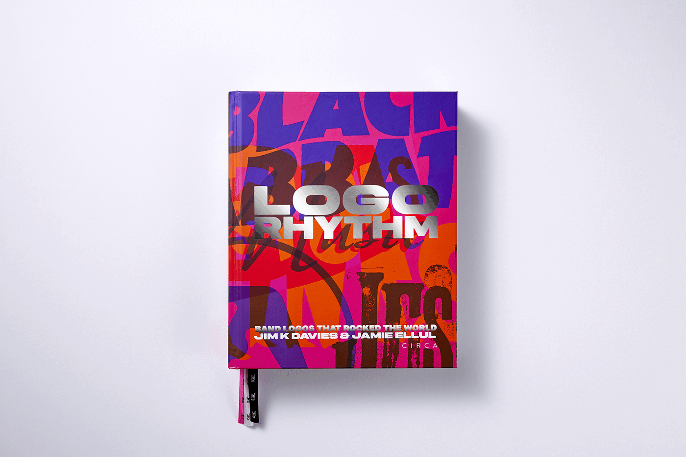
Logo Rhythm: Band Logos that Rocked the World, written and edited by copywriter Jim K Davies and designed by book designer Jamie Ellul of Supple Studio, is a love letter to that phenomenon. Born from their 2017 blog bandlogojukebox.com—“not so much a casual side project as a building block, or building blog,” as Davies tells STIR—the idea was always destined for print. “A blog was just a good way of curating a whole load of material outside of our day jobs without any time pressure… and we had the stats to prove it later when we went knocking on publishers’ doors.”
The Circa Press-published book collects the origin stories, accidents and acts of genius behind the most enduring marks in popular music, from The Beatles’ ‘drop T’ to Iron Maiden’s jagged runic, very much “an ingrained part of the pop-cultural landscape,” as Logo Rhythm puts it, its contents delving into how these logos exist at “the intersection of identity, music, culture, design, communication and technology.”
According to the publisher and author, Logo Rhythm pays homage to "the neglected art of band logos", with their pages "saluting 90-plus stone-cold classics, as well as some lesser-known gems". He states, "for the past seven years, we’ve dug deep to unearth the fascinating stories behind the band logos we know and love. How they came about, who designed them, what they mean, why they rock.”
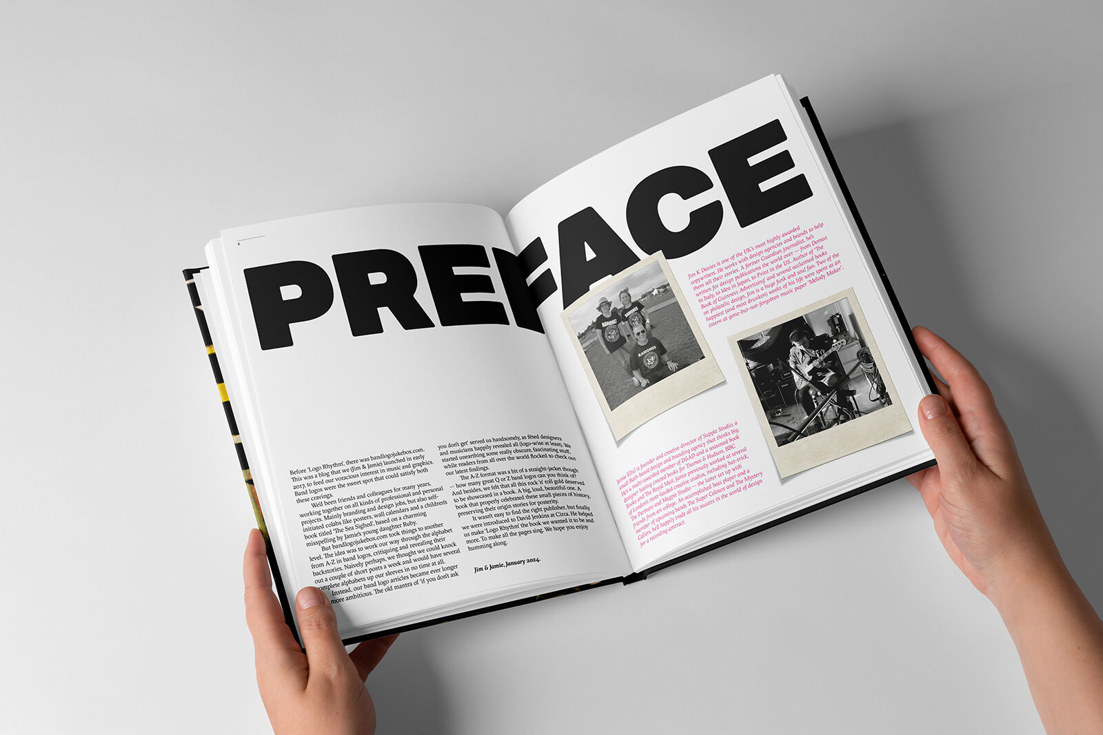
Fronted by a punk-pink and black cover, the book’s 452 pages are structured like a setlist: moving through decades and styles with deliberate pacing. The narrative unspools in sharp, anecdote-rich bursts; there is ’graphics guru’ Malcolm Garrett’s foreword on consistency versus evolution (“Band logos, I admire the effectiveness of your simplicity, and savour the complexity of your deployment”), songwriter and broadcaster Tom Robinson’s note on music as identity (“As far as I’m aware, Logo Rhythm is the first book to recognise and celebrate band logos as a cultural phenomenon. About time too”) and the author's own introduction crediting “the unsung designer or drummer’s girlfriend who came up with the idea.”
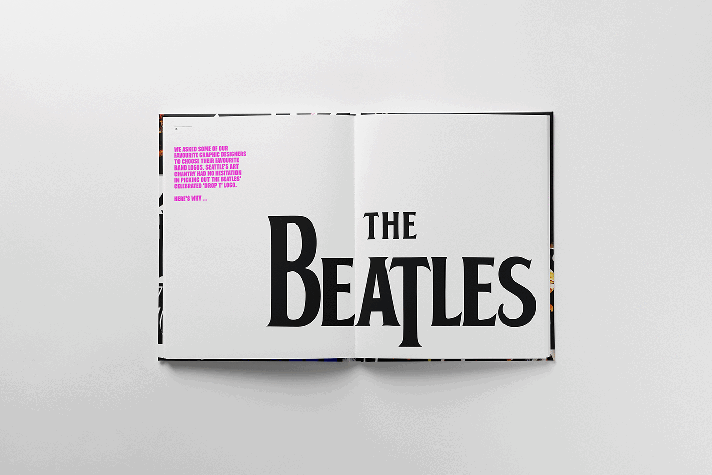
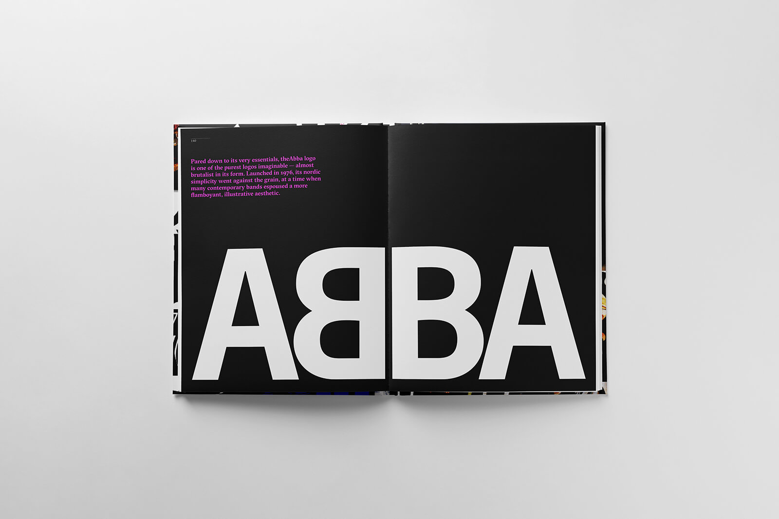
What opens the show is The Beatles’ ‘drop T’, a crisp black logotype sketched by London’s Drum City owner Ivor Arbiter and hand-painted by local sign painter Eddie Stokes for £5, turning a typographic pun on “Beat” into what is arguably the first rock band logo in history. ABBA’s mirrored B, a balanced logo designed by Swedish art director Rune Söderqvist in 1976, was not just a neat trick of symmetry, as Logo Rhythm reveals: it was a stage-ready emblem, for a band whose entire presentation was precision-engineered pop. “Pared down to its very essentials, the ABBA logo is one of the purest logos imaginable,” states Logo Rhythm.
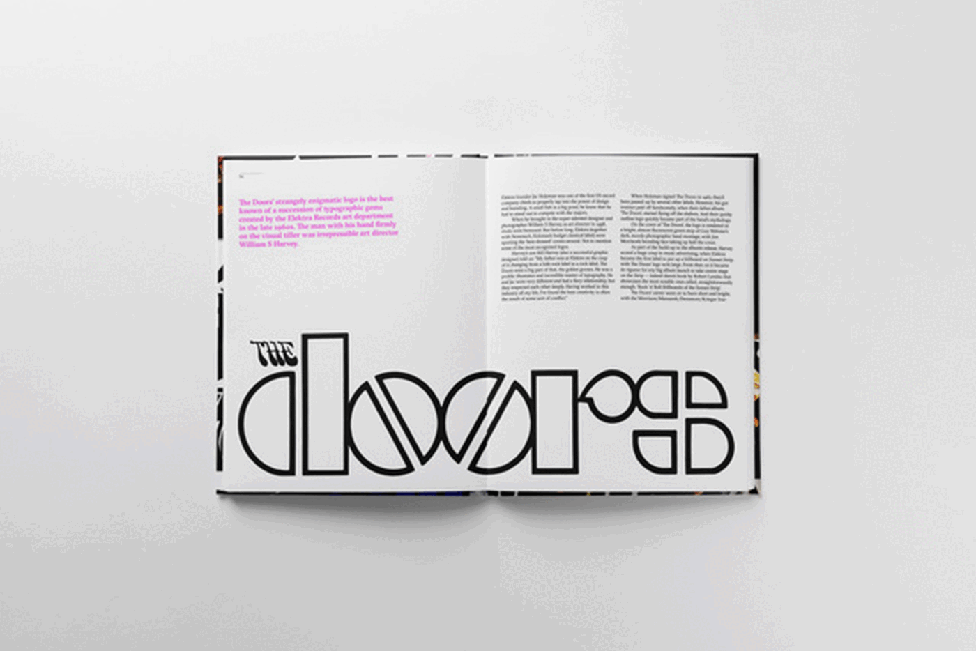
The Doors’ outline logo, by Elektra Records art director William S Harvey, was all stark geometry and oversized lettering: blocky, architectural forms paired with imperfect symmetry, a “perfect imperfection” for a band steeped in the strange. “If you take a good look at it, the logo is surprisingly rudimentary, the main letters made up of crude, blocky rectangles, half-circles and quarter-circles. The two o’s, with their mirrored diagonal lines, could possibly be seen to resemble pills,” the author shares.
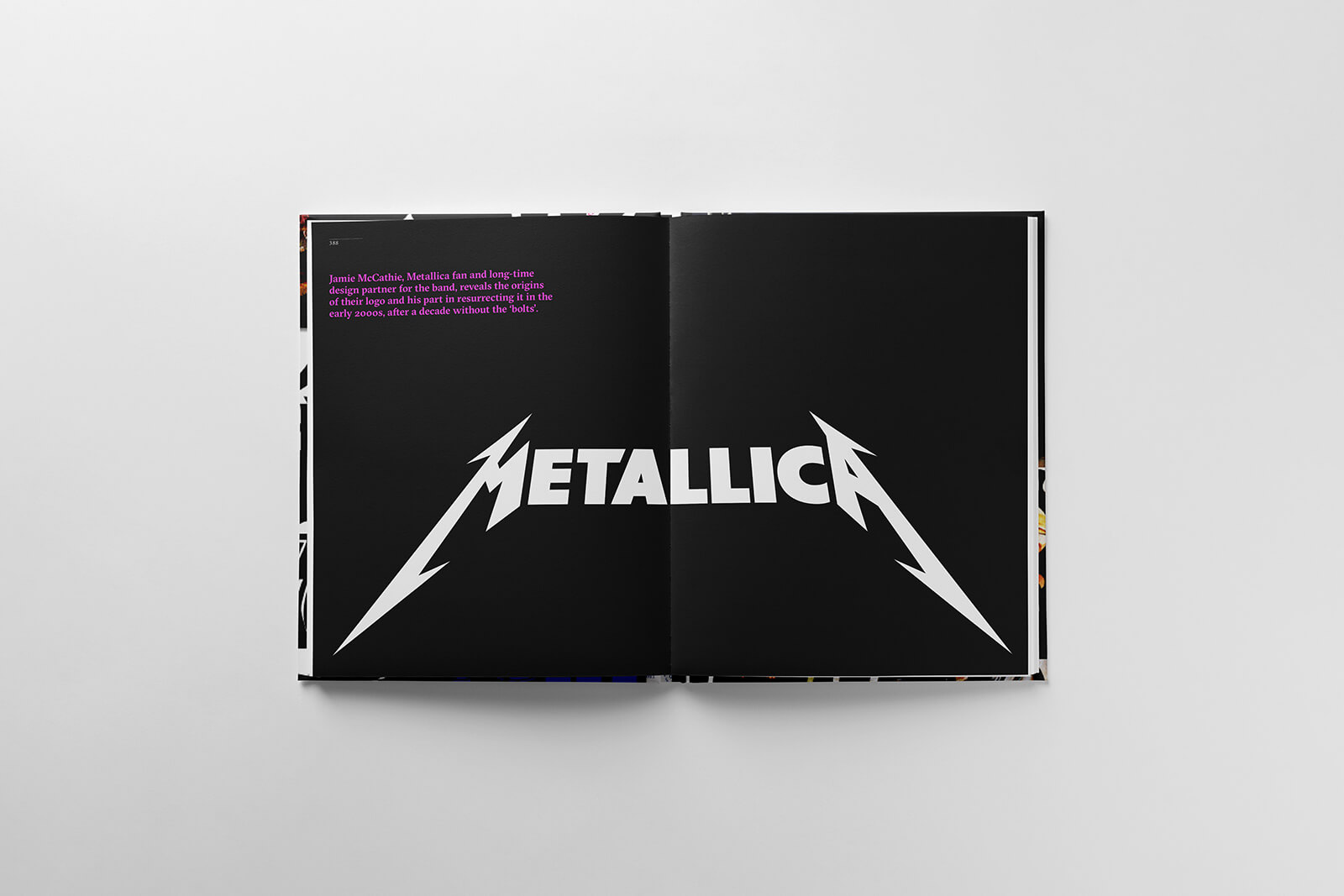
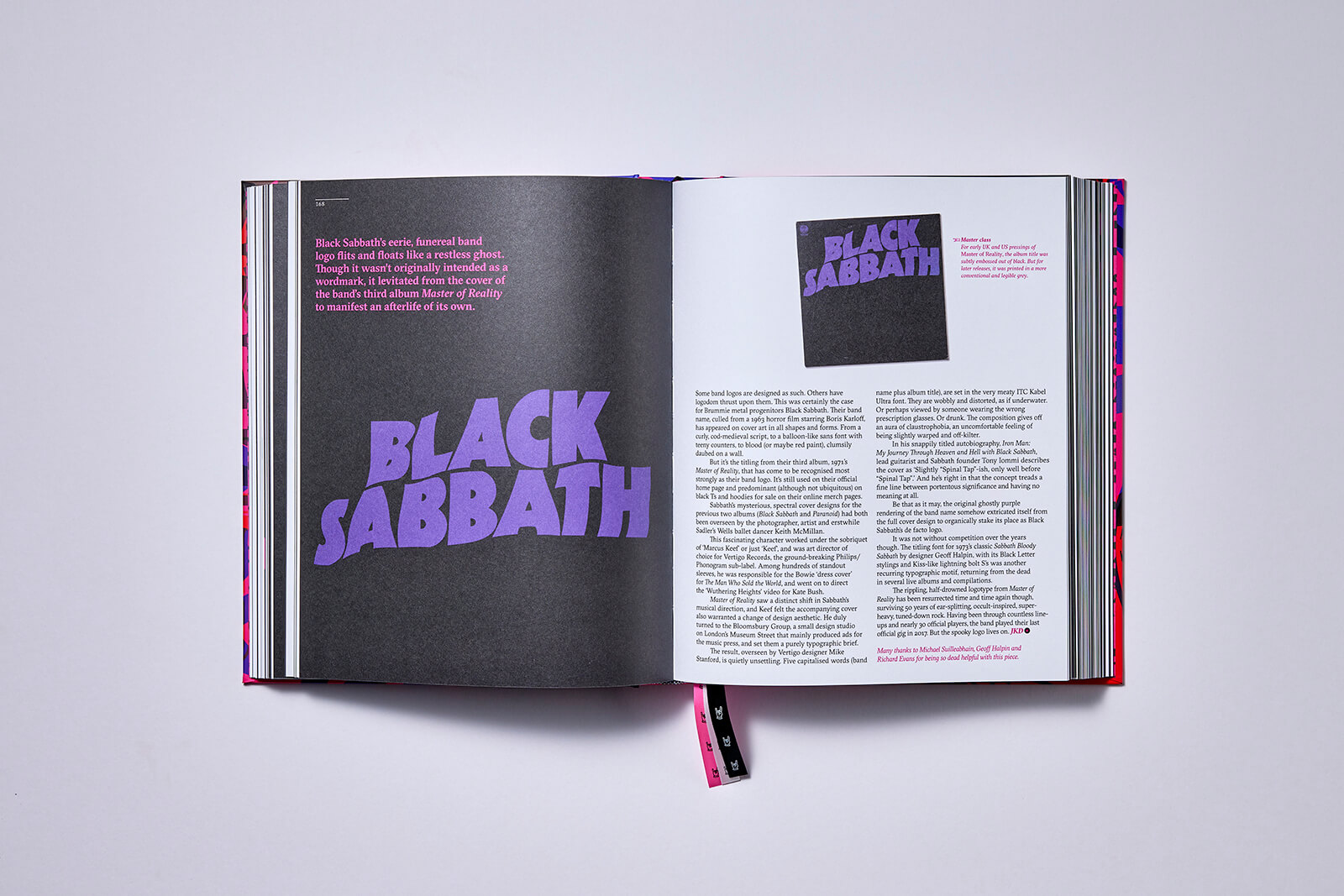
Heavy rock’s logos get their due in the book too. Black Sabbath’s “eerie, funereal band logo flits and floats like a restless ghost”, making its menace and darkness marketable. Led Zeppelin’s visual calling card, the four mysterious symbols from IV (each member’s personal sigil), remains a masterclass in myth-making, a graphic design that’s more riddle than brand, yet instantly recognisable on bootleg tees and arena backdrops. Metallica’s sharp-edged wordmark, introduced on Kill ’Em All (1983), stretched the M and A into dagger-like points or ‘bolts’, its heavy-metal typography as aggressive and uncompromising as the music.
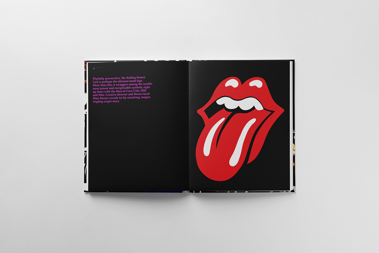
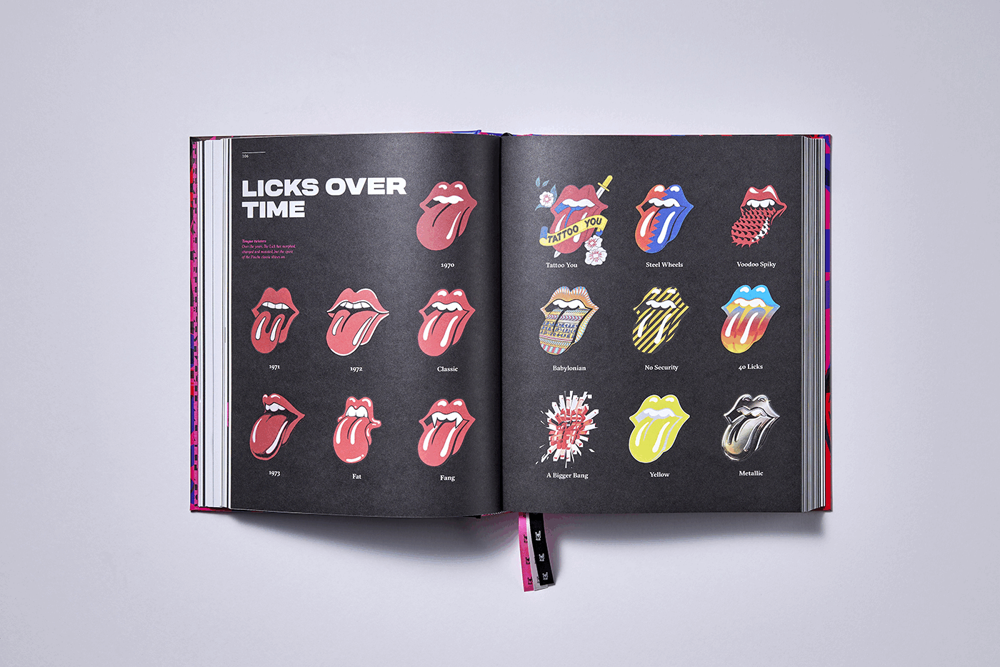
And then there’s John Pasche’s ‘playfully provocative’ Rolling Stones tongue and lips, created in 1971: “perhaps the ultimate band logo… among the world’s most potent and recognisable symbols”. As Garrett notes, “Consistency and repetition ensure basic recognition,” and Pasche’s design has thrived on both. “A glossily pert pair of lips, a lasciviously lolling tongue and a top set of pearly whites. Dispensing with the need for anything as gauche as typography… [The Lick] has become a universal symbol of rock ’n’ roll excess and anti-authoritarian bravado, a representation of rebellion like no other,” the book relays.
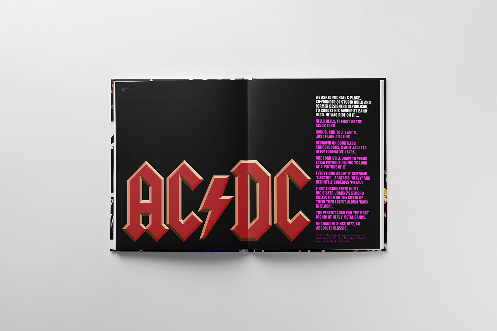
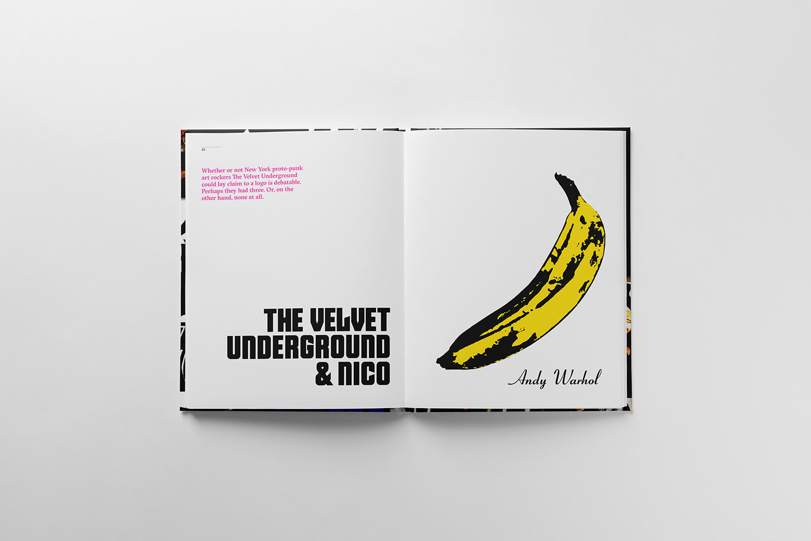
The Velvet Underground’s story folds in Andy Warhol’s banana; originally peelable, now shorthand for a certain downtown artiness. AC/DC’s ‘venerated’ lightning bolt by Gerard Huerta, introduced on Let There Be Rock (1977), was as blunt and abrasive as their riffs. Gary Talpas’s NIN wordmark, slick, modernist, a minimalist palindrome and mirrored without distortion, distilled Nine Inch Nails’ experimental, industrial rock music into three letters.
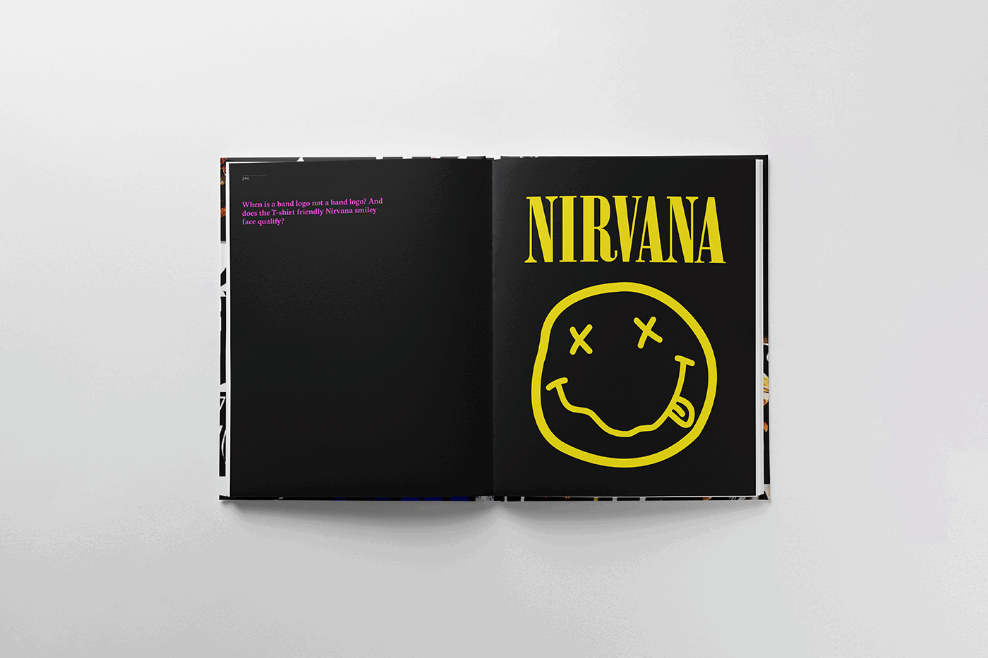
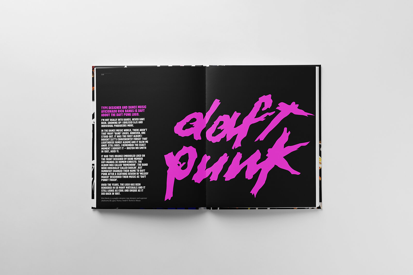
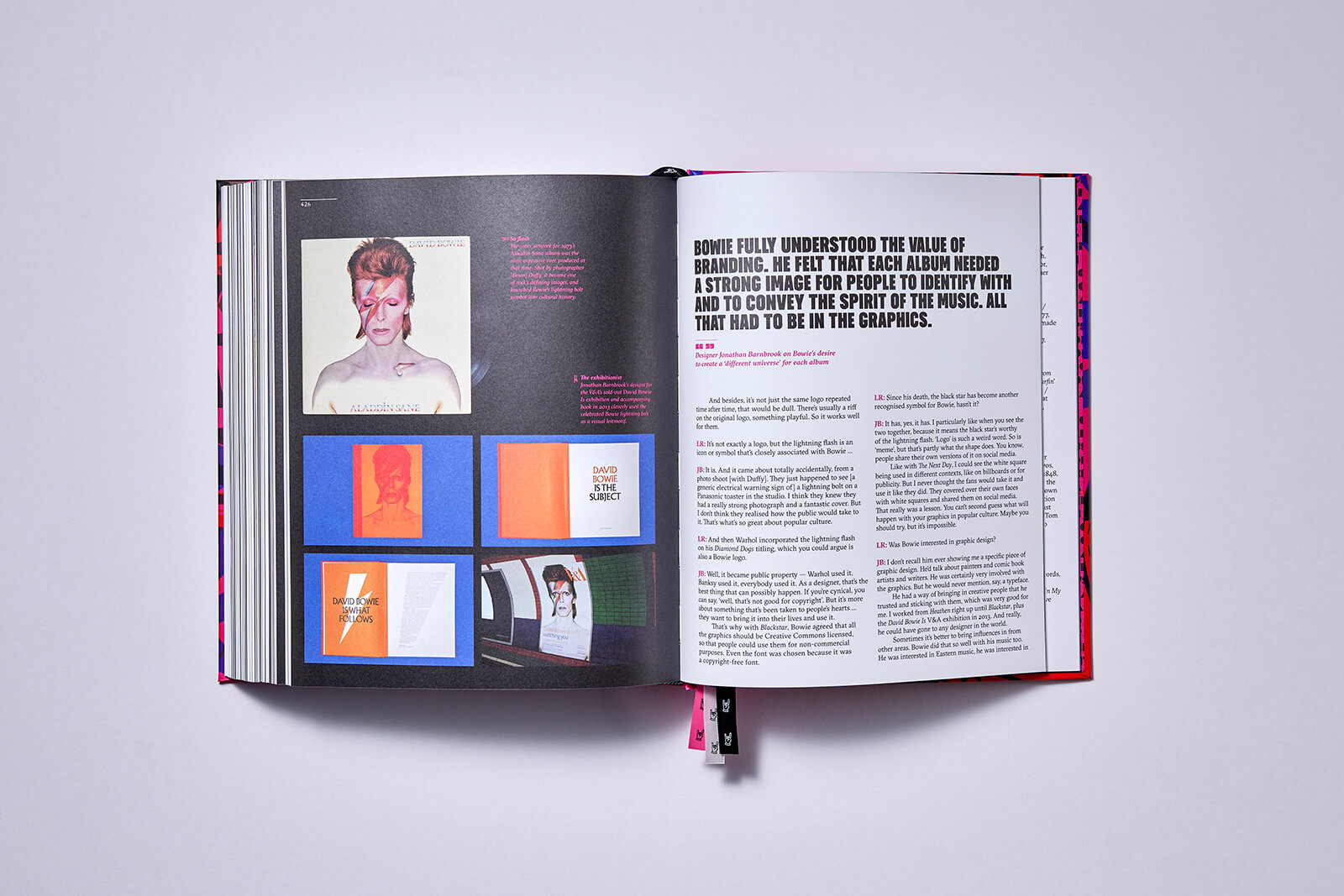
Its provenance fuzzier than most, Nirvana’s wonky smiley face with a drooling tongue and x eyes, still floats on T-shirts decades after the group’s disbandment. From the 2000s, Daft Punk’s chrome script (by Cédric Hervet and Gildas Loaëc) and David Bowie’s succession of lightning flashes, stars and typographic reinventions show how a mark can shift with an artist’s shape-shifting creative identity.
Some omissions still haunt the authors: Radiohead, Gorillaz, The Clash and Steel Pulse, for rights or timing reasons. “We made sure to cover all the big hitters,” Davies shares with STIR. “But several people have approached us with interesting band logo stories since the book was published—maybe next time.”
The afterlives of these symbols are as curious as their births. Many have outgrown their bands entirely, surviving as pure ornament, rather than a signifier of musical allegiance or taste. High-street racks now sell Nirvana smileys, Ramones’ seal, Run DMC wordmarks and Misfits skulls to people who may never have heard a note of their music. “People see them as being cool on face level without being interested in their provenance. I don’t think there’s anything wrong with that, it just seems a bit superficial and random. I’m sure the bands don’t mind though,” he shrugs.
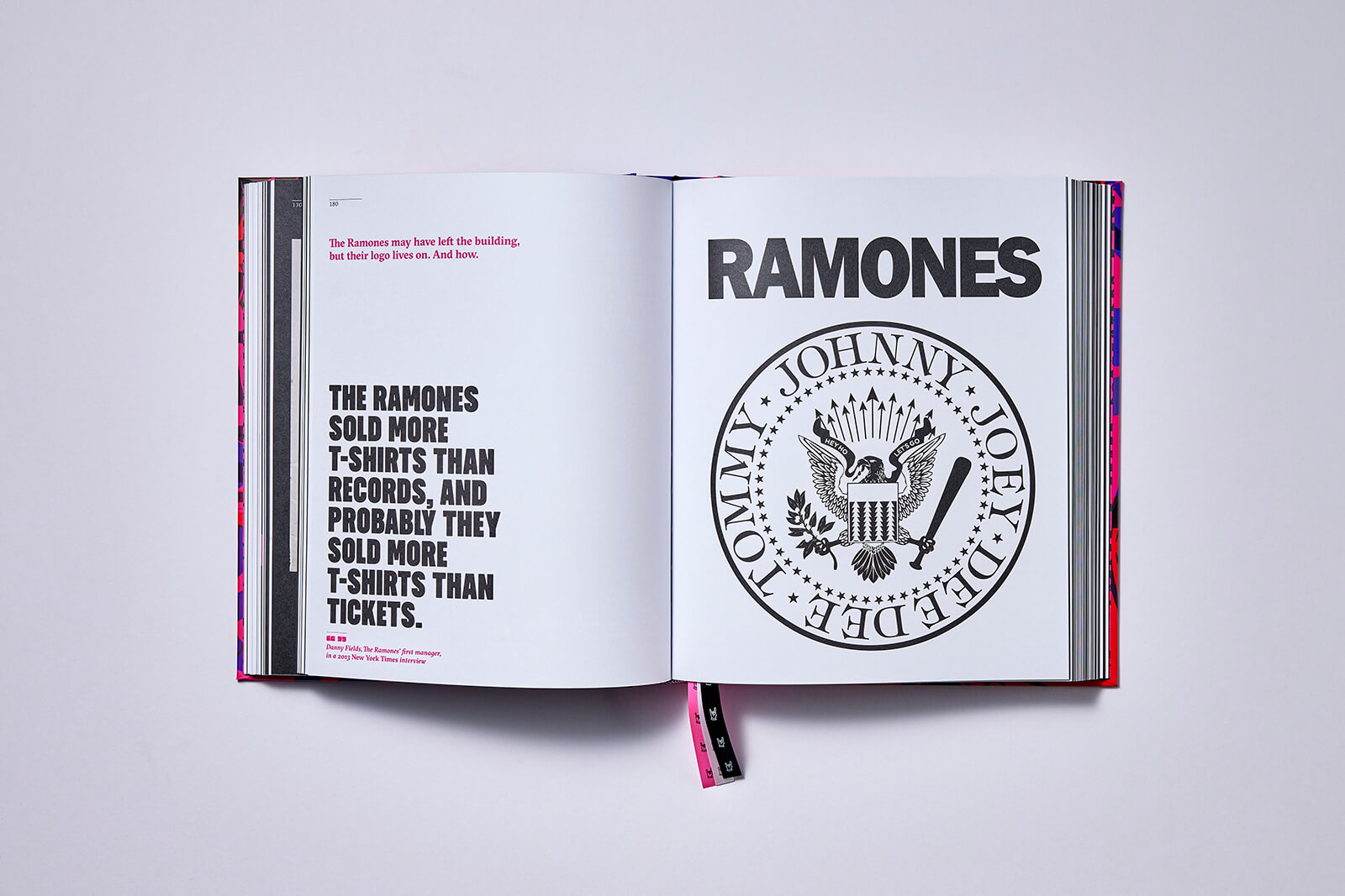
The book’s visual richness is part of the pleasure: original sketches, early variants, tour posters, record sleeves, gossip galore. You see the Beatles’ discarded ‘bug’ branding; the pencil drafts of The Monkees’ guitar-shaped lettering; the subtle tweaks across The Yardbirds’ scratchy hand-lettering. As the authors note, “a rock band makes far more money from licensing their logo than they do from selling their music”—a line that lands harder in the age of streaming, when logos live as merch more than as sleeves.
That’s part of why Logo Rhythm skews historic. “I think the golden age of the band logo is probably over,” Davies admits. “This is reflected in the length of the chapters in Logo Rhythm. 34 per cent of the book is dedicated to the 1970s and only 11 per cent from 2000 onwards. In many ways, it’s a history book. We wanted to chronicle the stories behind some of the great band logos before they are forgotten… we felt it was culturally important to record their achievements while we can.”
“A fixed band logo simply doesn’t feel in step with the time… so no, I don’t think we’ll see a logo or identity with the staying power of the Rolling Stones’ Lick or the Ramones’ seal again,” he continues.
Logo Rhythm then works not as a memory trip so much as a cultural audit. Many of these marks are now graphically fluent beyond their original sound, a stubborn survival of an era, a scene, an attitude. They’ve been reprinted on supermarket babygrows, bootleg streetwear, coffee mugs, the likes. They’ve certainly outgrown trends, scandals and the bands themselves. Some stand for rebellion, others for nostalgia, but the best ones? They stand for nothing except themselves. And that is as rock ‘n’ roll as it gets.

by Pranjal Maheshwari Jul 14, 2026
Using salvaged wood, wild earth, copper remnants and more, the exhibition at ICA San Diego / North brings together 20 regional creatives exploring regenerative approaches to making.
by Pranjal Maheshwari Jul 14, 2026
Taking a closer look at the comprehensive retrospective at the Vitra Schaudepot in Weil am Rhein, STIR explores the enduring relevance of the 20th-century designer.
by Anmol Ahuja Jul 13, 2026
An inflatable chair, a rocking bench, an angled, adjustable floor lamp and artistic textiles, among others, round out IKEA’s 10th PS collection, built around ‘playful functionality’.
by Pranjal Maheshwari Jul 06, 2026
Using hanji paper and stitches, Seoul-based MANO Design Studio channels the Korean concept of yeobaek-mi in a recent lamp series to restore 'thingness' to design through craft.
 surprise me!

make your fridays matter
SUBSCRIBEmake your fridays matter with a well-read weekend
Enter your details to sign in
Don’t have an account?
Sign upOr you can sign in with
a single account for all
STIR platforms
All your bookmarks will be available across all your devices.
Stay STIRred
Already have an account?
Sign inOr you can sign up with
Tap on things that interests you.
Select the Conversation Category you would like to watch
Please enter your details and click submit.
Enter the 6-digit code sent at
Verification link sent to check your inbox or spam folder to complete sign up process


Logo Rhythm: hot lips, drop Ts and other marques that made rock music immortal
by Jincy Iype | Published on : Aug 14, 2025


 Sign in with email
What do you think?