


Design08 mins. read
Nat Pyper’s carrier bags of fugitive stories with A Queer Year of Love Letters
by Mrinmayee BhootJun 04, 2026
•make your fridays matter with a well-read weekend
by Mrinmayee BhootPublished on : Aug 28, 2025
The world, as much as it is formed by things, is formed by how we can read them, or what images we associate with the words we encounter. Among legible, readable 'objects', we read books, we read the news, we read billboards, street signs and graffiti; we read instructions and calorie counts of the packaged food we eat. We have to read work emails and messages, and if you're anything like me, we even stop and read every bus stop sign and trampled upon flyer. In the words of Argentinian writer Alberto Manguel, who penned one of the most comprehensive histories of the inherently human act of reading (and the act that precedes writing), while positing the 'images' as an act of conjuring—reading, “almost as much as breathing, is our essential function.”
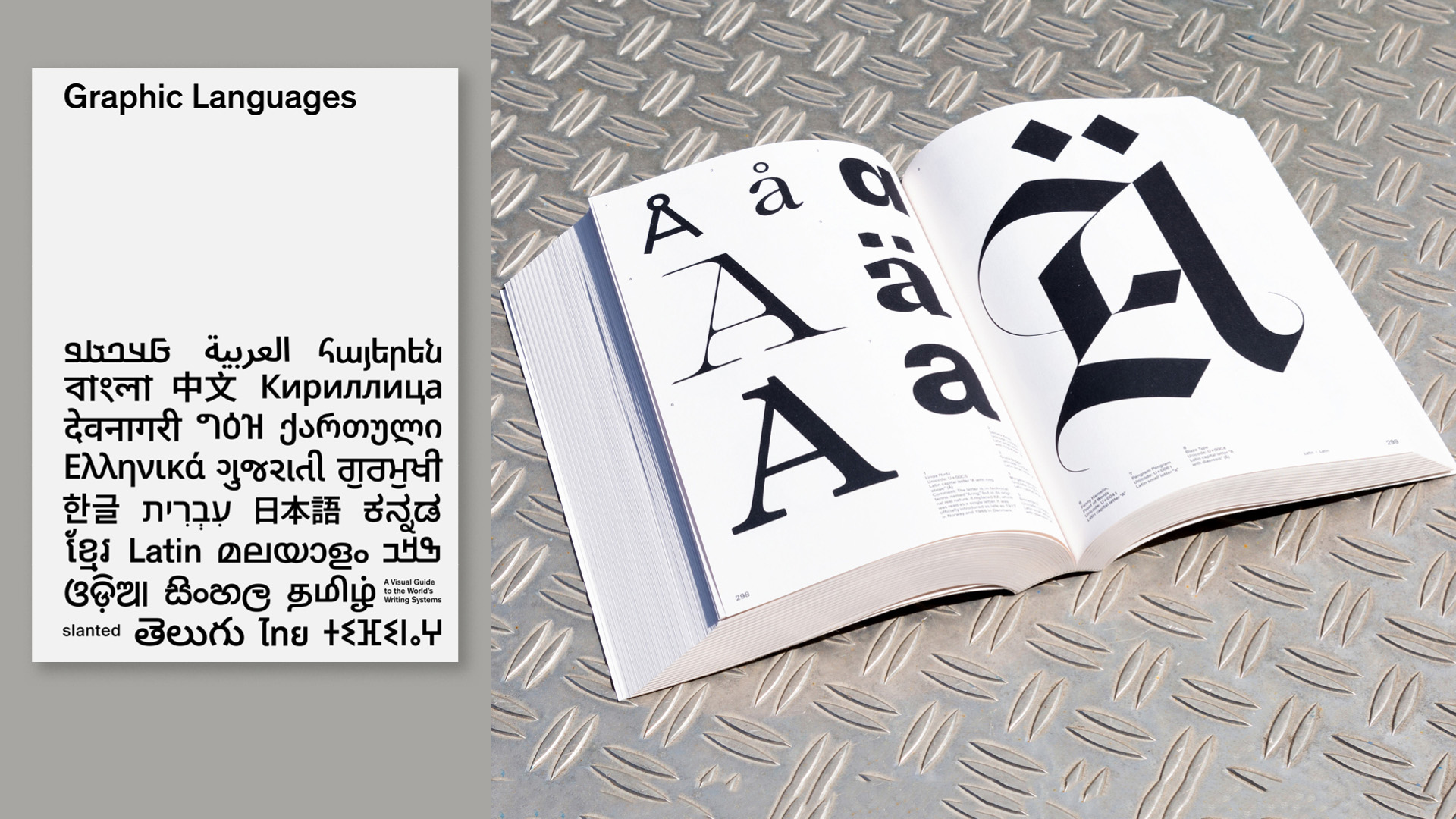
The setting down of spoken language into standardised systems of writing created a way for humanity to understand, categorise and interact with the world; to possess—and eventually appropriate—information. In that light, I am compulsively drawn to registering the cover of Graphic Languages, a book compiled and edited by Germany-based graphic designer Oliver Häusle and published by Slanted; to reading the different scripts displayed on its minimal design (I can read four with ease, even five). It's not even a compulsive response as much as it is innate – this ability we possess to associate symbols with sounds; to make out words from graphemes. As Häusle notes, written text and the ability to communicate through such visual tools are now “tacit companions in our everyday lives”.
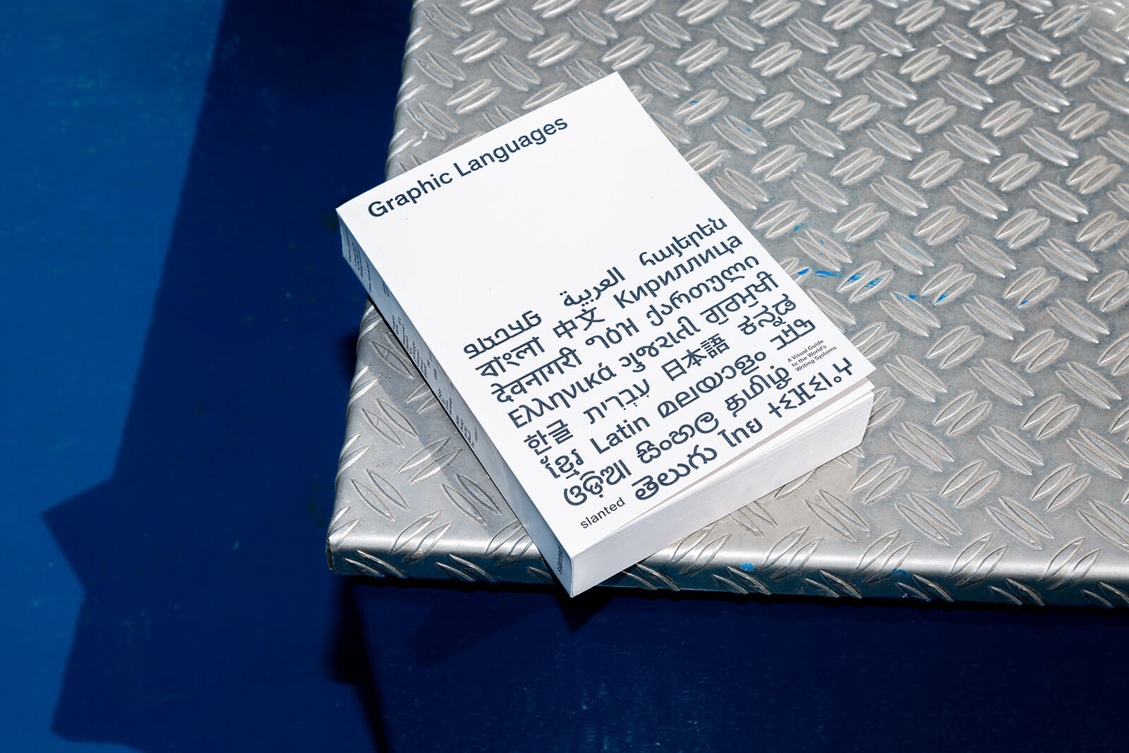
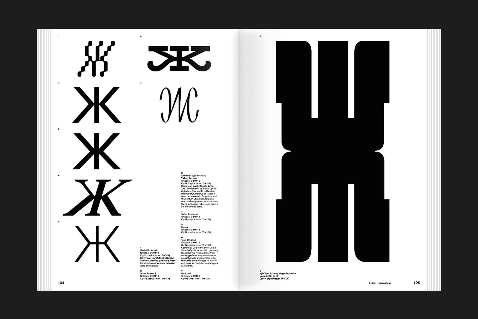
Häusle, who is focused on the visual design of different writing systems, believes that the manner in which we write is as important to this reflex as what is being written. The volume compiles a delightful selection from the approximately 4000 writing systems that currently exist in the world, presented through collaboration with international type designers and type experts. Through it, the German designer hopes to highlight "the unique DNA of each typeface", bringing together the distinct forms they employ and the cultural significance of each typographical nuance.
Häusle’s project is liberated by the sheer choice afforded by language, its related system(s) of notation and their many variations. There's a distinct delineation to be gleaned here, between the aesthetics of the typeform and the language that it denotes. Armenian, for instance, sometimes uses decorative accents in its text. There are extremely specific brushstrokes (and directions) one must adhere to while setting down Mandarin. A simple accent acute here or circumflex there changes the meaning of a word. These idiosyncracies, distinguishing one language or its script from another, contrast the (potentially) infinite experiments with type design in an earlier issue by the publishers—Letterform Variations by British designer Nigel Cottier—with his 'variations' defined by rules, grids and modules.
In his introductory chapters, Häusle is cautious to touch upon not only the cultural significance of writing for societies that are literate, but also the political dimensions of written language. He notes, “Language, along with its associated writing systems, is a fundamental aspect of cultural identity. The language spoken by a community often reflects its history, social structures and worldview…The study of various languages and writing systems can promote respect for diversity and contribute to intercultural dialogue.” He also briefly mentions how dominant languages (or writing systems) can be used as tools of oppression, which exclude minority groups. Conversely, how the use of the language of minority groups can be seen as a form of resistance and activism is also touched upon.
While Häusle does not provide explicit examples, it's vital to note that there are certainly some sociopolitical inferences we could derive through not only the use of different writing systems, but the very design of certain visual styles. Take the controversial Wonton font, patented in 1883 by the Cleveland Type Foundry. The font has been used and abused in restaurant menus, travel poster designs and other ephemera all over the world to signify that the culture being depicted is Chinese, or more generally, ‘Asian’. We could similarly look at debates around accessible design and how certain font styles are designed to be more suited to people with disabilities. Another instance of evolving language and the evolving meanings we attribute to writing systems is the appropriation of the Latin script. Once textual communication became a more commonplace thing in the digital age, cultures all over the world starting employing the sounds of letters to signify the sounds used in their own languages; romaji for instance, is an entirely separate script for writing English words in the Japanese language. Then, there is the more commonplace use of the Latin script in digital communication through Hinglish (a portmanteau of Hindi and English).
Sidestepping a fraught politics (also evident in the exclusion and erasure of oral traditions), the book positions itself as a primer for graphic designers, students and admirers of type design to the many, many different variations of the visual tools that act as cultural artefacts, “preserving the cultural heritage and identity tied to these scripts”. It's a fascinating phenomenon to record, not only in how the use of language evolves with the evolution of culture and politics, but how the systems we use to record this evolve along with it. Further, Häusle sees the project as creating a bridge that surpasses the barriers of languages.
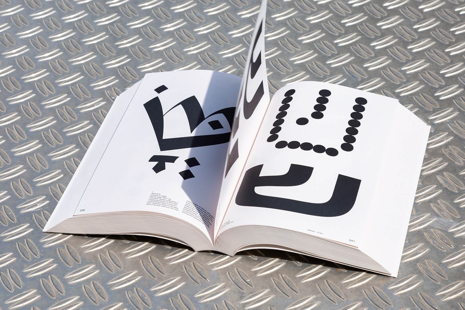
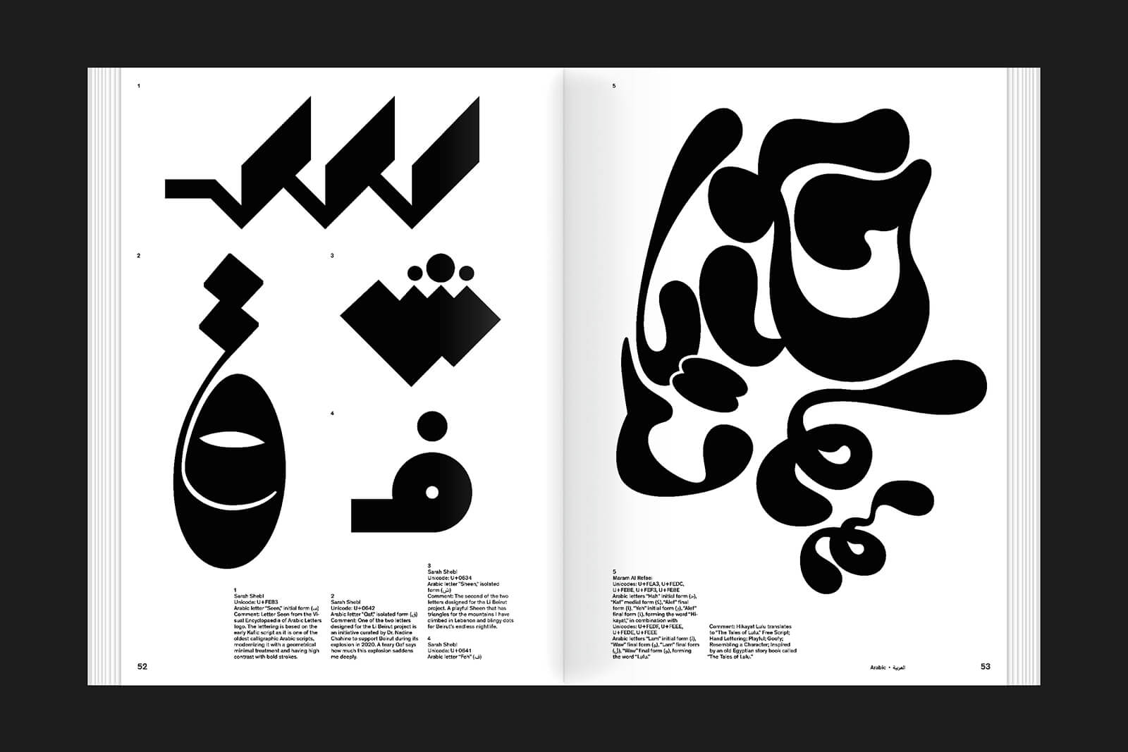
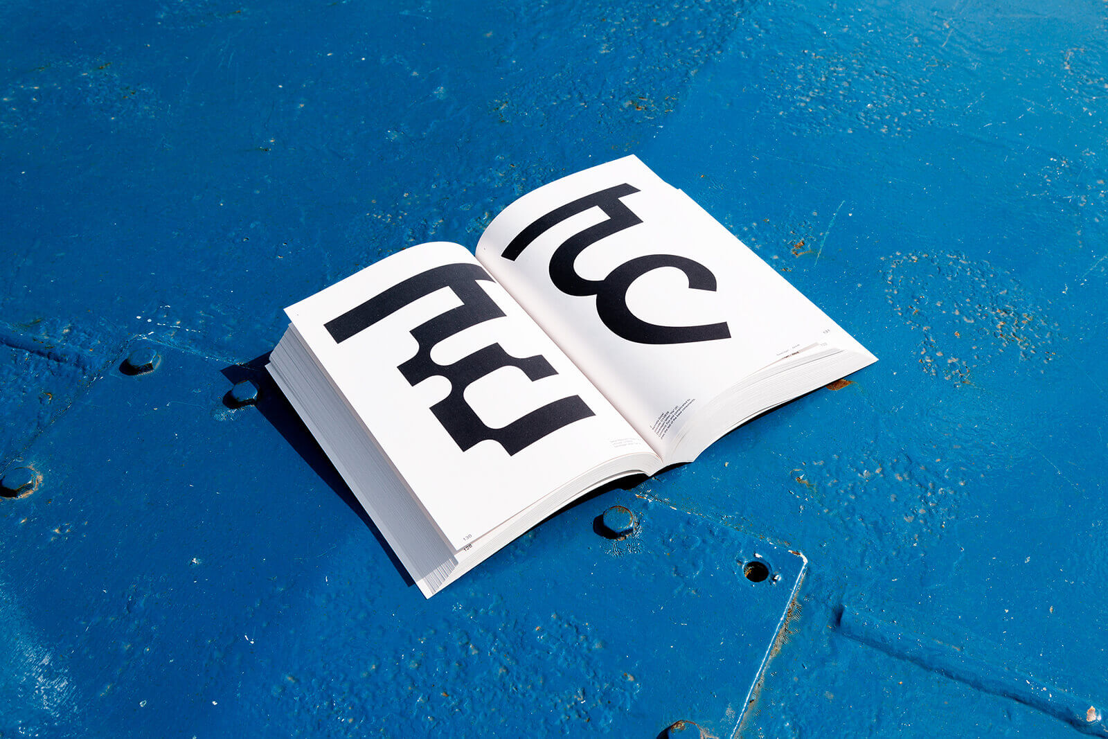
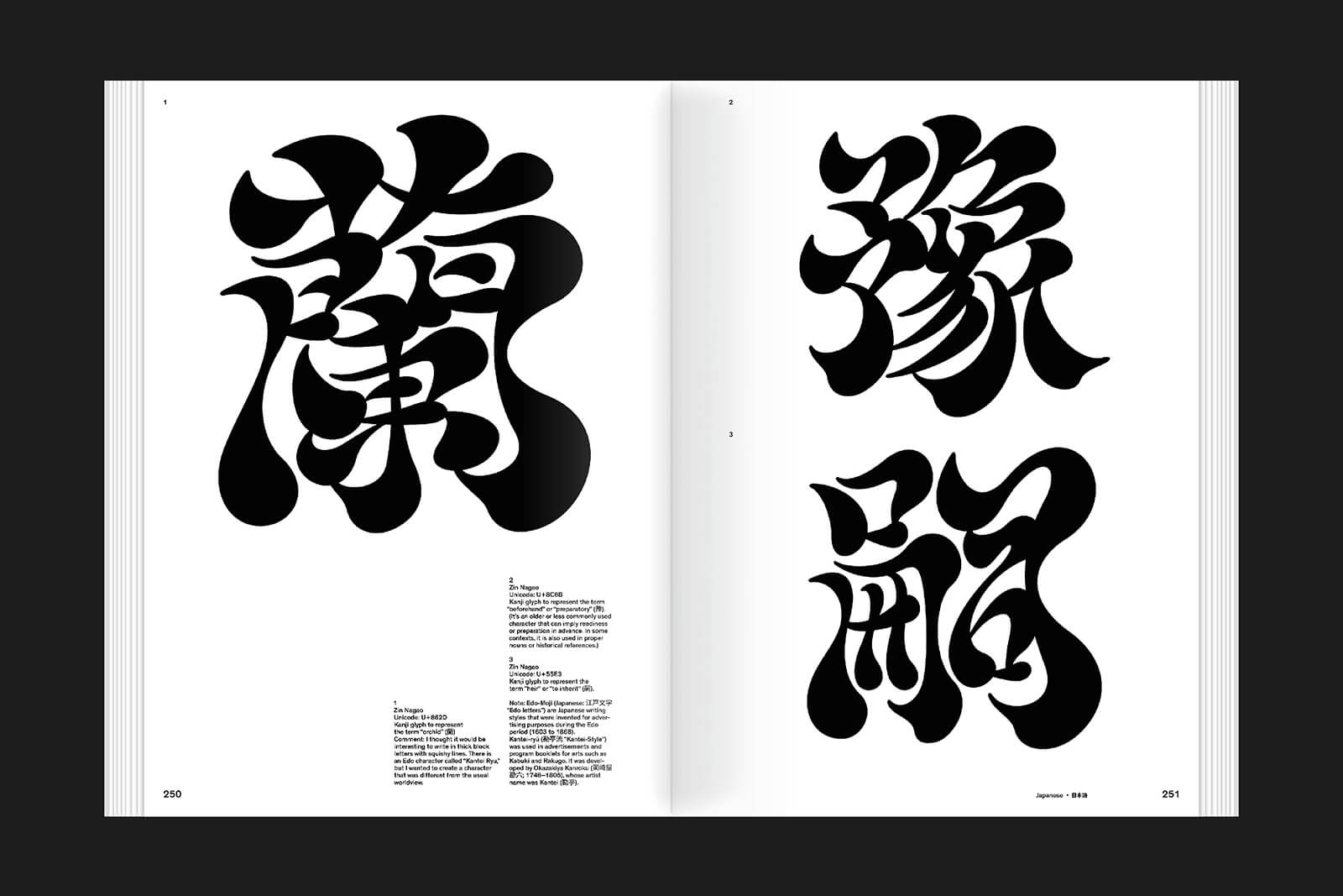
It’s a handy—while quite hefty—guide to understanding the visual diversity, experimental expressions and collaborative methods employed in type design. Through this, it affords the chance for designers to understand what goes into creating different typesets and letterforms—the essential qualities of a writing system that must be preserved for the words to be intelligible—detailing different diacritical marks, strokes and letters in variations to this effect. The book design is very visually engaging to flip through, the fluidity of the Arabic scripts giving way to the painterly gestures of Kanji and the razor sharp lines of Russian, which look almost like Latin (all rendered in different styles making them blobby or sleek or sinuous by turn); the aesthetic possibilities are seemingly endless.
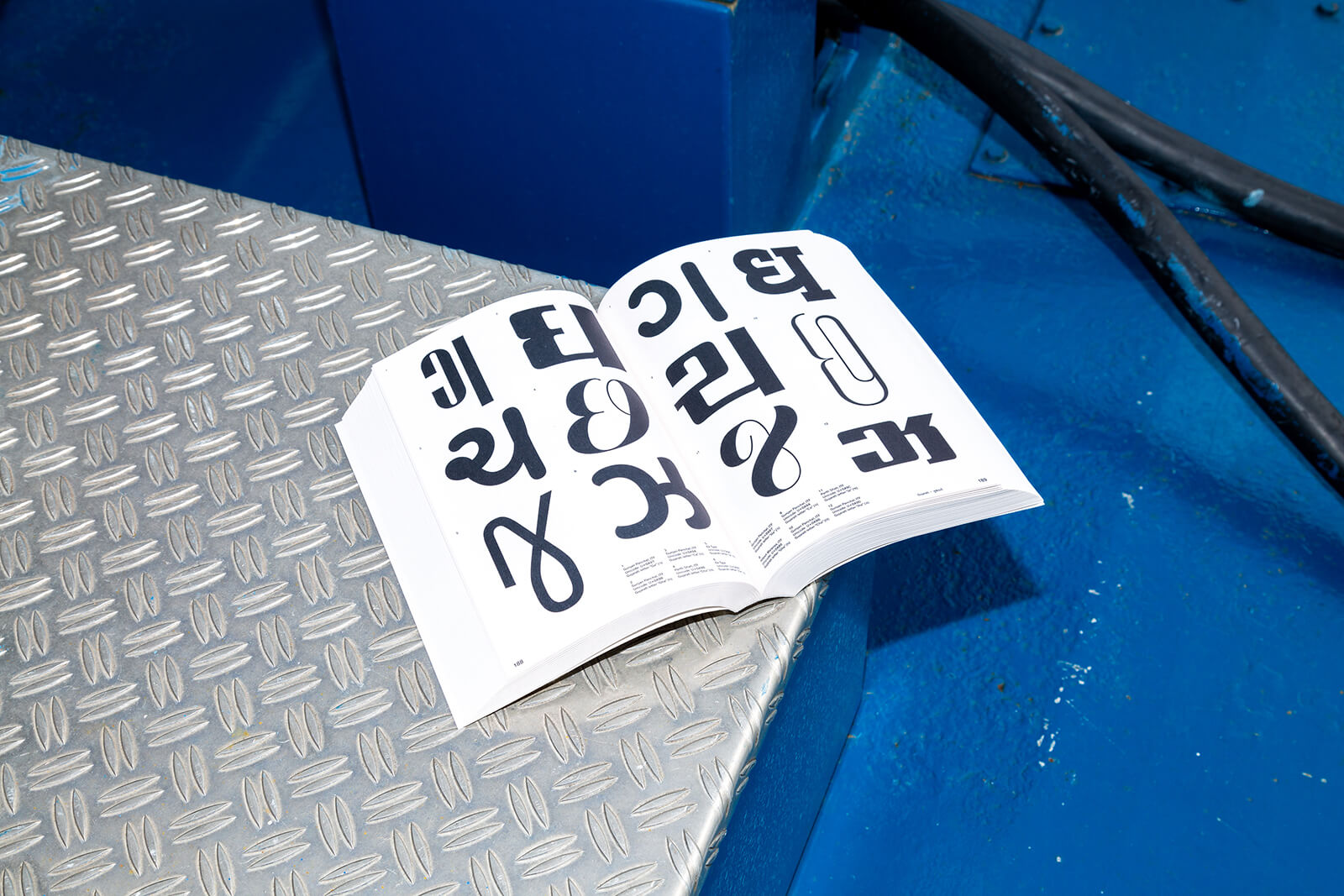
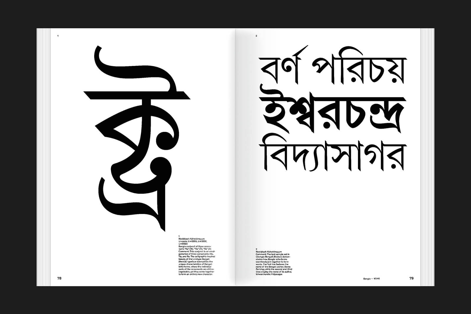
In this, it also demonstrates the similarities and disparities between different text systems. There’s a resonance, readers would agree, in the roundedness of the Thai and Telugu alphabets, for instance; there is also certainly some difference in the more evocative Kanji (used in both Chinese and Japanese alphabets) and the minimal Hangul script. Armenian, if not differentiated by its leaner letterforms, would in another world pass for Tamil, and the Odia script could pass for either if it weren’t so rounded. The Gujarati script, if you only pick out certain letters—as the book’s layout does for the most part—looks exactly like Devanagri. Bold strokes, fluid curves and slim dashes dominate the page, with entire pages at times filled with one single letter. The ultimate message: typography connects (as well as communicates). In closing, this noble intention brings to mind the ending to Denis Villeneuve's film, Arrival (2016), and its insistence that language should unite. By presenting the deviations, convergences and aesthetics of how and what we write, Graphic Languages invites engagement that goes beyond the act of reading.

by Pranjal Maheshwari Jul 14, 2026
Taking a closer look at the comprehensive retrospective at the Vitra Schaudepot in Weil am Rhein, STIR explores the enduring relevance of the 20th-century designer.
by Anmol Ahuja Jul 13, 2026
An inflatable chair, a rocking bench, an angled, adjustable floor lamp and artistic textiles, among others, round out IKEA’s 10th PS collection, built around ‘playful functionality’.
by Pranjal Maheshwari Jul 06, 2026
Using hanji paper and stitches, Seoul-based MANO Design Studio channels the Korean concept of yeobaek-mi in a recent lamp series to restore 'thingness' to design through craft.
by Bansari Paghdar Jul 04, 2026
Designed by the Berlin-based firm, the vibrant renovation of an apartment features dramatic sculptures and wave-like forms cut into walls and furnitures.
 surprise me!

make your fridays matter
SUBSCRIBEmake your fridays matter with a well-read weekend
Enter your details to sign in
Don’t have an account?
Sign upOr you can sign in with
a single account for all
STIR platforms
All your bookmarks will be available across all your devices.
Stay STIRred
Already have an account?
Sign inOr you can sign up with
Tap on things that interests you.
Select the Conversation Category you would like to watch
Please enter your details and click submit.
Enter the 6-digit code sent at
Verification link sent to check your inbox or spam folder to complete sign up process


Making writing forms and forms of writing intelligible with Graphic Languages
by Mrinmayee Bhoot | Published on : Aug 28, 2025


 Sign in with email
What do you think?