


Design05 mins. read
Monotype’s Gotham Variable expands a typographic classic into a design system
by Pranjal MaheshwariMay 16, 2026
•make your fridays matter with a well-read weekend
by Almas SadiquePublished on : Aug 14, 2024
At the brink of design and information dissemination lies the discipline of data visualisation. From this discipline’s amateur antecedents such as pie charts and bar graphs to today’s sophisticated and interactive maps, patterns and symbols, the scope for experimentation in data visualisation is paramount, especially with the development of new applications and AI models. This opens up a space for graphic designers, type designers, animators, data scientists, data analysts, web developers and programmers to collaborate and visualise important data, analyses and trends in an engaging and impactful manner. Alternatively, the discipline poses the potential of simplifying complex information and making it accessible for visual learners. Recently, research and creative visualisation have led to the design and development of interfaces, systems and applications where one can skim through the expanse of the world map to find popular trees in a city, pollution levels in a certain district or dominant music habits in a town.
An example of engaging data visualisation that comes to mind is Spotify’s Wrapped and Blend features, both of which not only present quantified information splattered across vibrant slides but also go on to design personalised playlists that draw data from user habits. Another application in the realm of music that appends data visualisation is Radiooooo, a French music website and application where users can scan through the global map, pick a country and a decade and be invited to peruse songs and playlists prominent during the chosen era in the selected region. SPACE10's (IKEA’s former research and design lab) Products of Place, an interactive map that enables users to explore and discover dominant materials in a given region, is another example of interactive data visualisation that engages users and attempts to inspire cognizant user practices. Alternatively, certain digital publications such as The Pudding, dedicated primarily to platforming visual essays, routinely publish stories on the visualisation of mundane data in interactive formats.
This desire to consume information via formats that have broken out of the typical moulds of text, video and audio, led me to discover the novel project Shapes of Data, conceptualised and spearheaded by graphic designer Adrien Jacquemet and web developer Basile Jesset. “The aim of Shapes of Data is to create new ways of visualising data,” reads a description from their website. Both Jacquemet and Jesset are based in Tours in the Centre-Val de Loire region in France. Although both Jacquemet and Jesset are trained in visual design and graphic design, the former is an expert in visual identities and websites and the latter specialises in the design and development of web tools and websites, with rigorous training in digital cultures.
Interactive and innovative data visualisation makes it easier to understand dense and complex subjects so that people can form their opinions and not just consume the results. – Basile Jesset
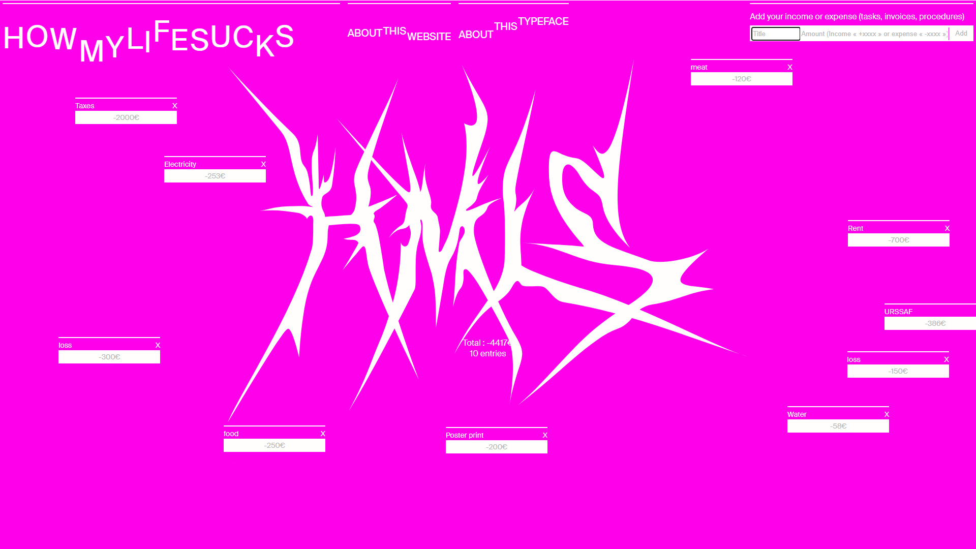
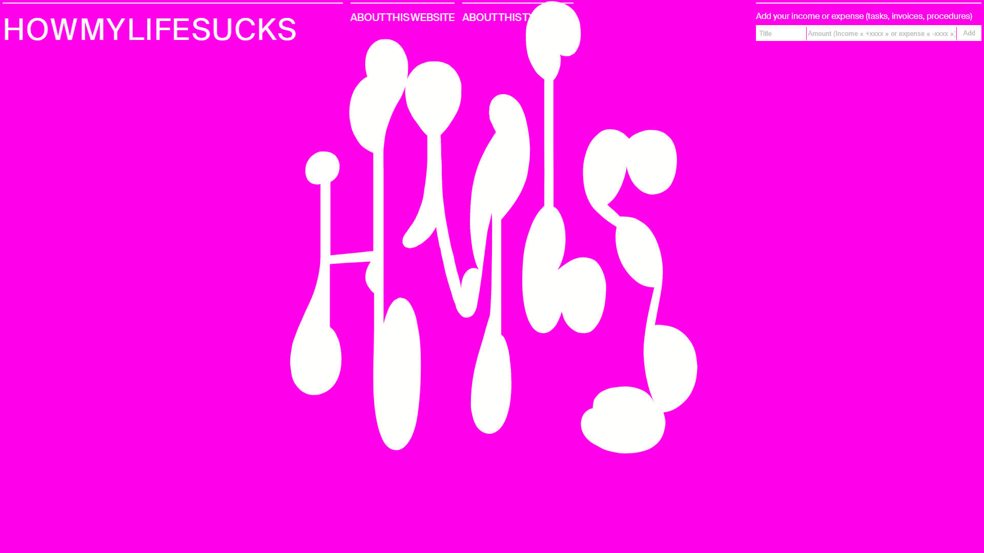
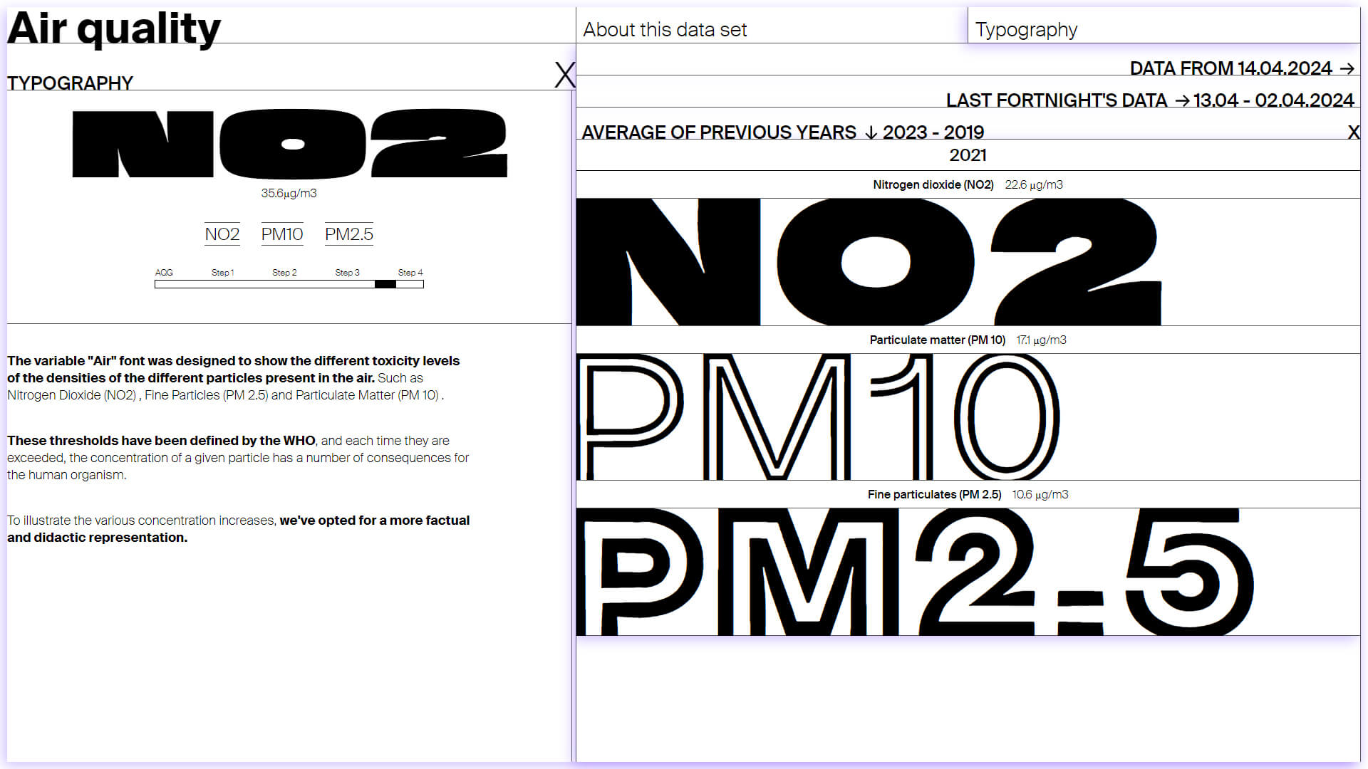
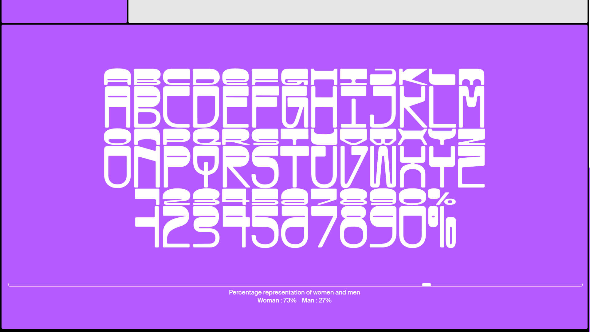
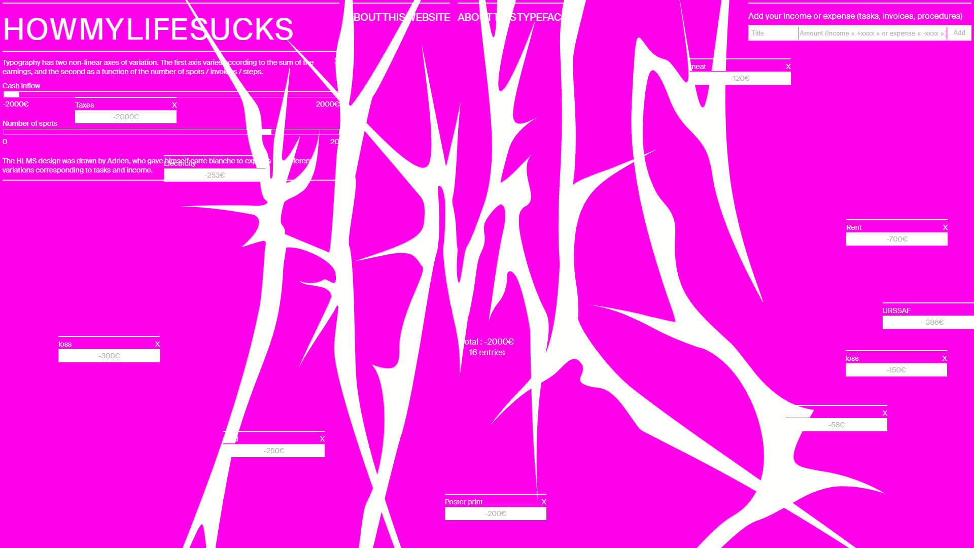
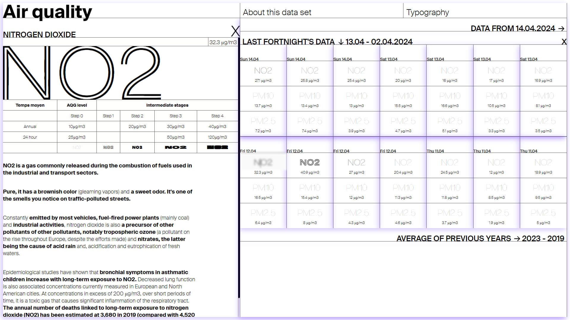
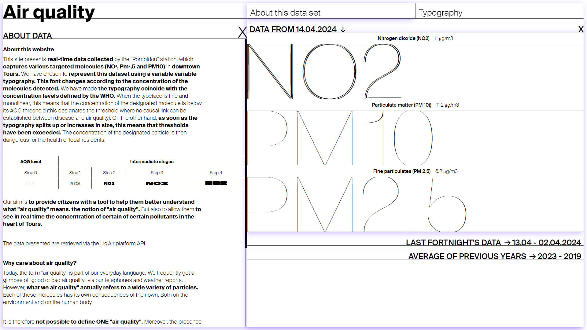
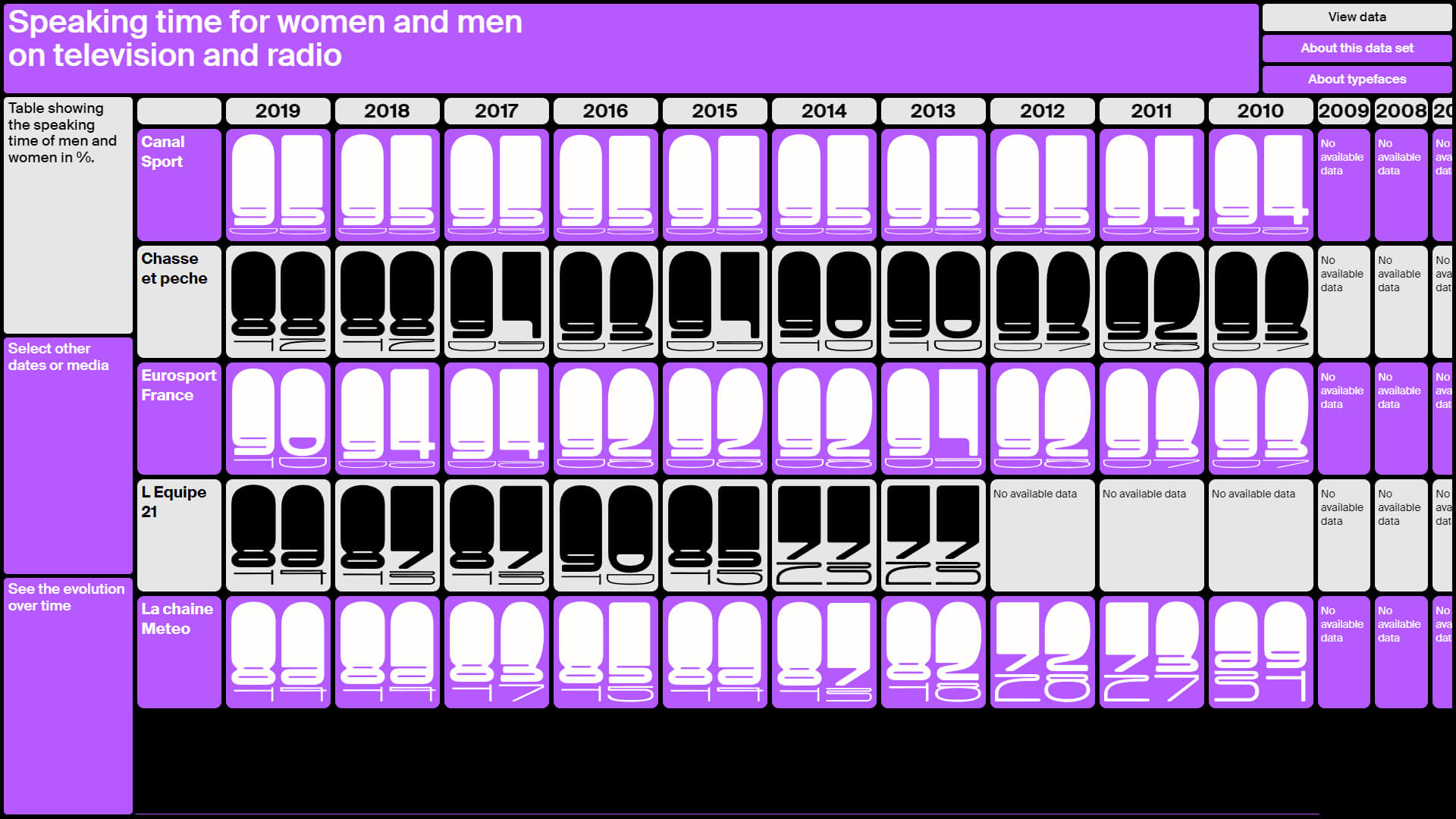
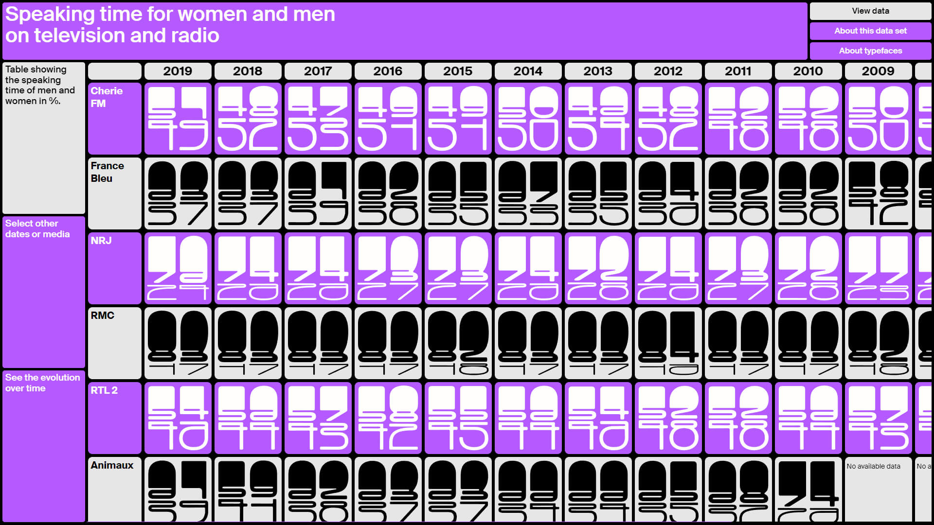
With Shapes of Data, Jacquemet and Jesset aim to create web interfaces and variable typography for the individual subjects that they choose to tackle. The intent behind the project is a desire to enhance the value of data via strong and innovative design. Some of the projects undertaken by them include Speaking time for women and men on television and radio, Air Quality and How My Life Sucks (HMLS). All three projects culminated in the creation of interactive and vibrant websites. Speaking time for women and men on television and radio showcases the speaking time of both genders in the French media from 1995 to 2019. Their Air Quality website provides real-time data on the concentrations of particulate pollutants PM10, PM2.5 and NO2. This data is acquired from the Lig'air air quality measurement station in the centre of Tours. Lastly, HMLS is a humorous website that came out of the makers’ desire to design a graphic system showcasing the precariousness of young people. It allows everyone to enter their income and expenditures and generates each individual’s unique How My Life Sucks graphic.
To gain a better understanding of the world of data visualisation and the journey that Jacquemet and Jesset have envisioned for Shapes of Data, STIR queried the two makers. Below are the edited excerpts from the conversation:
Almas Sadique: Where, when and how did Shapes of Data begin? What were the initial goals and the intent of the project and how has that evolved?
Adrien Jacquemet: For my degree project in 2019, I was interested in the visual identities of cities. I came up with a communication project based entirely on the data generated by a city. Basile, for his degree in 2020, was interested in the relationship between databases and images. In 2022, we decided to create our first experiment, which would later give rise to a much bigger project, which is Shapes of Data. Our first experiment consisted of drawing just two letters that varied according to the parameters inherent in a territory (population, topography, surface area, biodiversity, land artificialisation). We worked with the 13 regions of mainland France and almost all the data was entered manually.
Eventually, we wanted to illustrate larger datasets. For this, we had to flesh out our project theoretically with a bit of reading and position ourselves at odds with conventional data visualisation methods. By the end of 2022, we had scoured all the open source datasets available on the ‘Plateforme ouverte des données publiques françaises’ website. We, then, selected the datasets measuring the speaking time of men and women in the French media and a dataset measuring air quality in France. As we were not satisfied with the API made available by Ademe, we found another issue with data relating to air quality in our region, ‘Lig'air’ is now using this data. It was only after we had completed the first two websites that we came up with How My Life Sucks, to use the data in very different ways on three websites, demonstrating the diversity of possibilities offered by our approach.
Almas: What is the procedure undertaken for each new project - from determining the subset of data and the method of acquiring it to its collation and visualisation?
Adrien: For my part, I develop each of the visualisations and conceive the entire UX/UI design. However, it's the two of us who validate all the graphic and UX/UI choices. During this graphic design work, Basile clears up all the technical problems that may arise from API requests.
Basile Jesset: Given that we're forging our own path in the field of data visualisation, we have to test and correct constantly. We're currently following this roadmap: we select a dataset according to our interests, categorise the data sets and then make an initial overview of the data if it is complex, to get an idea of exactly what the set contains. Thereafter, we do considerable research on the subject, develop scenarios and hypotheses, undertake the feasibility analysis, perform graphical research, navigate and organise data, develop the layout and graphic design for the project and then, finally develop the idea into the final product. This is a very precise plan that we have currently put in place. We finish the site once and then a month later we do a complete overhaul because what we had produced wasn't relevant to the wealth of data we're working with.
The strength and essence of Shapes of Data is based on the premise that there is no objective way of representing data. In fact, we're opposed to any form of visualisation that claims to be objective because in our view it's wrong. – Adrien Jacquemet
Almas: What tools and software—both analogue and digital—aid the process of data visualisation?
Basile: Our project is entirely web-based, so we use native web languages (HTML, CSS, JAVASCRIPT, PHP) to minimise our dependency on private libraries. We use Visual Studio for the development environment and Wamp for our local server tests.
Adrien: To design the UX and UI of our sites we use Figma and for fonts we use FontLab7.
Almas: Tell us about some people, styles, elements and projects that inspire you and the work done at Shapes of Data.
Adrien: The references we have are mainly theoretical because as far as we know, no other similar approach has been developed to date. Our two main theoretical references are Visualisation: Modular Interpretation (2020) by Johanna Drucker and Design and Digital Humanities (2017) by Anthony Masure. The former is a key work for our project because it helped us to understand that data visualisation is not just about linking data to an image but about creating an interactive tool for accessing knowledge. Masure’s book helped us position our project in relation to contemporary uses of websites, which are often highly formatted. This helped us make our websites user-friendly.
Almas: What are the factors that help determine the colours, style and typeface design in each project? Is there a tangible conversion between the subject of data and its representation?
Adrien: The strength and essence of Shapes of Data is based on the premise that there is no objective way of representing data. We observe that, from the creation to the visualisation of data, a large number of errors and biases can occur. This systematically renders a visualisation imperfect, even if it is mathematically correct and therefore subjective. We assumed our subjectivity and sensitivity when creating our visualisation modes to give more dynamism and simplify access to understanding a dataset. Our work is closer to that of an illustrator than a typographer.
However, we must remain vigilant about the signs and symbols we use to avoid major misunderstandings. We are French, so we carry within us a way of seeing shapes and symbols that will not be the same in another country. But to avoid any misinterpretation, we have systematically sought to communicate with the creators of the data sets. This was the case for the dataset on the speaking time of men and women. We spoke to David Doukhan, the engineer behind the AI that generated the data. We were thus able to understand the biases in the data we were representing (time of day, reliability of the AI, presence of advertising). As the theme was political, we also asked many women from different age groups to test our visualisations and as a result, the shape of our letters evolved a lot. The same goes for the website interface and the colours. Typographer Alice Savoie also gave us time to share her expert eye on our project.
Almas: How do you balance the aesthetic quality of the designs and animations against the largely statistical or factual sentiment they are supposed to evoke? Is this dichotomy part of the process or the outcome?
Basile: It's often said that you can't dispute the figures and that's true, but you can question everything that goes on around them. Who put these figures together? What methodology? If there is an AI, what data set has it been trained on? All these aspects influence what the data will show. Visualisation then adds a new layer of interpretation.
We then ask ourselves: Who commissioned this visualisation? Is it accessible to the general public? I would even add that the sense of factuality of diagrams, pie charts or graphs, is often used deliberately to deceive our perception and make us believe in their factual objectivity. For example, representing human relationships using pure forms is the best way to dehumanise them and turn them into mere numbers. In short, visualisation is never neutral, so why try to achieve the unattainable?
Almas: What are some challenges that you face while developing web interfaces, typographies and animations and how do you deal with them?
Adrien: For my part, I came up against the technical problems inherent in exporting variable fonts. Being self-taught, I first had to confront the various export problems and then solve them. Secondly, we understood that to design a variable typeface, it has to go from one strong extreme to another and take care of all the intermediate stages. The typeface has to consider all possible data fluctuations, both static and moving.
Basile: On the development side, it's the datasets and related APIs that have caused a lot of problems. France has been following the Open Data movement for almost 10 years, but there are still a lot of good practices to be put in place. Most French APIs today are poorly documented, making them complex to use. Another example: the Lig'Air API was updated two weeks after the publication of our site. This update completely changed how it was used and we had to contact them in a hurry because nothing worked any more.
Adrien: Then we had to come up with different site layouts to enable the ideal use of a sometimes vast dataset and allow a user to select portions of the dataset presented. We also had to make them accessible and readable despite the density of the forms and information presented. We also quickly realised that we needed to explain all the issues behind our data visualisations to the users of our sites. That's why there are always two additional pages to the dataviz, one about the data itself.
Almas: Can the language of data visualisation be universalised?
Adrien: No, on the contrary, for us it depends entirely on the cultural context in which it is used. Every culture has its history and so the symbolism of signs and letters differs. Alphabets and languages differ too. In this age of globalisation, we tend to believe that we can all understand each other and live anywhere and everywhere. Fortunately, there is still a big gap between our different cultures. Shapes of Data is imbued with the contemporary and past dynamics of European graphic design. If we wanted to work in Asia, for example, we would have to collaborate with other designers native to the region into which the project would be integrated.
We hope that sensitive subjects such as immigration and the environment will have other ways of visualising their data at their disposal. – Basile Jesset
Almas: What are the didactic benefits of innovative and interactive data visualisation and how can it benefit people across disciplines and ages?
Basile: Interactive and innovative data visualisation makes it easier to understand dense and complex subjects so that people can form their opinions and not just consume the results. This applies to all ages, all disciplines and a wide range of subjects. On the subject of food, for example, Yuka is an application that allows you to scan a product and get a representation of all the components of a food, its origin, its nutritional benefits and defects, enabling one to eat better. We could also imagine this type of service for many other subjects such as health, housing, well-being, etc.
Almas: What’s NEXT? What are some datasets that you hope to visualise in the future? Also, what are some progressions that you hope to see in this realm of data visualisation, in the coming years?
Basile: For the future, we're planning to set up scalable pictograms to quickly represent key company data relating to CSR. This seems to be the most economically viable branch of the Shapes of Data project. After several interviews and discussions that we have conducted, many players seem interested in following up on our project.
In the future, we hope that sensitive subjects such as immigration and the environment will have other ways of visualising their data at their disposal. France is one of the most climate-sceptical countries in Europe. We could do with an easy-to-read interface that allows comparisons between different key sets on the subject. Europe is also seeing a rise in the far right, which is gaining support on the subject of immigration. We're convinced that a platform that enables richer, more information-dense data sets to be compared could provide a clearer picture of reality and help the debate on this subject evolve.
Since the start of the project, we have seen that the subject of data visualisation is often used by private players to boost their figures. What's more, it's easy to change the AI model that will give better percentages on a given subject. In the future, we hope to see a commission responsible for data validity with a label that may be able to certify a company's approach (obligation to restrict itself to an AI model, have its algorithms checked and the integrity of its approach). We also hope that data representation will become more accessible. Today, the voluntary sector cannot afford to pay for data representation services. If these services become more widespread, diversified and accessible, it will be even easier to use data to defend environmental and social issues.

by Pranjal Maheshwari Jul 14, 2026
Taking a closer look at the comprehensive retrospective at the Vitra Schaudepot in Weil am Rhein, STIR explores the legacy and enduring relevance of the 20th-century designer.
by Anmol Ahuja Jul 13, 2026
An inflatable chair, a rocking bench, an angled, adjustable floor lamp and artistic textiles, among others, round out IKEA’s 10th PS collection, built around ‘playful functionality’.
by Pranjal Maheshwari Jul 06, 2026
Using hanji paper and stitches, Seoul-based MANO Design Studio channels the Korean concept of yeobaek-mi in a recent lamp series to restore 'thingness' to design through craft.
by Bansari Paghdar Jul 04, 2026
Designed by the Berlin-based firm, the vibrant renovation of an apartment features dramatic sculptures and wave-like forms cut into walls and furnitures.
 surprise me!

make your fridays matter
SUBSCRIBEmake your fridays matter with a well-read weekend
Enter your details to sign in
Don’t have an account?
Sign upOr you can sign in with
a single account for all
STIR platforms
All your bookmarks will be available across all your devices.
Stay STIRred
Already have an account?
Sign inOr you can sign up with
Tap on things that interests you.
Select the Conversation Category you would like to watch
Please enter your details and click submit.
Enter the 6-digit code sent at
Verification link sent to check your inbox or spam folder to complete sign up process


Exploring 'Shapes of Data' with Adrien Jacquemet and Basile Jesset
by Almas Sadique | Published on : Aug 14, 2024


 Sign in with email
What do you think?