


Design14 mins. read
Anton Repponen on distorting the mundane into unfamiliar visual explorations
by Zohra KhanJul 04, 2025
•make your fridays matter with a well-read weekend
by Chahna TankPublished on : Jan 01, 2026
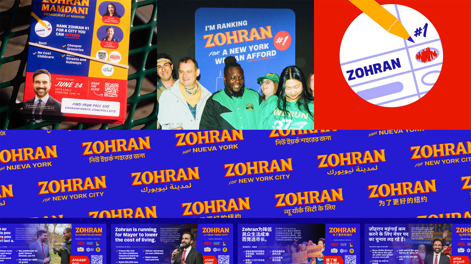
Zohran Mamdani is now the new Mayor of New York City, elected in what may be the city’s most consequential election in recent memory—an outcome that surprised some, energised many and likely reached you even if you live nowhere near the metropolis. He became our mayor, really, a symbol of effervescent optimism and sincere hope rooted in collective action. His campaign was hard to miss: ricocheting across TikTok, cruising on Instagram stories, and plastered on storefronts and street corners throughout the city. Instead of saying: Vote For Me, it seemed to holler: Hey! This is our city. Let’s fix it! And there was plenty to fix. The election unfolded amid a housing crisis, soaring prices and a growing disconnect between political institutions and the people they claim to represent. Voters weren’t simply choosing a candidate; they were choosing a direction for the city's future, deciding whether New York can become a place where everybody can safely belong. As Mamdani steps into office, STIR takes a closer look at the campaign design that turned our collective frustration into collective hope.
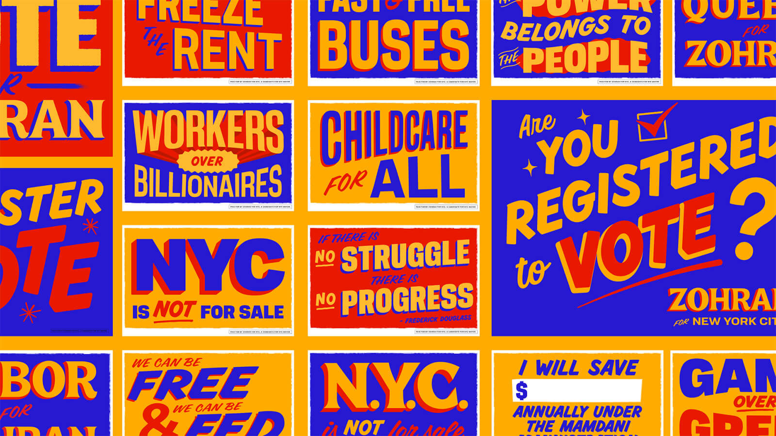
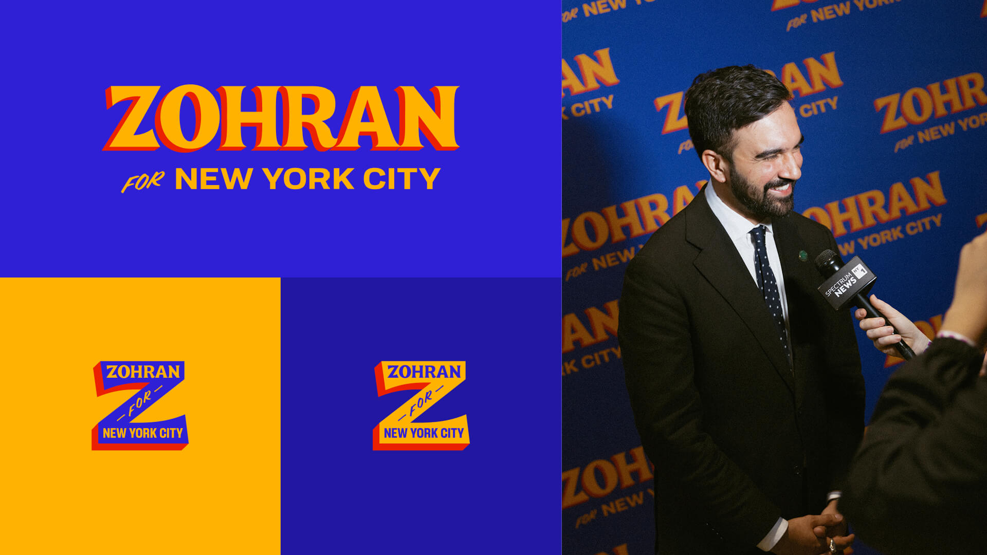
‘A New York You Can Afford’ was Mamdani’s rallying cry to go up against the hostile backdrop of a deeply polarised political climate in the United States. And his campaign echoed that very jolt of energy he hoped to suffuse into the city—spirited, insurgent, radiant with purpose. ‘Freeze Rent’, ‘Childcare for All’, ‘Fast & Free Buses’—he decried. And we believed it was possible. With surprising freshness, the branding for his campaign tapped into the city’s visual and cultural rhythms in ways other campaigns had misguidedly overlooked. Much of that vitality—possessing an unmistakable presence that came from its design, led by Forge, the creative co-op helmed by Philadelphia-based designer Aneesh Bhoopathy—and its grassroots-driven visual identity was geared towards drawing people in not just as voters, but as participants in a city-wide conversation.
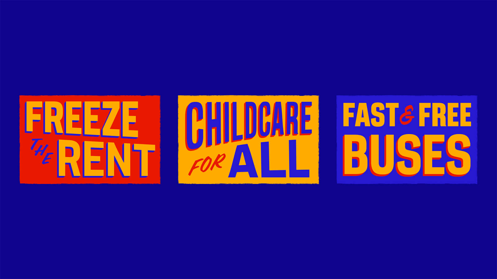
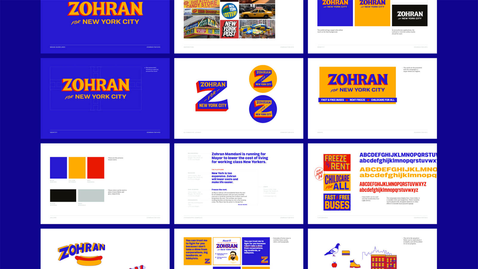
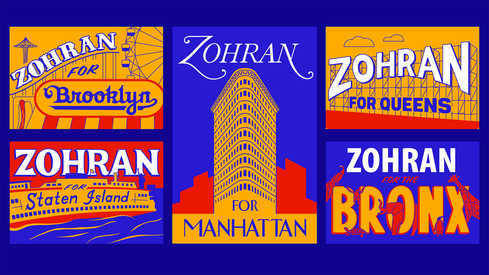
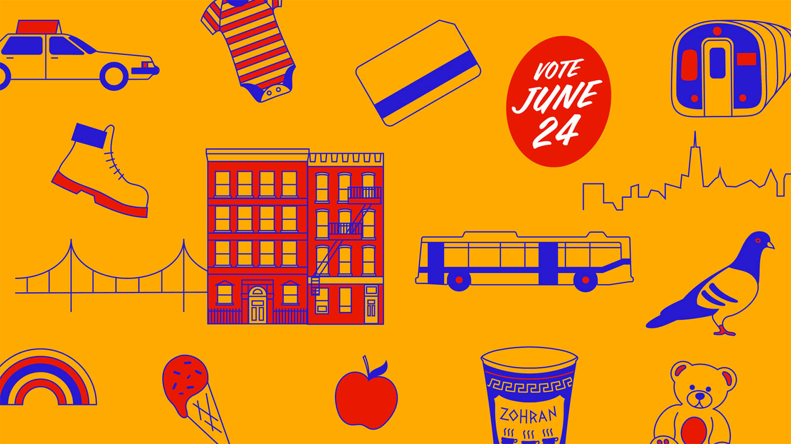
Visuals for Mamdani’s campaign didn’t look like political graphics at all, they looked like they were inherently part of the Big Apple—a multilingual, electric and somewhat unruly urban cosmos. The vivid blue background, paired with hot orange and sunlight yellow lettering, immediately set it apart from the overly sanitised conventional political branding—reminiscent of the vibrancy of superhero logos in their choice of colours. The hues weren’t chosen for their vibrancy alone; they were lifted straight from the city’s everyday iconography—bodega signs, MetroCards, street-food carts and small-business storefronts.
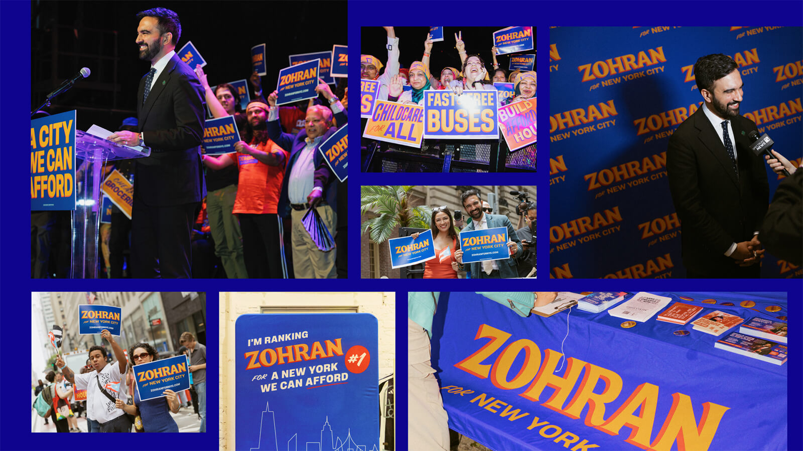

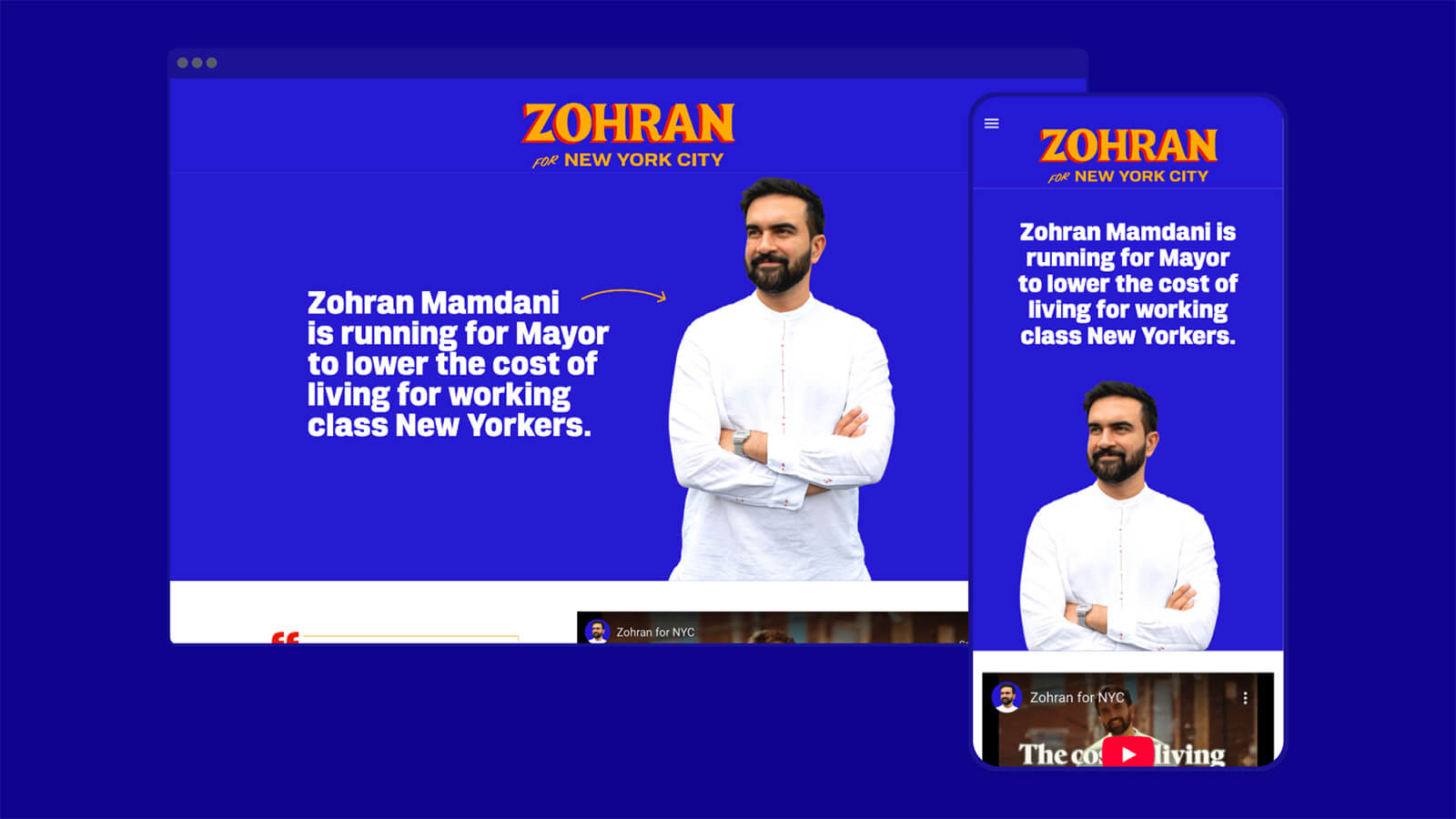
The campaign’s typography and graphic language leaned into a distinct pulp aesthetic—evoking the bold outlines of vintage comic books—and the hand-painted quality of the poster designs seemed like the retro Bollywood film posters, with their striking blue against the grey of the city. Mamdani’s own connection to Bollywood shaped this sensibility, giving the graphic design a cinematic flair. Tyler Evans, a veteran of Bernie Sanders’s 2020 campaign design team, channelled that into the posters that would become the campaign’s most iconic objects. They felt less like political advertisements and more like objects of community life—pinned to deli fridges, taped to pharmacy windows, propped in apartment balconies or plastered on neighbourhood bulletin boards. Mamdani’s smiling portrait, placed front and centre on every poster and paired with a clear message, "Zohran for New York City," made him look approachable. With only a few seconds to catch a passerby’s attention, the design distilled the campaign’s messages to their essence, making it engaging on both streets and social media feeds.
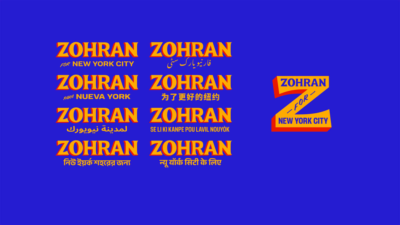
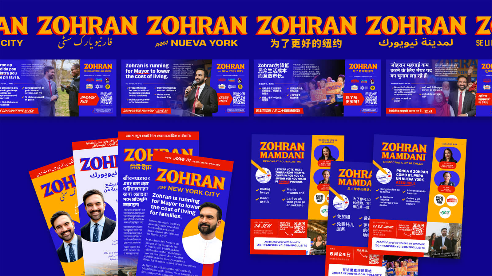
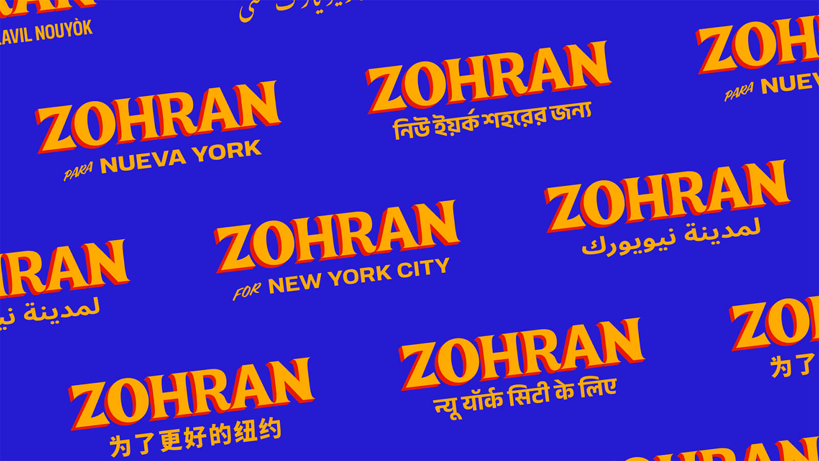
Multilingual signage sat at the heart of the campaign’s design. Posters and printed materials appeared in Spanish, Urdu, Hindi and English, among other languages—a nod to the city’s rich linguistic landscape—that made the campaign feel inclusive, approachable and rooted in the neighbourhoods it served and beyond. By speaking in the languages people actually use every day, the visuals became instantly recognisable, widened the campaign’s reach and let supporters see themselves reflected in the movement. In a city shaped by generations of immigrants—the reason for such a diverse linguistic landscape—Mamdani’s opposition to ICE raids underscored his campaign's broader commitment to safety and belonging.
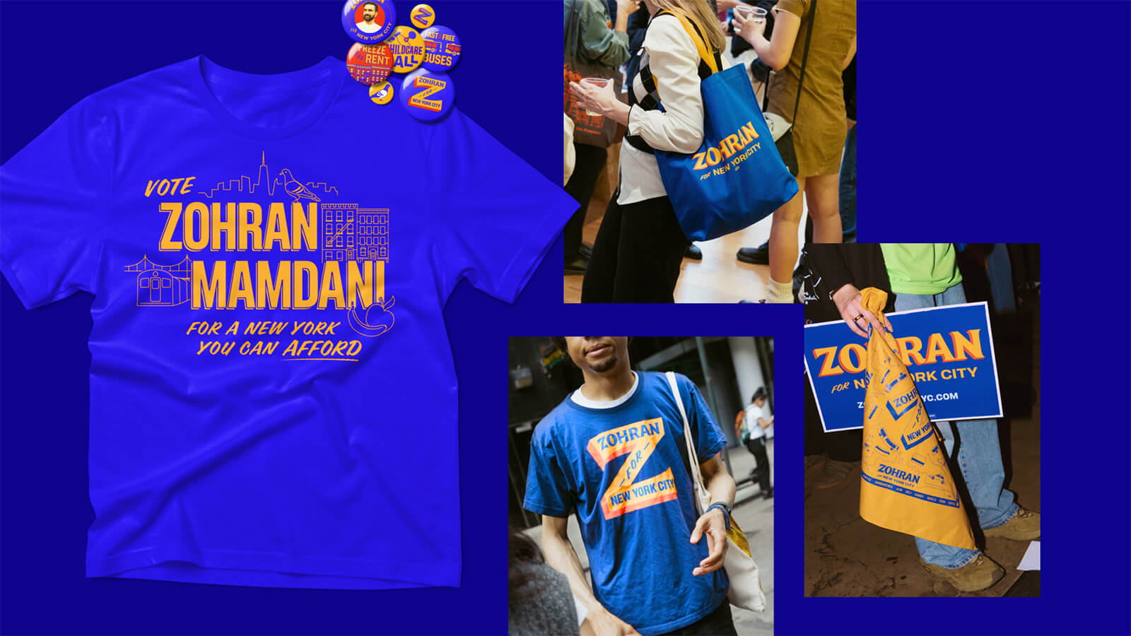
The campaign extended its design sensibility to merchandise as well—turning everyday objects into tools of participation and visual expression. Tote bags, stickers, stamps and T-shirts—especially the cheeky ‘Hot Girls for Zohran’ tees, which went viral in a way nobody could have foreseen—circulated widely among volunteers and supporters, fostering a sense of shared ownership. These items weren’t just fun add-ons; they became a form of social currency, letting supporters signal participation and carry the campaign’s visual language into public spaces—embedding the campaign’s value and community-driven energy into everyday life.
Mamdani’s campaign offered a rare glimpse of what political campaign design can look like when it grows organically from a place rather than being imposed upon it. Thoughtful, locally rooted design transformed the election into a shared visual and social experience, turning supporters into active participants in shaping the city’s future rather than mere observers. Its hands-on, community-focused approach even brought to mind Leslie Knope’s fictional run for city council in Parks and Recreation, where volunteer enthusiasm and civic participation created a movement genuinely powered by the people. And maybe that’s the real story here: a campaign that didn’t just ask people to vote but invited them to see themselves in the future of the city, giving them reasons to believe that that future is possible.

by Pranjal Maheshwari Jul 14, 2026
Taking a closer look at the comprehensive retrospective at the Vitra Schaudepot in Weil am Rhein, STIR explores the enduring relevance of the 20th-century designer.
by Anmol Ahuja Jul 13, 2026
An inflatable chair, a rocking bench, an angled, adjustable floor lamp and artistic textiles, among others, round out IKEA’s 10th PS collection, built around ‘playful functionality’.
by Pranjal Maheshwari Jul 06, 2026
Using hanji paper and stitches, Seoul-based MANO Design Studio channels the Korean concept of yeobaek-mi in a recent lamp series to restore 'thingness' to design through craft.
by Bansari Paghdar Jul 04, 2026
Designed by the Berlin-based firm, the vibrant renovation of an apartment features dramatic sculptures and wave-like forms cut into walls and furnitures.
 surprise me!

make your fridays matter
SUBSCRIBEmake your fridays matter with a well-read weekend
Enter your details to sign in
Don’t have an account?
Sign upOr you can sign in with
a single account for all
STIR platforms
All your bookmarks will be available across all your devices.
Stay STIRred
Already have an account?
Sign inOr you can sign up with
Tap on things that interests you.
Select the Conversation Category you would like to watch
Please enter your details and click submit.
Enter the 6-digit code sent at
Verification link sent to check your inbox or spam folder to complete sign up process


Inside Zohran Mamdani’s defiant and unruly campaign design, radiant with purpose
by Chahna Tank | Published on : Jan 01, 2026


 Sign in with email
What do you think?