


Design09 mins. read
Can you design a world of gratitude? Justyna Green shows the way
by Soumya MukerjiSep 07, 2021
•make your fridays matter with a well-read weekend
by Anmol AhujaPublished on : Feb 24, 2022
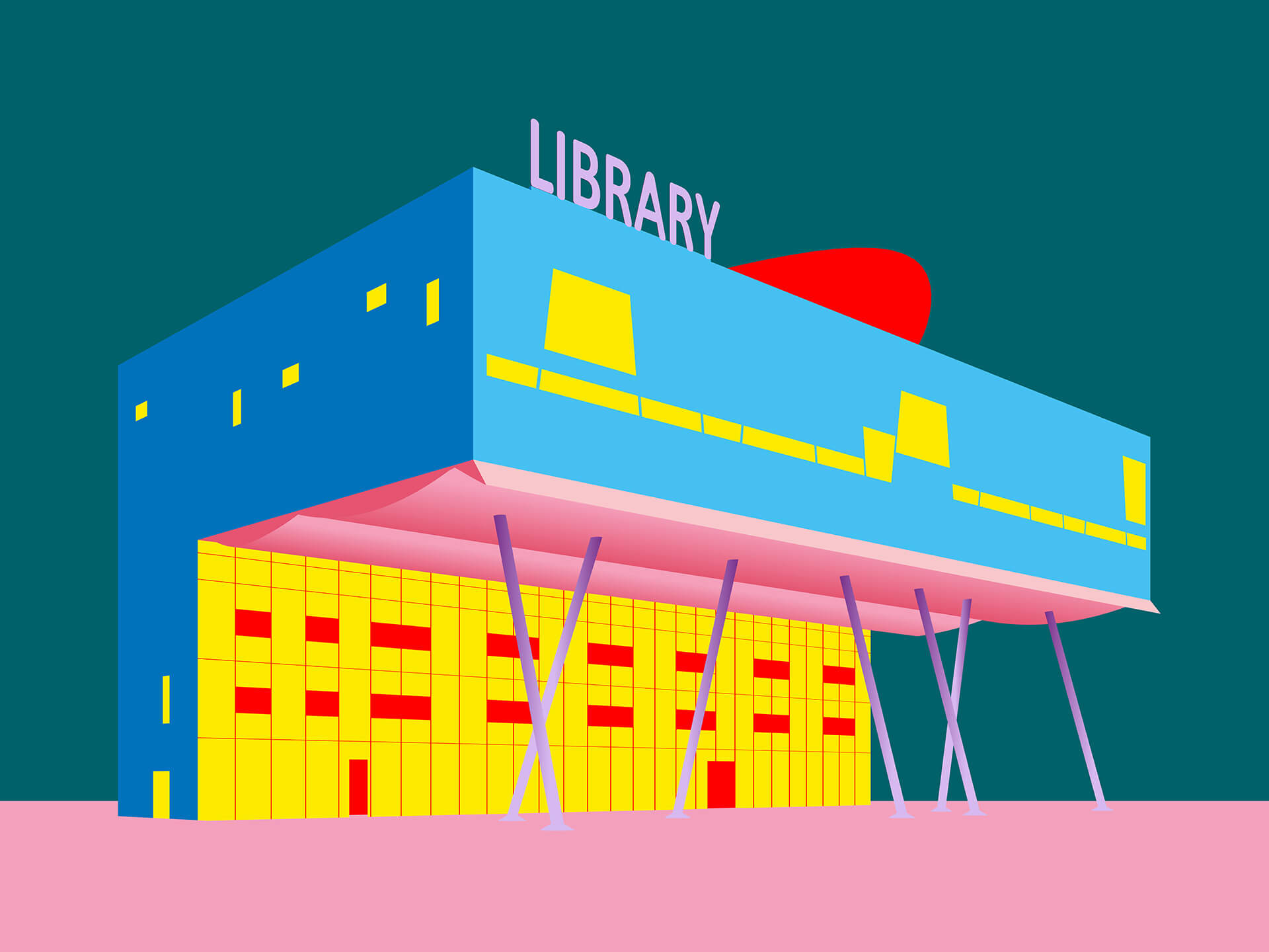
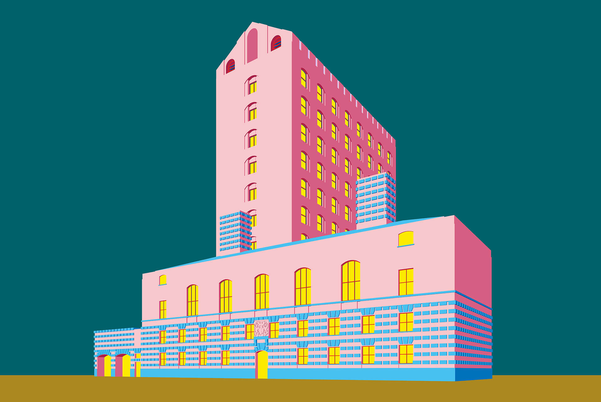
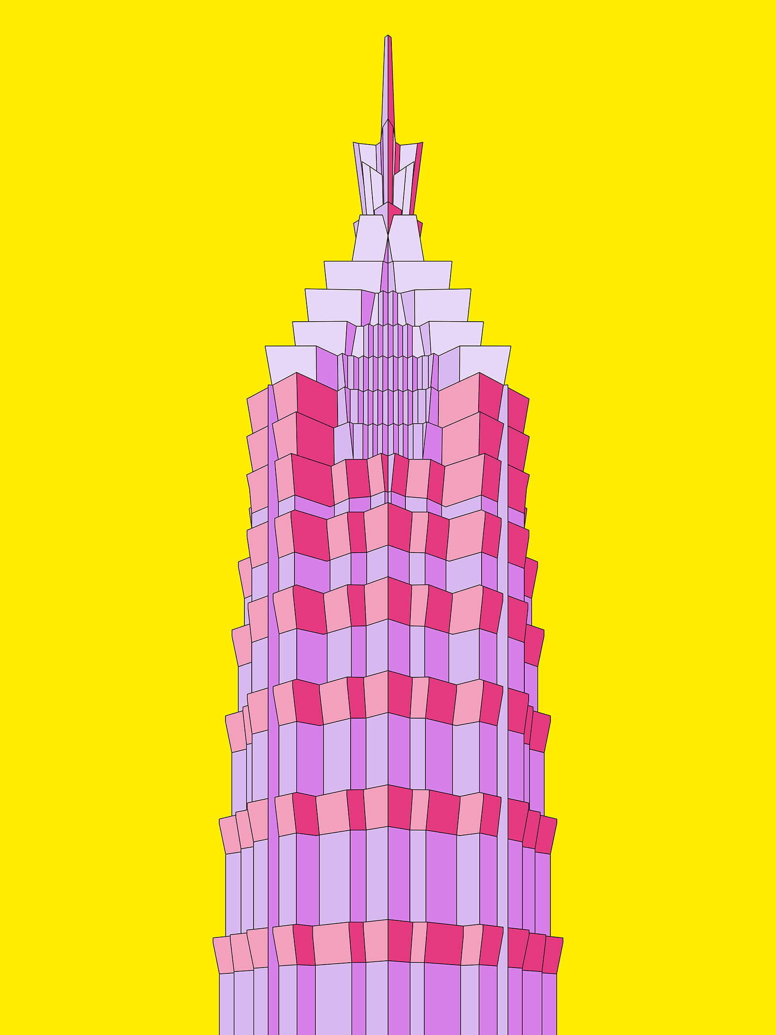
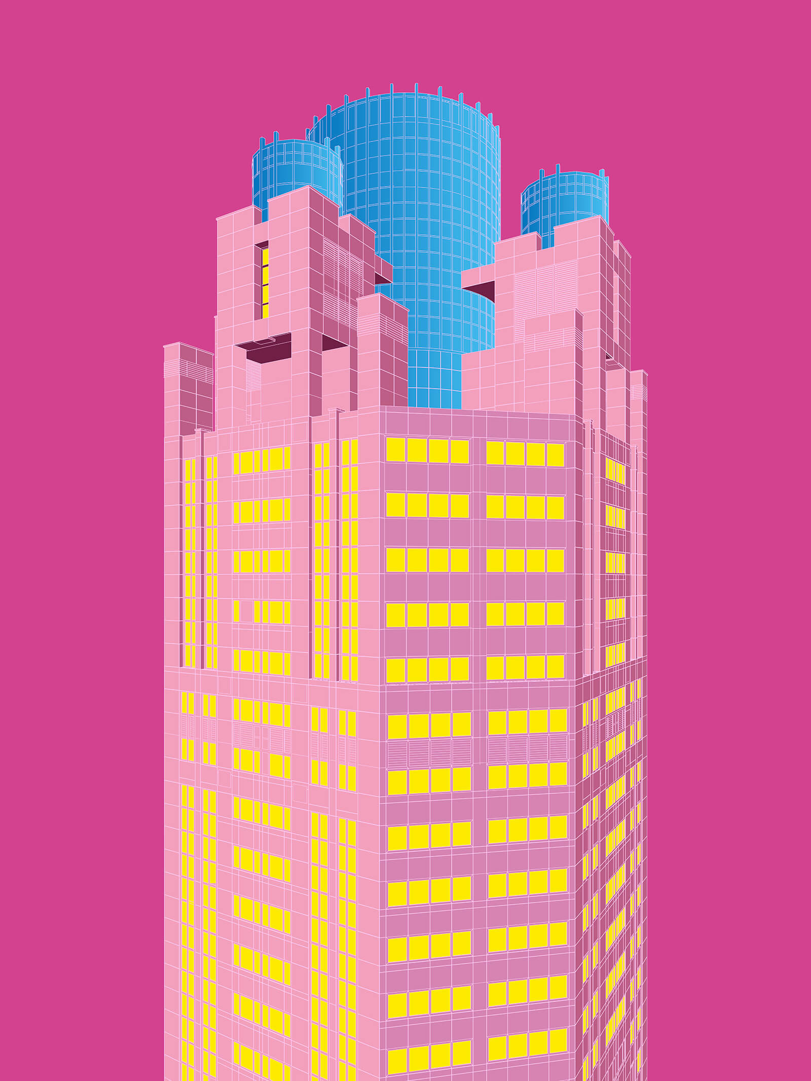
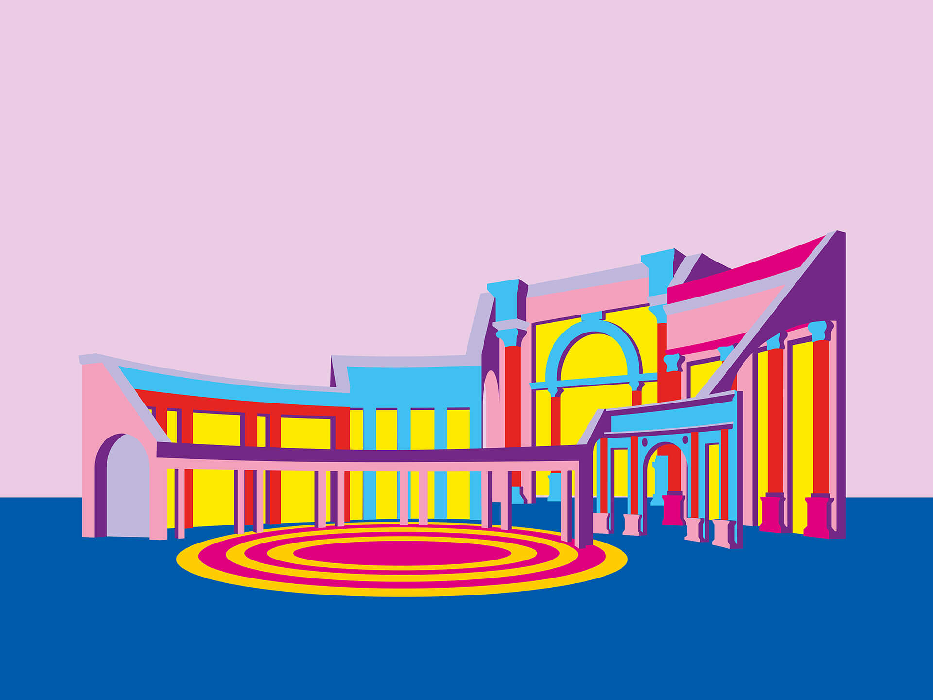
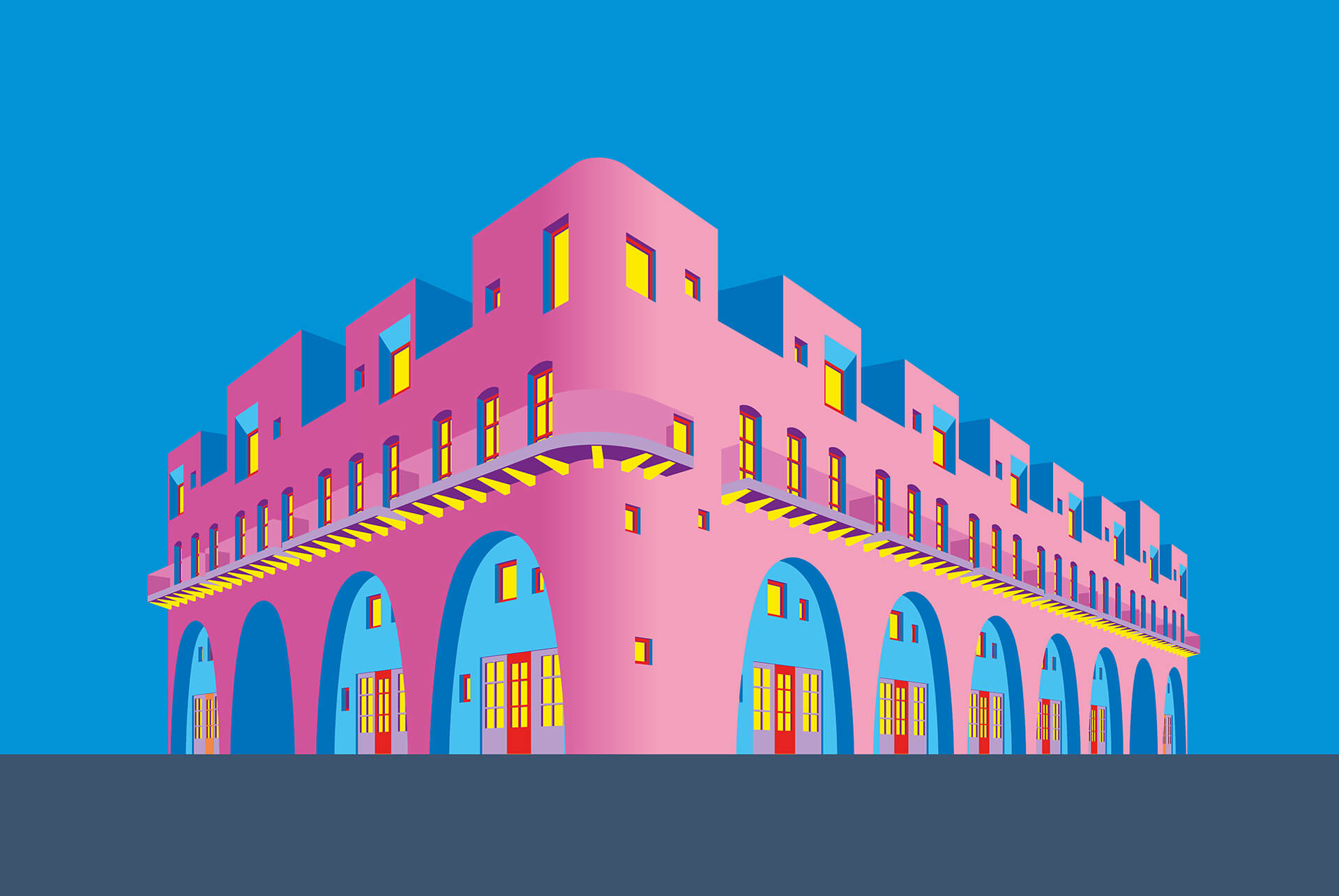
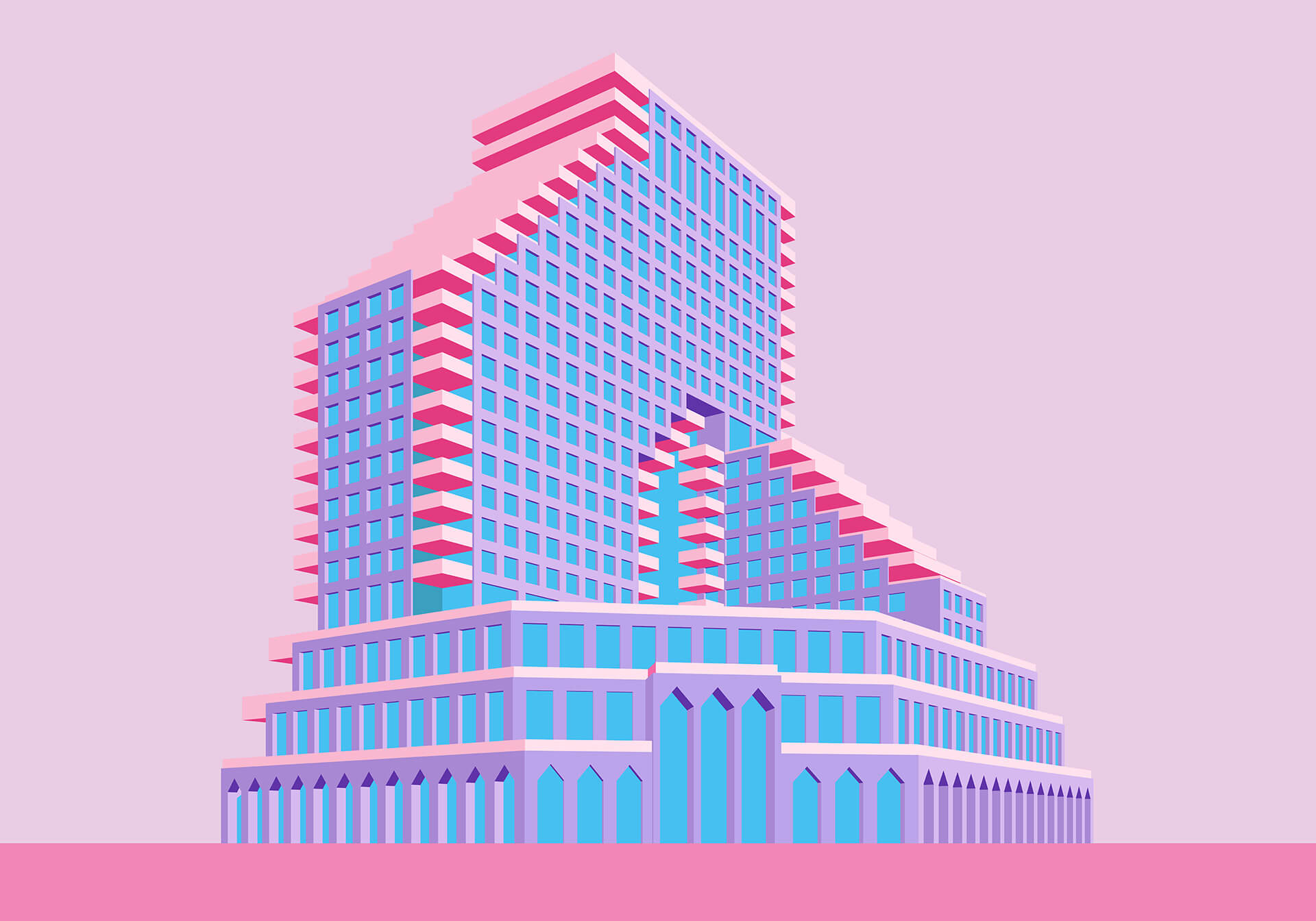
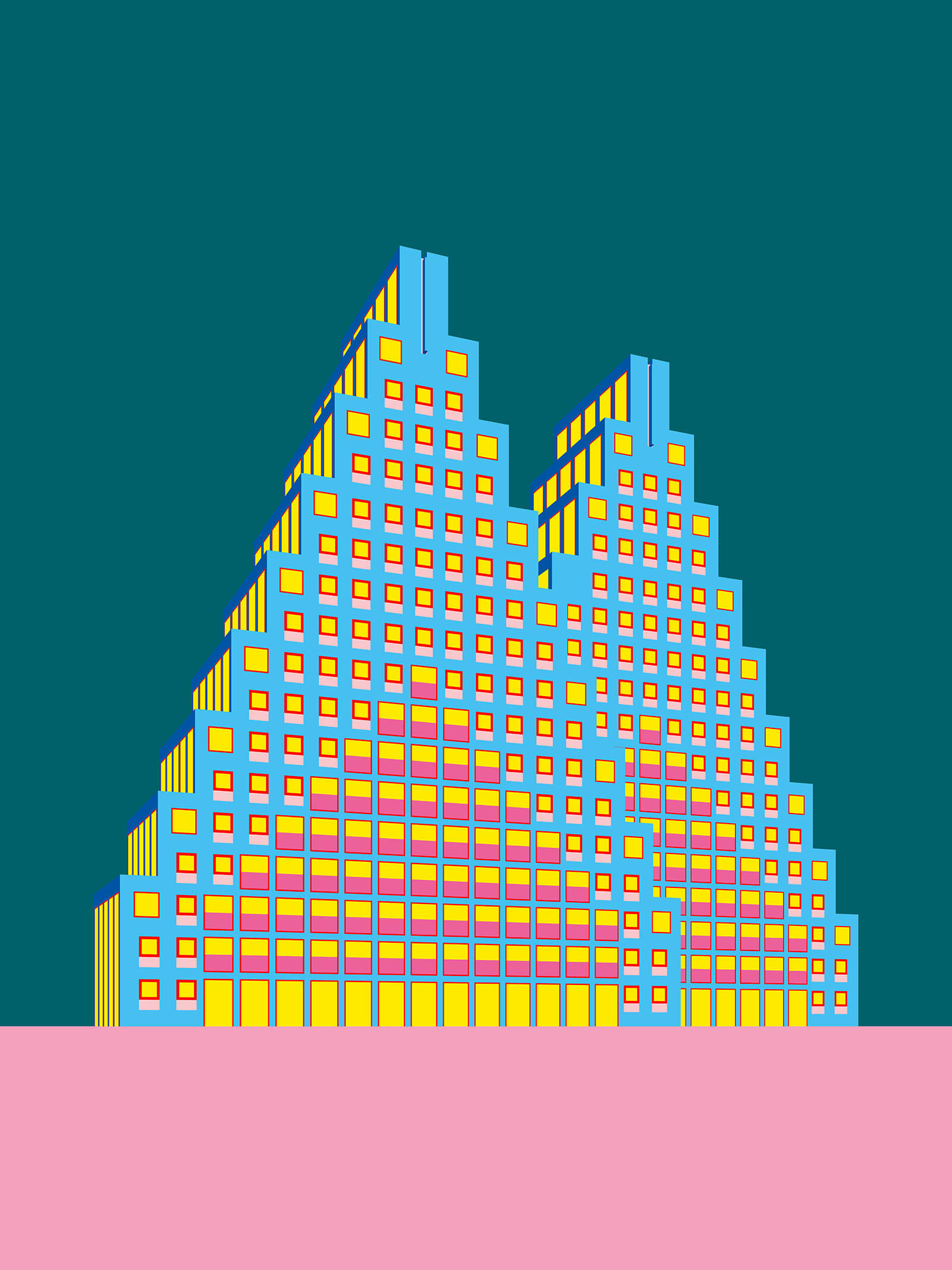
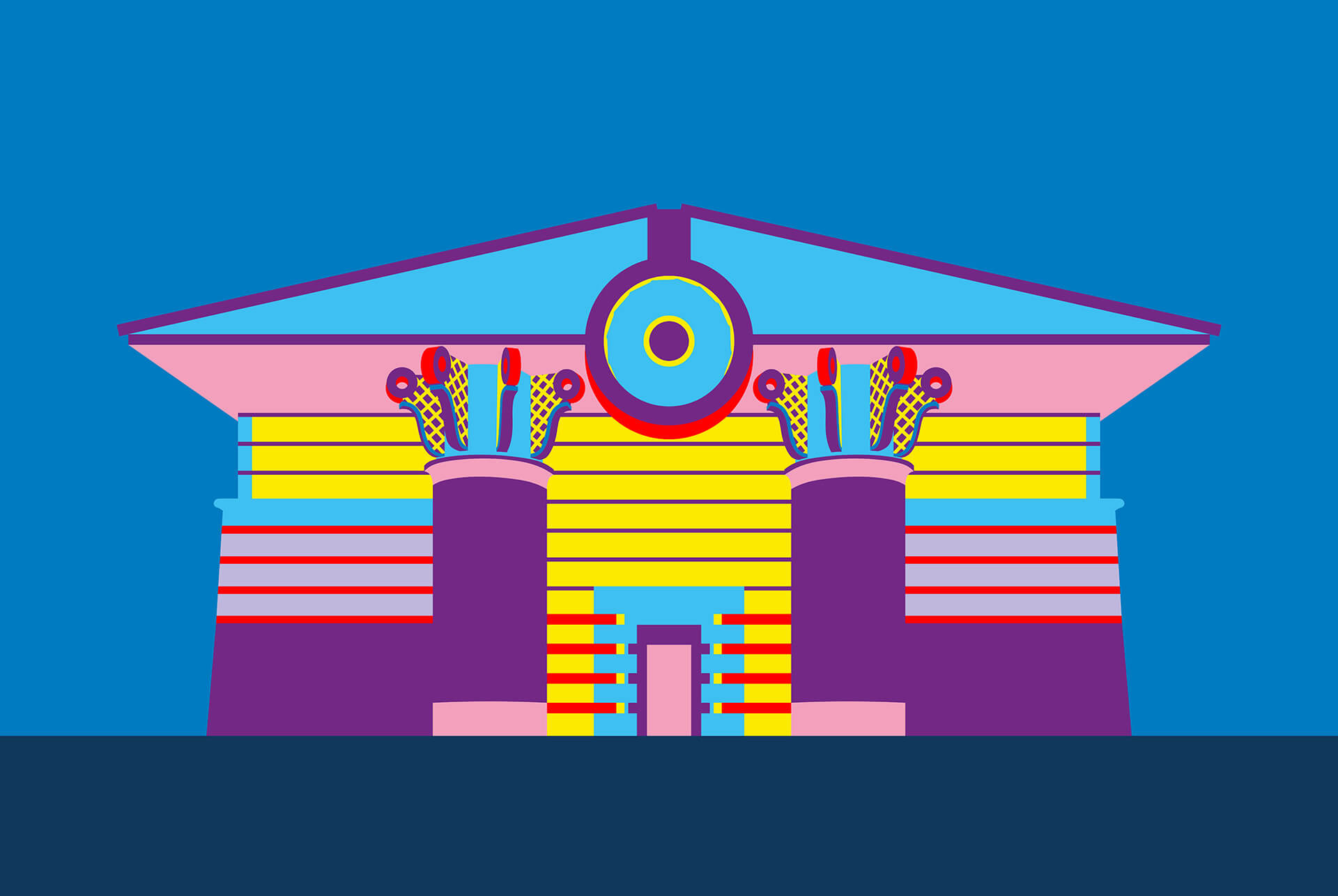
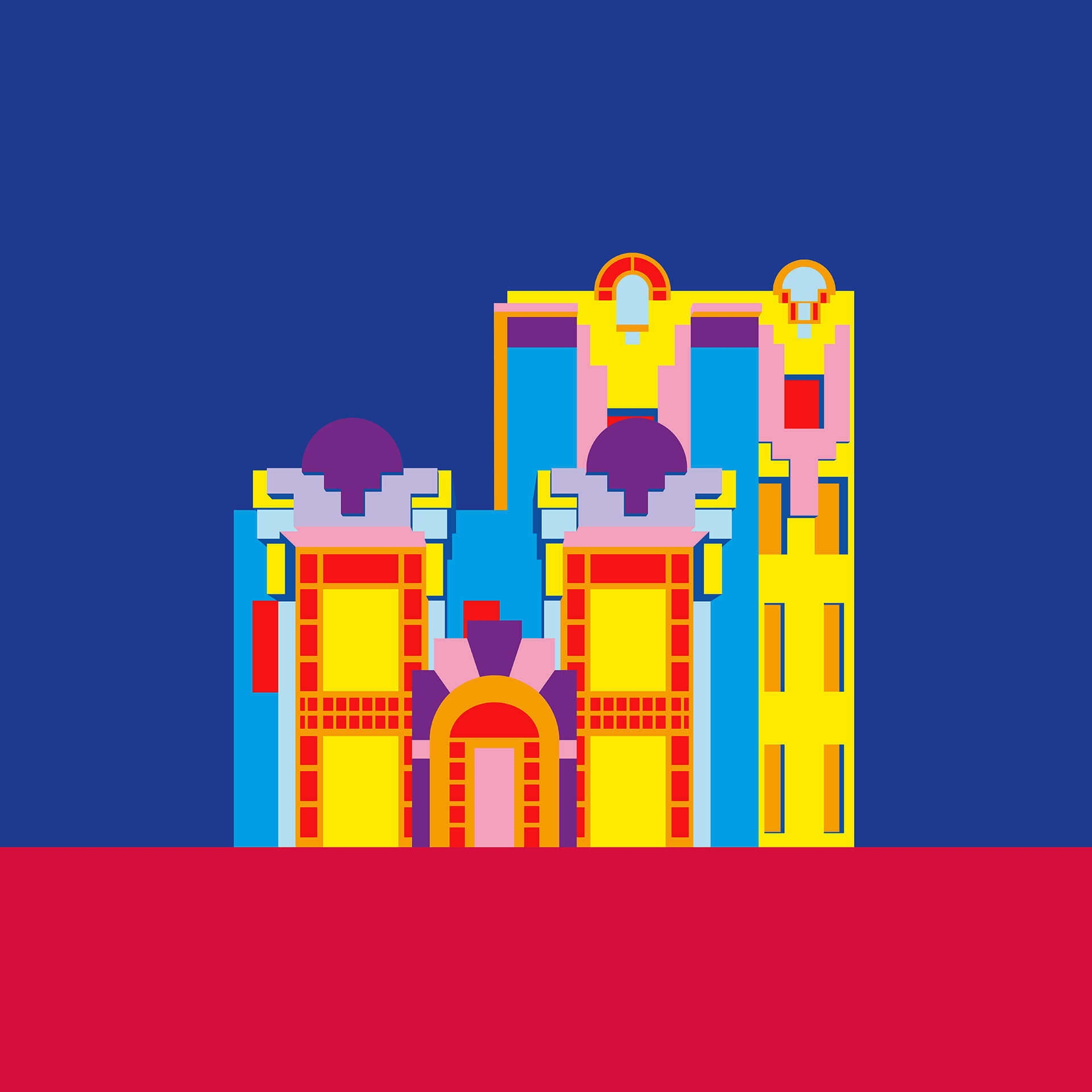
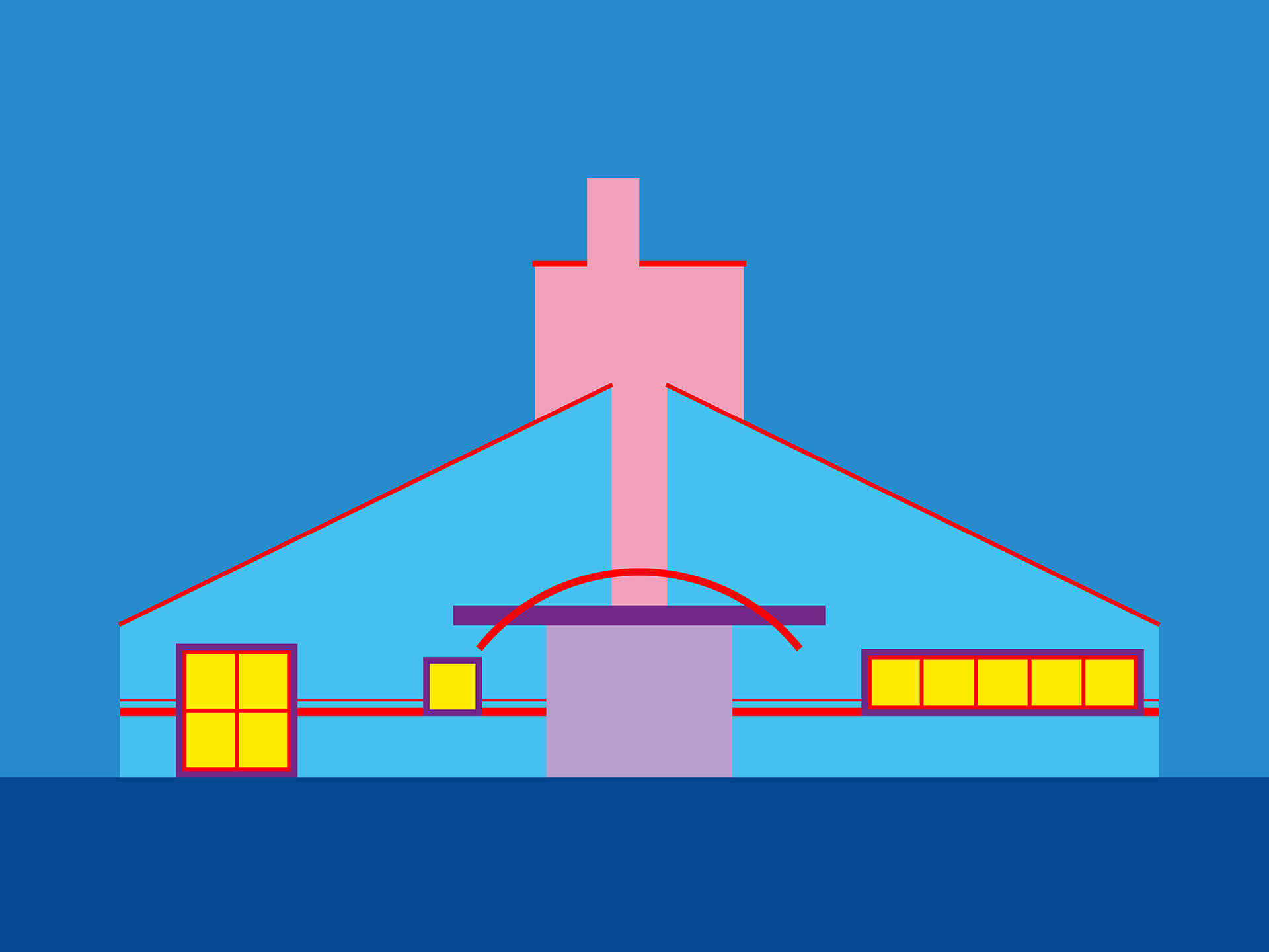
The primary school of thought professed by the postmodernist movement in architecture, the most non-definitive in terms of a stylistic language, was an induced sense of personalisation, of emancipation, and of freedom, breaking away from the somewhat rigid notions of modernism and more datedly, the classical style of architecture. Nobody but Charles Jencks, whose Cosmic House in London features in the collection, could have summed some of the themes from postmodernism better: hybrid expression, variable spaces with surprises, eclectic, semiotic articulation, and a variable, mixed aesthetic depending on context. Of course, by the very nature of 'postmodern' alluding to finding a unique language, each building and edifice different from the one that came before it, the stated themes aren’t the last word, but they may very well be taken to be the guiding principle in British designer Adam Nathaniel Furman's vibrant illustrations. Coupled with an obvious fascination with these 20th century structures, Furman finds an outlet to showcase his intense love for everything architecture. The result is a motley visual odyssey, a confluence of styles, and a celebration of incredible detail, all in Furman’s now near signature, varicoloured palette.
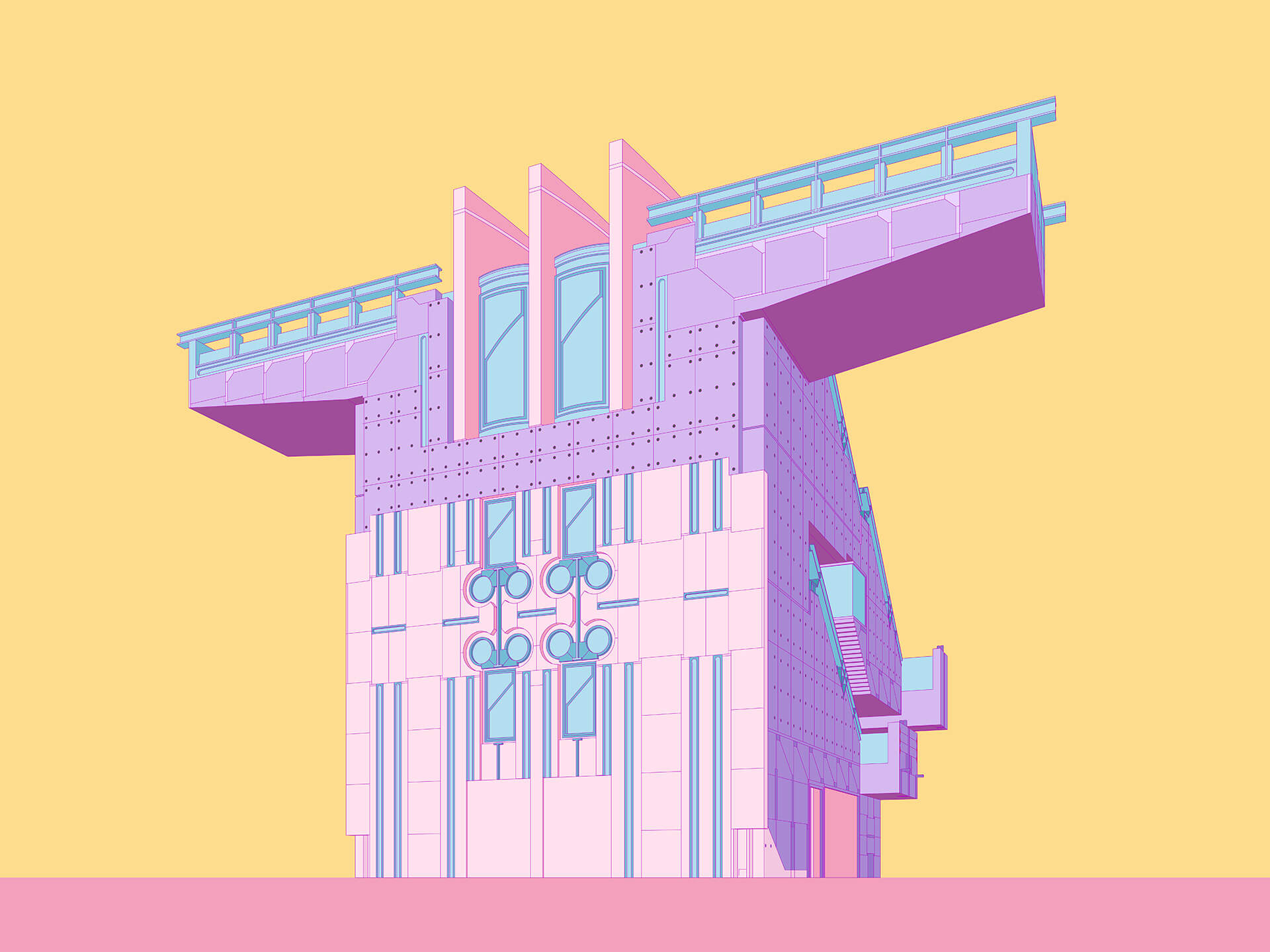
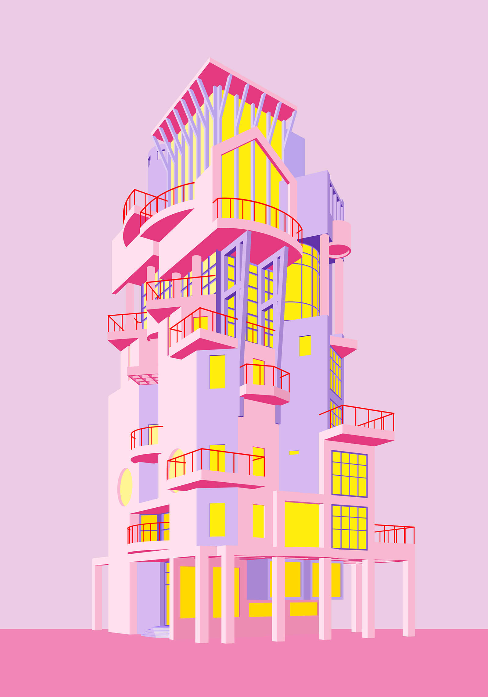
Reflecting the very spirit of the movement, Furman's illustrations, and indirectly his curation of the most iconic postmodern structures gracing that part of the world, aren’t set to a mould. It is the most fascinating detail for him - from a column detail, to a facade design element, to the form, its elevation, or even the queerness of the building in one case - that becomes his illustrative muse. Staged solitarily against a single hue and sans its principal occupiers, each of the buildings in Furman’s spirited collection comes alive in a form that is as raw in its lines as cosmetic as it is in composition. Even in inimitable style, the love for the latent stroke shines through.
STIR interacts with Adam Nathaniel Furman on his obsession with PoMo, his process of choosing and illustrating these structures, and where he plans to go next with his vivid tribute to a style of architecture not entirely foregone.
Anmol Ahuja: What is the criteria for the buildings you chose to illustrate in this series?
Adam Nathaniel Furman: It is a combination of things, with the primary reason being that I must really like them a lot! However, they also need to potentially be “popular”, by which I mean that they are known by enough people to actually be bought by them. They are intended to be bought after all. The buildings also need to stand on their own, by which I mean they must be able to be illustrated as free-standing “objects'' in the illustrations, as they are meant to come across as souvenirs, which rules out some buildings that are too integrated into an existing street - townhouses for instance. I also illustrate buildings that are in danger from redevelopment or demolition, to help raise awareness. For instance the Thompson Center, Solpol. Now I am just working on an illustration to help raise awareness of the masterpiece that is Alban Gate in London, which is in imminent danger.

Anmol: Would you say that these illustrations represent your signature varicoloured style? Or, did you intend to try something different with the colour scheme here?
Adam: I don’t really have a style per se, but I do always use a lot of colours, and these illustrations are no exception. I am however here developing a more reduced mode of representation in which very complex designs (Postmodernism is known for having a “lot going on”!) are clarified in a relatively controlled palette of colours, and all lines are removed, so the artworks are mostly created through blocks of colour, no shading or shadows, and relatively few, bold colours. This is a method of drawing that I have taken forward through new designs in my NFT project designing a city building by building, which uses the same bold block-colour approach.
Anmol: Kindly shed some light on how the series came about. What did you originally intend with this series of illustrations?
Adam: I was struggling a little bit during the third British lockdown. I usually love being out in cities, looking at buildings, sketching what I see, taking pictures, soaking up all the ornament and details; it really gives me life. This wasn’t possible for an extended period, and so I started studying buildings I loved online and through books, and I began sketching them that way. Taking it one step further, I decided to model some of them in detail in digital 3D files, a process I really enjoyed. It wasn’t quite like being in the street sketching, but I did feel like I could get close to the buildings. After a few of these, I had the idea to use my merchandise connections to turn them into a range of merch with illustrations that would share the joy I felt from these buildings, and from the process of drawing and appreciating them, the series was born. Initially, it was just a trial, a few items within my broader merch collection, but soon the response was so strong that I grew the collection, and had to essentially make a separate website for them.
Anmol: There are no humans in the illustrations; architecture and composition take centrestage, rendering all the illustrations a uniform sense of scale. Is that deliberate?
Adam: Yes it is. I never have people in my drawings, renders, or illustrations, unless I am forced to by a client, and even then I push back as hard as I can. I absolutely love how eloquent architecture, design and space can be, and my judge of a successful design is when it speaks equally eloquently of human inhabitation without the need for people in the view: something like the opposite of the banal render full of people doing exciting things, which is what I see so often in architecture. The sense of scale is also deliberate; I like to think of buildings as much as objects of the imagination as real things, something like souvenirs: eloquent embodiments of the best aspects of reality reduced into a powerful distillation. This means that buildings, when represented in my work, always have the quality of an object, a toy, a souvenir… a skyscraper becomes a teapot, and a mug an office building!

Anmol: The drawings are minimal in line work, while at the same time very vibrant in expression. Does that describe what you were going for?
Adam: Yes absolutely, the designs are often rather complex, and I wanted to turn them into representations that are as clear and as direct as possible…
Anmol: Describe your process of coming up with these illustrations. How iterative was it?
Adam: I sketch by hand, then I move into Rhino, and I work them up in 3D. Then I move into Illustrator and use a colour palette that I have developed for the project, which, for instance, looks good on mugs (a special kind of ink), on prints, on tote bags and cushions (fabric print) etc.
Anmol: What is the one emotion or thought you want viewers to have while looking at your illustrations of these icons?
Adam: A luscious pleasure in architecture. I genuinely love architecture so much, and in everything I do, I really want to spread appreciation of buildings that people otherwise might not enjoy in the world around them, and show how just by looking up, reconsidering your prejudices, your world gets that bit brighter.
Anmol: Do you plan to sell these as NFTs? What do you think about the latest NFT boom? How has it affected your way and style of work, and how do you think artists and designers can use it best?
Adam: Yes, I am indeed going to offer these as NFTs in the near future. I think NFTs are extremely important, and are an absolutely revolutionary development in the creative world, possibly as big as the introduction of commercially available oil, watercolour and then acrylic paints in the 19th and 20th century. It has suddenly meant that designers and artists can actually make a living from digital work, or rather/also, can make money from their work by digitising it. Not only that, they can access vast international markets of buyers easily, and get a percentage of onward secondary sales because royalties are built into the smart contracts.
by Pranjal Maheshwari Jul 14, 2026
Taking a closer look at the comprehensive retrospective at the Vitra Schaudepot in Weil am Rhein, STIR explores the enduring relevance of the 20th-century designer.
by Anmol Ahuja Jul 13, 2026
An inflatable chair, a rocking bench, an angled, adjustable floor lamp and artistic textiles, among others, round out IKEA’s 10th PS collection, built around ‘playful functionality’.
by Pranjal Maheshwari Jul 06, 2026
Using hanji paper and stitches, Seoul-based MANO Design Studio channels the Korean concept of yeobaek-mi in a recent lamp series to restore 'thingness' to design through craft.
by Bansari Paghdar Jul 04, 2026
Designed by the Berlin-based firm, the vibrant renovation of an apartment features dramatic sculptures and wave-like forms cut into walls and furnitures.
 surprise me!

make your fridays matter
SUBSCRIBEmake your fridays matter with a well-read weekend
Enter your details to sign in
Don’t have an account?
Sign upOr you can sign in with
a single account for all
STIR platforms
All your bookmarks will be available across all your devices.
Stay STIRred
Already have an account?
Sign inOr you can sign up with
Tap on things that interests you.
Select the Conversation Category you would like to watch
Please enter your details and click submit.
Enter the 6-digit code sent at
Verification link sent to check your inbox or spam folder to complete sign up process


Adam Nathaniel Furman's 'Postmodern Icons' is a visual motley of colour and romp
by Anmol Ahuja | Published on : Feb 24, 2022


 Sign in with email
What do you think?