


Architecture16 mins. read
Books on architecture and design coordinating discourse and knowledge
by Jincy IypeDec 12, 2023
•make your fridays matter with a well-read weekend
by Bansari PaghdarPublished on : Dec 21, 2024
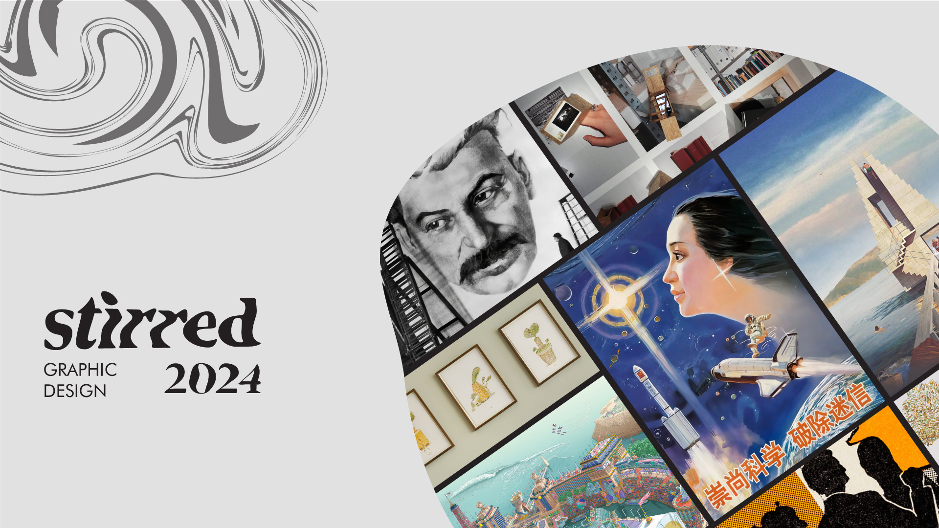
Visual design as a means of communication and expression has been essential in facilitating a comprehensible, immersive and memorable experience for viewers. From analogue mediums such as architectural drawings, pamphlets and posters, models, sketches and paintings, to contemporary mediums using digital technology including typeface designs, digital illustrations and data visualisations, visual design and communication have enormously evolved over the years. However, despite the growing importance of digital design in recent years, one cannot overlook the nostalgia, freedom and boundless possibilities the ‘traditional’ mediums carry. Different as they may be, it is precisely their distinction—and at opportune moments, their coalition into an exciting hybrid—that both mediums continue to coexist in a looming digital age, catering to multifarious needs and preferences. Recalling the best of 2024, STIR revisits six of the most remarkable graphic design projects, exhibitions and publishings, embodying innovation, authenticity and a cohesive visual identity.
1. Nature/Architecture. Follies, Shelters, Places of Decompression by Ugo La Pietra
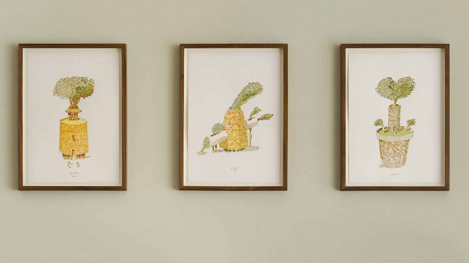
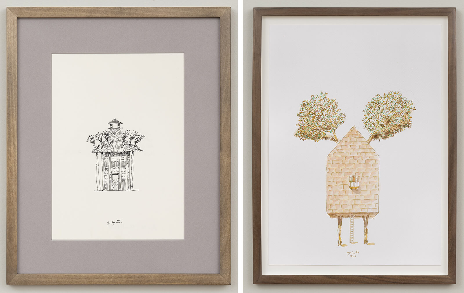
Curated by Piero Tomassoni, the radical Italian designer and architect Ugo La Pietra’s solo exhibition, Nature/Architecture. Follies, Shelters, Places of Decompression at Artvisor in London, explored the dichotomous relationship between nature and architecture. La Pietra outlined himself as a ‘researcher in the system of communication and visual arts’, as his research on the interaction between individuals and architecture informed the exhibition. Humorously addressing nature’s relationship with built environments and how they struggle to coexist, the illustrations underlined contemporary architecture’s superficial and gimmicky approach towards integrating greenery. Through two series of works, the Forest in the City, which draws on the residential architecture of Milan’s ‘Vertical Forest’ and the Gazebos—featuring conceptual 'places of decompression' that become follies—he underlines the inadequacy of a fair few green architecture practices.
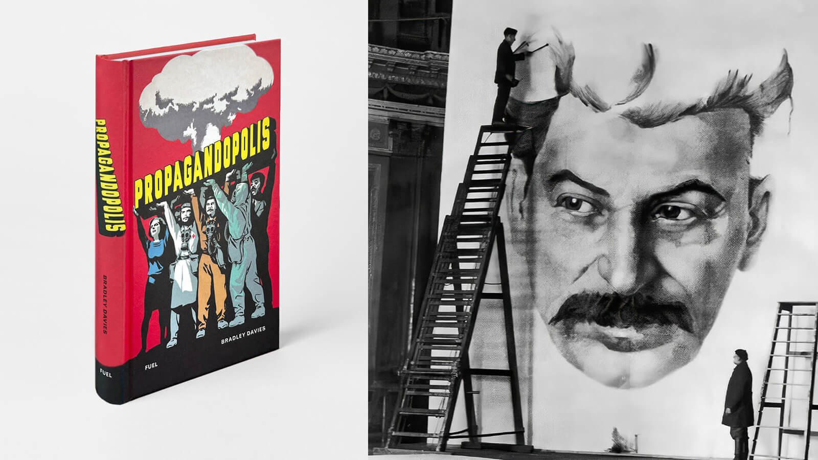
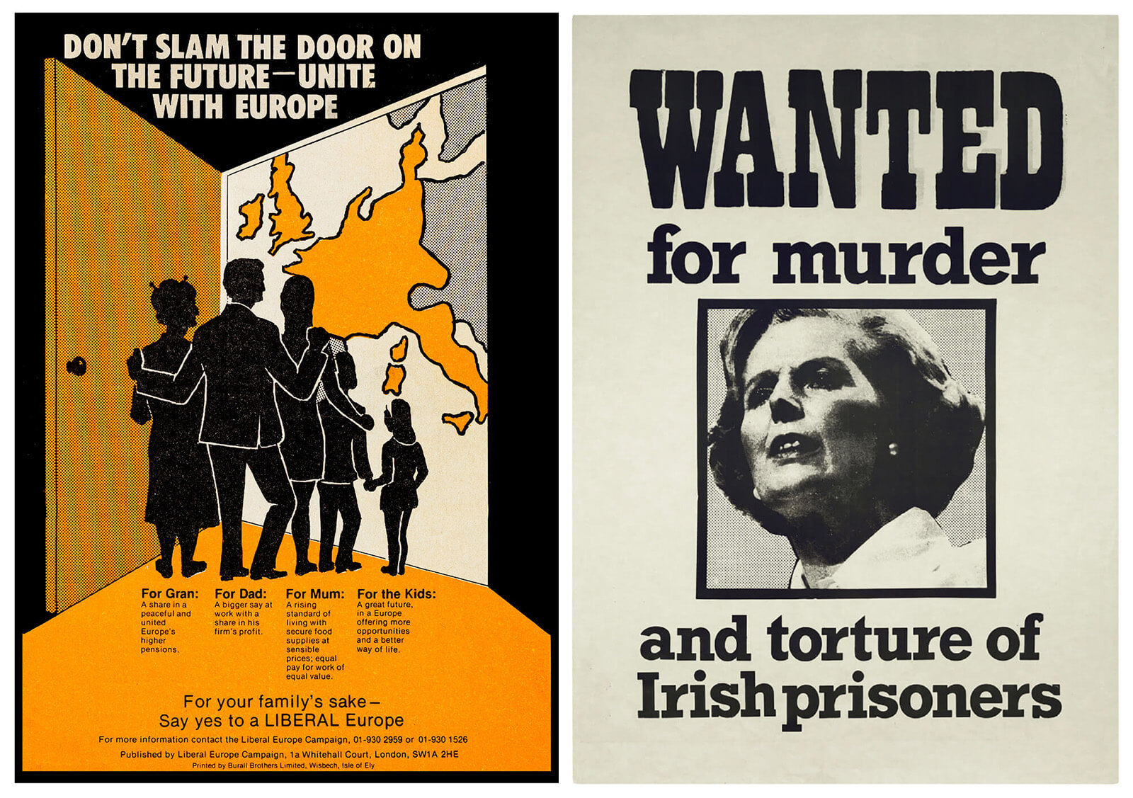
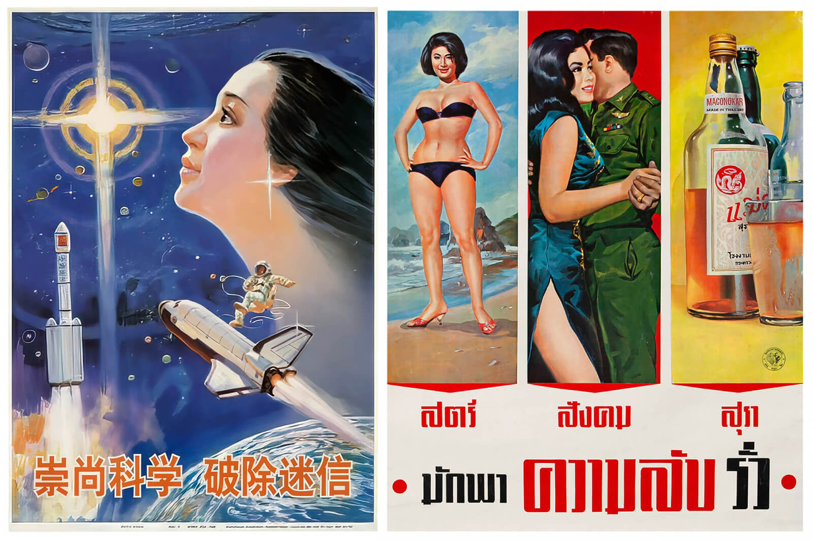
FUEL's publication Propagandopolis presented a collection of unusual, shocking and controversial graphic designs—posters, pamphlets, murals and billboards—hailing from several countries and spanning decades. The book features distinct art styles used to depict themes ranging from communism and Soviet Union ideologies to science and healthcare, with the intent of strategic mass manipulation. Bringing the stories behind the artworks to the readers, Propagandopolis revealed the grand designs of governments, organisations and individuals that attempted to steer public opinion by rounding up support, provoking thought, evoking emotions and instilling fear. In the book review, STIR drew parallels and encouraged discourse on the relevance of such designs in the present day, while examining the popularity and influence of propaganda artworks in their respective eras.
3. Jiminie Ha’s trailblazing graphic designs
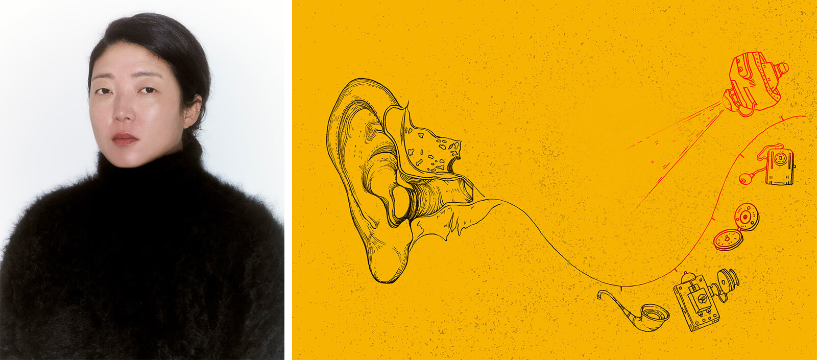
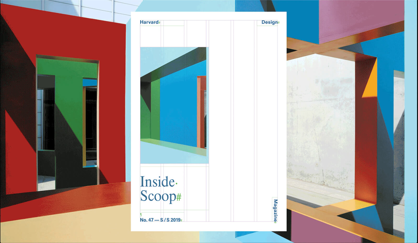
In a conversation with New York-based visual storyteller Jiminie Ha earlier this year, STIR delved into her works and role as the senior director of graphic design at the Guggenheim Museum. Ha’s unconventional design approach was discussed through her then-latest book design for The Sterns Are Listening, inspired by punk culture, featuring bold font styles and striking colours, and embodied the themes of the book including complex familial dynamics and stigma surrounding ageing. The designer also shared the multidisciplinary influences behind her works while shedding light on how her graphic arts experience and artistic collaborations informed the curatorial approach for the museum exhibitions.
4. Paris 2024 posters by Ugo Gattoni
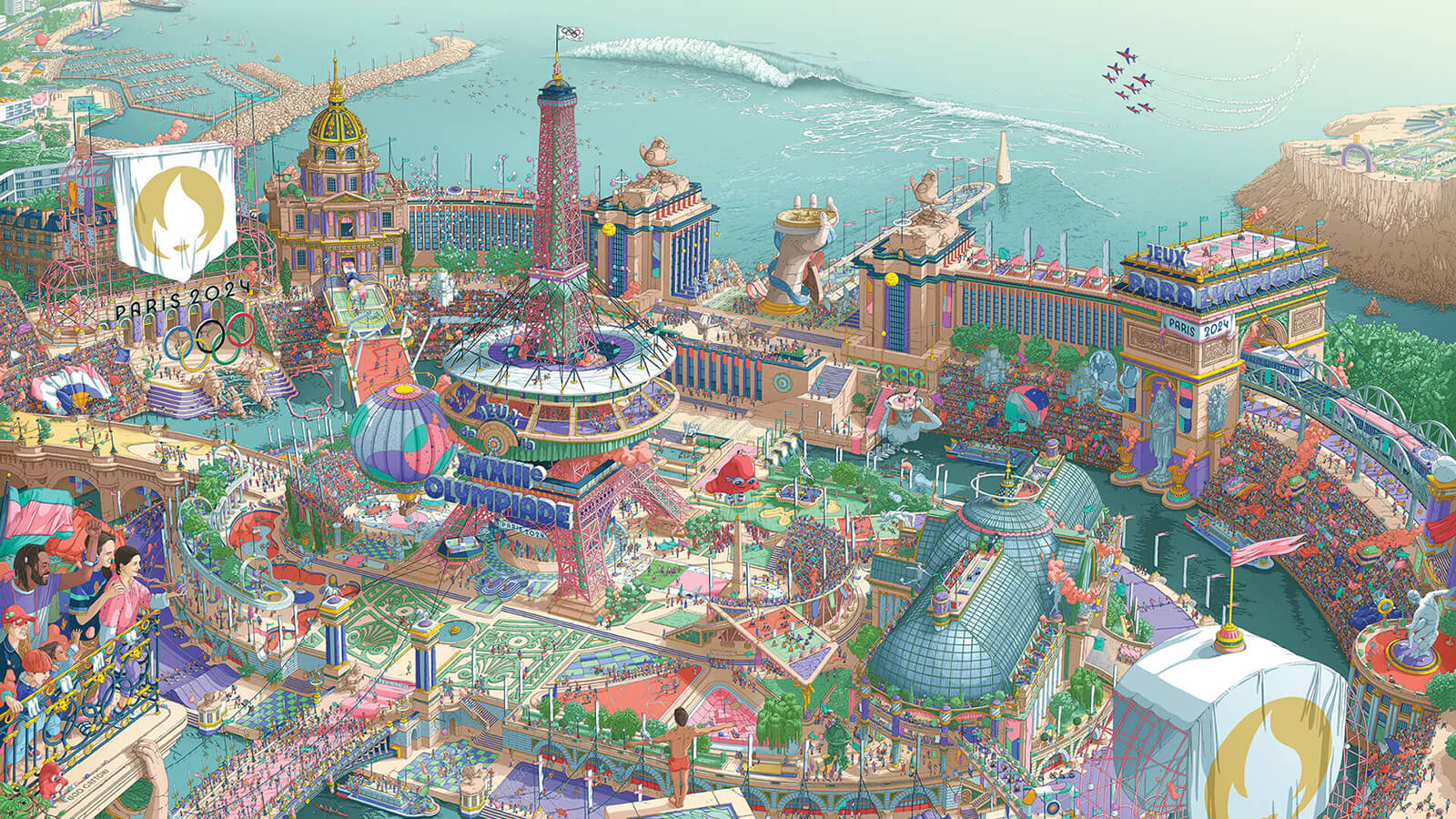
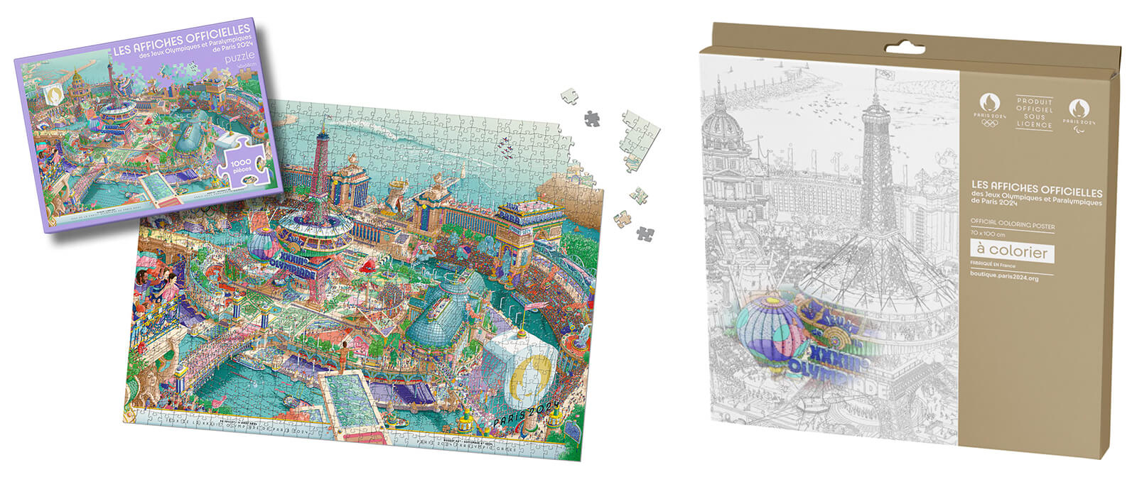
In anticipation of the Paris Olympics 2024, French artist Ugo Gattoni released a series of surreal posters that conveyed the tale of the city and the spirit of the games. Introduced in 1912 as promotional media, creating artworks for the games eventually transformed into an honoured tradition, for which renowned artists started getting commissioned. The quality, detail and art style of the posters advanced over time, with this year’s digital art being vibrant, detail-oriented and a fantastical visualisation of a utopian Paris. Six months of rigorous work went into creating the immersive microcosm of the poster, representing a vibrant fusion of the city’s culture and the sports event through various activities illustrated around iconic landmarks.
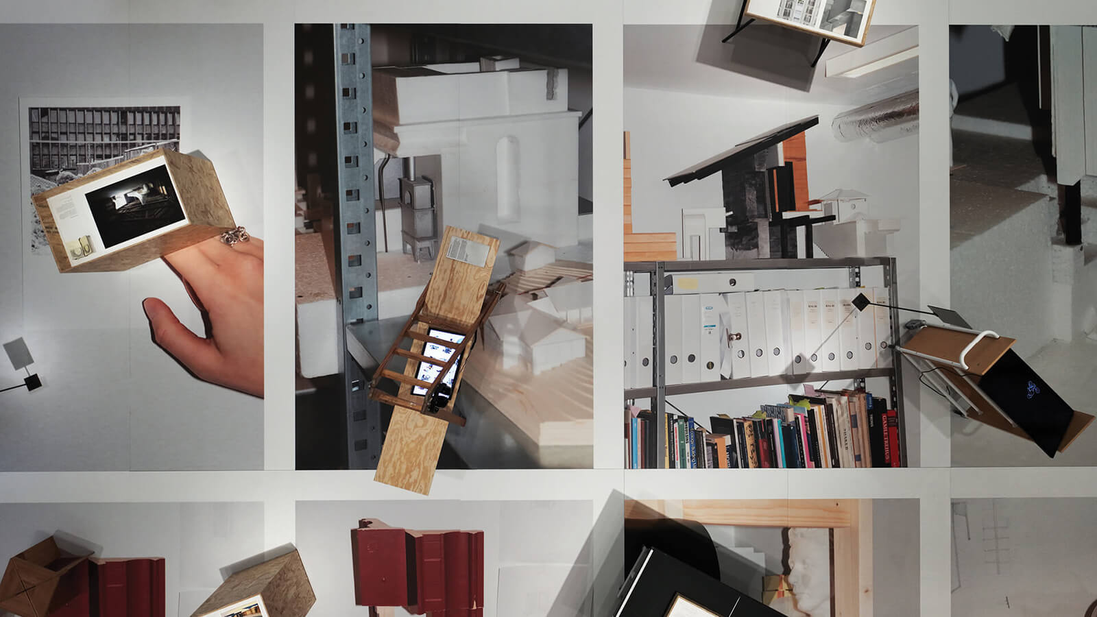
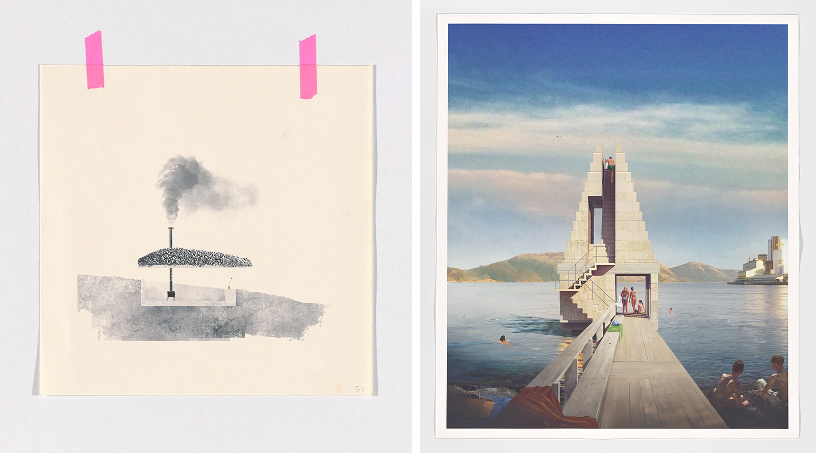
Norway’s National Museum of Art, Architecture and Design earlier this year showcased Hand and Machine. Architectural drawings, an exhibition comprising architectural drawings by several architects that explored analogue means of expression between 2008-2023, during which several global crises concurrently emerged. The exhibition also featured architectural photography, along with drawings to celebrate the simple joys of traditional media, such as free-form sketching, which created an informal and inviting atmosphere for the visitors. The illustrations, while being critical of computer-generated visual imagery and the popularity of digital and social media, embraced the freedom and authenticity brought by more traditional, hand-led mediums.
6. ‘Shapes of Data’ by Adrien Jacquemet and Basile Jesset
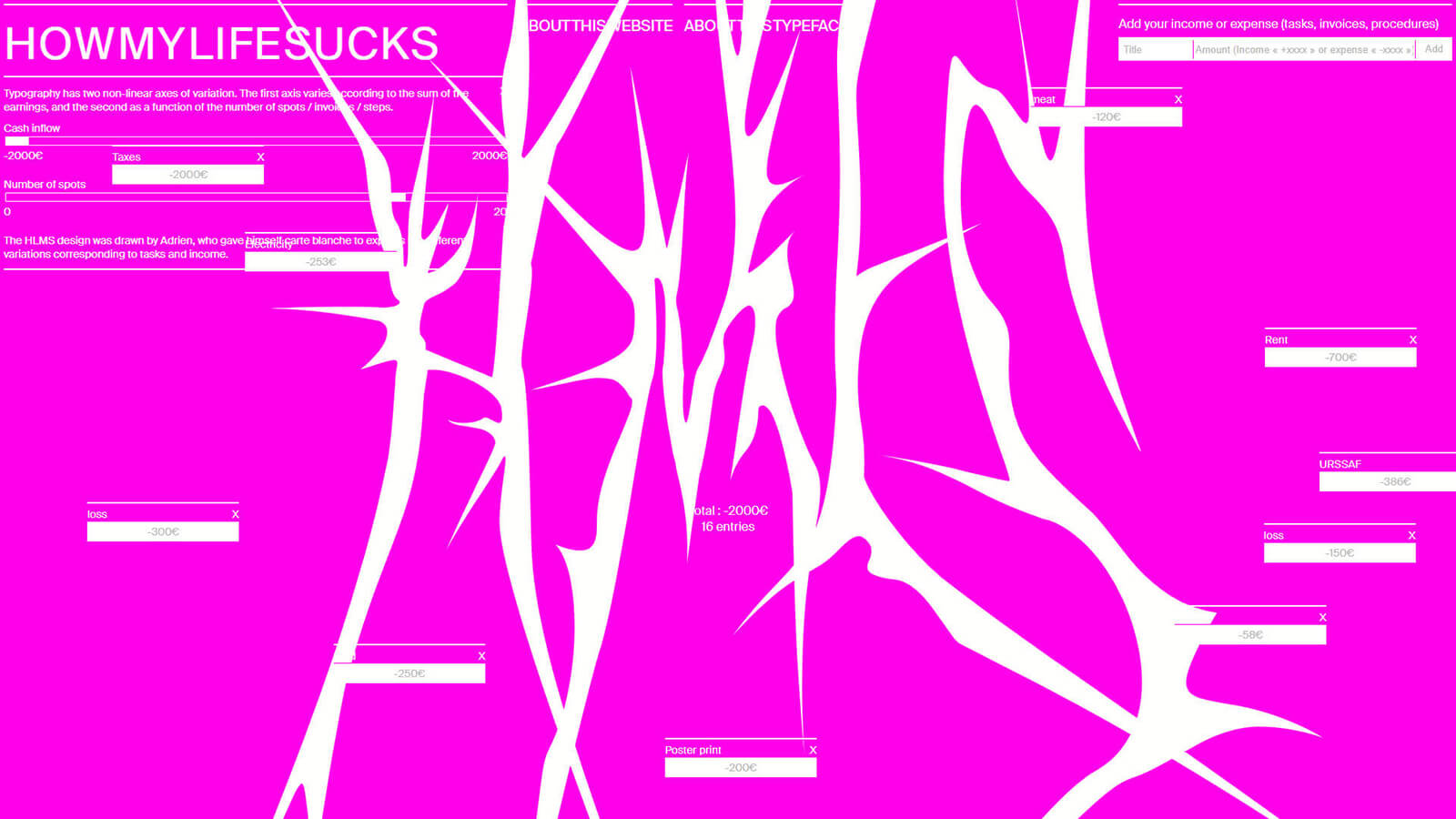
Perhaps one of the most thorough and innovative visual design undertakings this year was Shapes of Data, a data visualisation project by graphic designer Adrien Jacquemet and web developer Basile Jesset, which aimed to add more value to data and establish a unique design language. In a conversation with STIR, Jacquemet and Jesset briefly went over their previous graphic and typeface design projects, such as Speaking time for women and men on television and radio, Air Quality and How My Life Sucks, followed by explaining the entire process behind Shapes of Data, including its inception, approach and intent. Arguing that there is no objective way of data representation, the duo underlined the importance of considering the cultural contexts and collaborating with native designers to whom the respective data sets belong.
STIRred 2024 wraps up the year with curated compilations of our expansive art, architecture and design coverage at STIR this year. Did your favourites make the list? Tell us in the comments!

by Pranjal Maheshwari Jul 14, 2026
Using salvaged wood, wild earth, copper remnants and more, the exhibition at ICA San Diego / North brings together 20 regional creatives exploring regenerative approaches to making.
by Pranjal Maheshwari Jul 14, 2026
Taking a closer look at the comprehensive retrospective at the Vitra Schaudepot in Weil am Rhein, STIR explores the enduring relevance of the 20th-century designer.
by Anmol Ahuja Jul 13, 2026
An inflatable chair, a rocking bench, an angled, adjustable floor lamp and artistic textiles, among others, round out IKEA’s 10th PS collection, built around ‘playful functionality’.
by Pranjal Maheshwari Jul 06, 2026
Using hanji paper and stitches, Seoul-based MANO Design Studio channels the Korean concept of yeobaek-mi in a recent lamp series to restore 'thingness' to design through craft.
 surprise me!

make your fridays matter
SUBSCRIBEmake your fridays matter with a well-read weekend
Enter your details to sign in
Don’t have an account?
Sign upOr you can sign in with
a single account for all
STIR platforms
All your bookmarks will be available across all your devices.
Stay STIRred
Already have an account?
Sign inOr you can sign up with
Tap on things that interests you.
Select the Conversation Category you would like to watch
Please enter your details and click submit.
Enter the 6-digit code sent at
Verification link sent to check your inbox or spam folder to complete sign up process


Dot, blob, line and form: Visual designs from 2024 transcending medium and muse
by Bansari Paghdar | Published on : Dec 21, 2024


 Sign in with email
What do you think?