


Design08 mins. read
Making writing forms and forms of writing intelligible with Graphic Languages
by Mrinmayee BhootAug 28, 2025
•make your fridays matter with a well-read weekend
by Mrinmayee BhootPublished on : Jun 04, 2026
It matters what stories make worlds, what worlds make stories.
- Donna Haraway, Staying with the Trouble (2016)
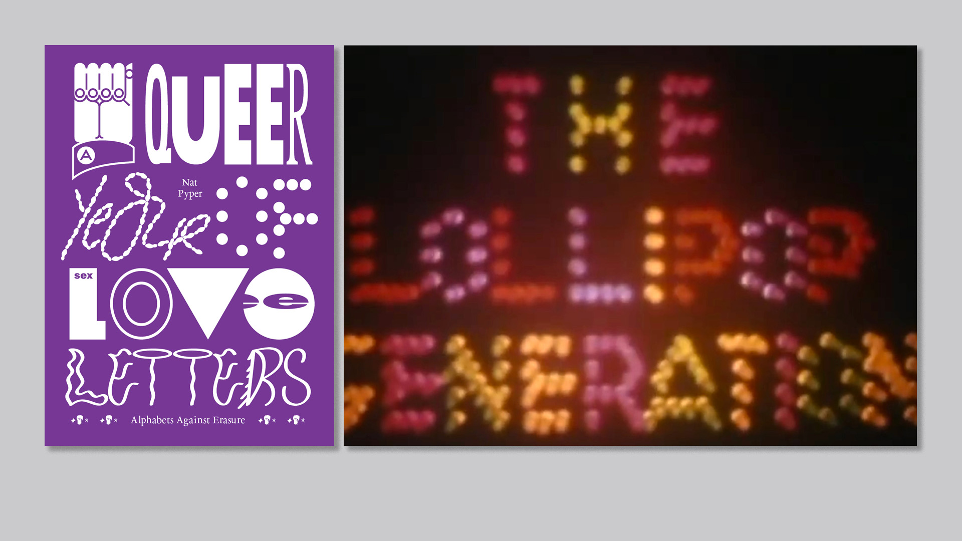
Feminist philosopher Donna Haraway’s oft-quoted line, abstracted from her book on the work of sustaining kinships across species, offers a particular maxim for queering how we think of words. Haraway insists, as all storytellers know, that the words we use are tangible. Hence, her repetition of matter—here both as something significant and the stuff that makes worlds. It’s in this spirit that Nat Pyper, who styles themselves as an alphabet artist, conceptualised their book on queer type design, A Queer Year of Love Letters (2025). As Pyper notes in the introduction to the volume, the book is an attempt to memorialise the lives and work of countercultural queers, giving them new life through letterforms. As they note, the project “[makes] the act of remembering these overlooked and illegitimate histories accessible to other people, as easy as typing.” Comprising a series of fonts whose letterforms derive from historical queer figures Pyper discovered and wanted to spotlight, the project makes visible overlooked biographies presenting archival material, graphic design and contributions from various queer artists and writers.
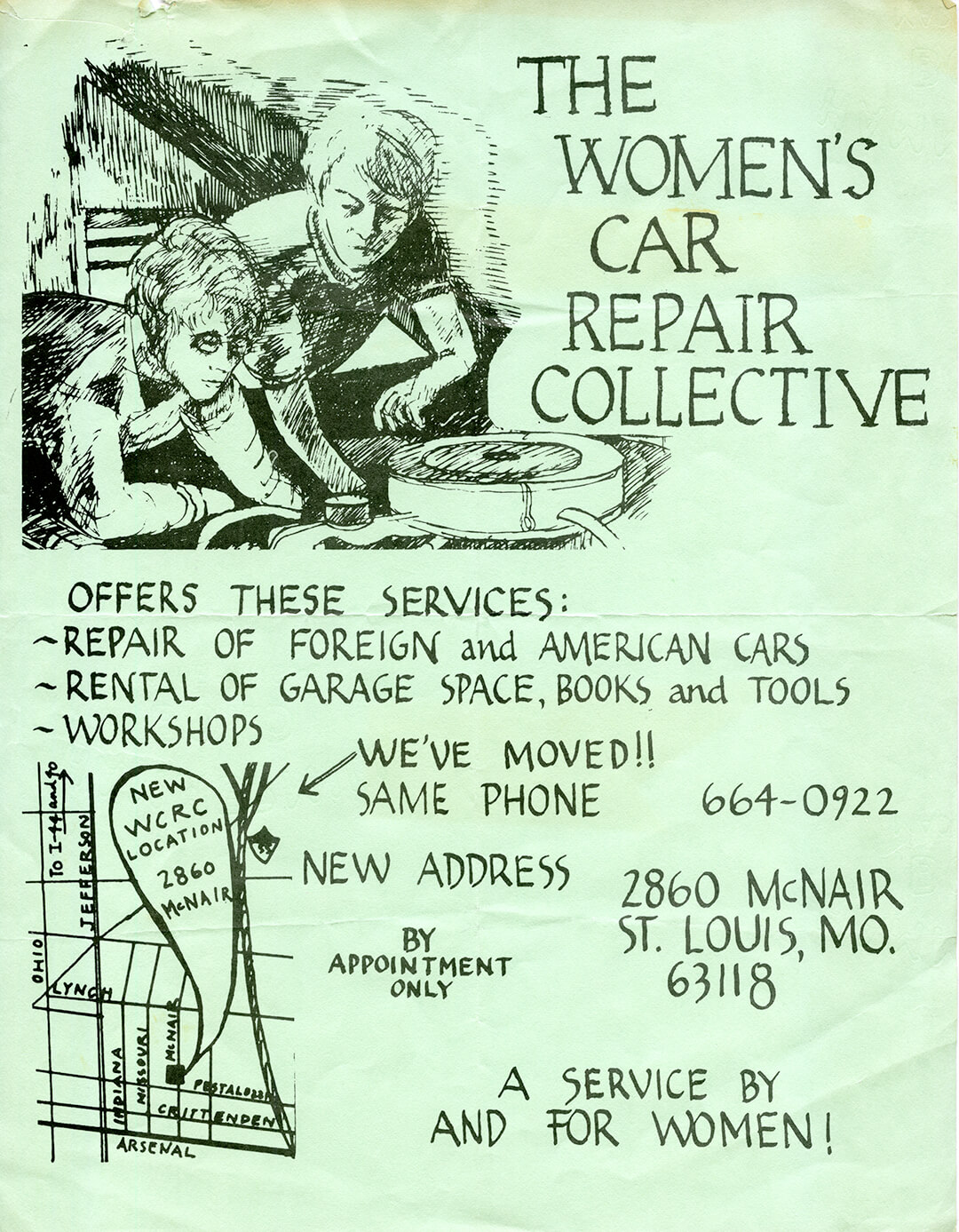
Over the course of six years—even though the title proclaims Pyper’s original plan—the graphic designer documented and digitised the fonts of various queer activist groups they discovered during their research. The depth of research and attention given to each font is apparent in Pyper’s notes on each of them. They detail not only where the font originates from, but also present the stories of each person that Pyper hoped to remember. Included in the book are the histories of G. B. Jones, an artist and experimental filmmaker with ties to the Toronto queer punk scene; Robert Ford, publisher of THING magazine, a Black queer publication based in Chicago; Los Angeles punk synth musician and poet Gerardo Velázquez; and the Goddess Bunny, a tap-dancing trans drag diva who died in January 2021 from COVID-19 at the age of 61. Pyper has given new life to collectives such as the Women’s Car Repair Collective (an initiative organised by the Lesbian Alliance of St. Louis, Missouri) and Third World Gay Revolution, an offshoot of the Gay Liberation Front that formed in the aftermath of the Stonewall Riots in New York. On thinking queerly about typography, Pyper elucidates on the position in a conversation with STIR, “Paul Soulellis cites a conversation we had with Nicole Killian in his essay, What is queer typography? where he writes, ‘There is no queer typography, only queer acts of reading and writing.’ I love this framing because it shifts queerness from something static to something active.”
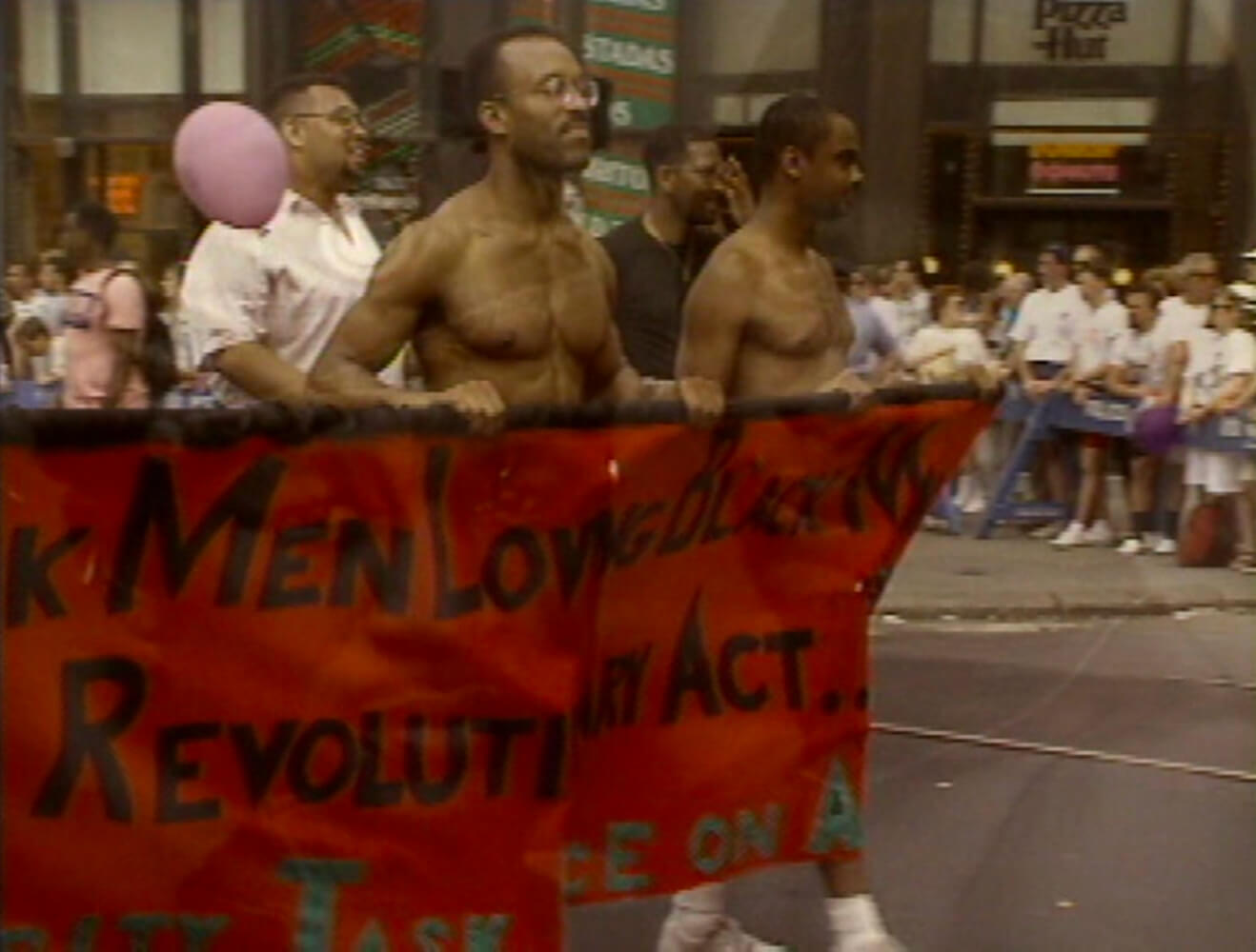
In documenting the typographic styles used by the activists for flyers, magazines and protest signs (perhaps the most ephemeral of the archival material), Pyper presents a distinct set of visual designs. Some lean towards the shapely forms of inked handwriting (such as the one used for a flyer for the Women’s Car Repair Collective), some appear scrawled hastily or even languidly by hand, while some are distinctly punk in appearance, like the irregular lines of poet Velazquez’s flyers, arranged haphazardly in the suggestion of an alphabet’s shape. Each is a ‘time machine’ according to Pyper, carrying the little-known and unexplored histories of resistance by LGBTQIA+ communities to a present where rising conservative, right-wing sentiments and laws against the recognition of queer realities have reignited an atmosphere of dread, onward to unknown futures. Words don’t simply serve the function of language; they do things in the world, as J. L. Austin points out in How to Do Things With Words (1962), echoing Haraway’s sage advice. In Pyper’s estimation, the words and the forms they take are an attempt at a clandestine lineage, a queer kinship through the act of writing.
Explaining the focus on fonts for the project, Pyper writes, “Fonts have the capacity to contain a hefty amount of information within a tiny package. In under 100 kilobytes, an entire alphabet! In the font’s metadata, a manifesto!” This notion, of design as visual communication and more specifically, typography as a form of digital archiving system and carrier bag, is a critical adjunct to the preservation of queer histories and the legacy of protests for equal rights, representation, even merely visibility and acknowledgement. As designer Silas Munro notes in their contribution to O.U.R. (Open-Source Underexposed Reading), the signs, pamphlets, posters and other printed material created by queer designers were means to shift public opinion on queer social acceptance, designed for mass dissemination. Their visual language, shaped by collective struggle, was meant to sustain the momentum for political agitation against state violence, repression, denial of queer lived realities and societal ostracisation in the wake of the AIDS crisis. By emphasising the act of writing as a form of resistance and arguing that the graphic design was very much a part of this rhetoric, Pyper shifts our understanding of what graphic design can do.
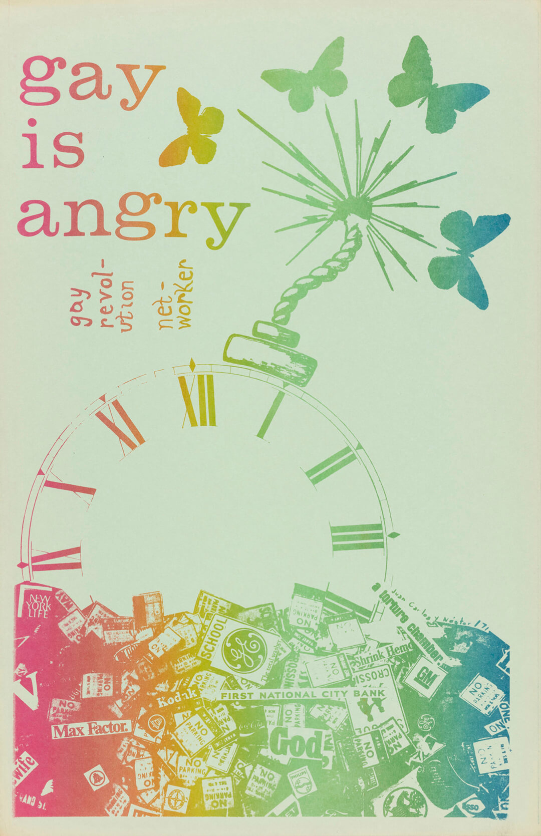
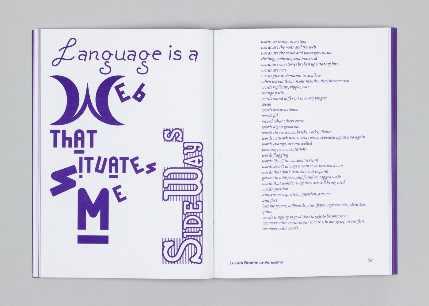
It’s that demand that Pyper hopes will be transmitted from writer to writer, from one screen to another, one wor(l)d to the next through their project. As Lukaza Branfman-Verissimo points out in their contribution to the volume, Gay is Angry, Words Give Us Demands to Swallow, “How do we change the system? We create our own systems, ways of being and orientations of support. We naturally become the networkers that spin words into re-oriented pathways of exchange and collective work.” It begins with the stories we tell.
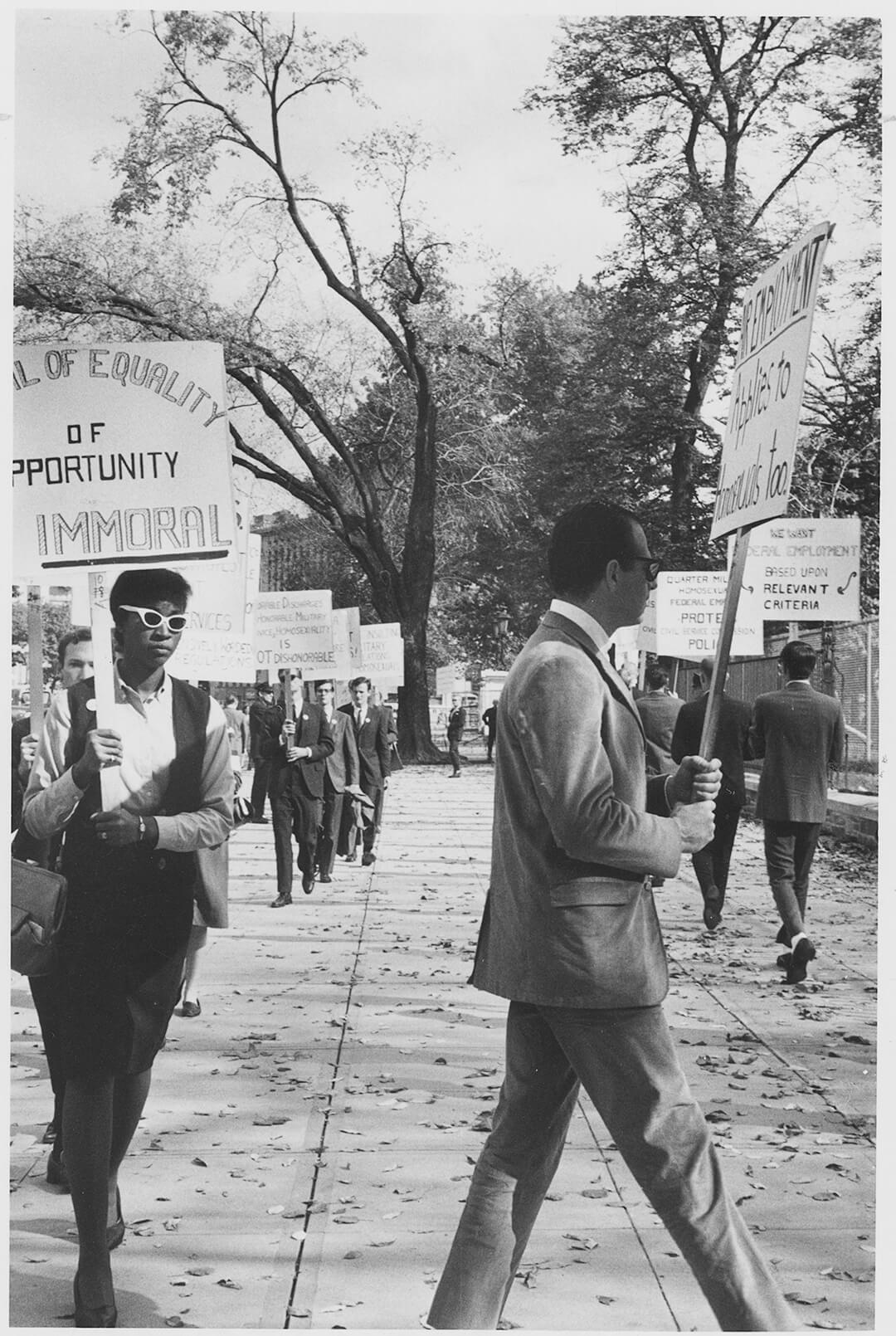
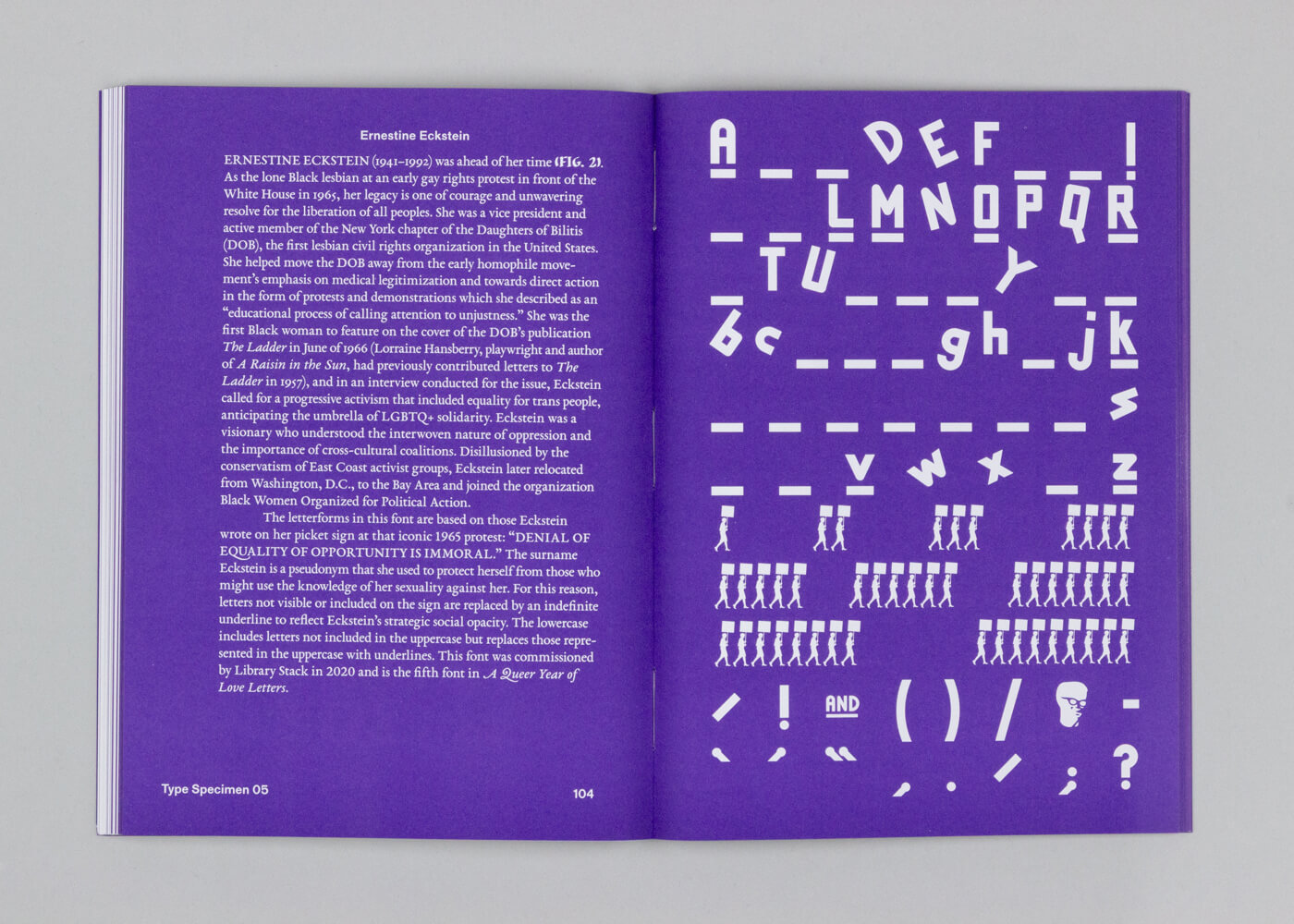
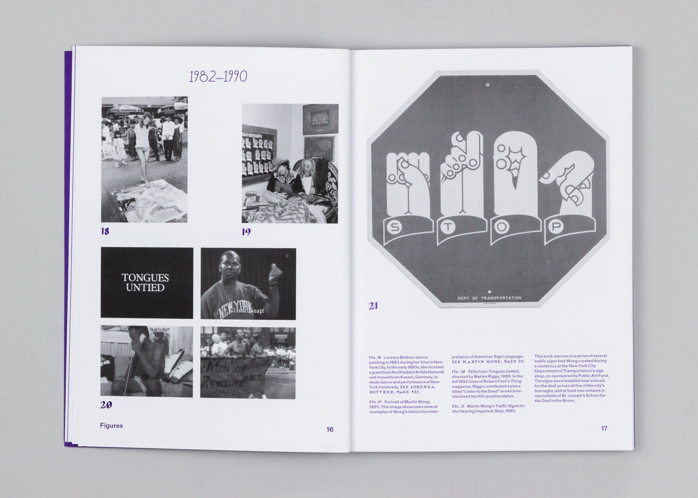
Pyper, through their project, gives Ernestine Eckstein, identified by them as the lone Black lesbian at an early gay rights protest in front of the White House in 1965, a new story to dwell in. The letterforms in the font dedicated to her are based on the words Eckstein wrote on her picket sign at that protest: “DENIAL OF EQUALITY OF OPPORTUNITY IS IMMORAL.” Velázquez’s militant, transgressive expression might have disintegrated were it not given new life by Pyper in a design that matches Velázquez’s anger visually. Similarly, Third World Gay Revolution’s manifesto, ‘Sixteen Point Platform and Program’ (its name and format echoing the Black Panther Party’s ‘Ten-Point Program’) in the Gay Liberation Front’s (GLF) newspaper Come Out! is resurrected in Pyper’s almost groovy, hand-drawn font design. Similarly analogue in appearance is the font inspired by trans artist Lorenza Böttner’s short documentary about her life and work called Lorenza, directed by Michael Stahlberg in 1991.
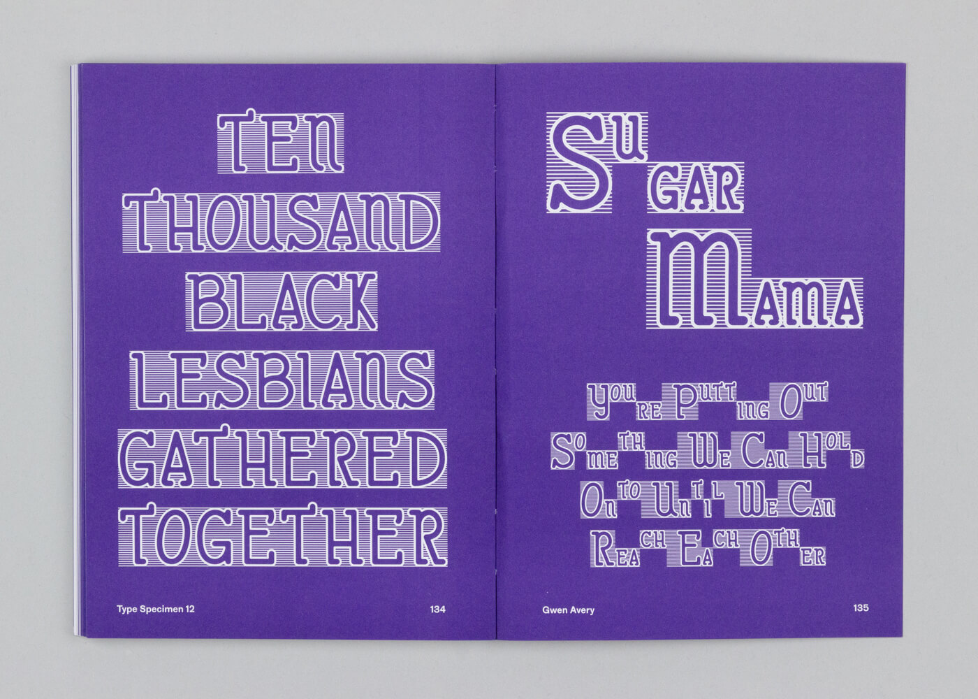
A particularly winsome inclusion is the font inspired by Moonstorm, a lesbian feminist magazine published by the Lesbian Alliance of St. Louis, Missouri. Emulating crescent moons for the letters, the font recreated by Pyper is taken from the magazine’s Spring 1977 issue. No font is similar to any other, but perhaps the most inventive is the one inspired by the poet Michiyo Fukaya. The uppercase letterforms, Pyper notes, are based on illustrations that were used across many issues of Commonwoman and accompanied an article titled ‘Michiyo’s Future Vision’. They depict women in different poses as stand-ins for letters.
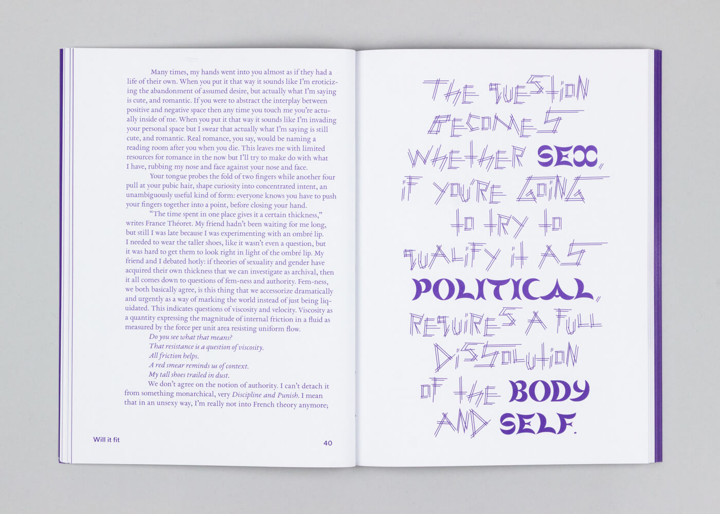
What changes when we decide to use these fonts? Admittedly, the visual language our words take does not, in the grand scheme of things, seem to bear much consequence. But to name them here, to remember their stories, to think with them is a vital act against their violation and subsequent erasure. That fonts too can be carrier bags of stories is a critical engagement with the sociopolitical dimensions of graphic design, as Pyper observes in their essay, Why I Write. “I also know that the act of writing, of rearranging the world into new combinations and sharing it with others, is deeply pleasurable,” they note in conversation. Speaking about writing and its role in their own practice of thinking about design, they continue in conversation, “For me, that pleasure comes from recognising that meaning is mutable and not fixed. Design, as an extension of writing and writing systems, knows that the meaning of a word is shaped by the form that it takes.”
It is we, after all, who decide what words we mobilise. And sometimes a font can become a subversive way to demonstrate defiance to the norm. A sea of signs held out. It does not matter where; they scream the same demand. FREE PALESTINE. CEASEFIRE NOW. Elsewhere, TRANS RIGHTS ARE HUMAN RIGHTS. We Will Not Be Erased. Scrawled angrily by hand, printed on paper of all sizes, these walls of text act as obstacles against authority that would otherwise silence them.
The letters, the words, the signs, the demands for a world built on mutual care, community and parity. They all signal the same thing: try as you might, we will not be forgotten. We will not go gently. Words are matter, tangible, dispersible, persisting. The words we use are fugitive. Our stories and realities will remain in them, like seeds waiting for the rain.

by Chahna Tank Jul 17, 2026
STIR speaks with the celebrated American graphic designer about the new retrospective publication by gestalten that chronicles the lesser-known world of his children's books.
by Chahna Tank Jul 16, 2026
STIR speaks with the Irish creative on his ongoing project reimagining the rigidity of nation states through myriad flag designs, probing identity, community and symbolism.
by Pranjal Maheshwari Jul 14, 2026
Using salvaged wood, wild earth, copper remnants and more, the exhibition at ICA San Diego / North brings together 20 regional creatives exploring regenerative approaches to making.
by Pranjal Maheshwari Jul 14, 2026
Taking a closer look at the comprehensive retrospective at the Vitra Schaudepot in Weil am Rhein, STIR explores the enduring relevance of the 20th-century designer.
 surprise me!

make your fridays matter
SUBSCRIBEmake your fridays matter with a well-read weekend
Enter your details to sign in
Don’t have an account?
Sign upOr you can sign in with
a single account for all
STIR platforms
All your bookmarks will be available across all your devices.
Stay STIRred
Already have an account?
Sign inOr you can sign up with
Tap on things that interests you.
Select the Conversation Category you would like to watch
Please enter your details and click submit.
Enter the 6-digit code sent at
Verification link sent to check your inbox or spam folder to complete sign up process


Nat Pyper’s carrier bags of fugitive stories with A Queer Year of Love Letters
by Mrinmayee Bhoot | Published on : Jun 04, 2026


 Sign in with email
What do you think?