Architecture11 mins. read
HouseEurope! wins the 2025 OBEL Award with its appeal to ‘Renovate, Don’t Speculate’
by Mrinmayee BhootJun 17, 2025



by Mrinmayee BhootPublished on : Oct 01, 2026
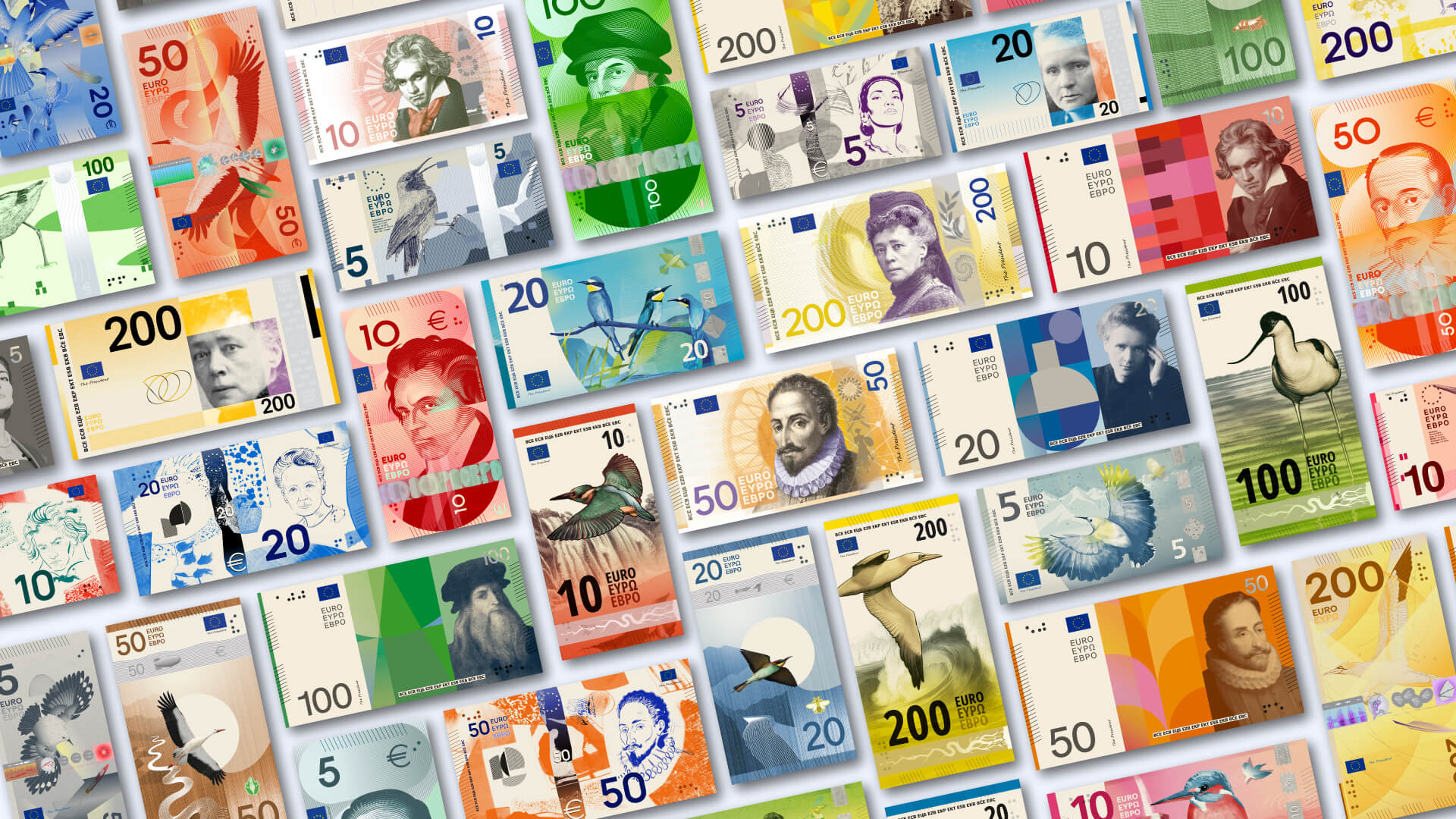
“Euro banknotes are more than a means of payment – they are one of the most tangible expressions of Europe,” Christine Lagarde, president of the European Central Bank (ECB), noted in a recent statement announcing the shortlisted proposals for the redesign of its paper currency. The 10 proposals by graphic designers and visual artists across Europe reimagine the Euro, doing away with the architectural motifs for the first time since the introduction of the banknotes in 2002. “Through designs that combine beauty and meaning, they will reinforce our shared identity,” Lagarde continued, emphasising the notion that the banknote conveys, in a concrete way, a sense of Europeanness. While flag designs might signal the collective identity of a people by communicating a mutual respect for and solidarity for a shared history, what could a banknote signify along similar lines? For instance, if the image of Mahatma Gandhi were replaced with the lotus (India’s national flower) on the country’s banknotes, would our identity as an Indian people shift, and if so, would it be based on the image projected? Could banknotes, like flags, signify shared memories and rituals?
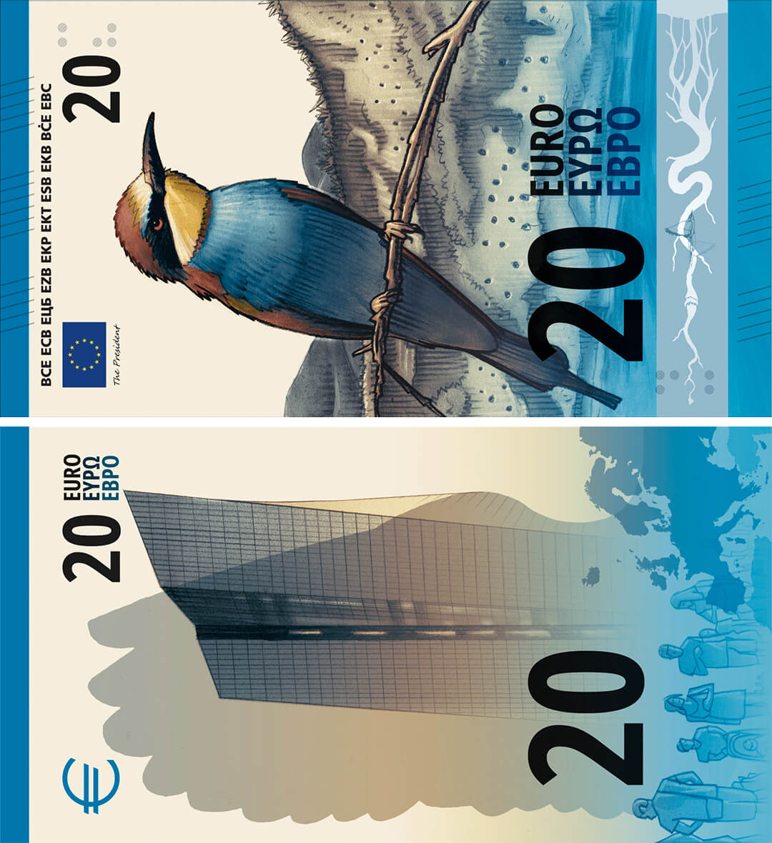
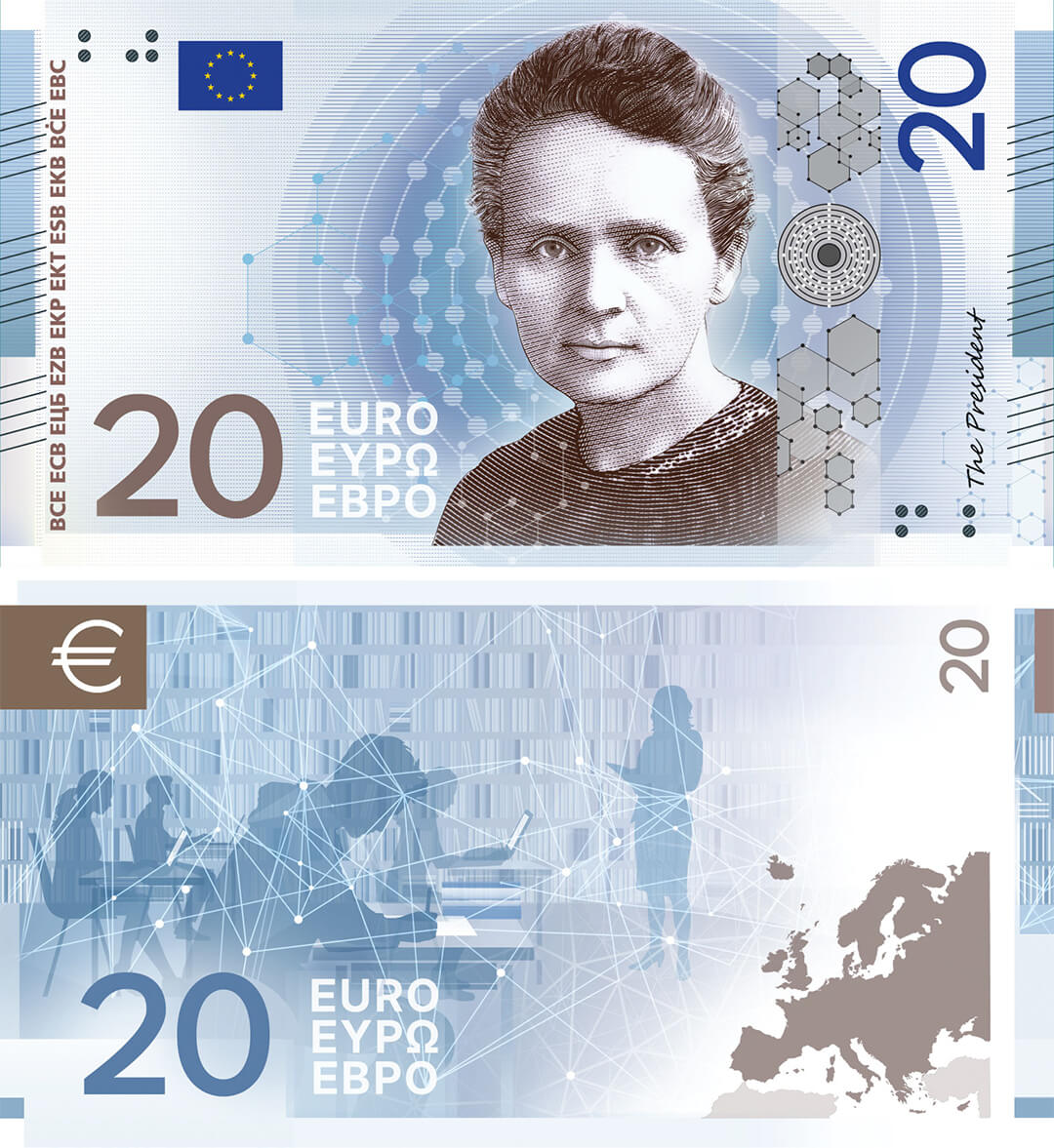
The redesign of the visual identity of the Euro presents an interesting case in response to these questions. The 10 shortlisted proposals mark a distinct break from the current visual language of the banknotes: they are more dynamic in expression and more vibrant. They look almost unreal. The shortlisted designs, by designers based in Finland, Germany, Spain and Greece, to name a few, were selected from over 1,200 applications reviewed by the ECB, of which 25 were invited to create design proposals. An independent jury of 21 experts in different fields, such as graphic design, communication, neuroscience and history, each nominated by a Euro area central bank, shortlisted the design proposals. These were then revealed to the public, who were invited to participate in a survey to pick the most popular design, which concluded on September 21, 2026. As the official ECB website notes, the winning design will be announced at the end of the year while the circulation of the notes themselves will only commence after 2027.
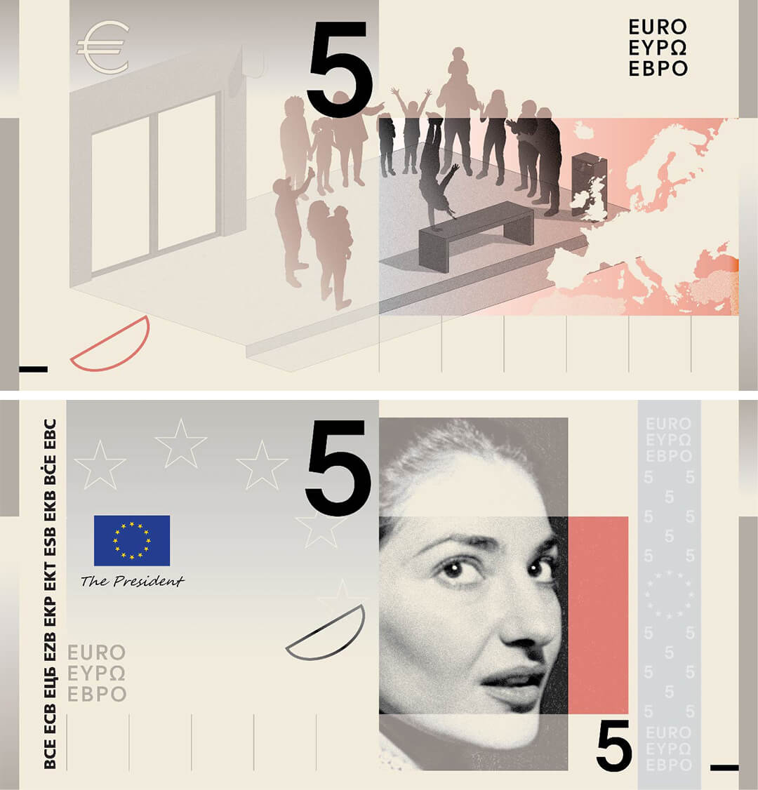
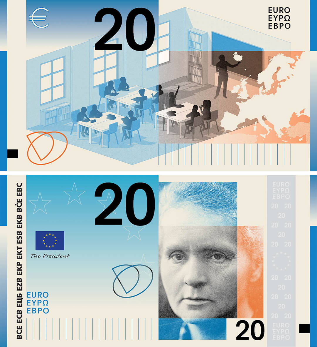
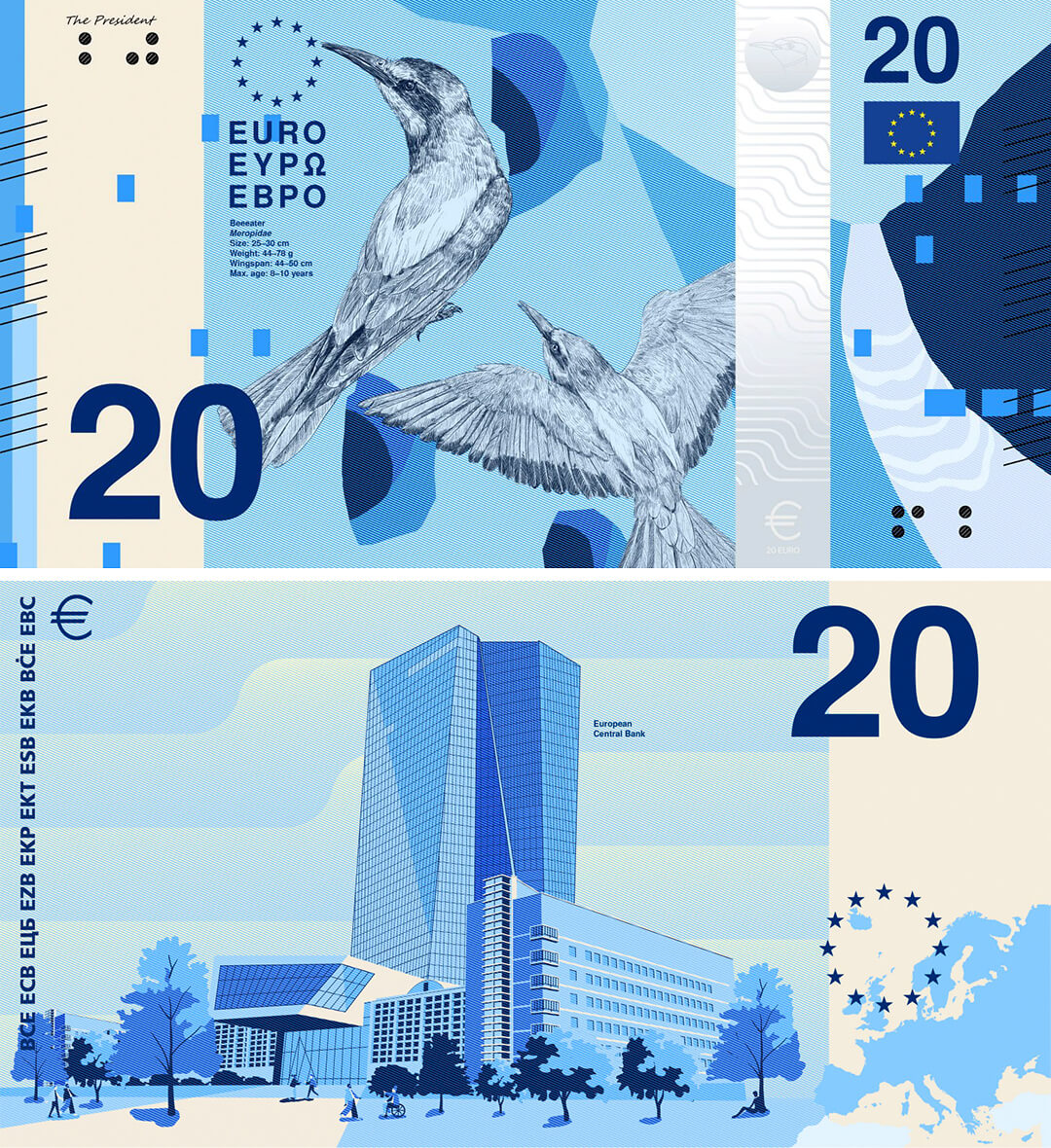
The two emerging themes—the result of a stringent set of guidelines for the designers outlined by the bank from public surveys conducted last year—are ‘European culture’ and ‘nature’. Returning to Lagarde’s remarks that we opened with, that the banknote’s visual design represents the ‘most tangible expressions of Europe’, makes the pitting of nature against History quite telling. On the one hand, one could question why the particular historical figures that adorn the notes of different values were selected, and the merits of picking these over other figures: for instance, the choice of Beethoven over Mozart or Chopin. Or, for that matter, the inclusion of Maria Callas, a contemporary figure, compared to the likes of Miguel Cervantes or Leonardo da Vinci, apart from also being someone born in the United States. Do these figures represent a form of ‘shared identity’ for Europeans—understood to be people from different countries with distinct cultures? And if so, on what metrics to have different understandings of their contemporaries?
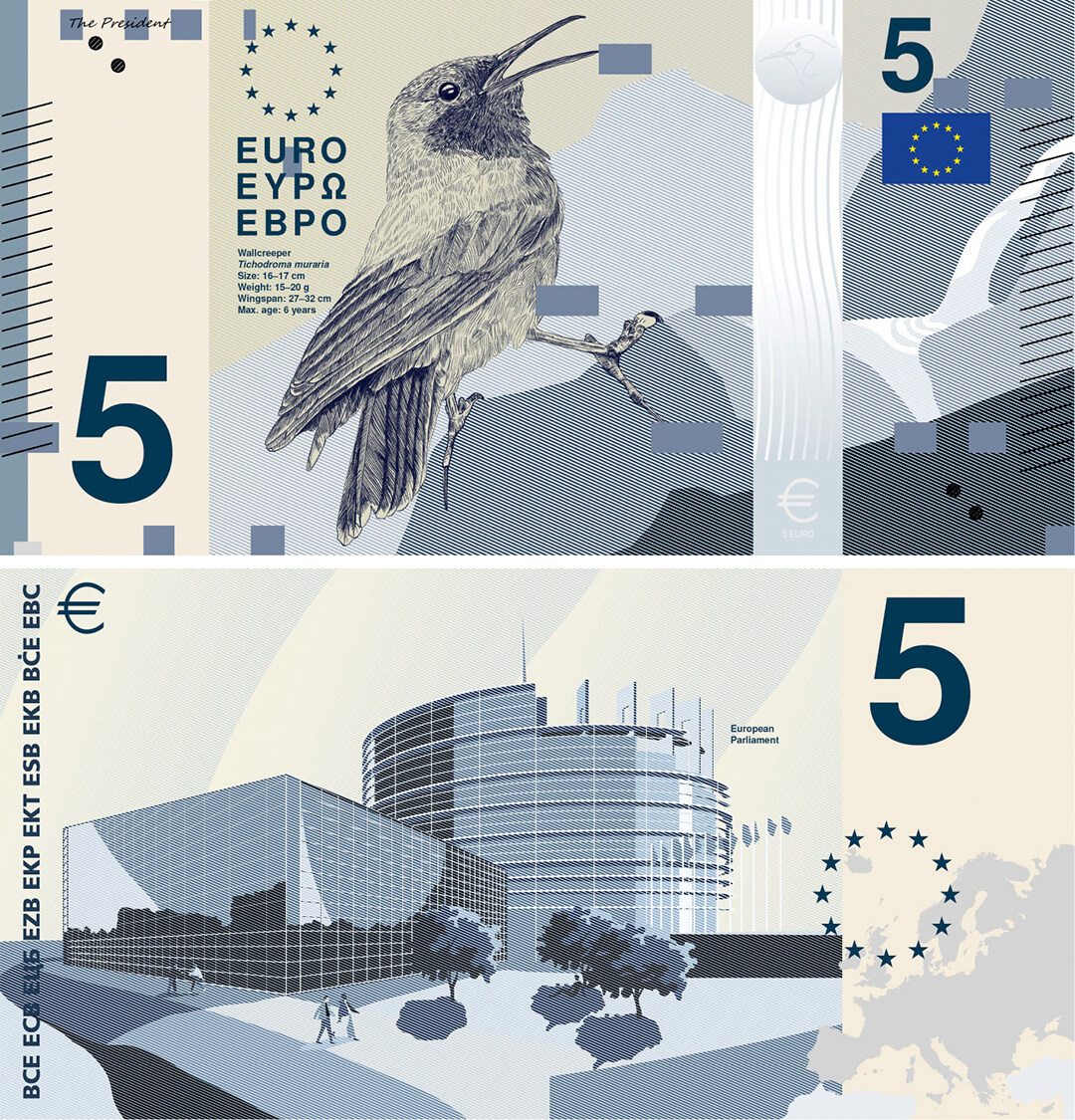
On the other hand, one could ask how birds or natural landscapes like rivers and mountain ranges call for a tangible expression of ‘Europe’ in particular. One could argue that natural landscapes cannot be defined by a nation (whatever that may mean today); and, as was the case with the proposed rehaul of the Australian dollar, the fauna being considered might not be native to the terrain in the first place. That said, the shift from architectural imagery for the banknotes to potentially flora and fauna underscores the inherent schism between the manmade and the natural and what constitutes our definitive perception of ourselves, or the ultimate legacy of Europe: the Enlightenment. Seemingly sick of the ‘inoffensive’ bridges, windows and doorways that currently adorn the Euro and are meant to ‘symbolise the European spirit of openness and cooperation’, people want to return to nature. In a survey commissioned by the ECB in a representative sample of 23,377 Europeans, ‘European culture’ was most popular (21 per cent) amongst euro area citizens, followed by ‘Rivers: the waters of life in Europe’ (18 per cent) and ‘Birds: free, resilient, inspiring’ (17 per cent). The people want the birds.
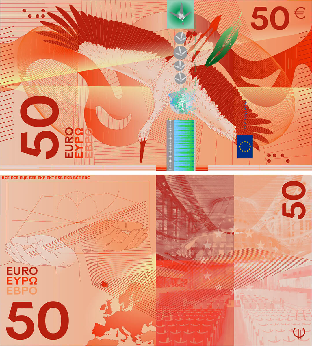
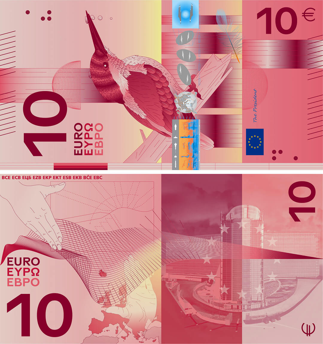
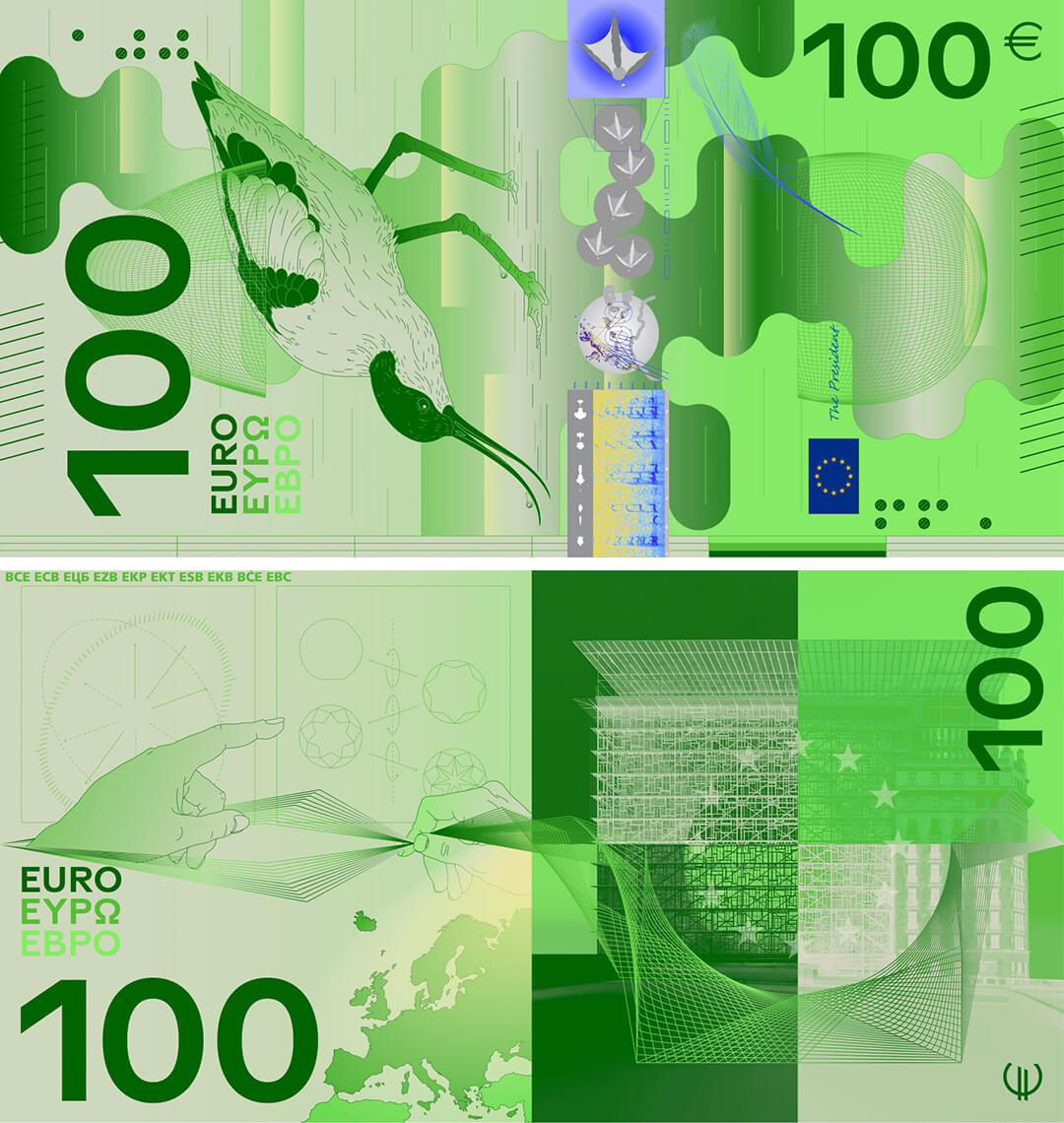
What’s more intriguing about the incorporation of natural motifs for the dominant graphic design of half the shortlisted proposals is their juxtaposition with buildings associated with the EU's governance mechanism. As the concept note of one shortlisted designer, PunktFormStrich, puts it—the hope is to ‘establish a connection between natural environments and shared cultural identity.’ It’s perhaps a means to draw attention to the fact that our natural environments are collapsing, but the notes serve as a reminder that environmental protection is ‘one of the fundamental values of the European project’. One day, the birds will be extinct, the designs seem to imply, but at least corporate bureaucracy will endure.
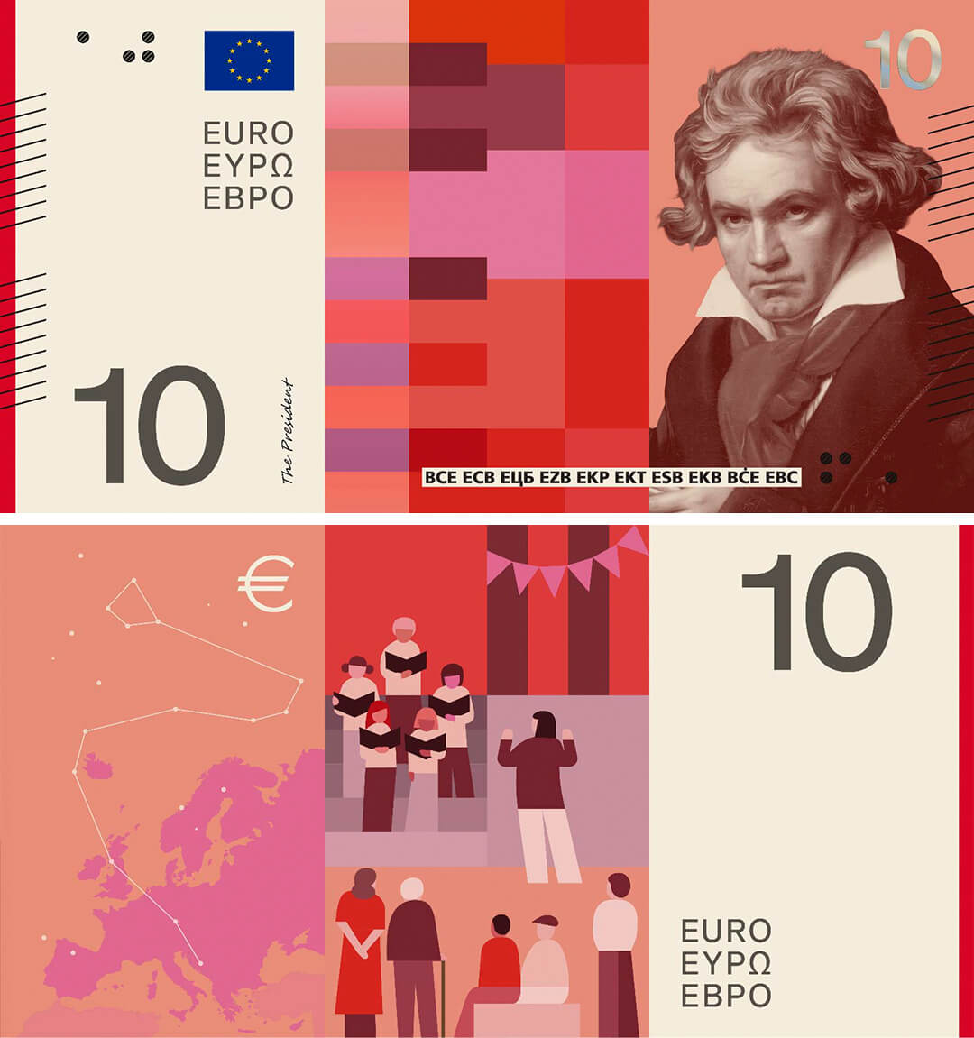
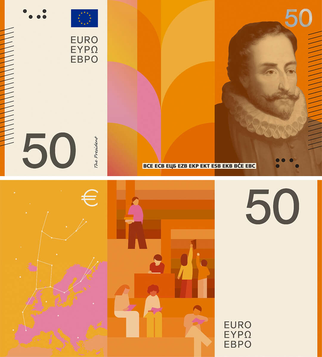
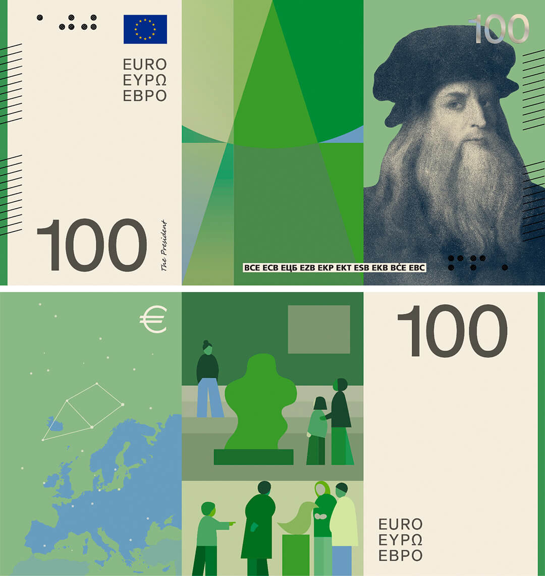
The shortlisted proposals that use nature motifs, interestingly, seem to be the popular choice among the public, in line with a trend towards nature-related imagery in the redesign of banknotes in several countries over the world. For instance, the UK’s graphic design overhaul of the pound may soon replace figures like Jane Austen and JMW Turner with critters like frogs or hedgehogs (subject to public survey). Switzerland’s newly issued currency will feature the country’s landscape, and Taiwan’s will depict bamboo, orchids, plums, mountains and deer, alongside architectural landmarks, sporting figures and notable individuals. Zimbabwe’s recent redesign, too, deferred to a growing interest in flora and fauna, featuring a lion, leopard, buffalo, elephant and rhino on their notes. Countries are banking on nature as visual communication for their country’s identity on banknotes. The natural world, it seems, has been deemed the least controversial or offensive to most religious, political or ideological sentiments.
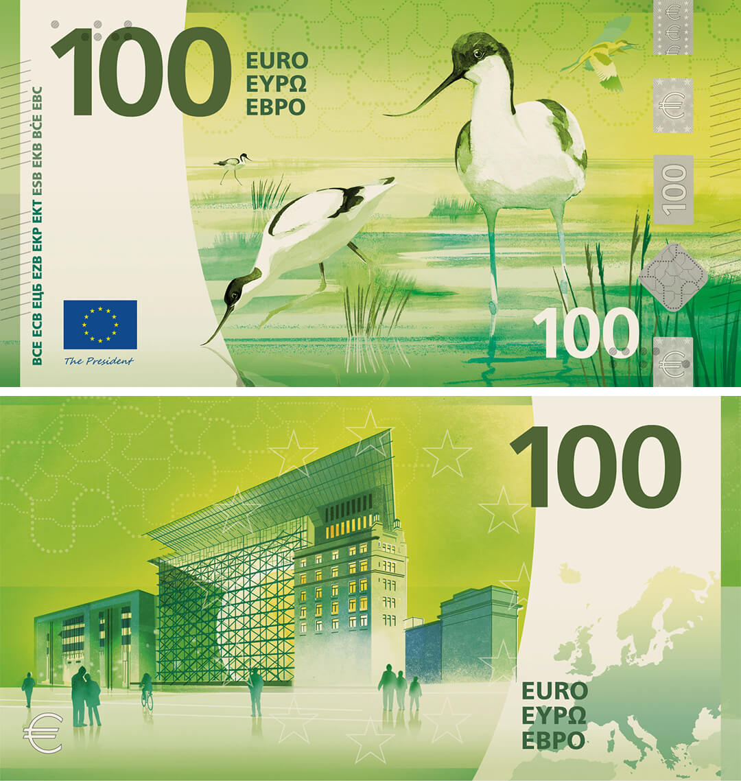
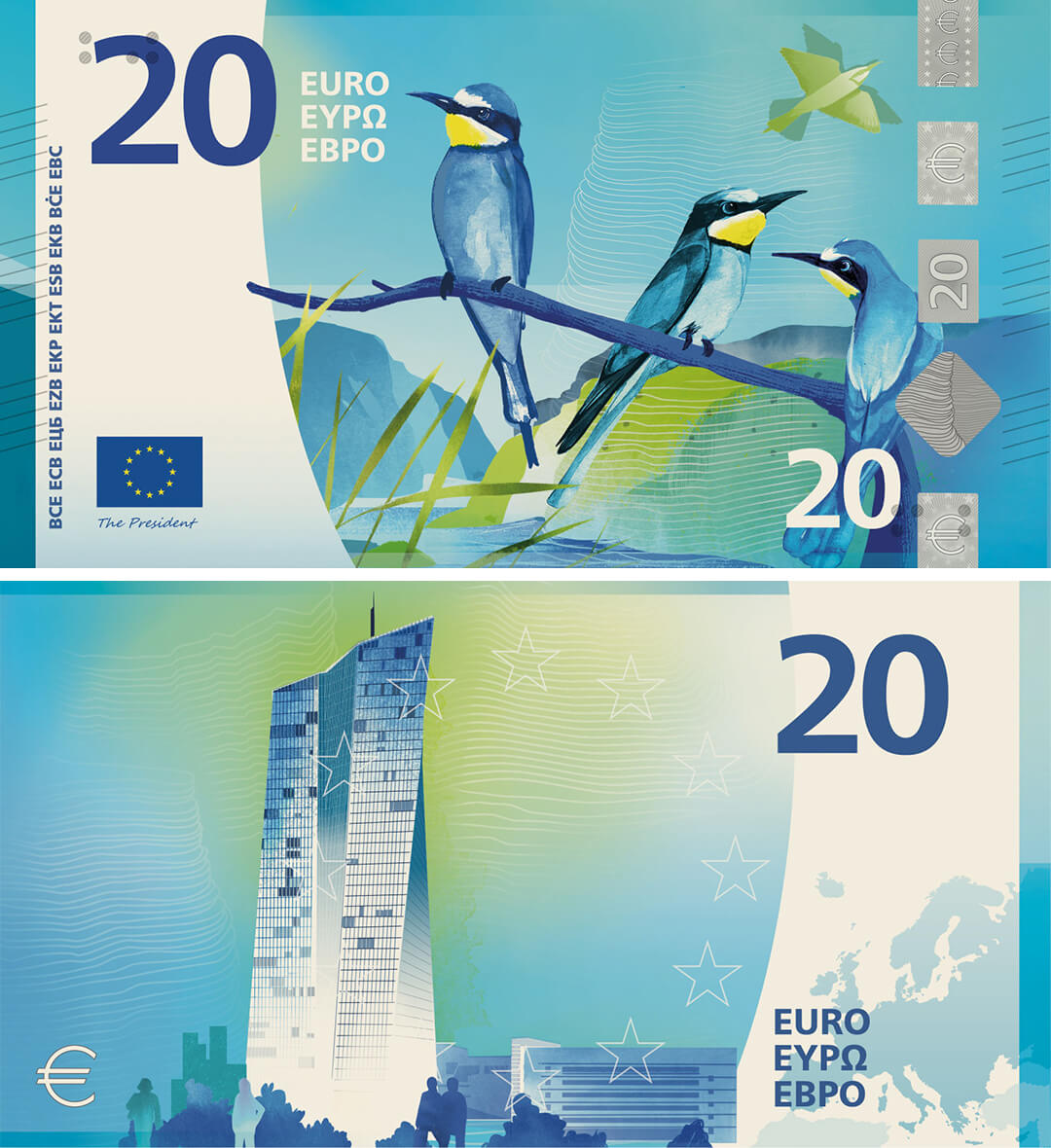
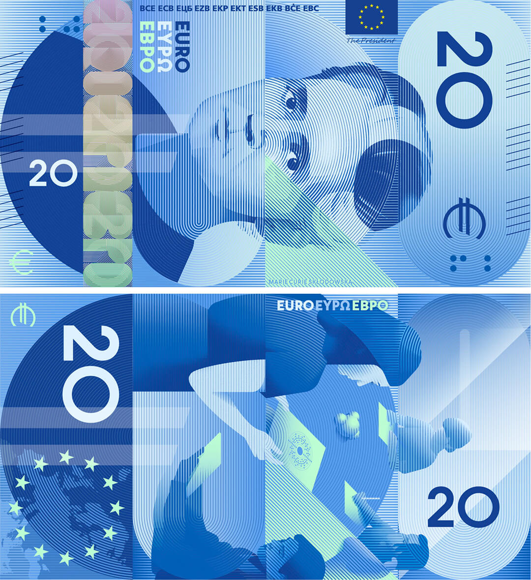
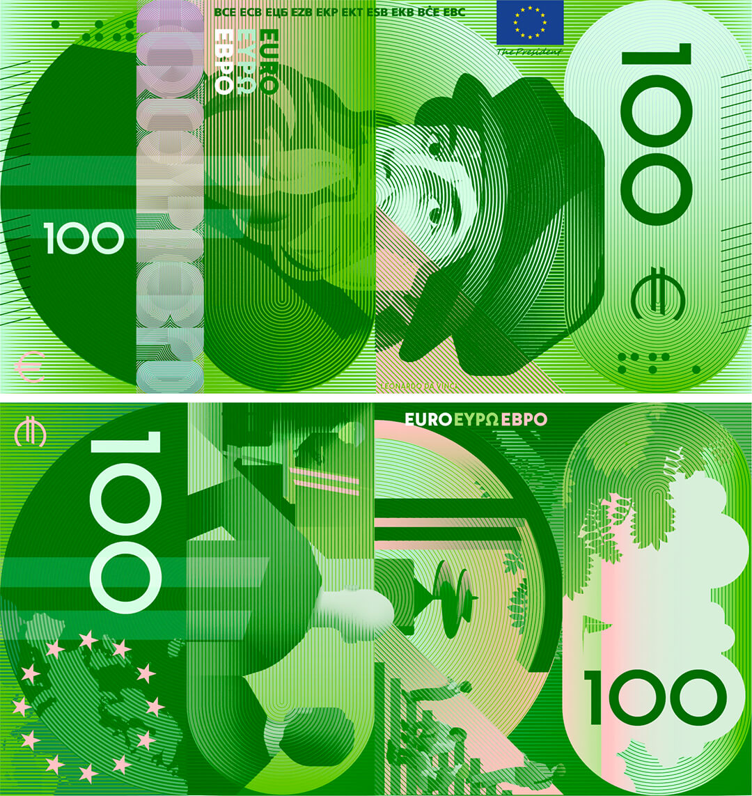
The iconography of currency is certainly a contentious topic, one that bears particular weight. Why else would the redesign of banknotes be a matter of any concern to the public? Why else might newly independent countries want to replace colonial imagery on their banknotes with figures who fought for the country’s liberation? Why indeed, might Donald Trump consider issuing a 250-dollar bill with his face on it? Money, after all, is the ultimate authority.
Returning to the redesign of the Euro, the graphic identity of the shortlisted proposals is certainly the most striking and distinctive aspect of the different options. Vivid art styles, and in some cases, vibrant colours have been employed to mark a break from the previous iterations, while at the same time, making the currency more accessible—easier to recognise and handle. In a survey conducted by the ECB between December 2021 and March 2022, many respondents admitted to not thinking too closely about the design of the notes themselves; that ‘design is not important’ and many had stopped using physical currency in the wake of the pandemic at any rate. As a counter to this blase attitude towards the design of the notes, the painterly quality of some of the shortlisted proposals (take Design H by Atelier Goppel-Toperngpong or Design F by Jan Robert Dünnweller) is of particular note here. It denotes a shift away from the dominant minimal, corporate-style visual language of the recent past, and emphasises a renewed interest in analogue drawing techniques: a reaction to AI slop, perhaps.
Beyond reflecting Europe's identity and values and ensuring accessibility, the decision to overhaul existing Euro designs also stems from a desire to ensure the continued relevance of the currency and its physical asset, while staying ahead of counterfeiting techniques. As ECB executive board member Piero Cipollone notes in an official statement, “The redesign of the Euro banknotes is part of a long-term effort by the Eurosystem to ensure that cash remains a secure, efficient and relatable means of payment, preserving citizens’ access to public money and their freedom to choose how to pay.”
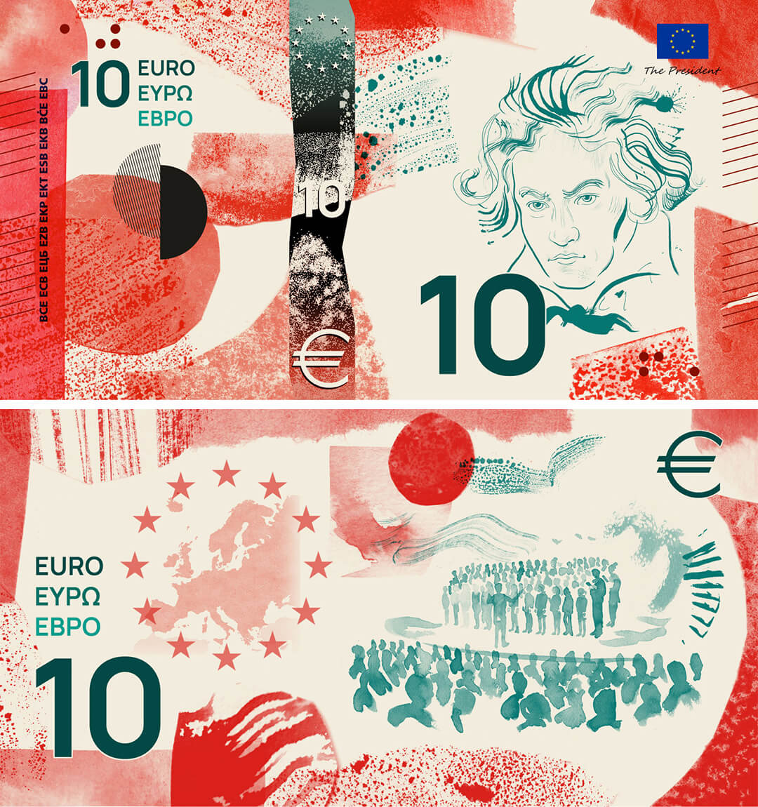
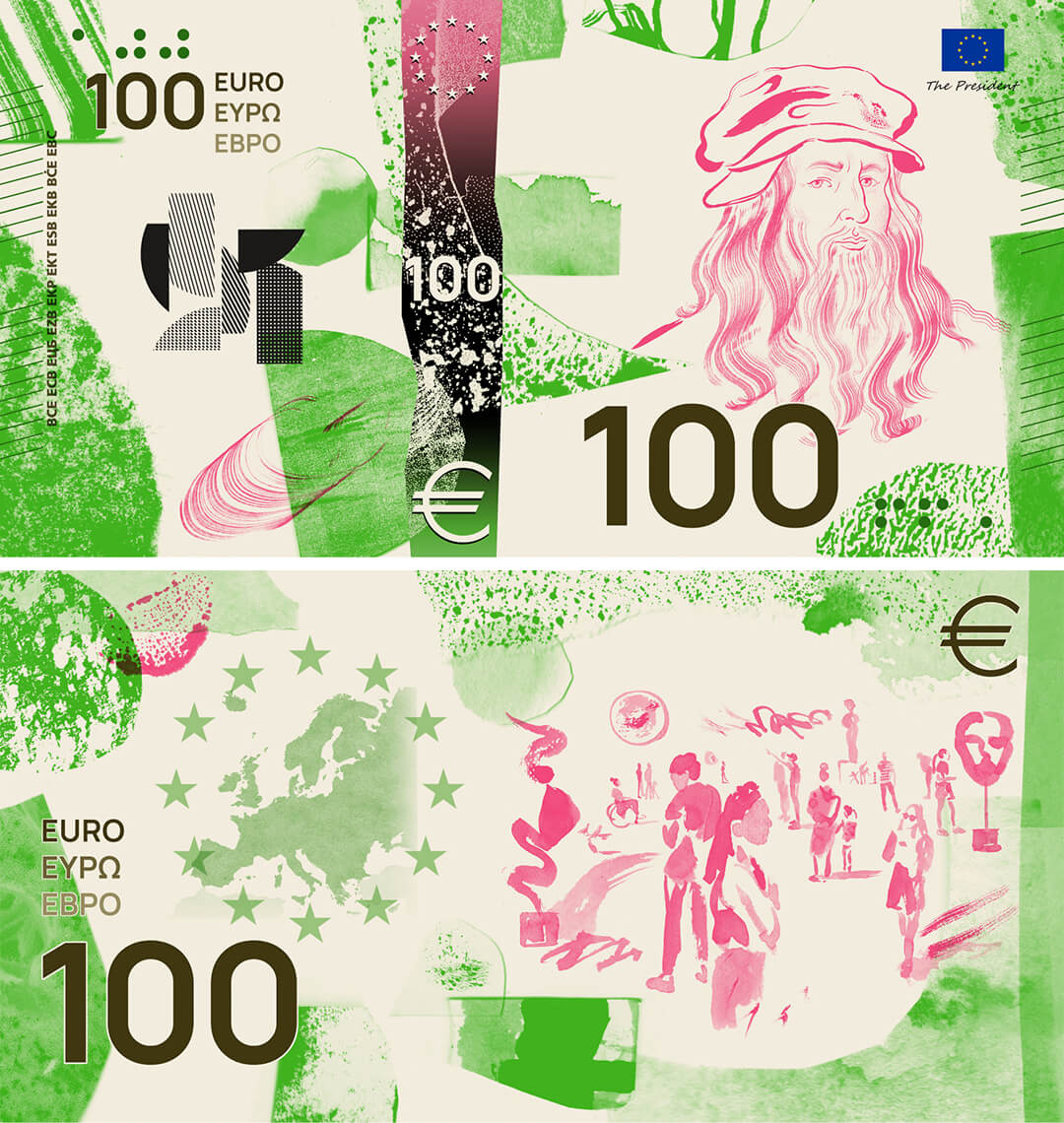
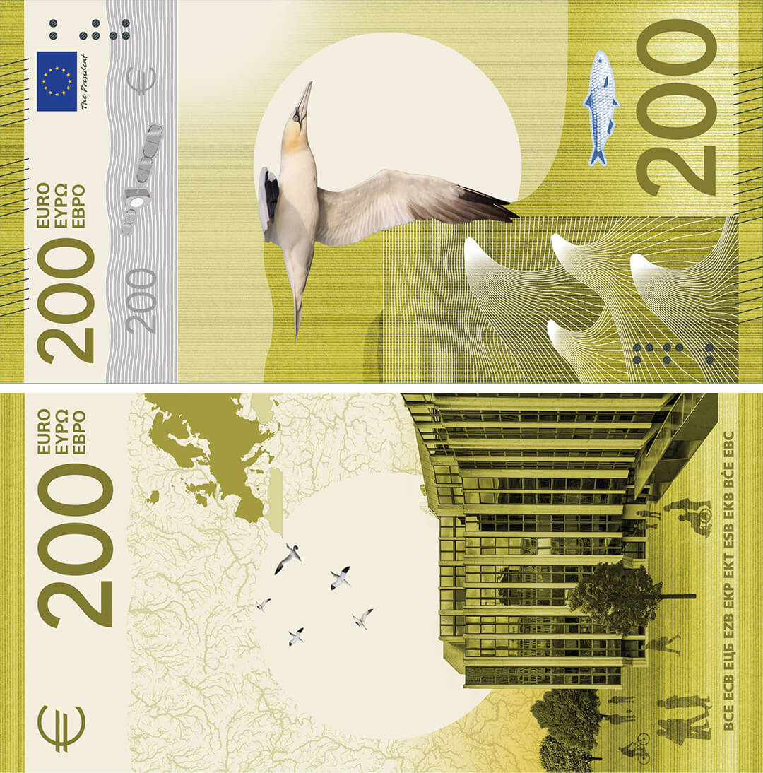
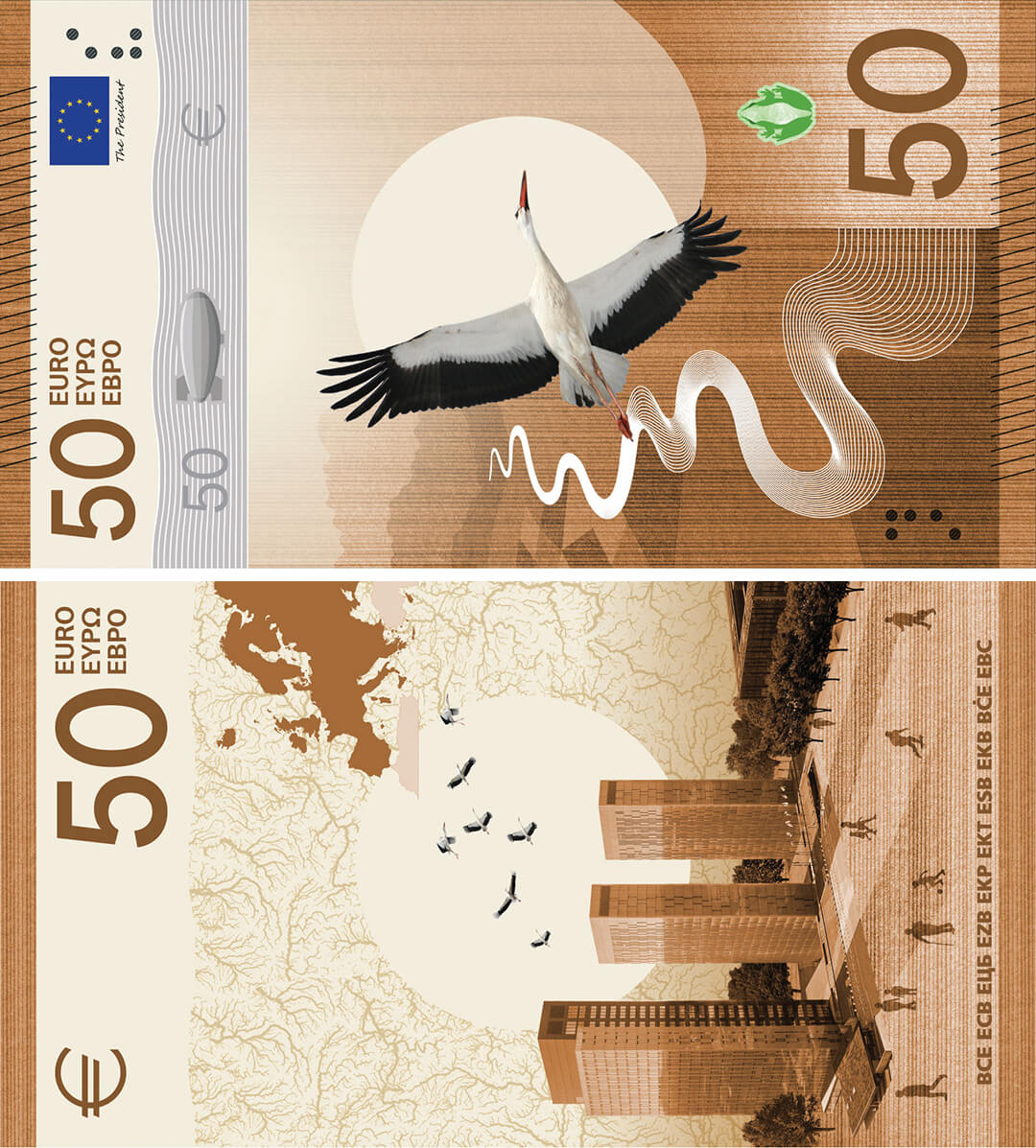
The adherence to functionality that banknotes must uphold—they should be readable by ATMs, usable by people with visual impairments and recognisable from all angles—makes the proposed redesigns great examples to study to that effect. The designs are visually striking, and display a certain harmony in how they balance the prevalent image (whether that’s a bird or a cultural figure) with the other elements that make each design unique. In another instance, for Studio Joost Grootens’ proposal (Design A), the Copenhagen-based studio notes how the design deliberately crops the portraits of the depicted personalities to highlight eyes and mouths, symbolising values such as observation and dialogue. While the minimal design features few other elements, the result is striking. Similarly, Neue Gestaltung GmbH’s proposal includes geometric elements that refresh an otherwise simple design. In many proposals that feature birds, designers note that birdsong has been incorporated into the designs through graphic elements. Small, considered details add different layers to each proposal, making each distinctive.
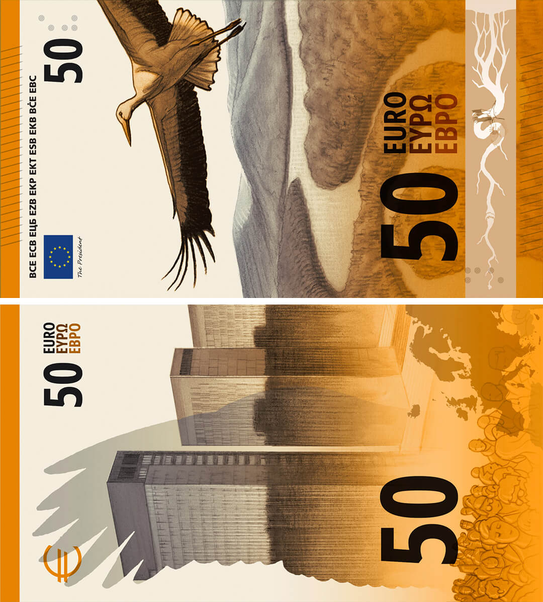
It’s these aspects of what ought to be fairly standard procedure for a national/supranational institution—the open call to designers, the instantly appealing nature of the proposals, the democratic process for selection of the final design as a practice that is being increasingly adopted by many countries for their own currency redesigns—that makes the redesign of the Euro currency an event worth critical inquiry. Predominantly, it asks how currency art might be more inclusive and ‘inoffensive’ while still being culturally relevant, and in this consideration sets forth the larger question of cultural value. The imagery on our currency has a dramatic impact on what and who we imagine is valuable. Together, they expose the tension between the power of money and the playfulness of art.
The views and opinions expressed here are those of the author(s) and do not necessarily reflect the official position of STIR or its editors.

by Jincy Iype Oct 15, 2026
STIR explores craft, material intelligence and people shaping Indian design through dialogues with Design Democracy’s co-founders and the curators of its special exhibitions.
by Pranjal Maheshwari Oct 13, 2026
Through furniture, art and films, the showcase at the Ian Potter Centre in Melbourne advocates for biophilic material cultures as an antidote to planetary degradation.
by Pranjal Maheshwari Oct 12, 2026
The exhibition reimagines the 20th-century Scottsville residence of the American sculptor and his partner, ceramicist Nancy Jurs, curated by their daughter Alison Castle.
by Mrinmayee Bhoot Oct 08, 2026
The game designer discusses their work and its manipulation of scale, scientific data and non-human perspectives to create speculative futures in conversation with STIR.

make your fridays matter with a well-read weekend
Enter your details to sign in
Don’t have an account?
Sign upOr you can sign in with
a single account for all
STIR platforms
All your bookmarks will be available across all your devices.
Stay STIRred
Already have an account?
Sign inOr you can sign up with
Verification link sent to check your inbox or spam folder to complete sign up process
Tap on things that interests you.
Select the Conversation Category you would like to watch
Please enter your details and click submit.
Enter the 6-digit code sent at


On the money: Assessing the cultural value of currency with the Euro redesign
by Mrinmayee Bhoot | Published on : Oct 01, 2026


 Sign in with Google
 Sign in with email
What do you think?