Architecture10 mins. read
ADFF:STIR Mumbai 2026 promises a radical vision connecting cinema, space and city
by Jincy IypeDec 15, 2025



by Chahna TankPublished on : Oct 22, 2026
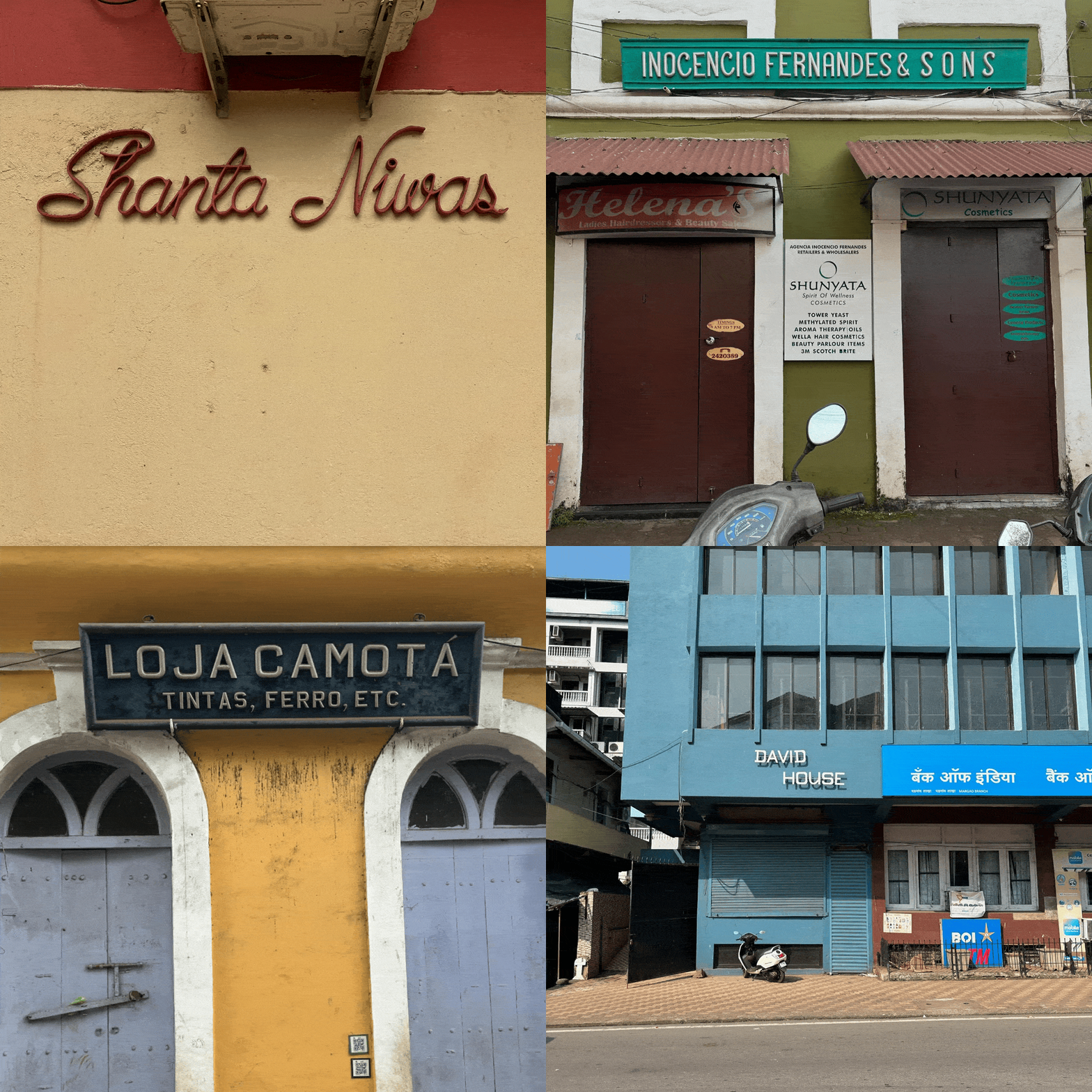
We walk past myriad signs every day—building names, menus, logos, shop signs, symbols—without turning our heads or sparing them a second thought, but for Mumbai-based type designer and design educator Tanya George, noticing them is a 'default setting', as she tells STIR in a video conversation. A crooked letter, an unusual curve or a particularly pleasing arrangement of seemingly forgettable words can stop her in her tracks. Having worked in the field for over a decade—designing typefaces, logos, researching and writing about typography—George has built a practice around her fascination with noticing signs and lettering wherever she goes, and her instinct to see the world around her through the lens of type. She shares this way of seeing with others through guided Type Walks in Mumbai!
Through these walks, George invites people to explore the rich world of letterforms scattered across Mumbai’s streets, from the names emblazoned on Art Deco buildings and lettering on old bank façades to hand-painted shop signs and store logos. She strives to bring the stories behind their design, and the people who made them, to light. Many of these histories are undocumented, absent from books and online searches, surviving instead on ageing signs and in the memories of the people who made them or lived with them. By speaking with shop owners and sign makers, George pieces together the local histories that shape Mumbai’s lettering. “My walks have grown over time. Initially, I was a lot more technical…but I realised the stories are what people take away from the walk, more than any of the technicalities,” she tells STIR. Type Walks also reflect a growing interest in India’s street lettering landscape, as explored in typeface designer Pooja Saxena’s India Street Lettering, which documented over 300 handmade signs in various Indian languages and scripts.
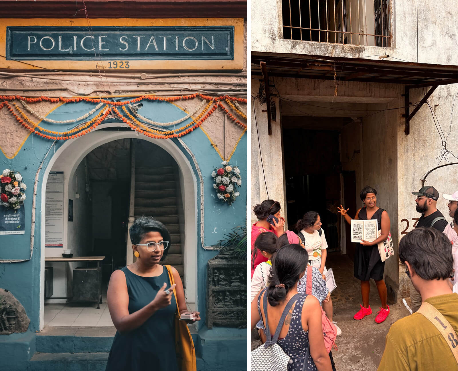
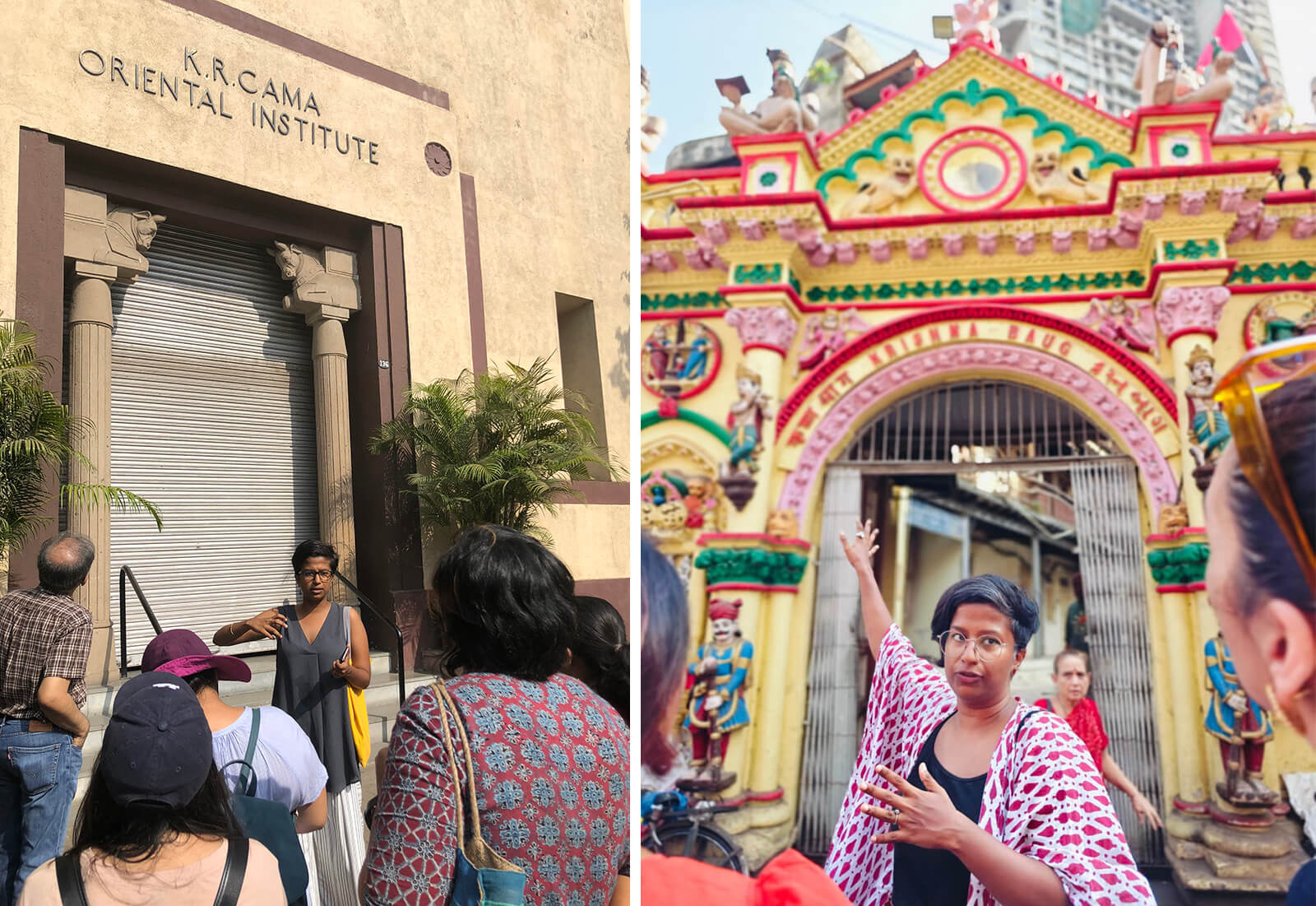
Type walks are as much about looking at and engaging with the signage and lettering in public spaces as they are about occupying these spaces. They are a way to remind ourselves that the street belongs to people who want to pause, observe and be curious about their surroundings. "[Type walks] gives me a chance to show people that this is a public space, and we're allowed to exist and take up this space, which is, I think, an empowering experience," George shares. By making looking a collective activity and creating room for conversation, curiosity and encounters with the people who shape the city’s visual landscape, George has made typography a way to connect with a place and the people around it.
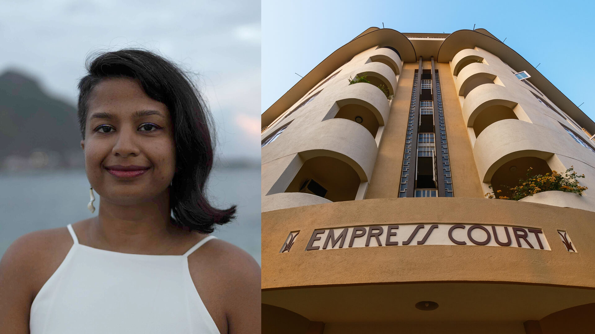
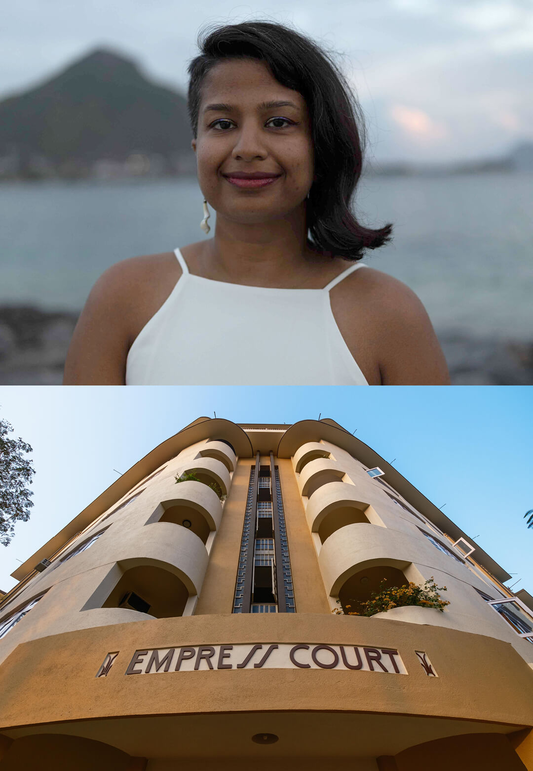
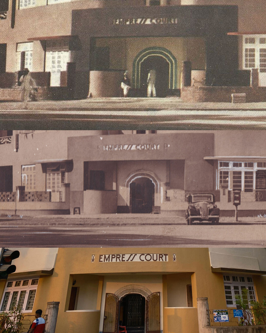
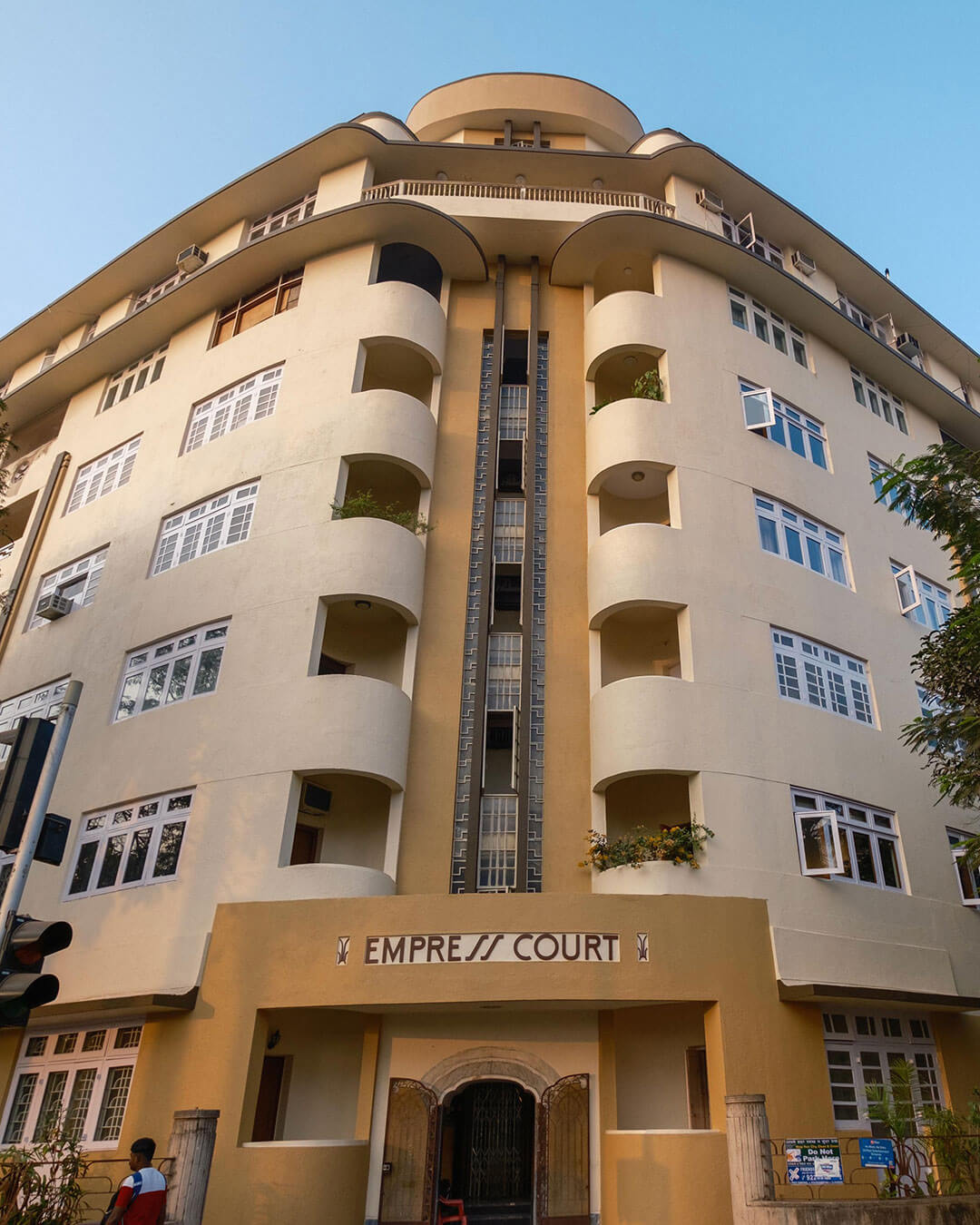
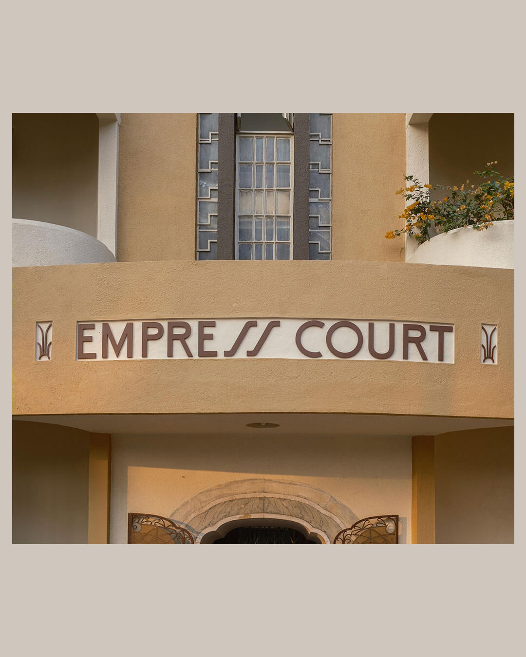
This interest in the relationship between lettering and the built environment also informs George’s work with Art Deco Mumbai Trust, for which she recreated the original signage of Empress Court, an Art Deco residential building dating to 1936. Working with faded and grainy archival photographs, she studied the original lettering and restored its distinctive forms into a sign that could be fabricated and installed on the building’s facade. "The entire building is now restored. It looks glorious, and I get goosebumps every time the taxi drives past it,” she says.
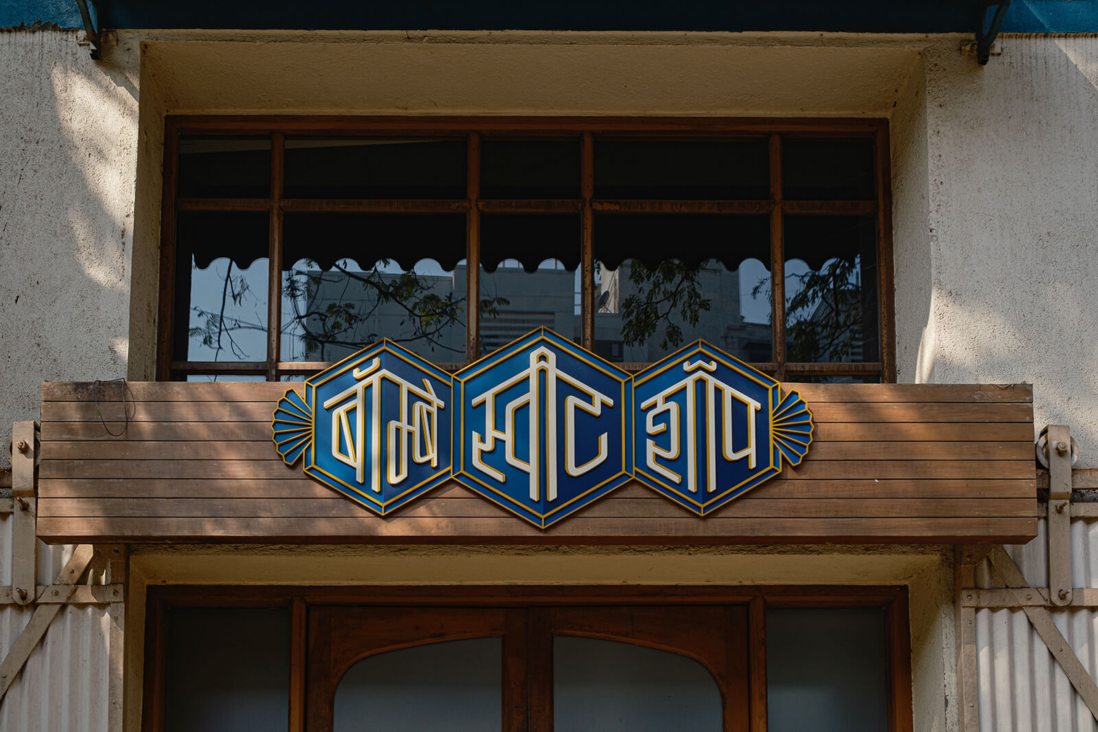
Beyond her engagement with the city and its everyday signs, George has also worked across branding and packaging. For Bombay Sweet Shop, she designed a Devanagari counterpart to Pleasesee's original English logo. Drawing on the Art Deco lettering that inspired the original identity, George translated its narrow, geometric forms into Devanagari script, matching the proportions and fitting the new letterforms within the same shape. She has also designed various logos, including, most recently, a limited-edition label for Great State Ale’s beer.

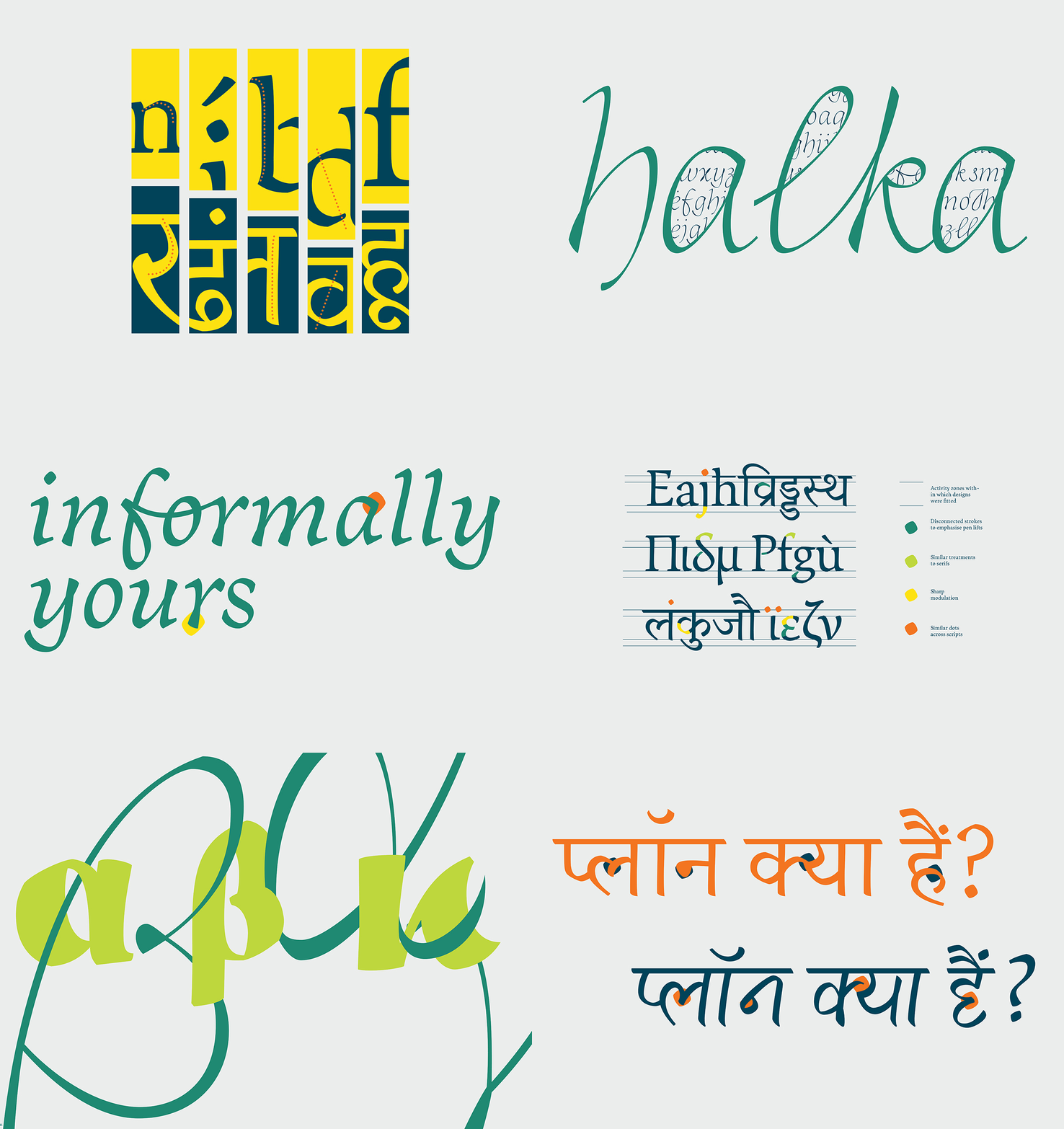
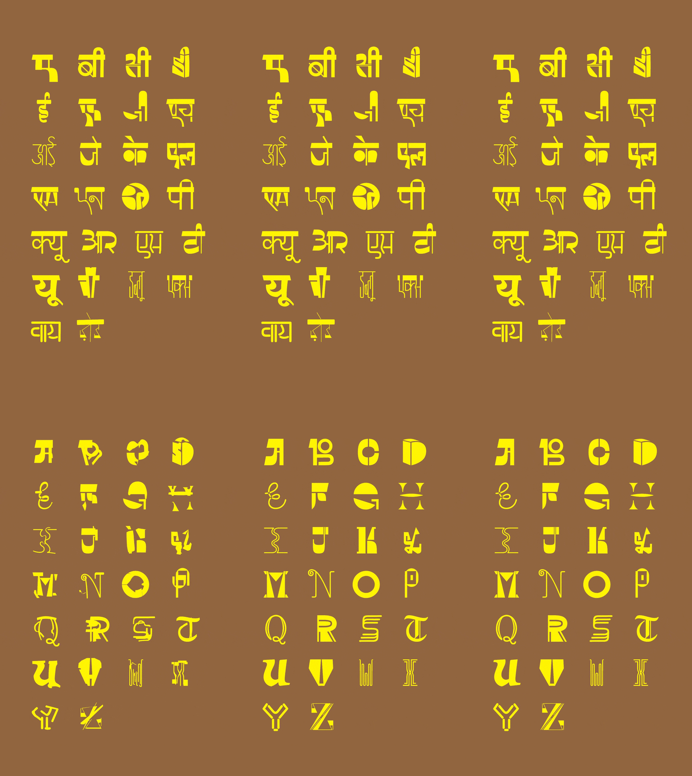
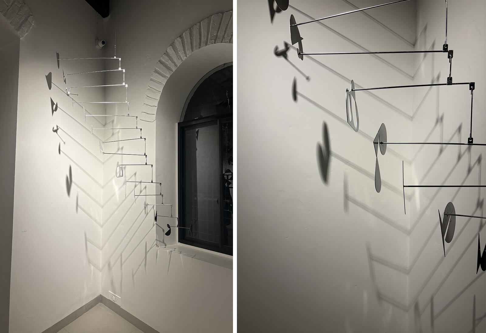
Her work also explores how scripts carry language and identity, and how we move between different linguistic worlds. In her mobile installation Glottosaurus, she translates the word ‘tongue’ into three languages and scripts—Latin, Devanagari and Malayalam—balancing letters across rotating, cantilever-like forms. As the elements turn and shift, the work evokes the movement of the tongue as it articulates sounds. This interest in the relationship between scripts also informs her other work, which includes a variable script font she designed that connects Latin and Devanagari (phonetically).
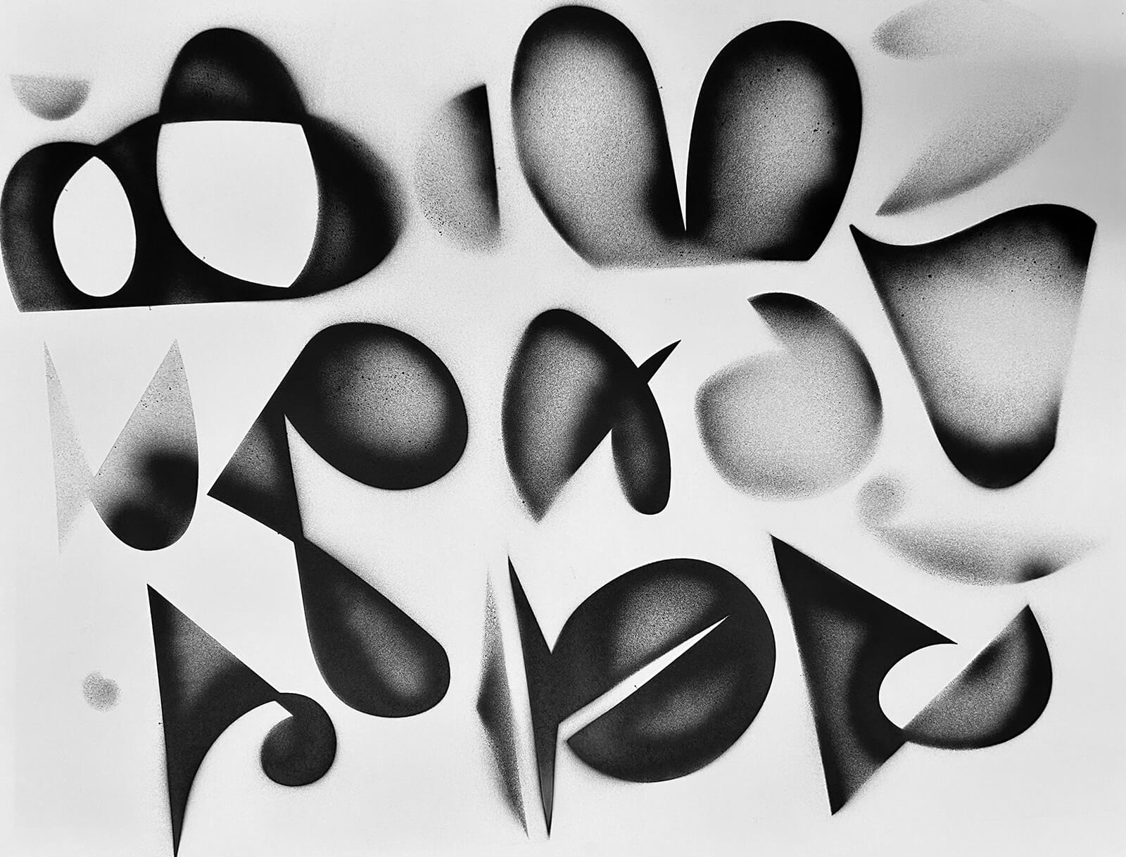
George’s interest in Indian scripts goes beyond designing letterforms; she wants to see them become a more visible part of everyday conversations about typography and visual culture. She would love to see people have the same spirited opinions about Devanagari and other Indian-script fonts as they do about familiar Latin typefaces such as Helvetica or Comic Sans. “What's the Hindi Comic Sans, or which is your go-to font in Telugu? I want those arguments to be happening,” she says. It is a playful question, but one that points to a larger ambition: for Indian-script typefaces to become part of our everyday visual culture, something we recognise, discuss and develop opinions about. Many independent foundries and designers are giving Indian scripts the attention they deserve—and George is certainly among those helping ensure Indian scripts get their moment in the spotlight!

by Mirra Lynn Oct 22, 2026
The curators behind Palestine Design Week 2026 reflect on its intent, considering how design holds memory, makes space for loss and imagines a future in Palestine.
by Jincy Iype Oct 15, 2026
STIR explores craft, material intelligence and people shaping Indian design through dialogues with Design Democracy’s co-founders and the curators of its special exhibitions.
by Pranjal Maheshwari Oct 13, 2026
Through furniture, art and films, the showcase at the Ian Potter Centre in Melbourne advocates for biophilic material cultures as an antidote to planetary degradation.
by Pranjal Maheshwari Oct 12, 2026
The exhibition reimagines the 20th-century Scottsville residence of the American sculptor and his partner, ceramicist Nancy Jurs, curated by their daughter Alison Castle.

make your fridays matter with a well-read weekend
Enter your details to sign in
Don’t have an account?
Sign upOr you can sign in with
a single account for all
STIR platforms
All your bookmarks will be available across all your devices.
Stay STIRred
Already have an account?
Sign inOr you can sign up with
Verification link sent to check your inbox or spam folder to complete sign up process
Tap on things that interests you.
Select the Conversation Category you would like to watch
Please enter your details and click submit.
Enter the 6-digit code sent at


Reading between the signs: Tanya George on experiencing a city through typography
by Chahna Tank | Published on : Oct 22, 2026


 Sign in with Google
 Sign in with email
What do you think?