


Design11 mins. read
‘Letterform Variations’ merges method and manner to make typography modular
by Anmol AhujaJan 03, 2022
•make your fridays matter with a well-read weekend
by Bansari PaghdarPublished on : Oct 31, 2025
In American author Mark Z. Danielewski’s experimental horror novel, House of Leaves (2000), a series of disturbing and disorienting events unravel with an equally disorienting visual language. Multiple font styles, colours and irregular textual arrangements take the viewers on a joyride of uncertainty, augmenting the distress, conflict and instability experienced by the characters. Here, typography becomes an agent of the many-layered narrative structure, adding a thematic, symbolic and architectural dimension to the reading experience. Used as a strong means of expression that—beyond complementing—drives and delivers the purpose and underlying themes of the book, typography becomes a character in itself.


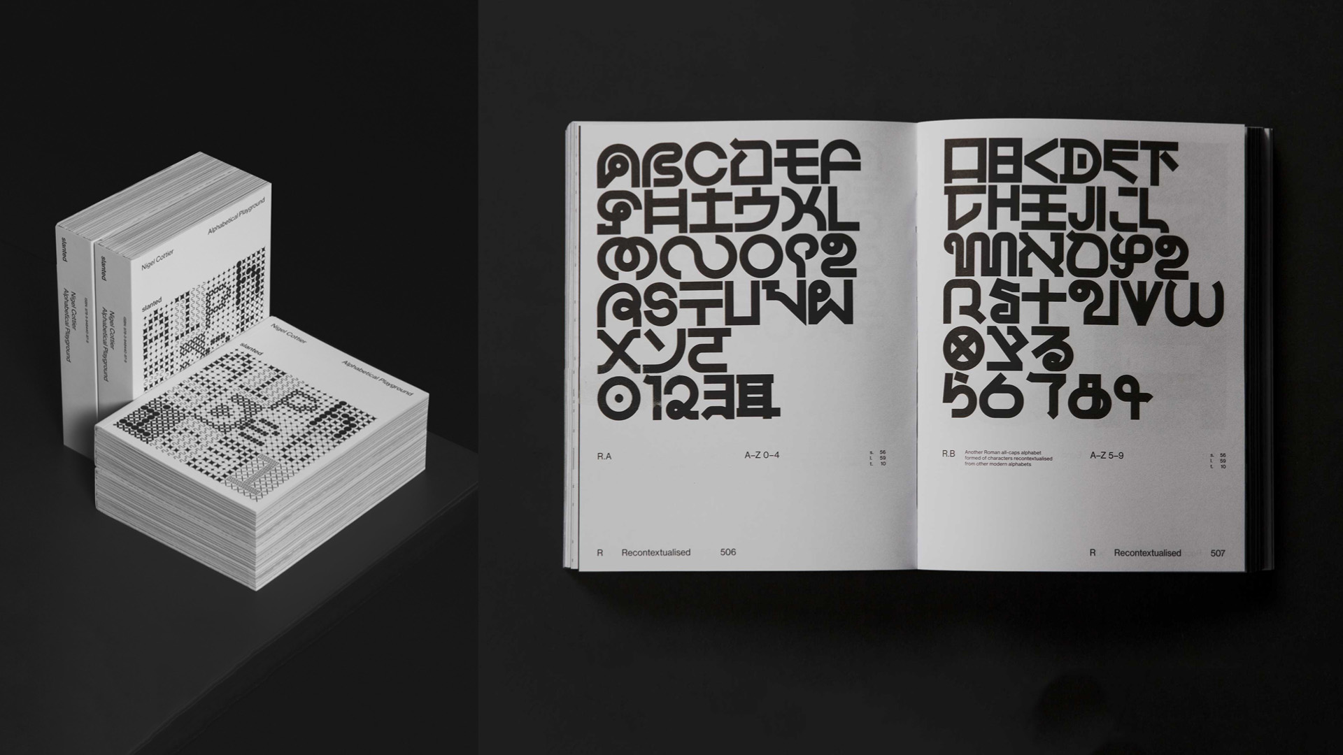
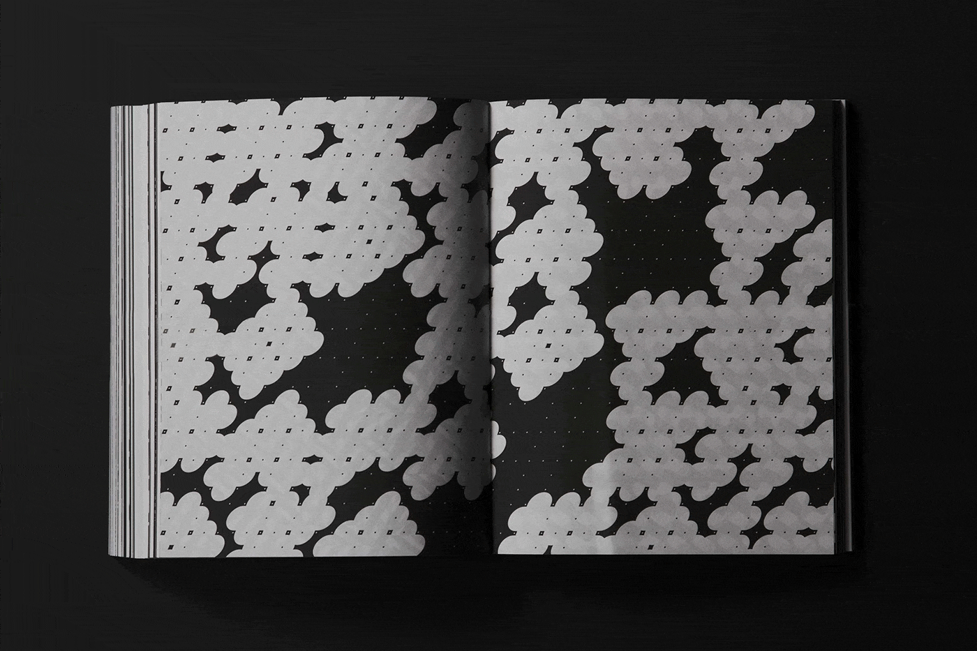
British designer Nigel Cottier’s Alphabetical Playground, a ‘gleeful’ exploration of the ‘outer limits of readability’—as Hamish Muir notes in the book’s foreword—evokes a similar structural and experimental depth. In Cottier’s own words, the type designs are ‘a system within a system’, underlining the ability of the alphabet to transcend its fundamental purpose as a communication tool and essentially become a playground for creative expression. “I think the anchor is the simplicity of the Roman alphabet and our ability to recognise it. We learn this very simple code as the building blocks of language at a young age; therefore, we learn to see and interpret its structure even when it’s heavily styled or abstracted,” Cottier—who is also Design Director at Accept & Proceed, tells STIR. From ‘Alphanumeric’, ‘Bisect’ and ‘Cursive’ to ‘Vertical’, ‘Woven’ and ‘XYZ Mixed System’, the A-Z of the typographic designs in the book are divided into 24 sections. The way these letterforms transform through their respective codes is compared to how a calligrapher's choice of brushes imparts character to the strokes.
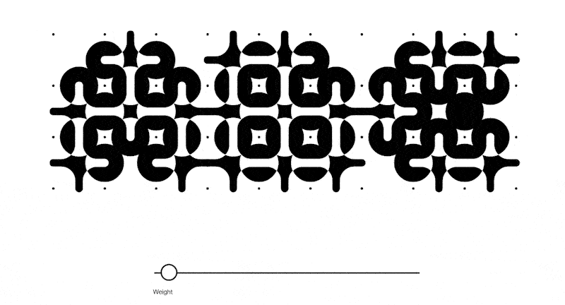

While Danielewski’s typography can be perceived as a character, Cottier’s work in the book can be seen as probing perception itself. It is a study on how far the readability of a letter can be pushed before its 'meaning' or purpose dissolves. The methods of the derivation of these letters are artistic and systematic, even mathematical at times, but they are almost always surprising and playful. “Creating systems and formulas to build visual forms can seem rigid and ‘unartful’; however, allowing the system to generate the form often leads to unexpected and surprising outcomes, [which] can feel serendipitous,” adds Cottier. His graphic designs here evoke a sense of wonder and play, as if he himself is unsure of the potential outcomes of the typographic explorations, essentially becoming gestures in motion.
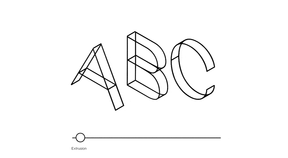
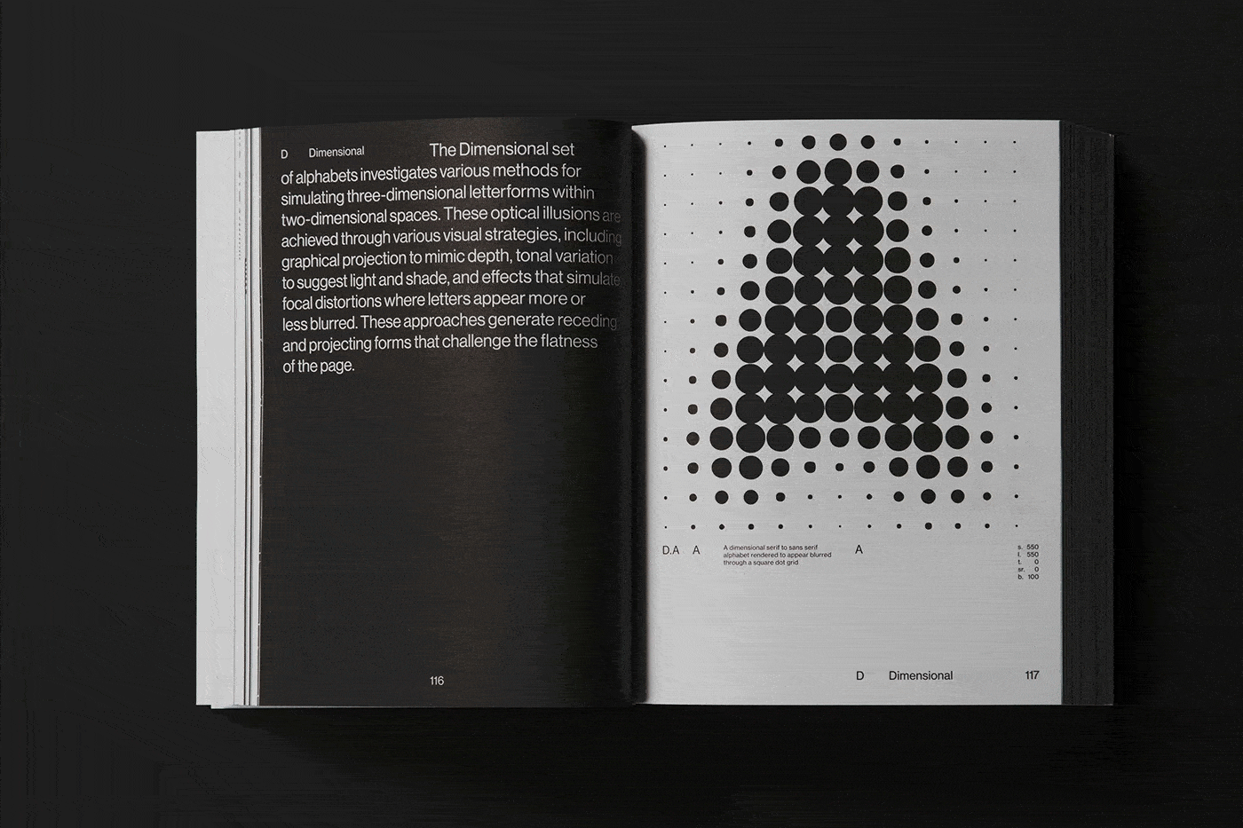
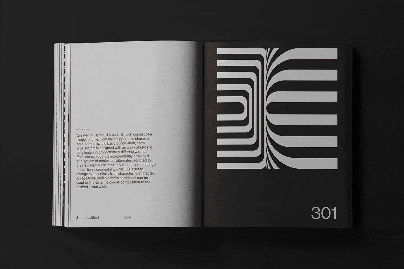
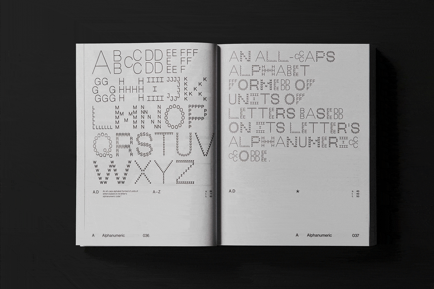
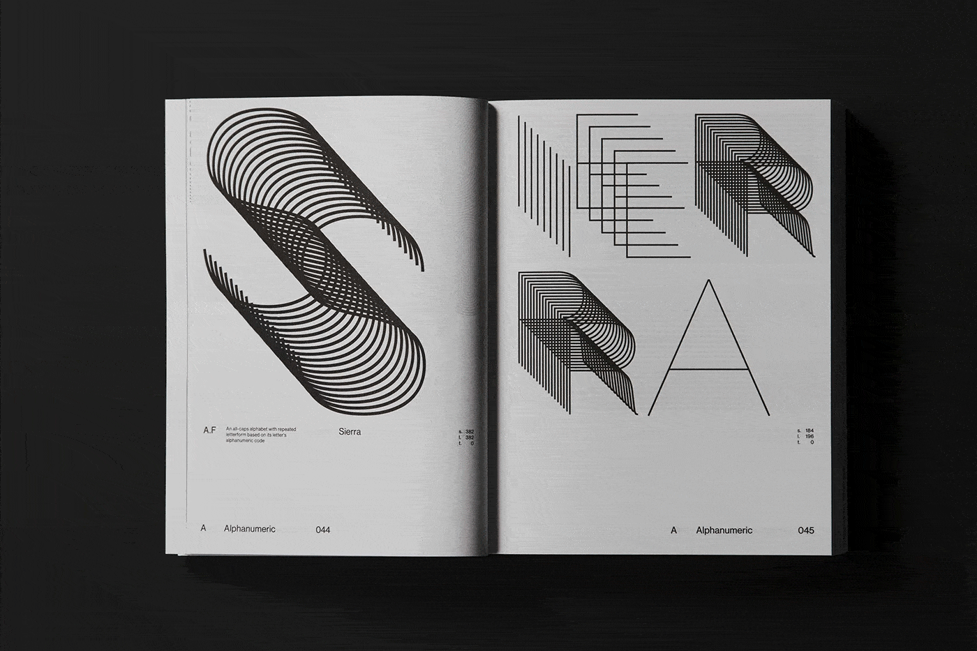
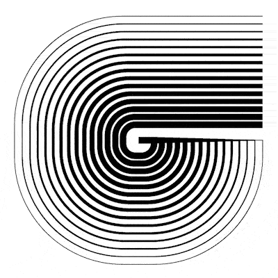
While the ‘Alphanumeric’ systems contain patterned encodings that express a form of ‘pseudo-writing’, ‘Bisect’ explores natural symmetries under strict constraints of symmetry. On the other hand, ‘Horizontal’ is a constrictive type system constructed exclusively from horizontal blocks arranged in a fixed unit grid, where glyphs are deciphered through relationships between parametric rules of lineweight, width and simulated focus. ‘Kinetic’, a set of three type systems, is centred around the concept of optical illusions, drawing from art movements such as Kinetic Art and Op Art. Another system, ‘Matrix’, is inspired by conventional dot matrix technologies that eliminate spaces between glyphs, emphasising the abstraction of intricate patterns.

In prevalent design systems and languages today, abstraction, grids and modularity dominate how we perceive information. Legibility is put into question, as Muir notes in the book, hinting that it is “overrated”, encouraging designers to push the boundaries of type design beyond the basic structures. “Our modern digital world is increasingly visually abundant and always in motion. Experiments can be shared across a variety of platforms, where designers can treat the medium of type with more freedom—concerned less with traditional typographic topologies and more with expression,” the graphic designer tells STIR. Cottier then looks at the reader’s relationship with text as a dialogue, wherein the readers may perceive letters as puzzles to be deciphered, or the act of reading as a game to be played; “That process or experience for the viewer is enriching in ways beyond a simple transference of information,” adds Cottier.

Imbuing the designs with his thoughts and worldview, the author lays out a web of intricate ‘visual codes’ that respond to and develop off of one another through a linear, hybridised progression. Alphabetical Playground is a reminder that language isn’t static; it is elastic and alive. The book is a space where order and creative exploration fuse to create endless possibilities, where every letter, however abstracted, still carries the ghost of meaning.

by Pranjal Maheshwari Jul 14, 2026
Taking a closer look at the comprehensive retrospective at the Vitra Schaudepot in Weil am Rhein, STIR explores the enduring relevance of the 20th-century designer.
by Anmol Ahuja Jul 13, 2026
An inflatable chair, a rocking bench, an angled, adjustable floor lamp and artistic textiles, among others, round out IKEA’s 10th PS collection, built around ‘playful functionality’.
by Pranjal Maheshwari Jul 06, 2026
Using hanji paper and stitches, Seoul-based MANO Design Studio channels the Korean concept of yeobaek-mi in a recent lamp series to restore 'thingness' to design through craft.
by Bansari Paghdar Jul 04, 2026
Designed by the Berlin-based firm, the vibrant renovation of an apartment features dramatic sculptures and wave-like forms cut into walls and furnitures.
 surprise me!

make your fridays matter
SUBSCRIBEmake your fridays matter with a well-read weekend
Enter your details to sign in
Don’t have an account?
Sign upOr you can sign in with
a single account for all
STIR platforms
All your bookmarks will be available across all your devices.
Stay STIRred
Already have an account?
Sign inOr you can sign up with
Tap on things that interests you.
Select the Conversation Category you would like to watch
Please enter your details and click submit.
Enter the 6-digit code sent at
Verification link sent to check your inbox or spam folder to complete sign up process


The act of reading becomes a lively dialogue in Nigel Cottier’s Alphabetical Playground
by Bansari Paghdar | Published on : Oct 31, 2025


 Sign in with email
What do you think?