


Design17 mins. read
Exploring 'Shapes of Data' with Adrien Jacquemet and Basile Jesset
by Almas SadiqueAug 14, 2024
•make your fridays matter with a well-read weekend
by Pranjal MaheshwariPublished on : May 16, 2026
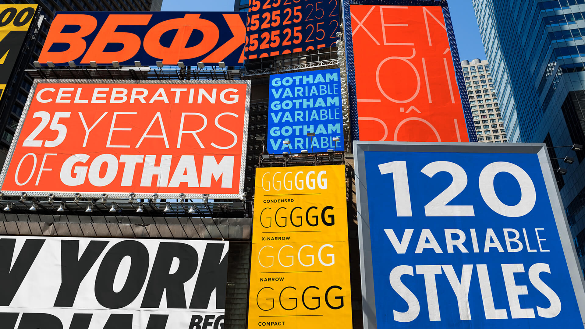
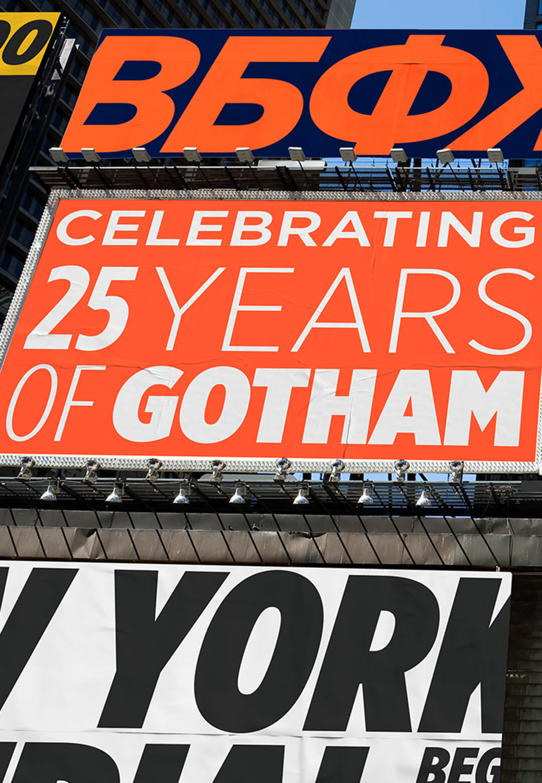
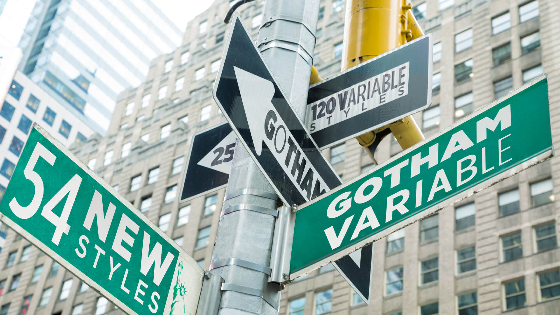
Few typefaces have contributed to the visual language of this century as much as Gotham. The sans serif has evolved into a near ubiquitous presence across branding, media, civic signage, digital interfaces and politics. The global type foundry Monotype Imaging Inc. has launched Gotham® Variable, a new variable font system for Gotham, designed to improve its adaptability across contemporary visual design and branding workflows, for increasingly fluid design environments. The release arrives 25 years after the typeface first appeared publicly on the cover of Gentleman Quarterly (GQ) magazine in January 2001.
The Gotham typeface family has established itself as one of the most versatile and widely recognisable ever. Ever since its inception, it has shaped the visual identities of global brands including Netflix, Coca-Cola, Spotify, Chanel and Taco Bell, alongside cultural platforms such as Saturday Night Live, institutions such as the United States Postal Service and political campaigns, including Barack Obama’s presidential campaign in 2008. Notably, this ubiquity developed organically, entirely on the merits of its design.
The Gotham typeface design was formally developed at the turn of the 21st century by Jonathan Hoefler and Tobias Frere-Jones for GQ magazine, who had commissioned something "modern, masculine, perhaps geometric", as the designers recall in their personal blogs. Although initially conceived as a headline typeface, the duo used the opportunity to create a font family with far broader applications.
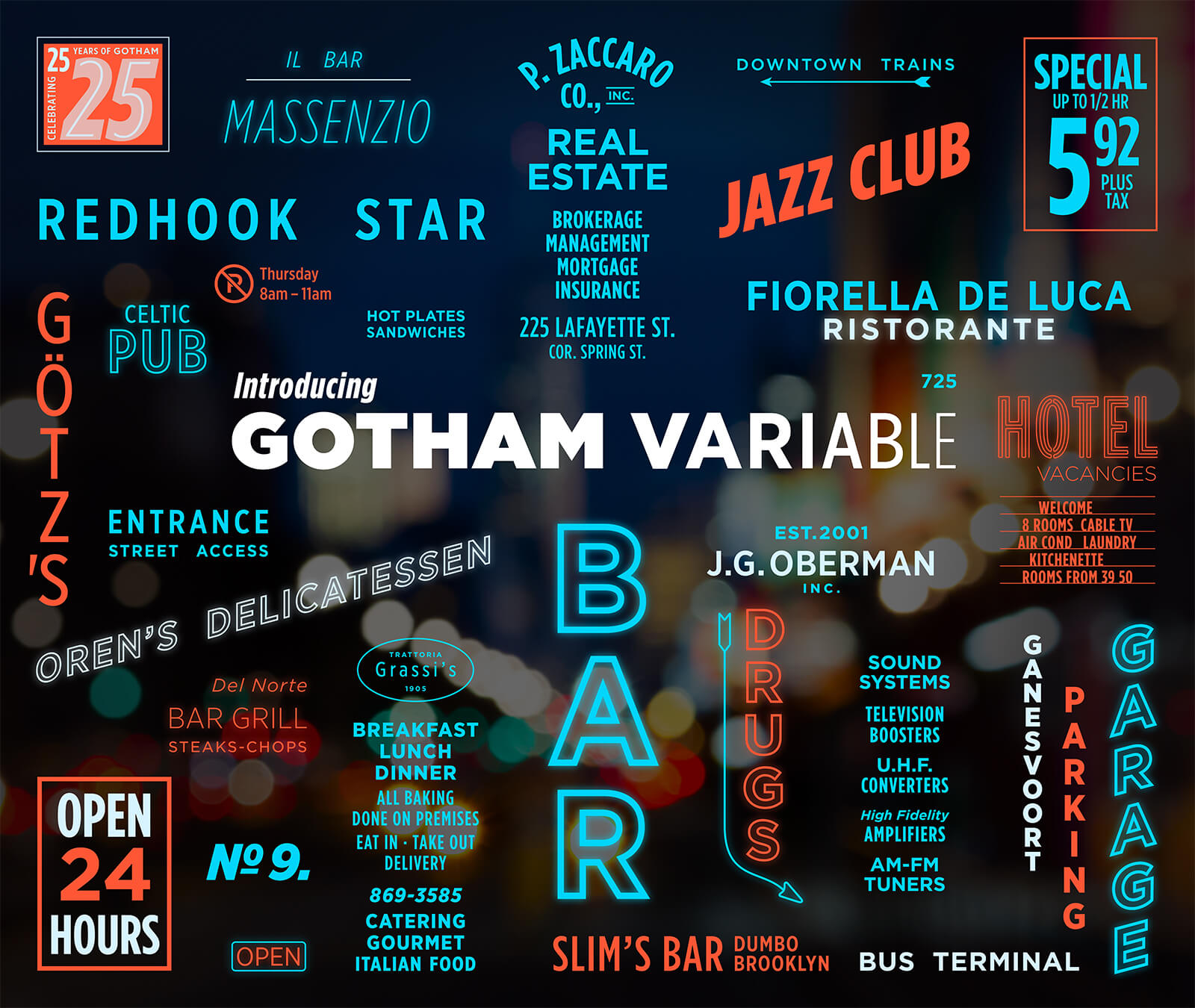
Drawing from lettering found across the city of New York—in paint, plaster, neon, glass and steel—the typeface designers distilled what they considered the most familiar and persistent qualities of urban typography into something that felt inherently universal: not idealised, but so fundamental that it appeared almost anonymous, as though it had always existed. Using the signage atop the Port Authority Bus Terminal entrance at 42nd and 8th as their base, they developed a type family that would eventually become Gotham.
Following its commercial release in 2002, Gotham rapidly became embedded within New York’s visual identity. Despite the designers’ initial reservations about its association with the DC Universe’s Batman comics, the typeface was eventually renamed after Gotham—one of the city’s enduring nicknames—in recognition of its growing presence across the urban landscape (although the original correlation was more satirical than ambitious). The new name also offered a practical advantage: the inclusion of the letters ‘G’, ‘O’ and ‘A’, which showcased some of the typeface’s most distinctive elements.
Gotham’s cultural significance deepened in 2004, when it was engraved in the cornerstone of the One World Trade Center, a memorial for the 2001 attacks on the World Trade Center. Its reach expanded further through Obama’s presidential campaigns, pivoting the conventional visual language of America’s political campaigns away from serifs while foregrounding the importance of coherent design systems. By 2011, Gotham had entered MoMA’s permanent collection of ‘historically significant artefacts’ alongside Frank Lloyd Wright’s model for Falling Water and the original Macintosh computer, cementing its place within the history of modern design. Gotham became a design system before ‘design systems’ became a common language.
Its enduring popularity lies in the design principles that make Gotham widely adaptable across scales, media and contexts. Built on geometric, Euclidean shapes with a high x-height and wide apertures, the typeface carries a bold, defined and highly legible character. Its most significant attribute, however, was the strength of its lowercase forms, which allowed the culturally pervasive Gotham to function equally effectively in headlines and body text—giving it a distinct advantage over many of its contemporaries.
Over time, it has demonstrated remarkable flexibility, expanding to support more than 564 languages while maintaining a consistent visual identity across print, digital and physical environments. With the launch of the Gotham Variable font system, that adaptability and resilience extend into contemporary AI-assisted and responsive design workflows as well.
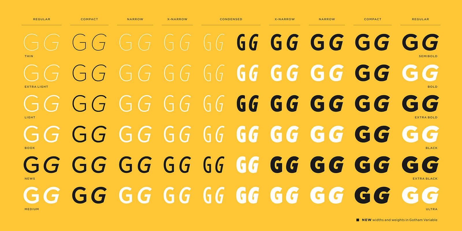
With Gotham Variable, Monotype furthers the typeface’s existing family of 66 with 54 new additions, while introducing continuous control across weight and width within a single font file. Other key features include expanded language support, including Vietnamese and enhanced Cyrillic and Bulgarian; new intermediate styles, including subtle new shades of weight and a new Compact width; and improved performance, faster load times and simplified implementation. The new system is essentially extending qualities that the typeface already possessed, those of geometric clarity and accessibility.
“With Gotham Variable, we tried to imagine what this typeface could become without losing sight of its powerful legacy,” explains Sara Soskolne, executive creative director at Monotype and lead designer for Gotham Variable, in an official press release. Soskolne had been closely associated with Gotham since joining Hoefler’s studio in 2005, where she worked extensively on refining the typeface’s intermediate styles.

“Why now? The timing isn't accidental. Under the creative direction of brand teams, AI is producing brand assets at speed and scale that wasn't possible when Gotham first launched. Brands know what those systems need: fonts that flex across every surface and every territory without breaking. Gotham Variable is Monotype’s answer to that brief,” the press release elaborates.
With Gotham, Hoefler and Frere-Jones sought to create a sans-serif capable of outlasting shifts in visual fashion. At a time when creative communication and brand design are undergoing shifts, especially with AI’s interventions and adaptive workflows, Gotham Variable reinforces the continued relevance of the familiar type family, broadening it from a static typeface into a responsive design system for contemporary brands, products and experiences, designed to perform across platforms, interfaces and algorithmically generated outputs.

by Chahna Tank Jul 17, 2026
STIR speaks with the celebrated American graphic designer about the new retrospective publication by gestalten that chronicles the lesser-known world of his children's books.
by Chahna Tank Jul 16, 2026
STIR speaks with the Irish creative on his ongoing project reimagining the rigidity of nation states through myriad flag designs, probing identity, community and symbolism.
by Pranjal Maheshwari Jul 14, 2026
Using salvaged wood, wild earth, copper remnants and more, the exhibition at ICA San Diego / North brings together 20 regional creatives exploring regenerative approaches to making.
by Pranjal Maheshwari Jul 14, 2026
Taking a closer look at the comprehensive retrospective at the Vitra Schaudepot in Weil am Rhein, STIR explores the enduring relevance of the 20th-century designer.
 surprise me!

make your fridays matter
SUBSCRIBEmake your fridays matter with a well-read weekend
Enter your details to sign in
Don’t have an account?
Sign upOr you can sign in with
a single account for all
STIR platforms
All your bookmarks will be available across all your devices.
Stay STIRred
Already have an account?
Sign inOr you can sign up with
Tap on things that interests you.
Select the Conversation Category you would like to watch
Please enter your details and click submit.
Enter the 6-digit code sent at
Verification link sent to check your inbox or spam folder to complete sign up process


Monotype’s Gotham Variable expands a typographic classic into a design system
by Pranjal Maheshwari | Published on : May 16, 2026


 Sign in with email
What do you think?