


Design06 mins. read
UnBroken at Camden Inspire 2025 proffered salvaged stories and second lives in design
by Asmita SinghOct 04, 2025
•make your fridays matter with a well-read weekend
by Pranjal MaheshwariPublished on : Apr 02, 2026
Since the 20th century, the idea of ornament came to be distinct from craft and object, while utilitarianism labelled it as an added (and often wasteful) effort—an option, or, to quote Adolf Loos, a ‘crime’. Accepted social orders successively found solace in bare surfaces, monochrome surroundings and plain, refined finishes. What mattered was the intended function and the bare minimum required to achieve it. The decorative did not necessarily lose its meaning; it was relegated to the category of the additional, maybe even the undesirable. This is not the first time that overtly decorative design elements from our pasts have been shunned as excessive, but perhaps the resistance has seeped deeper this time, into the core of what we derive from and seek in a space.
Attention has become rationed, carefully packaged and valued by the prominence of purpose. Most of us have come to dwell with bareness; in going from one place to another, to travel simply to reach, to pass by without a pause, to always keep moving. This inherent functional bareness of the in-between—of spaces that exist merely to serve—seems to have rendered them unworthy of drawing any attention, being of any influence or demanding any effort or identity of their own, no matter how trivial.
In the proliferation of an almost ubiquitous monotone palette, what defines, and justifies, if at all, the ‘beautification’ of these inherently utilitarian spaces? Streets, sidewalks, subway tunnels: are they bound to be strictly functional? Or can they be allowed to don ornaments that perhaps interject in everyday lives of people and places? Can they engage the passerby on a level that supersedes the surface?
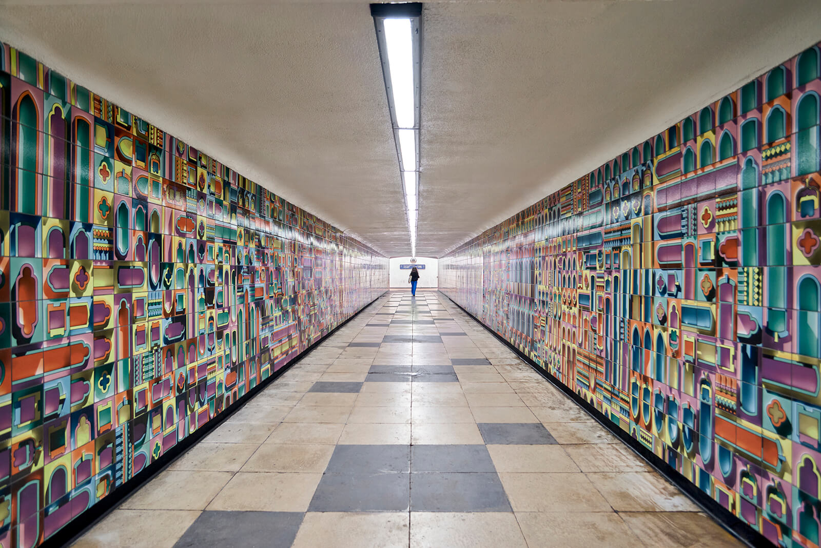
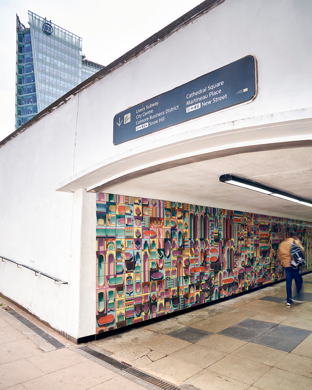
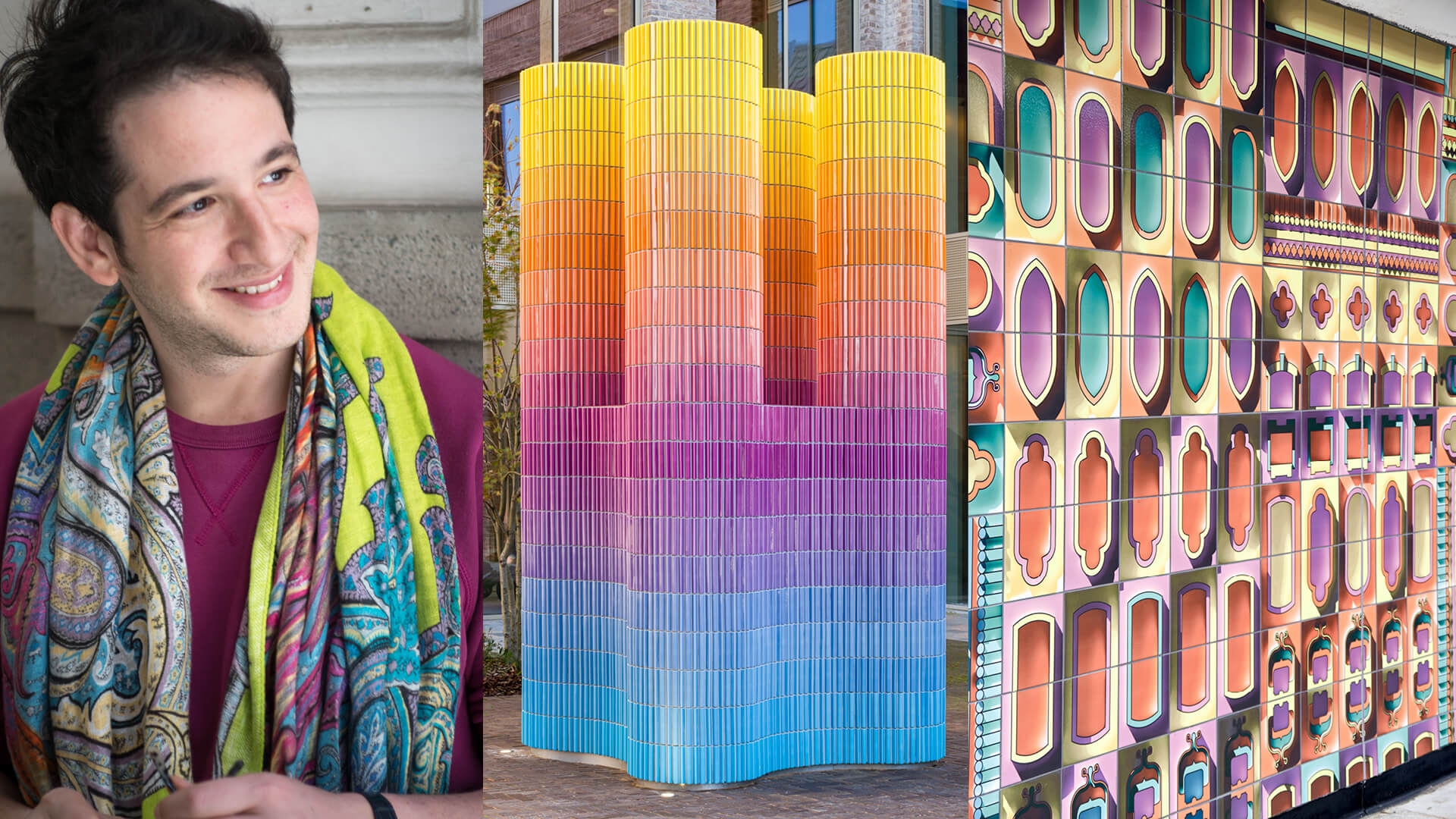
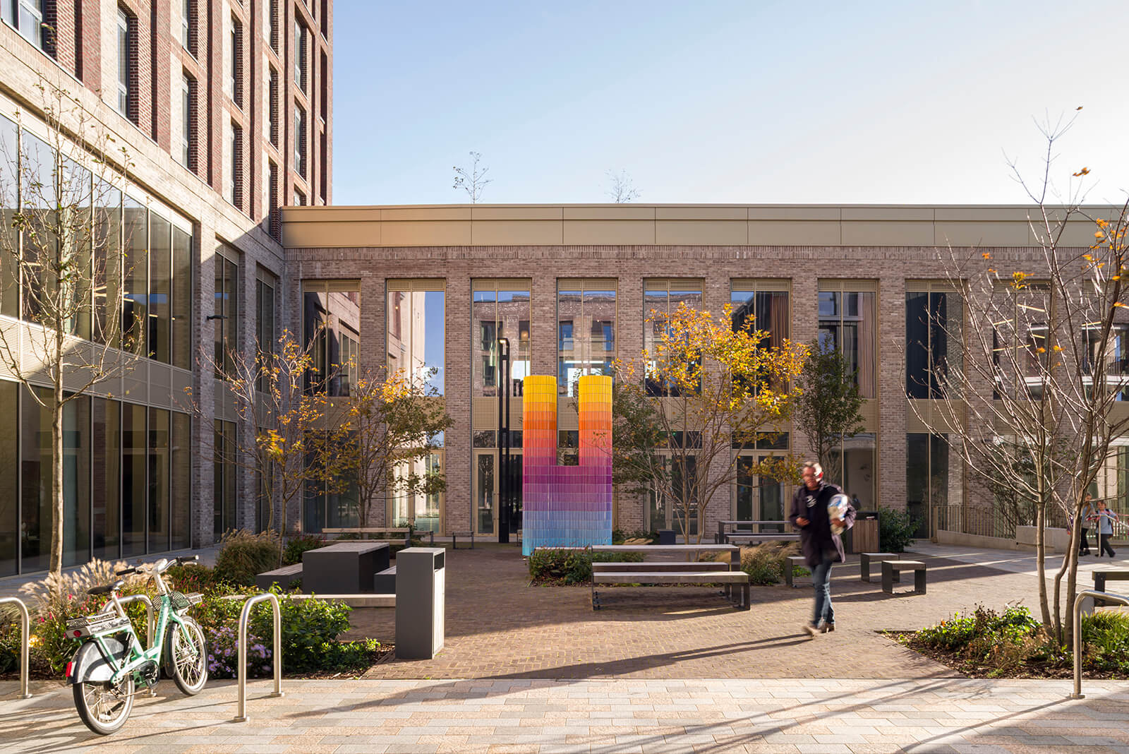
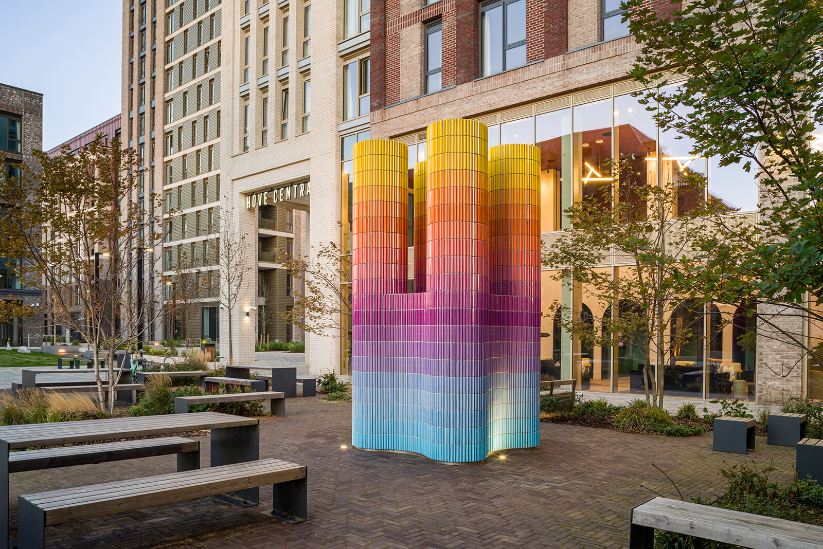
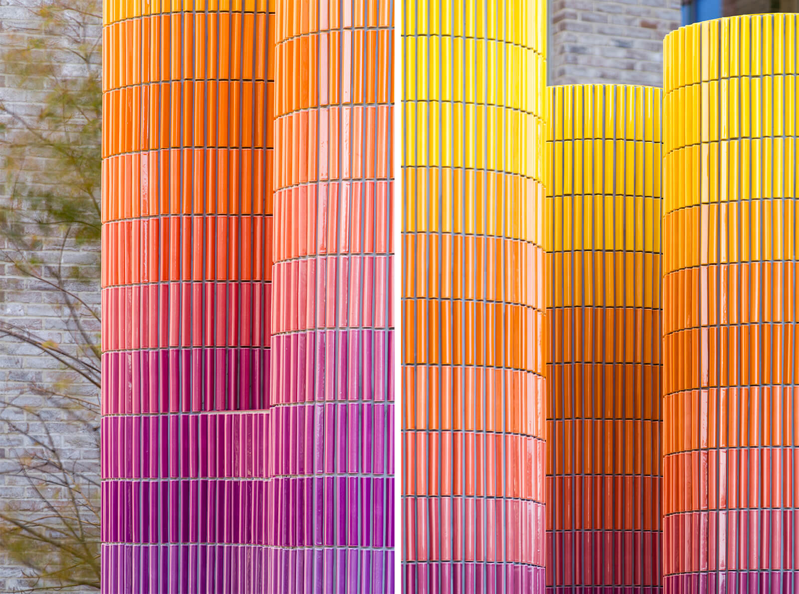
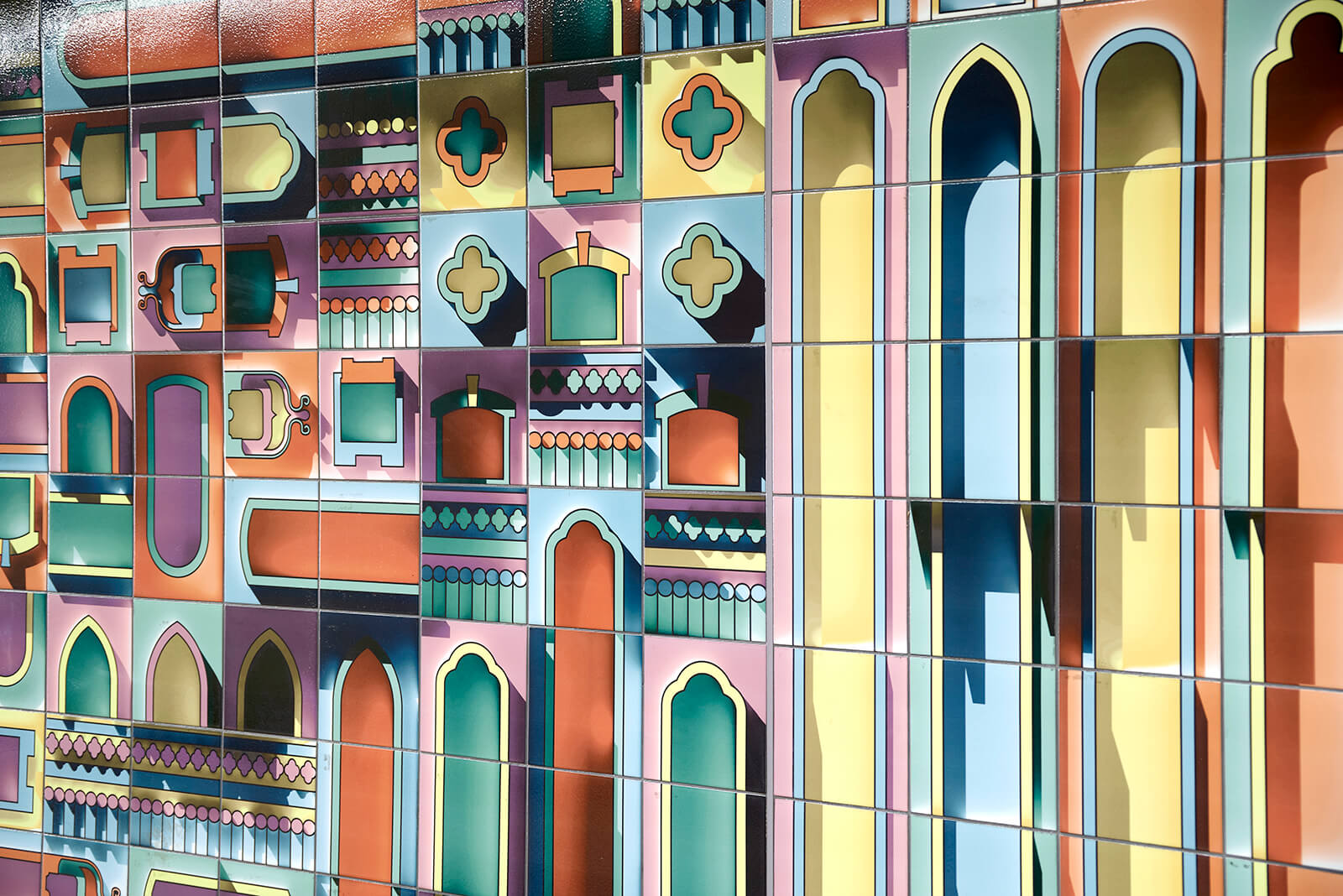
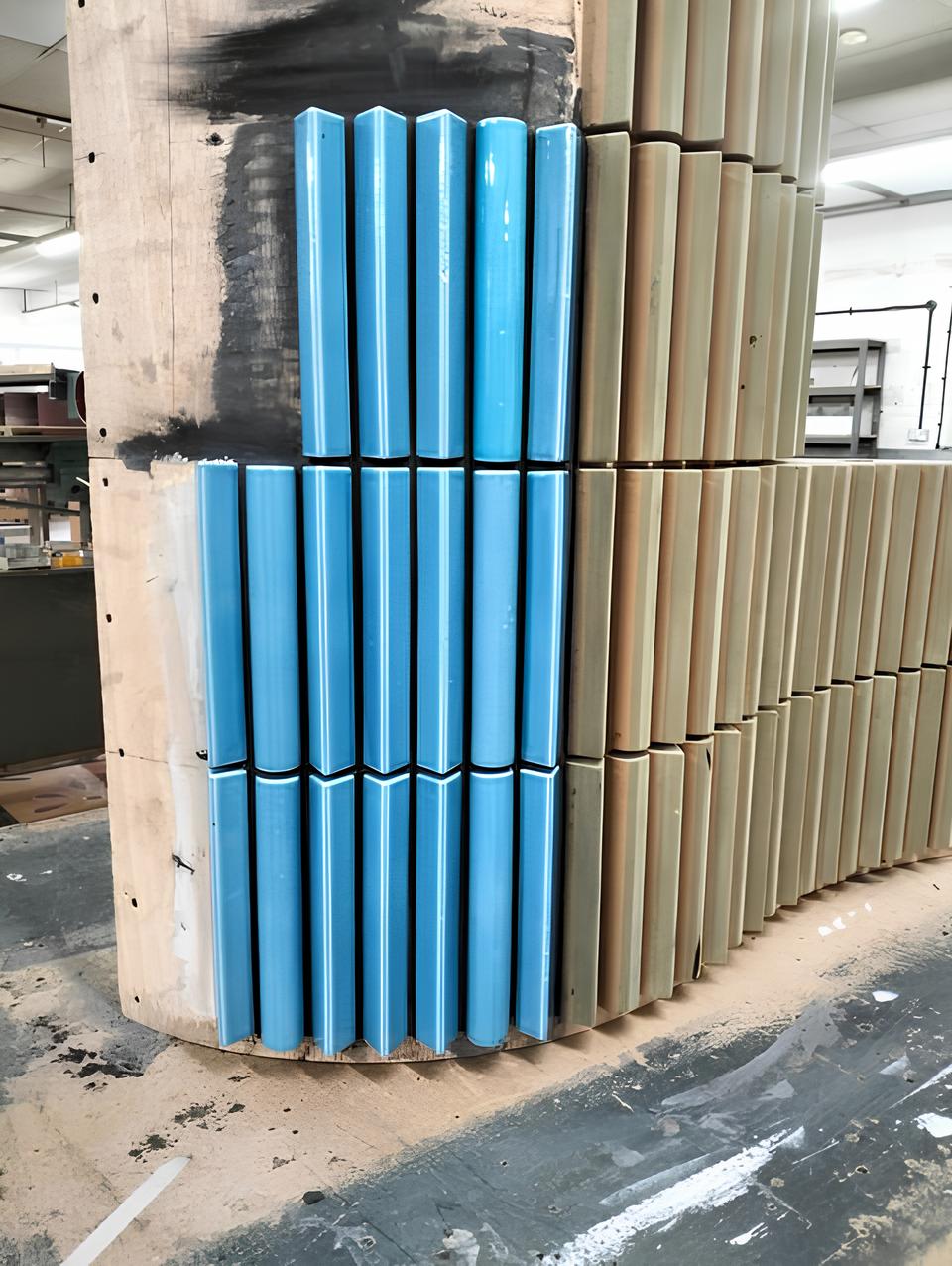
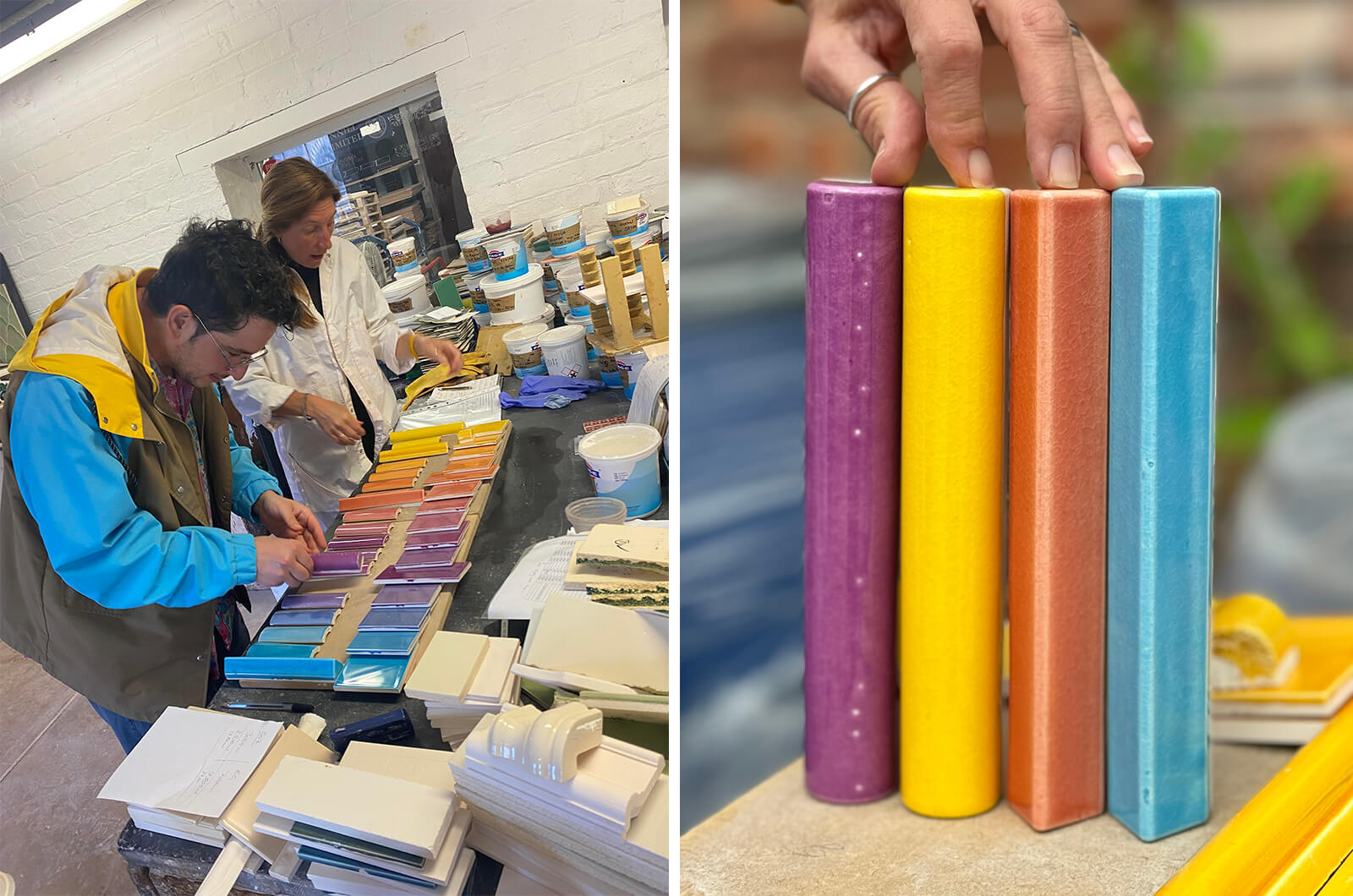
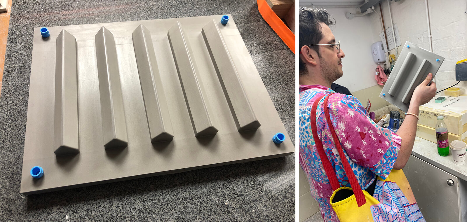
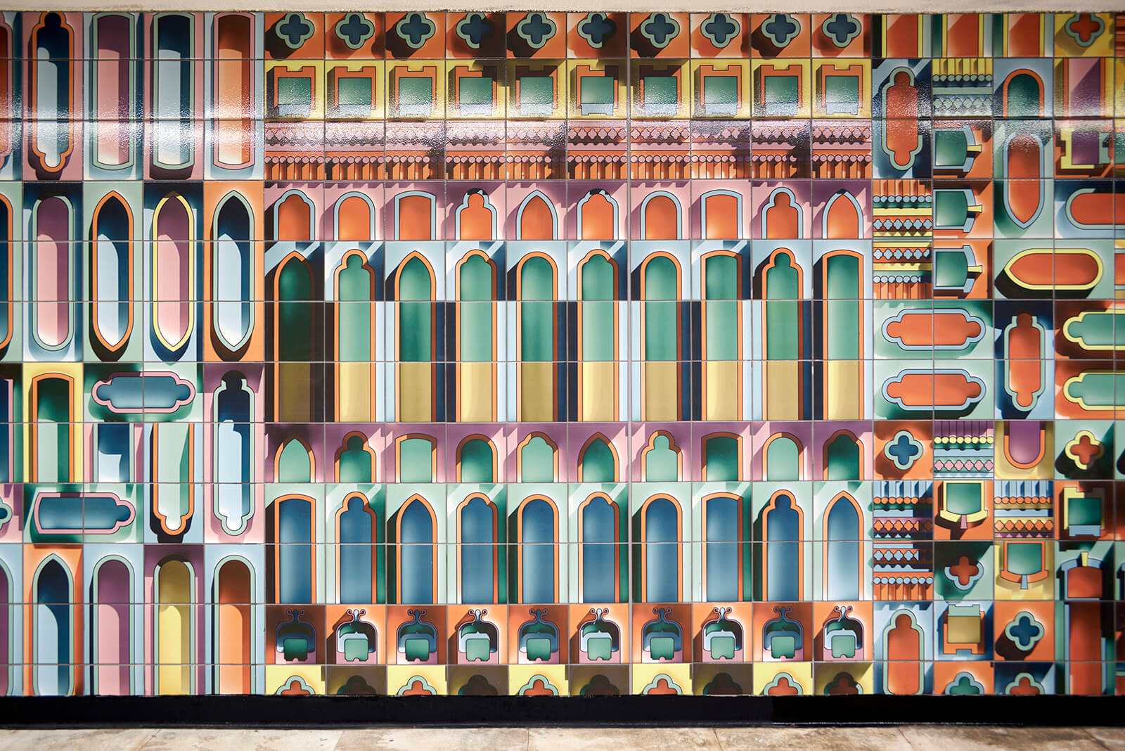
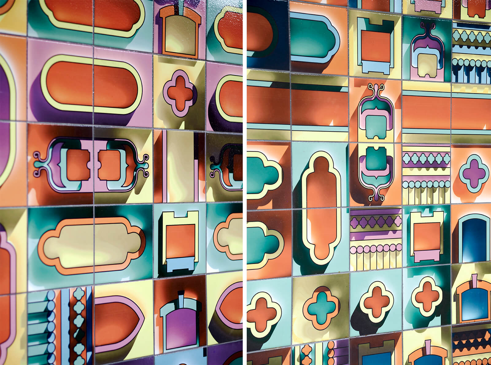
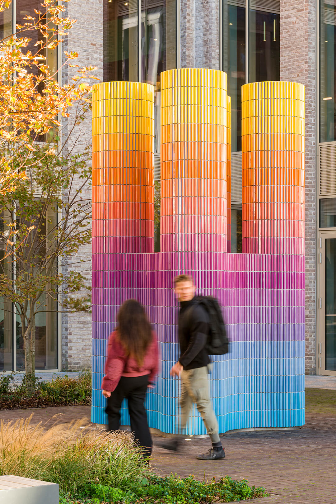
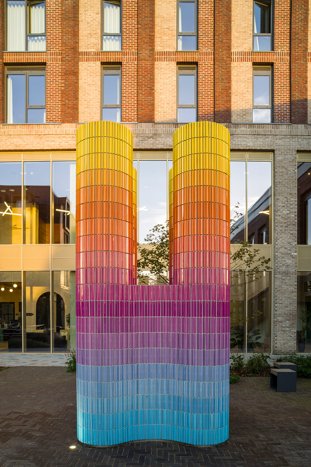
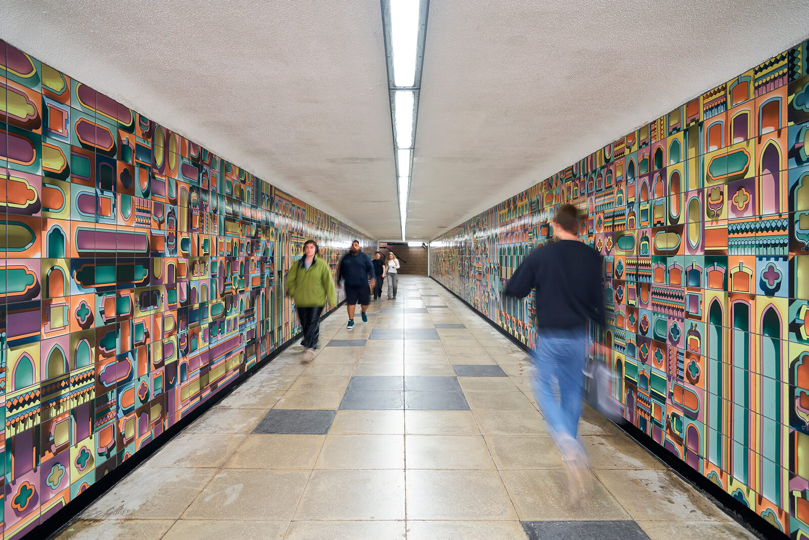
This inquiry is deepened in an engagement with the recent works of British designer and London-based spatial artist Adam Nathaniel Furman. The first, a varicoloured mural at the Livery Street subway, is a delightful renovation of the tunnel connecting Colmore Business District and the Jewellery Quarter in Birmingham, using about a thousand unique tiles to create a three-dimensional trompe-l'œil effect. The second is a luminous sculptural anchor for Hove Central in Brighton called the Cascade: an ensemble of glazed ceramic pieces of two kinds—pointed and arched—grading subtly from yellow to blue as they cascade down.
In a conversation with Furman, STIR enquires about his perception of what is deemed ornament in public spaces—vivacious use of colour, craft, expression, symbolism—including the apparent lack of it and why it features so prominently in his oeuvre in delightfully refreshing takes.
Pranjal Maheshwari: In your work, you seem to view colour as a medium of thinking rather than an ‘additive’ attribute or a surface treatment. How does this have an impact on your perception of space and the conception of an intervention?
Adam Nathaniel Furman: I think, imagine and daydream in full colour; the way I perceive my surroundings is in a highly saturated, technicolour mode that I take great joy from. It is central to the way I exist in the world and the way I add things into it. I like to describe colour as being—for me—the equivalent of the flavour in food; it is a potent aspect of our environment that is suffused with emotion and significance, memory and longing. It is the alchemical admixture of subjective complexity into our physical reality in a manner that works directly on us through our senses, instinctively.
Because I think in colour, I don't see a wall as a structural boundary to be decorated, or columns as functional elements to be covered; I see elements that form the shape of the city but which have been left absent of a vital aspect of their purpose: the chromatic resonance that will fill them with life and endear them to those whose lives they shape. My interventions aren't just 'placed' in a city; they are tonal shifts in the urban fabric that change the temperature and emotional resonance of the street.
Colour is a powerful, potent medium in whose successful usage I have found a way to engage directly with an incredibly broad audience—far beyond that of the design and art community and its critics—speaking directly and intimately with those who live, work and pass by my creations in an immediate and universal fashion. I feel as if I am laying delicious chromatic feasts for the people living in the cities I am lucky enough to work in. Having said that, there are many different manifestations of colour and I am specifically passionate about the kind that is embedded in materials having a tactile, crafted quality. In this way, colour is the animating life within a material gem imbued with the magic of the human hand. Whether it be glazed ceramics, glass mosaic tesserae or multi-coloured sprayed metal, colour that has material depth, imperfections and phenomenological interactions with the environment is what I try to use, as one can clearly see the difference in response and sense of added pride from people in whose areas work made this way is placed.
My interventions aren't just 'placed' in a city; they are tonal shifts in the urban fabric that change the temperature and emotional resonance of the street. – Adam Nathaniel Furman
Pranjal: Your general body of work, including Cascade and the Livery Street subway mural, features an intersectionality, almost a contamination, between architecture, art and design. Would you say craft, or the idea of making by hand, is the unifying factor here?
Adam: I have worked with many different mediums and techniques over the years, but I have always been drawn specifically to a way of working that engages both new and interesting fabrication technologies and traditional hand-making—ideally in combination.
I absolutely agree that there is a 'contamination' between the disciplines you mention in my work. For me, I would say crafted materiality, and how that is achieved, is what brings it all together. Whether I am working on the scale of a huge colonnade or a ceramic vessel, this focus on materiality and 'making' carries through everything I do, be it in the field of architecture, art or design. I have collected ceramics since I was in university, and I adore the ecosystem of crafts that we have here in the United Kingdom; there are very few areas of endeavour in the modern economy that are quite as fulfilling and meaningful as the hands-on creation of physical things imbued with the love, time and energy of their maker.
I find that the same passion and love can be found in the world of small-scale manufacturing, where new, innovative ways of creating forms in different materials are tested and almost always combined with traditional techniques and historical knowledge to form products that are wonderful syntheses: the past and the contemporary, the human and the machine, the crafted and the high-tech. My great love is the world of things—objects that exist materially in this place we all inhabit together for all and sundry to touch and see. I want them to be sensually inclusive, tactile and intriguing in their materials; satisfying to look at and chromatically delicious in their colours, and I have always believed that the best way to achieve this was to create work whose journey to realisation was tangible and appreciable in the end product.
For me, crafted materiality, and how that is achieved, is what brings it all together. – Adam Nathaniel Furman
Pranjal: Eduardo Paolozzi’s mosaics in the London Underground are widely regarded as among the most significant examples of public art in London. Do you consider his work an inspiration or influence on yours?
Adam: It is not possible to overstate how important Paolozzi's Tottenham Court Road mosaics are and have been, to me. Growing up, the decorative art in London—especially on the Tube—was a huge influence; it made the city a wonderland of constant delights. It was an accessible museum that didn't have invigilators or difficult-to-understand curatorial labels acting as barriers. Instead, it was an archive of art that I could understand entirely in my own way and interpret from my own idiosyncratic perspective, just as everyone else could.
There was—and still is for me—something magical about finding an incredible sculpture or mural on a facade, a tube platform or in an alleyway. It is spellbinding in its brilliance, yet thousands of commuters march past it every hour. I often find myself standing there, gobsmacked and in awe, while occasional passers-by look at me, then at the artwork, then back at me as they walk briskly to their destination. The way these pieces are embedded in the most utilitarian, busiest and most quotidian parts of our cities—deepening and adding beauty where they make the most difference—is a kind of wonder that still fills me with joy.
Paolozzi's Tottenham Court Road, even after the damage, losses and demolitions, is the Sistine Chapel of this kind of decorative art. Especially before we lost the utterly incomparable brilliance of the escalator arches, Paolozzi took a grungy, incredibly busy station and turned it into a grotto of glittering fascination—a series of interconnected caves decorated with vivacious contemporary cave paintings. As a young gay man, Soho was my home, both literally and spiritually, and this station was the gateway to that world. While it is objectively brilliant, it was also the station I spent the most time in and have the most memories associated with. Every square metre of it is coloured with deeply rooted and positive associations; its influence on my work can be noted by anyone who knows Paolozzi’s legacy.
Pranjal: What, according to you, was the intended impact of both the Cascade and the Livery Street subway mural? Any particularly surprising public interactions?
Adam: The impact I aim for in all my work—including Cascade and the Livery Street subway mural—is very much along the lines of what we have been discussing. I care deeply about creating decorative artworks that are understood instinctively; they work on the senses through colour and materials with a tactile, intriguing quality. However, they also work through something I haven't mentioned yet: formal associations that everyone in a given place can recognise.
I love architectural and design history—indeed, I love history in general—and whenever I design something new, I try to incorporate forms that feel recognisable and familiar rather than alien. I then work to transform them with fresh colours, formal tweaks and unexpected materialities. I find that this creates interventions that are simultaneously deeply familiar and fresh—a frisson that I enjoy and to which people respond very positively.
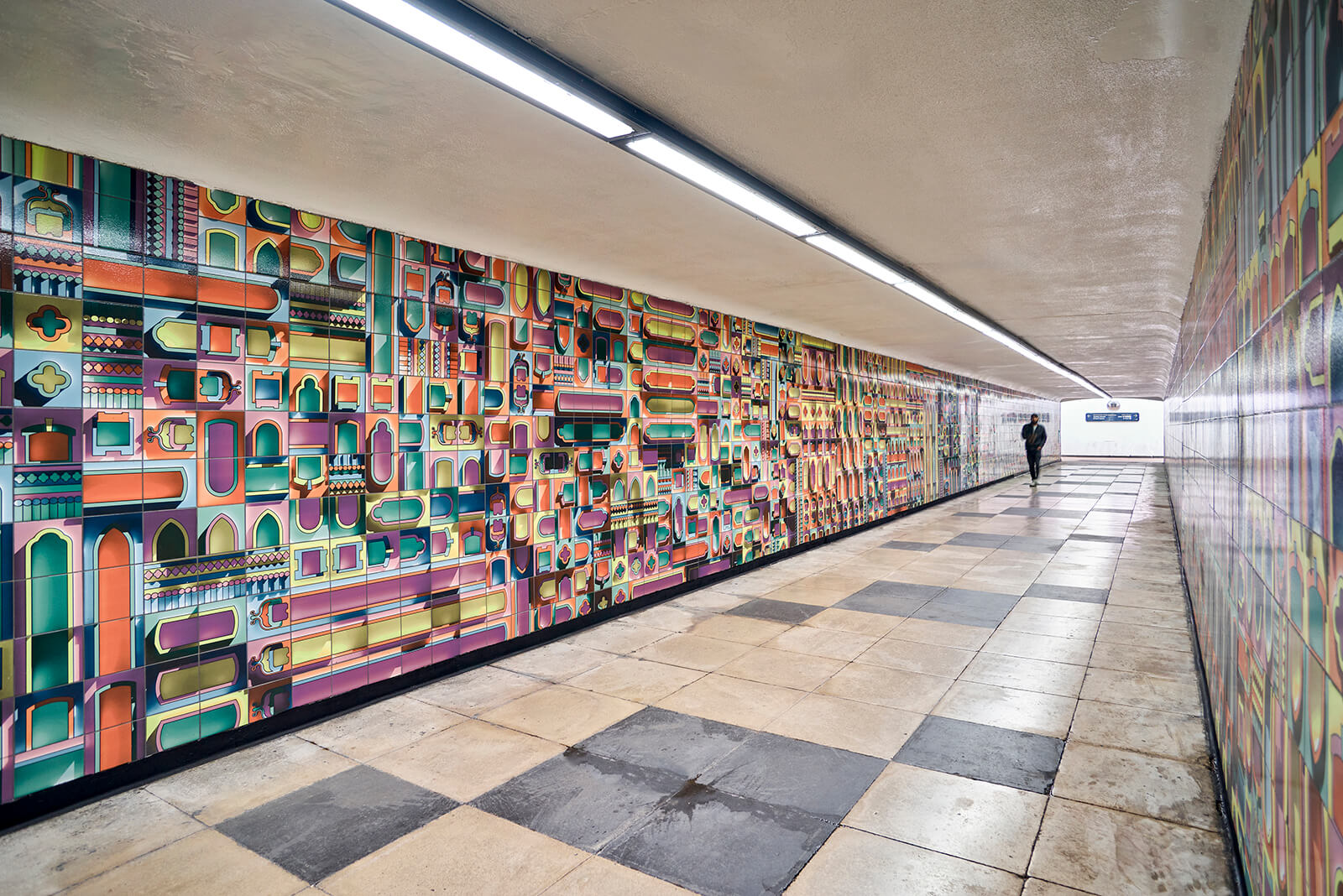
A very explicit example is my conceptual proposal, The Democratic Monument, for a new type of British Town Hall. In it, one can discern the silhouette of a Gothic cathedral, but clearly in a highly transformed, contemporary state. In this respect, Cascade recalls 1960s and 1970s ventilation outlets (Paolozzi rearing his head here again with his Pimlico vent), while Livery Street explicitly depicts actual architectural elements from the Jewellery and Colmore districts that the subway connects. Each, however, has been rendered in a chromatically saturated, technicolour ceramic manner.
The combination of ceramics that draw people to touch the work, the fresh colour palettes and the somehow-recognisably-familiar forms has meant that the feedback for these two works has been phenomenal. As Richard Wolfstrome, the curator for the Brighton development in which Cascade sits, has pointed out, people have been altering their daily walks specifically to pass by the sculpture. I have even had people message me saying they had been asked by friends to meet at ‘the big cool colourful thing.' Similarly, I regularly receive comments from those using the Livery Street subway about how much the murals are appreciated and how they have transformed the atmosphere of their daily commute.
Pranjal: Do you think public art needs to be especially symbolic to be influential or impactful?
Adam: I don't have a single opinion that applies to all public art, as there can and should be many different kinds. While there is an important space for symbolic art that speaks to specific figures, issues or events, I personally find joy in creating work that is not tied to any specific narrative.
I love being in the background of the everyday—deepening the sense of attachment people have with their 'boring' surroundings by providing material to justify their sense of pride in place, without linking that enjoyment to any particular creed. That doesn't mean my work lacks narrative or political undertones; however, those are part of the making process and are not intended to be explicit in the final outcome. I want my work to be enjoyed and appreciated just as much by those who would find my personal narratives ridiculous or my politics unpalatable as by those who wouldn't.
I love being in the background of the everyday. – Adam Nathaniel Furman
I aim for my work to be powerfully atmospheric—like artistic 'air-fresheners' that add a flavour and aroma to a place. They have an effect that is felt and comprehended intuitively and sensually, rather than working with precision through the rational mind, the way symbolism or allegory does. I see directly, in the way my interventions embed themselves in their contexts, that this approach is remarkably effective. While it might be a bit more difficult to explain or write about than a traditional monument, the response from local residents proves that this sensory connection is deeply impactful.
by Jincy Iype Jul 10, 2026
A sequence of folded planes articulates this café in South Korea, which emerges as a single-storey fortress of red brick, concrete, stainless steel and orchestrated light.
by Bansari Paghdar Jul 09, 2026
Photographer Eric Lusito documents the Soviet Union’s laboratories, reactors and other scientific buildings across the former USSR landscape in a new book by FUEL.
by Jincy Iype Jul 08, 2026
In partnership with LFA 2026, the panel, with Jim Stephenson, Sahra Hersi, Adam Kaasa and Manijeh Verghese, dwelt on belonging through the lens of architecture, art and archives.
by Samta Nadeem Jul 07, 2026
STIR takes a first-hand look at Concéntrico’s standout installations and the question of what a festival built to disappear actually leaves behind.
 surprise me!

make your fridays matter
SUBSCRIBEmake your fridays matter with a well-read weekend
Enter your details to sign in
Don’t have an account?
Sign upOr you can sign in with
a single account for all
STIR platforms
All your bookmarks will be available across all your devices.
Stay STIRred
Already have an account?
Sign inOr you can sign up with
Tap on things that interests you.
Select the Conversation Category you would like to watch
Please enter your details and click submit.
Enter the 6-digit code sent at
Verification link sent to check your inbox or spam folder to complete sign up process


Adam Nathaniel Furman on laying chromatic feasts for people through his public works
by Pranjal Maheshwari | Published on : Apr 02, 2026


 Sign in with email
What do you think?